 The 2018 midterm election in the United States of America has been among the hottest topics on the media agenda for quite a long time. Various publications were covering the course of the House, Senate, and governor campaigns, sharing forecasts from analysts, and so on. Now that voting is over, all eyes are on the outcome.
Today’s DataViz Weekly will show you how several prominent publications communicated the results of the midterms to their readers with the help of data visualization techniques: The New York Times, The Washington Post, Bloomberg, and The Guardian. So get ready for a lot of choropleth maps! But not only.
Visualizing 2018 Midterm Election Results Data
The New York Times
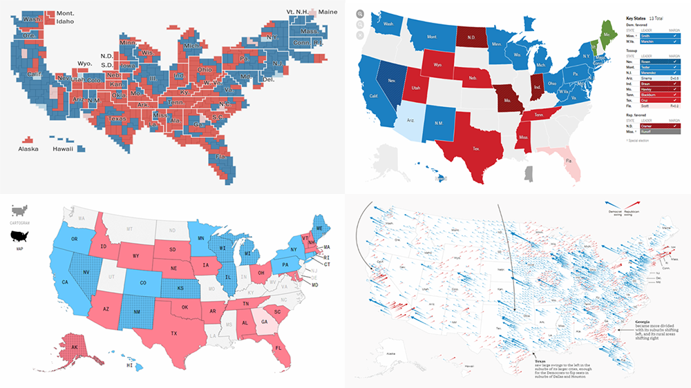
Let’s start with The New York Times. The publication’s graphics team created interactive maps for the House, Senate, and governor elections, displaying the results for each state and county. Hover and click over the visualization to explore the voting data.
The Washington Post
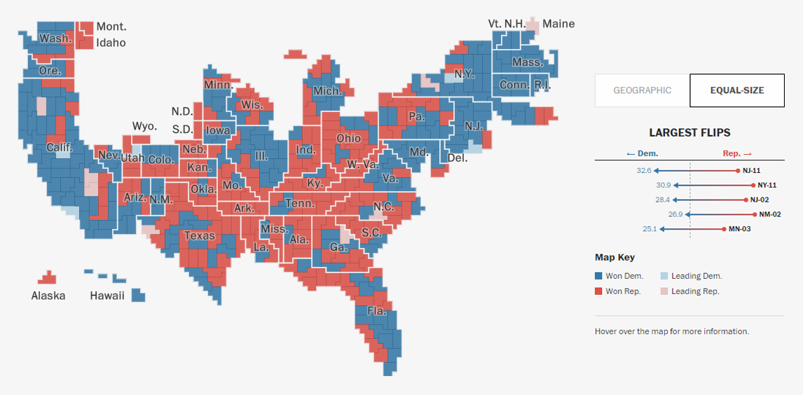
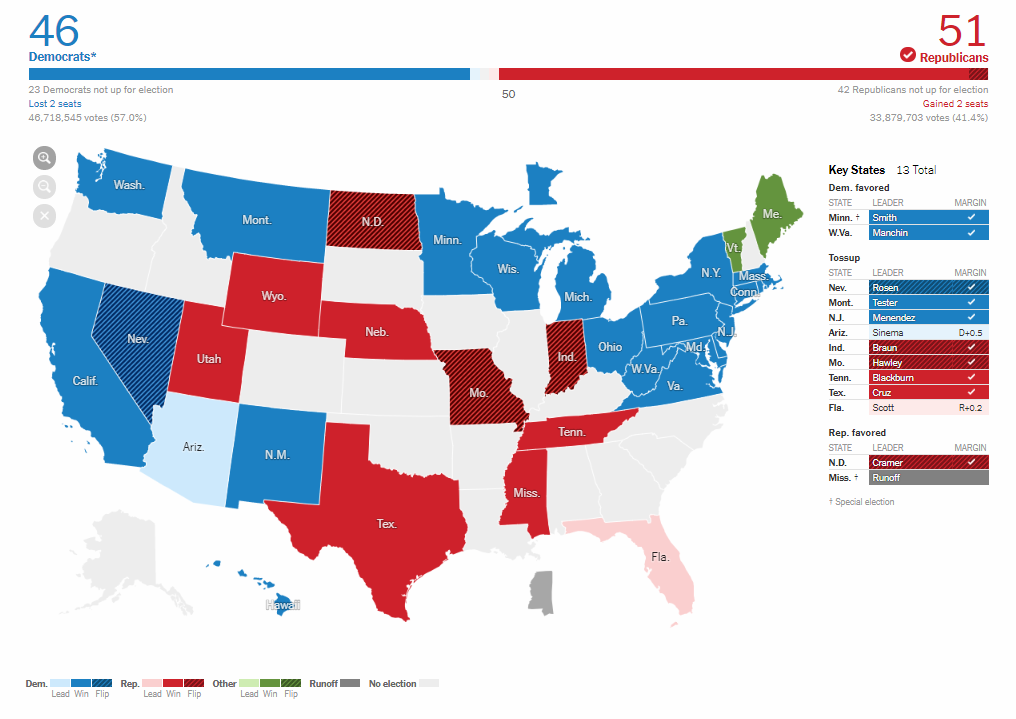
The Washington Post also used choropleth maps to graphically represent the results of the midterms for the House of Representatives, Senate, and state governors races. However, there you can also switch to the cartogram view of the same data, find interesting charts showing which Senate and House seats had actually been considered vulnerable, and trace the largest flips.
Bloomberg
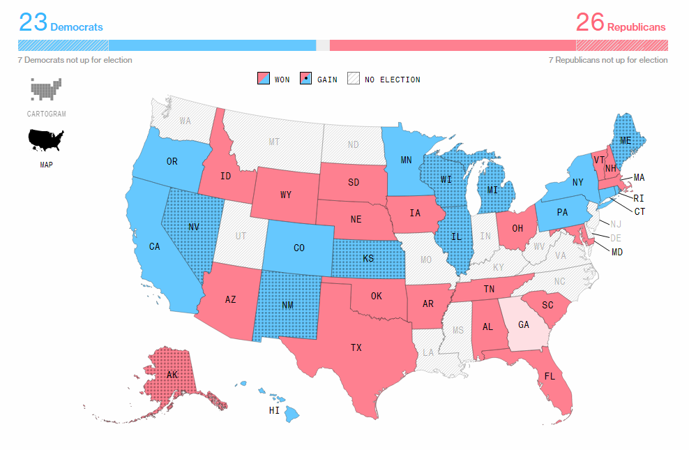
Bloomberg nicely visualized the midterms results on a single page, allowing you to conveniently switch between the elections and states. It is also possible to change the view from cartogram to map, and vice versa, as well as to select what races to show if not all: races with women, open races, key races, and committee chairs.
The Guardian
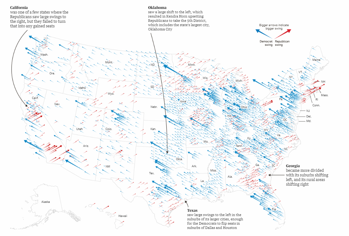
The Guardian focused on providing insight into who won where in terms of their political position: Lean Democrat, Likely Democrat, Lean Republican, Likely Republican, or Tossup. Don’t miss out on another set of interesting visualizations of the voting results. In particular, there is a cool static map — see the screenshot above — that shows the Democrats’ and Republicans’ gains in the 2018 midterm elections in comparison with 2016.
Conclusion
As you are likely to already know, the big picture of the 2018 midterm election results boils down to the following: Democrats take (back) the U.S. House and several states as governors, whereas Republicans keep the majority in the U.S. Senate. The graphics projects we’ve featured above shed light on further details. Generally speaking, there are a lot of various visualizations on the midterms out there. You can simply Google “midterms results,” and (almost) every top link will lead you to a piece where charts are used, because visualization is a very effective, and therefore more and more popular, way of representing data.
Follow DataViz Weekly on the AnyChart blog to learn about new interesting data visualization examples from around the web on a regular basis.
- Categories: Data Visualization Weekly
- 1 Comment »