 Continuing the regular DataViz Weekly feature on the AnyChart blog, today we are happy to tell you about new interesting data visualizations we’ve found these days — wonderful examples of charts designed for visual storytelling and analytics:
- gender pay gap in Germany;
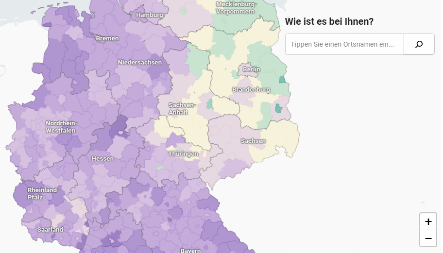
- NBA’s all-time scoring leaders, now with LeBron James in top 4;
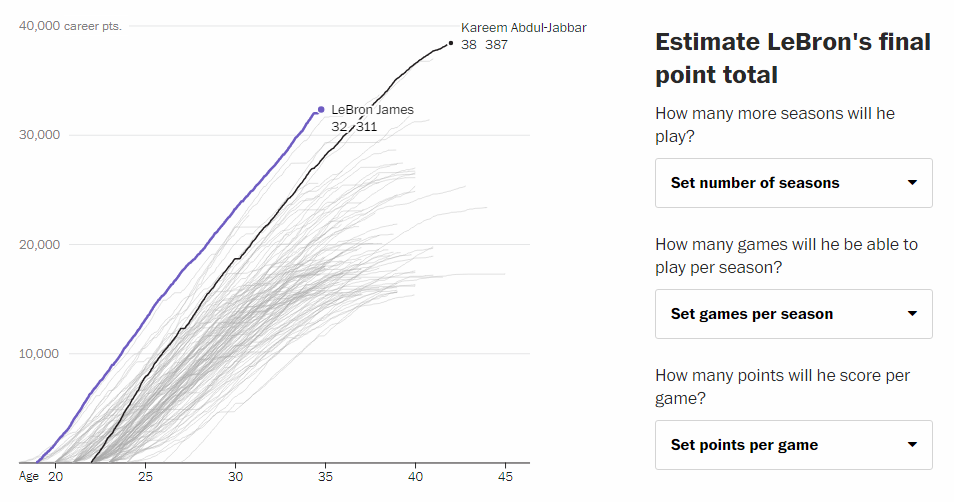
- from leading high school basketball players to NBA superstars;
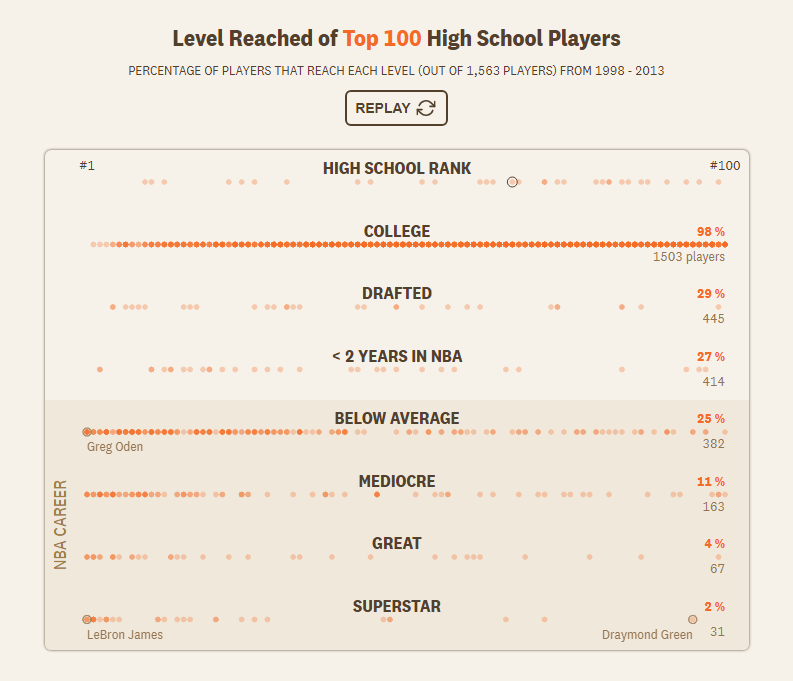
- household spending in the United States, by income group.
New Interesting Data Visualizations: March 8, 2019 — March 15,2019,
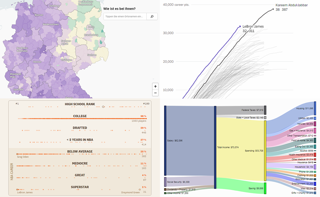
Gender Pay Gap Across Germany
In the European Union, the average gender pay gap — the difference in wages of men and women — is 16%. In Germany, it is higher and equals 21%. To analyze the gender pay gap in the spatial perspective and reveal geographic trends in its magnitude, Berliner Morgenpost visualized data from Germany’s Federal Employment Agency on an interactive choropleth map.
Explore the map on Berliner Morgenpost to see where in the country men earn more than women (and vice versa) and by how much, across all the country’s 401 administrative districts. Learn more in a dedicated article.
NBA All-Time Scoring Leaders with LeBron James Now in Top 4
LeBron James made it to the list of the NBA’s top four all-time career scorers. In early March, he left behind Michael Jordan, his idol, and now only Kareem Abdul-Jabbar (#1), Kobe Bryant (#2) and Karl Malone (#3) are ahead of him on the ranking. But how long will it take for LeBron James to pass them and is it possible at all?
Armand Emamdjomeh and Ben Golliver for The Washington Post allow you to find that out with the help of a simple prediction tool that accompanies an interesting interactive line chart-based visualization showing who else have scored over 15,000 points during an NBA career. Check out this cool visual story on The Washington Post.
From High School Stars to NBA Superstars
The next project in the spotlight of today’s DataViz Weekly is also about exploring basketball data. The Pudding‘s editor Russell Goldenberg and journalist-engineer Amber Thomas looked at how many of the top 100 high school basketball players actually make it to the NBA and become real superstars.
The short answer to that question is not many. But you should not miss out on the details and charts based on data from the Recruiting Services Consensus Index (RSCI) rankings and Basketball-Reference.com. Enjoy the story on The Pudding.
U.S. Household Spending by Income Group
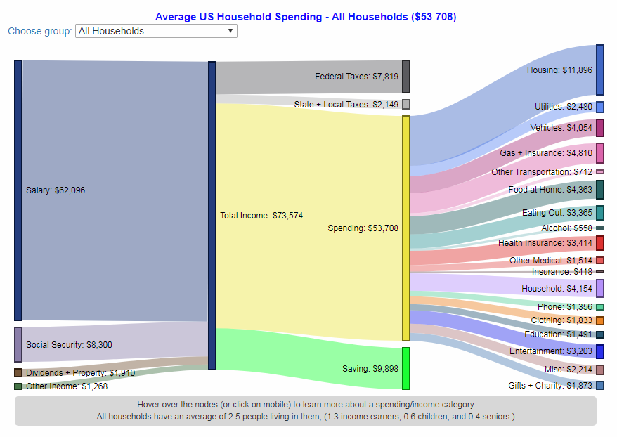
Engaging Data‘s creator Chris (apologies, no last name has been found so far) visualized data, collected by the Census Bureau for the Bureau of Labor Statistics (BLS) within the framework of the Consumer Expenditure Surveys (CE) program, to find out how the U.S. citizens are used to spending money. For this project, he took the Sankey diagram chart type known to be a great tool to graphically represent flows.
Check out the interactive visualization on Engaging Data to understand the average U.S. household spendings for all households as well as for each of the five income groups in consideration.
***
We appreciate your attention to Data Visualization Weekly.
Next week we’ll select another four new interesting data visualizations for your inspiration and fun.
Stay tuned!
- Categories: Data Visualization Weekly
- No Comments »