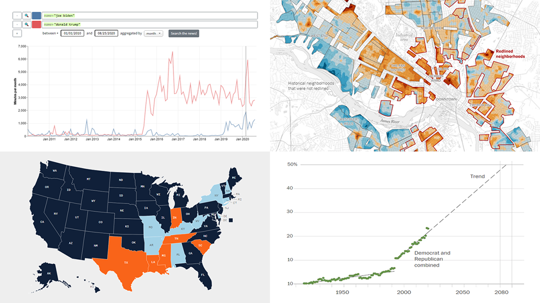
 We’ve curated another four great examples of data visualization in action. Would you like to learn about them and check them out right now? Wait no longer! Below is a list of the projects highlighted in the new DataViz Weekly — just give it a glance and go ahead!
- Exploring a link between racism in the housing policy and hotter neighborhoods — The New York Times
- Analyzing the content of cable TV news — Stanford University
- Tracking gender inequality in American politics — The Washington Post
- Summarizing voting rules for the 2020 U.S. election by state — NBC News
Data Visualization Weekly: August 21, 2020 — August 28, 2020
Link Between Racism in Housing Policy and Hotter Neighborhoods
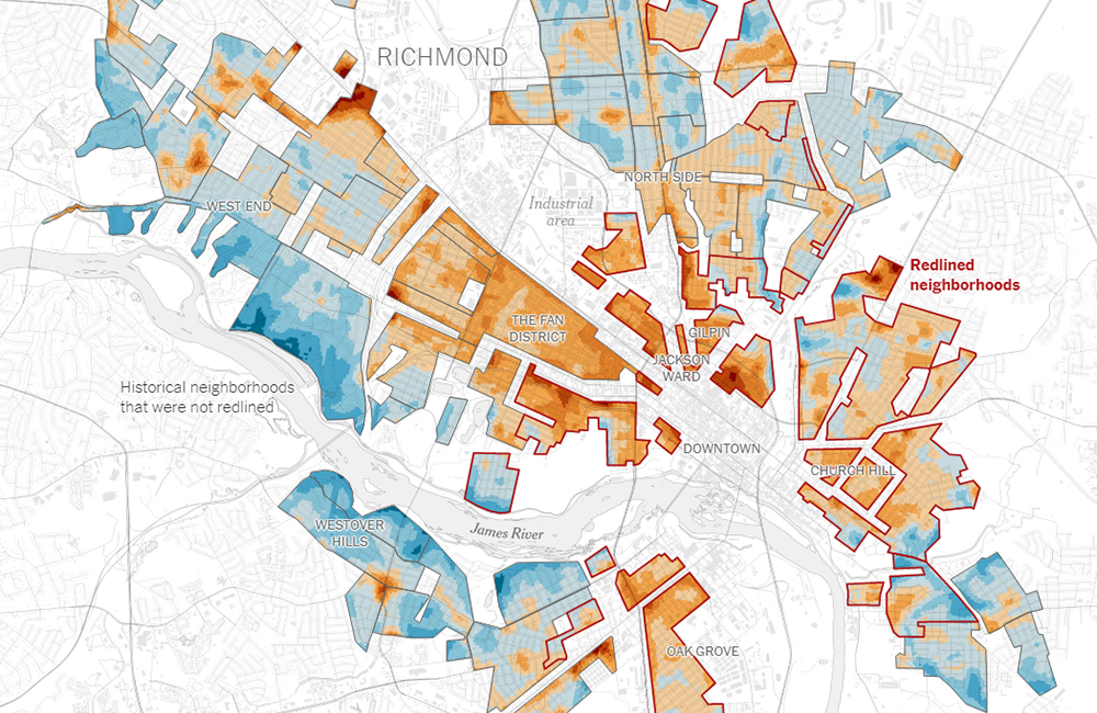
In the 1930s, seeking to support the housing market at the time of the Great Depression, the U.S. federal government rated neighborhoods in many cities based on their riskiness for real estate investments. Race played a significant role in such zoning, and in many cases, Black and immigrant communities were automatically assigned the “hazardous” grade and outlined in red in the respective maps.
Nowadays, as recent studies show, such redlined areas — with an abundance of paved surfaces radiating heat and a lack of trees among the reasons — experience substantially higher temperatures in summer compared to others. Already killing thousands of Americans each year, the excess heat problem is getting even worse due to the ongoing global warming.
For the New York Times, Nadja Popovich and Brad Plumer looked at how the racist housing policy left the redlined neighborhoods in a huge number of cities nationwide currently sweltering. Actually, the visualizations may speak for themselves.
Cable TV News Content Analyzer
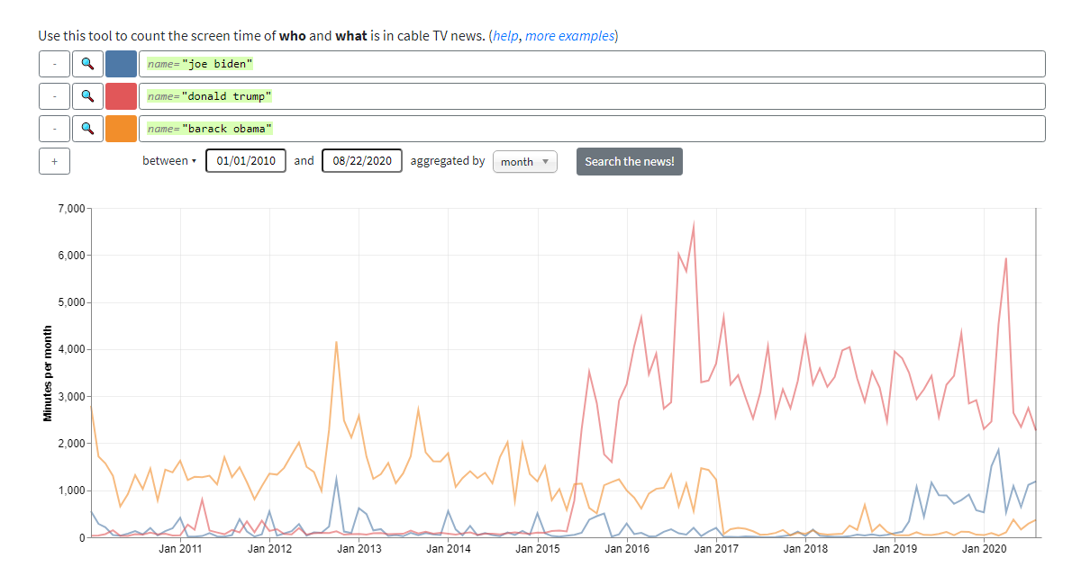
There are organizations that monitor and audit what and who is on air on the cable TV news. Generally, they count it all manually. But artificial intelligence (AI) is now here to help streamline the process.
The Computer Graphics Lab at Stanford University in collaboration with the John S. Knight Fellowship Program made a system which is capable of automatically measuring what subjects are talked about on the news and who is on air. Buiding on advanced sound and image recognition technologies powered by deep learning algorithms, it was applied by the developers to over a decade of broadcasts by CNN, MSNBC, and Fox News. The resulting project — the Stanford Cable TV News Analyzer — is a facinating tool for data-driven analysis of the content of the U.S. “big three” channels.
Enter a few details on what you want to search for in the news, and enjoy the insightful exploration. Click on the chart and you’ll be able to check out the related videos and transcripts.
Gender Inequality in American Politics
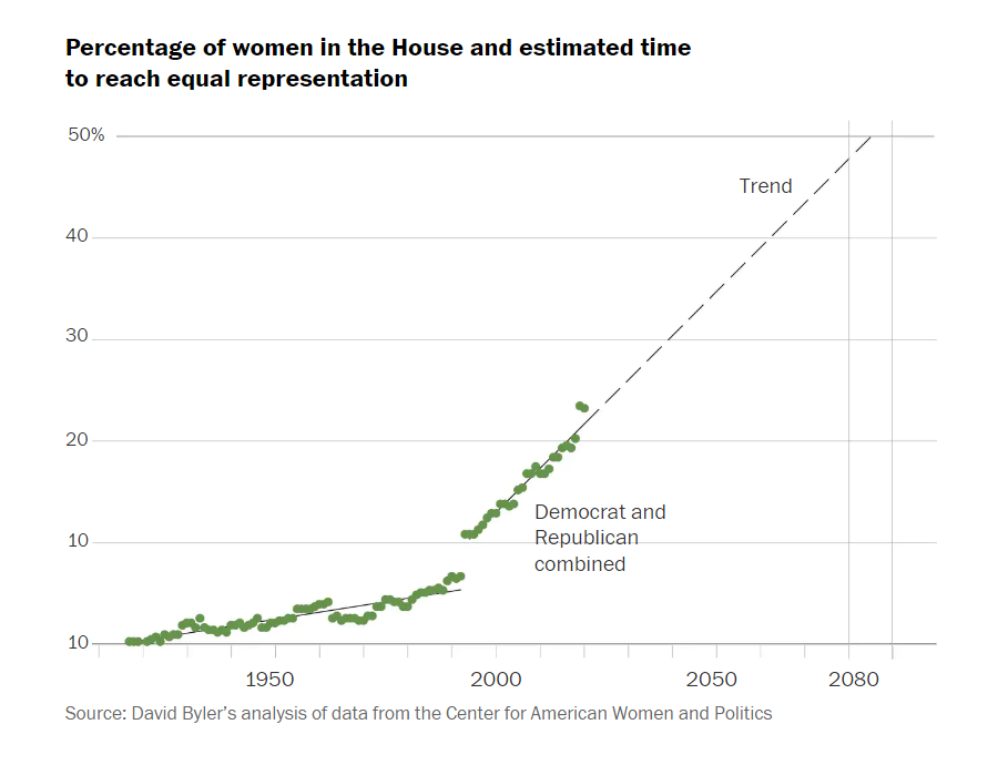
The United States is #83 in the IPU Parline rankings of the percentage of women in parliament, between Armenia and Tajikistan. So what will it take to reach equal representation for men and women in American politics?
Sergio Peçanha, a visual columnist at the Washington Post’s Opinions desk, tried to see where we are on that way through the lens of data and to find the answer. Along the article, he visualized and analyzed various interesting numbers on the gender difference, as of now and historically over time. There are a lot of line, bar, and other charts representing data from various sources.
So what about how much time America needs to achieve gender equality in politics? An estimate is voiced at the end of the piece: about sixty years. Let’s see!
Voting Rules for 2020 U.S. Election by State
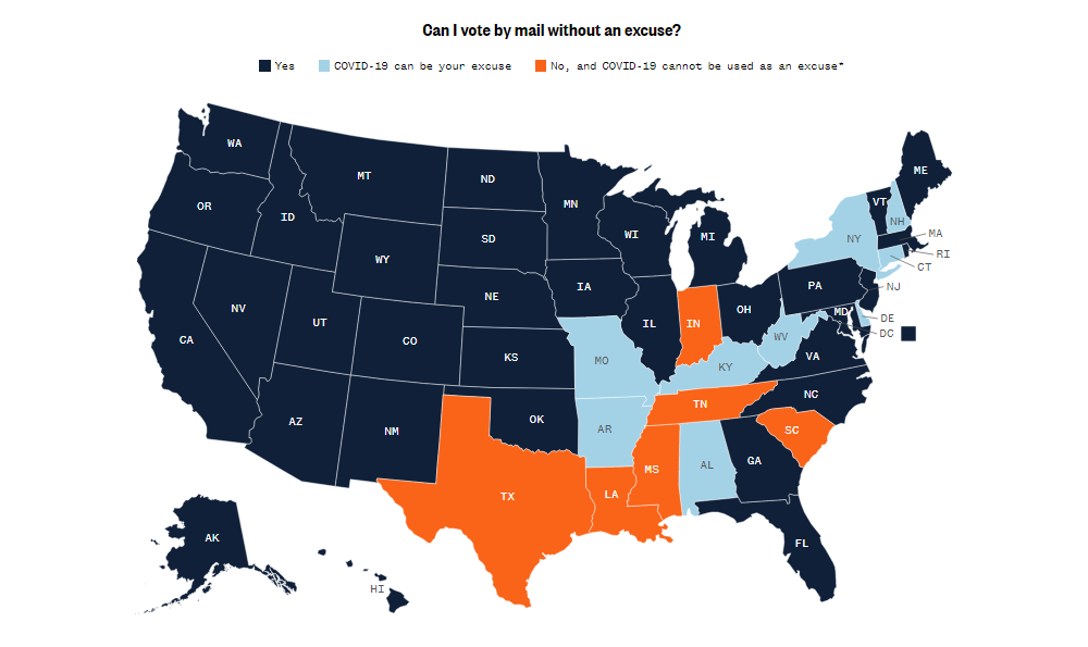
In the meantime, the next U.S. presidential election is just around the corner. To help you plan your vote, NBC News summarized literally everything you may need to know about the upcoming in-person and mail-in voting process.
The guide starts with four choropleth maps that display how the main rules differ across the country. There, you can see at a glance what states allow their people to vote by mail without an excuse, vote and cast the ballot on the same day, vote in person before November 3 (which is Election Day in case you missed it), and track the ballot after voting by mail.
Then you can also see more details about voting in each state, including relevant links to official resources.
***
4 new awesome examples of data visualization in action will be waiting for you on our blog next Friday. Stay tuned!
- Categories: Data Visualization Weekly
- No Comments »