Demonstrating Power of Clever Data Visualization in 4 Examples — DataViz Weekly
October 15th, 2021 by AnyChart Team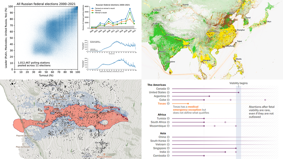 When properly visualized, data can truly speak and tell stories allowing us to quickly decode what raw numbers hide. Would you like to see some clever examples? Look at the awesome new charts and maps that made it to this Friday’s DataViz Weekly!
- All Russian federal elections since 2000 — Dmitry Kobak and Sergey Shpilkin
- Advance of the lava in La Palma — El País
- Abortion laws worldwide — The Washington Post
- Global methane emissions — Bloomberg Green
- Categories: Data Visualization Weekly
- No Comments »
New Interesting Visualizations on Jobs, Climate, TV Shows, Pandemic — DataViz Weekly
October 8th, 2021 by AnyChart Team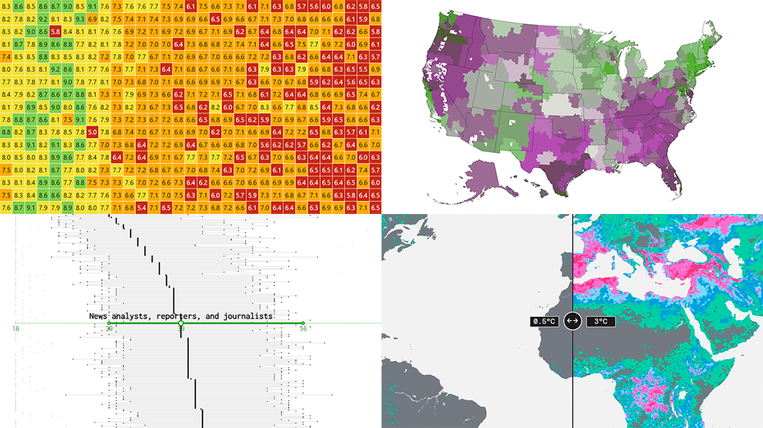 For all who already have an eye for data visualization or only want to get it, DataViz Weekly is here with an overview of four new interesting projects curated from around the web!
- U.S. jobs by age of workers — Nathan Yau
- Probable climate futures based on different scenarios — Probable Futures
- Average IMDb scores of all TV series by episode — Jim Vallandingham
- Vaccination vs hospitalization rates across the United States — The Washington Post
Read on to learn more about each and check them out!
- Categories: Data Visualization Weekly
- No Comments »
Most Compelling New Examples of Data Visualization in Action — DataViz Weekly
September 24th, 2021 by AnyChart Team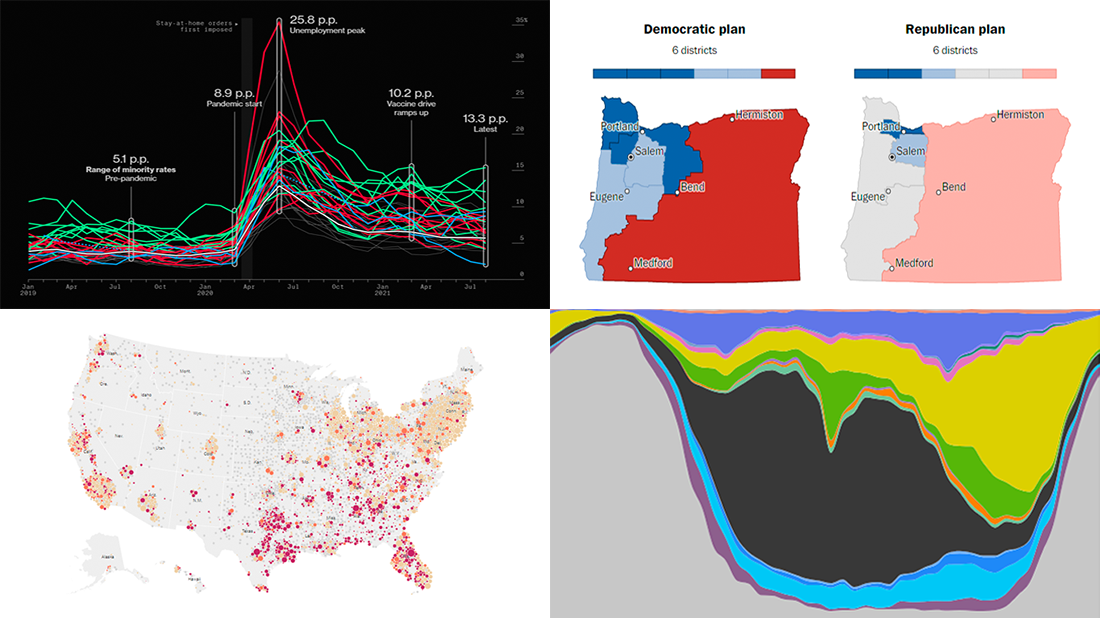 Hey everyone! It is Friday, and we are here to put a spotlight on the most compelling examples of sensible data visualization we have recently seen around the internet. As always, let’s start with a quick list and then look at each project. All aboard for DataViz Weekly!
- Intensive care unit occupancy rates in the United States — The New York Times
- Minority unemployment rates in 15 large U.S. cities. — Bloomberg
- Early proposals for congressional redistricting in Oregon, Indiana, and Colorado — The Washington Post
- Time use of American men and women by employment status — Nathan Yau
- Categories: Data Visualization Weekly
- No Comments »
New Awesome Charts and Maps Curated for Data Visualization Fans — DataViz Weekly
September 3rd, 2021 by AnyChart Team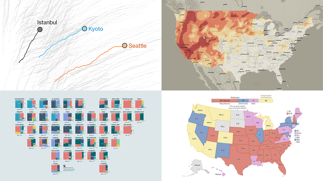 The seven-day wait is over for all data visualization fans wherever you are! DataViz Weekly is back with a selection of new awesome charts and maps curated from around the web. Look at our latest picks.
- Current and historic drought conditions across the United States — Esri
- Relationship between temperature, income, and mortality — Bloomberg Green
- U.S. electricity mix by state — Visual Capitalist
- Congressional redistricting rules and practices — The Washington Post
- Categories: Data Visualization Weekly
- 1 Comment »
New Impressive Visualizations Making Data Talk — DataViz Weekly
August 20th, 2021 by AnyChart Team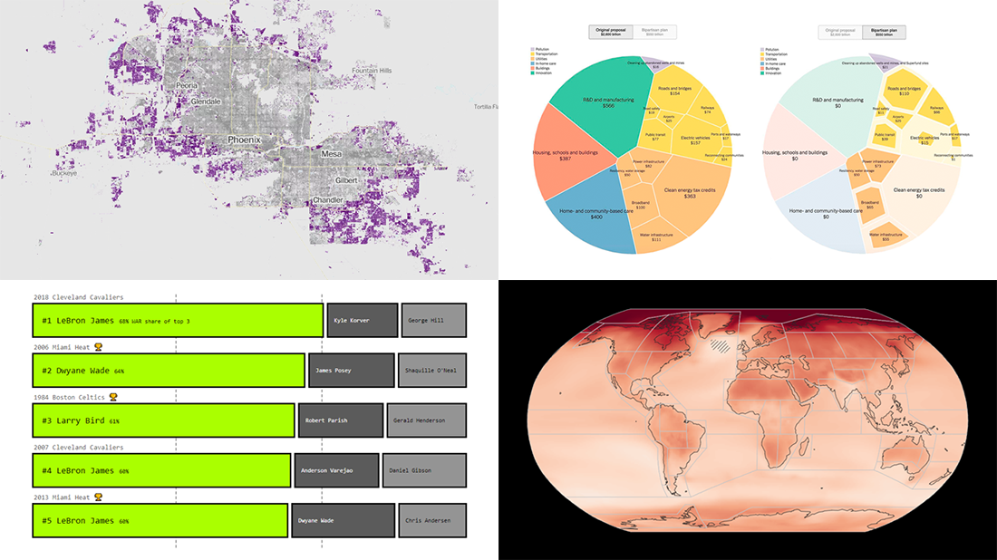 DataViz Weekly is here with an overview of new impressive visualizations that make data talk. These four projects grabbed our attention recently and we could not help telling you about them!
- The biggest carry jobs in NBA history — The Pudding
- Global and regional climate change effects — IPCC
- Presidential and bipartisan infrastructure plans in comparison — The Upshot
- Urban development and sprawl in America between 2001 and 2019 — The Washington Post
- Categories: Data Visualization Weekly
- No Comments »
Heat and Drought in American West in Visualizations — DataViz Weekly
July 2nd, 2021 by AnyChart Team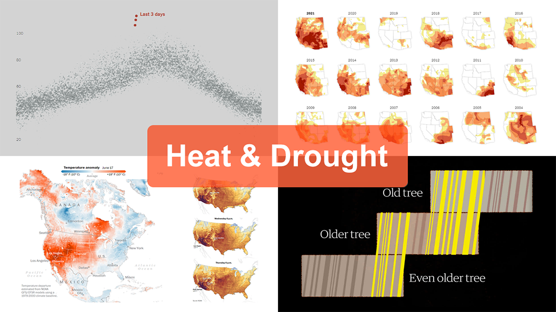 The extreme heat that has gripped the Western United States this summer basically aligns with scientists’ expectations for climate change. On top of that, as all the more scorchers are likely coming up, the year 2021 may well be remembered as a relatively cool one.
For this new edition of DataViz Weekly, we’ve curated a set of recent visualizations shedding light on the essence and context of the record-breaking heat and drought in the U.S. West. Take a look!
- Heat dome and temperature extremes in the West — The Washington Post
- Heat in the Pacific Northwest since 1979 — The Upshot
- Drought conditions in the West since 2000 — The New York Times
- Southwestern droughts since 800 CE (as shown by tree tings) — The Guardian
- Categories: Data Visualization Weekly
- No Comments »
Visualizing Data on COVID-19, Deprivation, Chess, Fishing — DataViz Weekly
June 4th, 2021 by AnyChart Team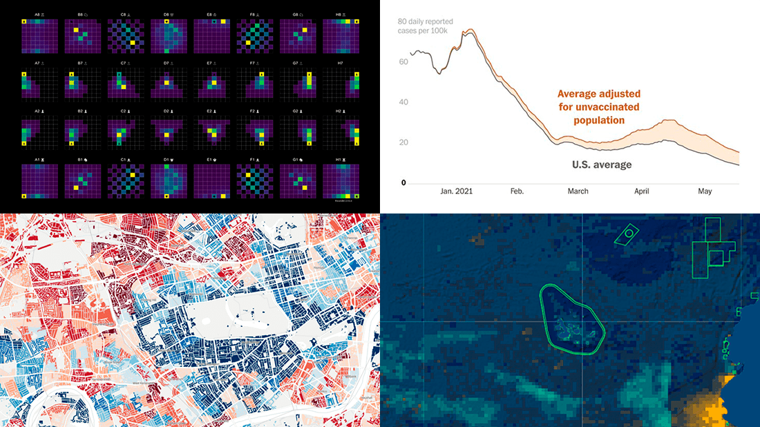 Each Friday, we pick the most compelling new data visualizations and show them in a quick overview. Take a look at our latest DataViz Weekly collection and feel the power of charts and maps!
- COVID-19 rates for unvaccinated people in the U.S. — The Washington Post
- Income deprivation within English local authorities — ONS
- Where chess pieces are usually captured — Anders Sundell
- Global Fishing Watch Marine Manager — Global Fishing Watch
- Categories: Data Visualization Weekly
- No Comments »
Overviewing Four Amazing New Data Visualization Projects — DataViz Weekly
May 21st, 2021 by AnyChart Team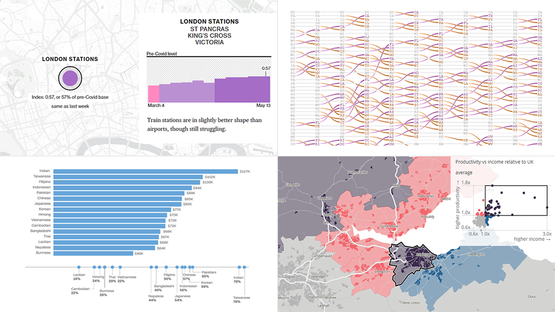 Not too long ago, visual communication skills were nice to have. But that has changed. Nowadays, the ability to visualize data in charts and maps is a must-have and not only for analysts. Stay tuned for DataViz Weekly to see the most interesting examples of smart graphics in action!
Join us today as we look at the following new data visualization projects worth checking out:
- Historical shifts in U.S. state population rankings — The Washington Post
- Diversity of Asian Americans — CNN
- Regional differences in income and productivity across the U.K. — ONS
- Pret A Manger sandwich sales as a proxy to measure pandemic recovery — Bloomberg
- Categories: Data Visualization Weekly
- 2 Comments »
Visualizing Vaccination Rates, Political Bubbles, Curry’s Stats, World Justified — DataViz Weekly
May 7th, 2021 by AnyChart Team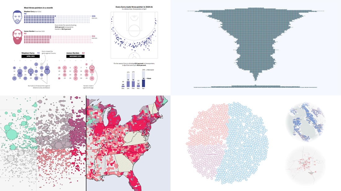 Every week, we choose the four most interesting visualizations from all we came across these days and present them to you in a quick review. Below is a list of the ones that made it to this new DataViz Weekly — take a glance and keep reading for a closer look at each!
- Vaccination rates in comparison with case metrics across the U.S. — McKinsey & Company
- Political bubbles across the U.S. — The New York Times Opinion
- Stephen Curry’s record-setting April scoring spree — The Washington Post
- World justified, left-aligned, centered, right-aligned — Nicolas Lambert
- Categories: Data Visualization Weekly
- No Comments »
New Impressive Data Visualization Projects — DataViz Weekly
April 16th, 2021 by AnyChart Team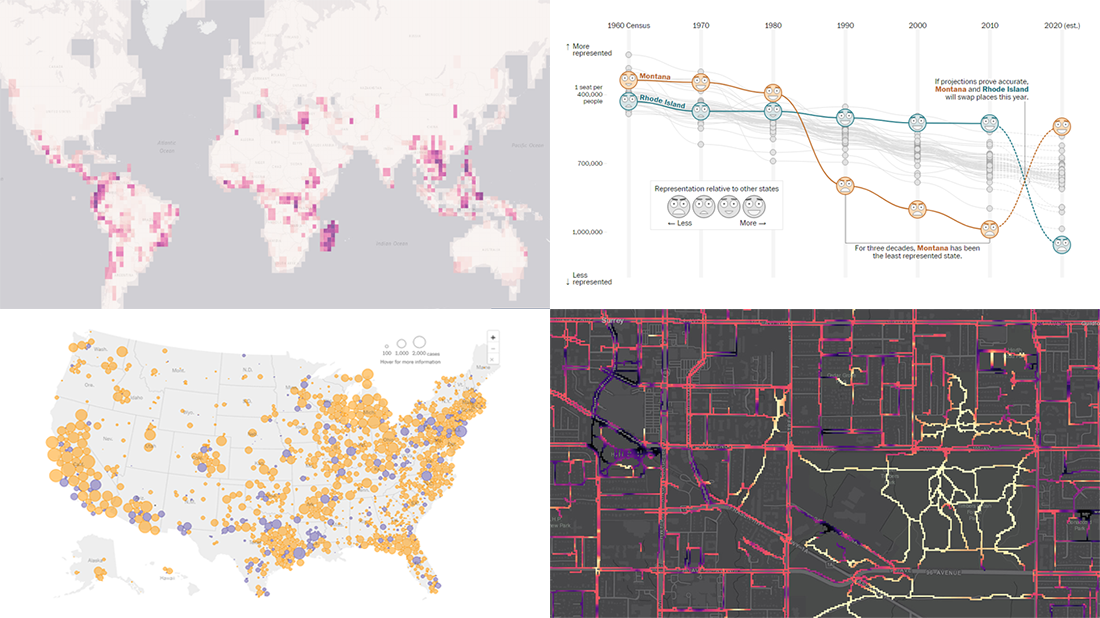 Hello and greetings to all who are fond of data visualization! We’ve curated a new collection of impressive maps and charts that came into existence just a little while ago. See what projects are praised this time on DataViz Weekly and read next to learn more about each:
- Reshuffling of the U.S. House seats after the 2020 Census — The Washington Post
- Runnability of streets — Simon Fraser University
- Probability of finding undiscovered species across the world — Map of Life
- Coronavirus in American prisons — The New York Times
- Categories: Data Visualization Weekly
- No Comments »