 When properly visualized, data can truly speak and tell stories allowing us to quickly decode what raw numbers hide. Would you like to see some clever examples? Look at the awesome new charts and maps that made it to this Friday’s DataViz Weekly!
- All Russian federal elections since 2000 — Dmitry Kobak and Sergey Shpilkin
- Advance of the lava in La Palma — El País
- Abortion laws worldwide — The Washington Post
- Global methane emissions — Bloomberg Green
Data Visualization Weekly: October 8, 2021 — October 15, 2021
Russian Election Results Since 2000
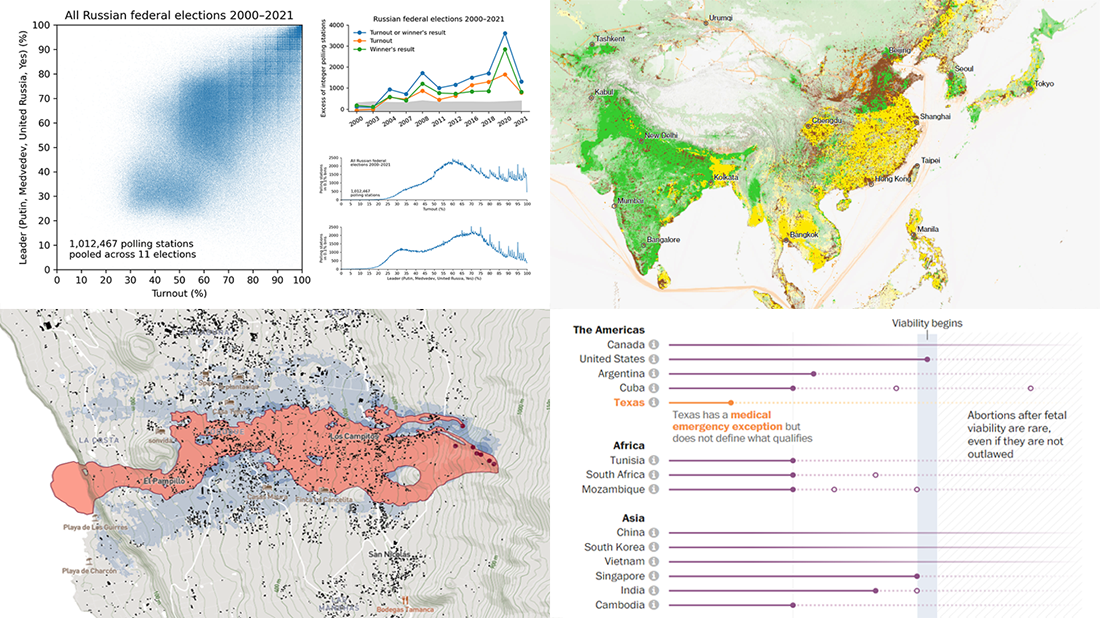
On Monday, The Economist published an article titled “Russian elections once again had a suspiciously neat result”. The piece centers around a scatter plot recently built and shared by Russian researchers Dmitry Kobak and Sergey Shpilkin.
The chart visualizes the results of all Russian federal elections since 2000. The voter turnout figures are represented on the X-axis. Shown on the Y-axis is the vote share of the winner, which has always been the ruling party (United Russia at the parliamentary elections of 2003, 2007, 2011, 2016, and 2021), person (Vladimir Putin in 2000, 2004, 2012, and 2018, and Dmitry Medvedev in 2008 — at the presidential elections), or opinion (“Yes” at the 2020 constitutional referendum).
Actually, it’s hard to not notice a peculiar pattern in the data thanks to this visualization. We can clearly see a structured grid at numbers ending in five or zero, which makes the Russian election results look too tidy and therefore suspicious. “Are they just making up numbers by hand or what?” statistician Nathan Yau wonders.
The full results of the analysis carried out by Dmitry Kobar and Sergey Shpilkin with more charts are available here.
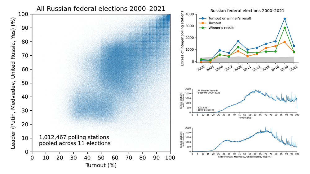
Advance of Lava from La Palma Volcano
A volcanic eruption in La Palma, one of Spain’s Canary Islands located off the northwest coast of Africa, has been underway for almost a month now. Since September 19 when it started, the lava streams have already destroyed a thousand buildings. Another thousand are under threat.
Borja Andrino, Kiko Llaneras, and Luis Sevillano Pires from El País used Copernicus Sentinel satellite images, flow forecasts from the University of La Laguna, and cadastral data about all houses on the island to visualize the advance of the lava on La Palma. The resulting visualization is a detailed, house-by-house map that shows the areas directly affected by the lava, possible future paths, and information about each building and its distance from the stream.
In addition, there is also a visual story that describes the lava advance day by day since the beginning of the eruption, in map-based scrollytelling.
Abortion Laws Worldwide
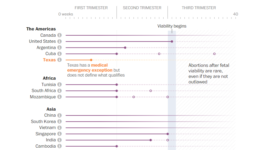
Abortion laws have gotten more liberal around the world. Since 1994, 53 of the 56 countries that have significantly modified their legislation in this field made it less restrictive. In the U.S., abortions are broadly legalized, but in some states access to these procedures has declined.
The Washington Post published an article created by Daniela Santamariña, Youjin Shin, Sammy Westfall, and Ruby Mellen, which looks at how the U.S. compares to the rest of the world when it comes to abortion laws. The first chart — its top part is demonstrated in the image above — represents the current limits, allowing you to learn more in a tooltip that shows up when you hover over a country name. The other chart you will find in the article displays how national abortion laws changed in the last 27 years.
The analysis is based on data from the World Health Organization and the Center for Reproductive Rights.
Global Methane Emissions
Speaking about drivers of global warming much has been said about carbon dioxide, the most abundant and dangerous greenhouse gas. Once its particle gets into the atmosphere, it stays there for a really long time like centuries.
However, CO2 is not the only heat-trapping gas. There is also methane, for example, responsible for about a quarter of today’s warming. Compared to CO2, methane traps much more heat, but it is also much more fleeting, so scientists say stopping methane emissions today will have an almost immediate effect.
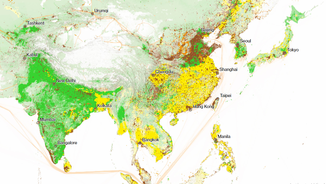
In a new article on Bloomberg Green, Hayley Warren and Akshat Rathi explain why curbing methane leaks is a cheap and easy way to cool the planet fast. Look at their visualizations to learn about the main sources of methane and find out where it is really feasible and even painless to start the cutting right now.
***
Love good charts and maps? Stay tuned for Data Visualization Weekly!
- Categories: Data Visualization Weekly
- No Comments »