 DataViz Weekly is here with an overview of new impressive visualizations that make data talk. These four projects grabbed our attention recently and we could not help telling you about them!
- The biggest carry jobs in NBA history — The Pudding
- Global and regional climate change effects — IPCC
- Presidential and bipartisan infrastructure plans in comparison — The Upshot
- Urban development and sprawl in America between 2001 and 2019 — The Washington Post
Data Visualization Weekly: August 13, 2021 — August 20, 2021
Biggest NBA Finals Carry Jobs
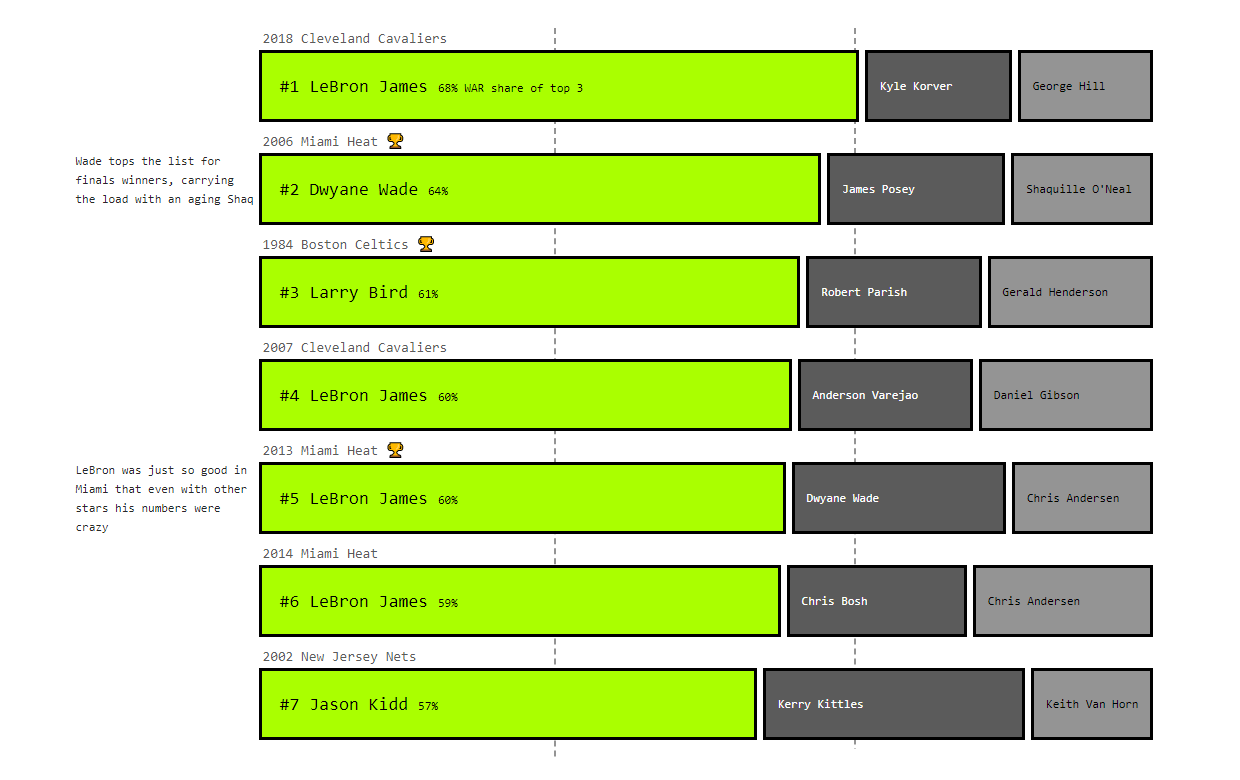
In team sports like basketball, winning matches and titles generally requires collective effort. However, sometimes there are single star players who contribute to success tangibly more than others. Russell Goldenberg decided to delve into this matter and identify the biggest carry jobs in the history of the NBA Finals with the help of data.
For his research, he took the RAPTOR WAR metric developed by FiveThirtyEight, which measures how many wins a player contributed relative to a replacement-level player. Then he made two cool visualizations.
First, Russell created an interactive scatter chart plotting the players’ WARs in the playoffs against the number of minutes played for all teams in the NBA Finals from 1977 through 2021. Second, he represented the WAR share among each team’s best three players using stacked bars.
Check out the biggest NBA Finals carry jobs on The Pudding.
Global and Regional Climate Change Effects
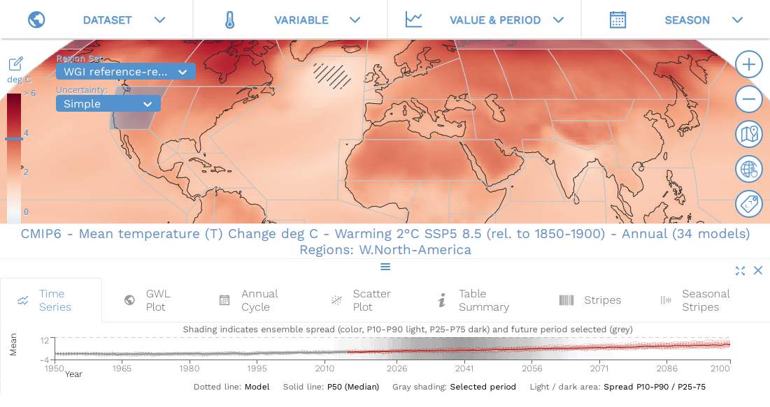
According to the 6th Assessment Report of the Intergovernmental Panel on Climate Change (IPCC) released several days ago, the extent of climate issues will not stop increasing in the near future. Experts expect even longer heatwaves, more intense droughts, and larger floodings.
The latest climate projections are represented in the IPCC WGI Interactive Atlas, an impressive dashboard that accompanies the report. This new project allows for an in-depth analysis of shifts in a wide range of key oceanic and atmospheric variables over time and geography.
Look at the reality of global climate change as it is reported by scientists and explore how your area could be impacted under different greenhouse gas emissions scenarios.
Presidential and Bipartisan Infrastructure Plans in Comparison
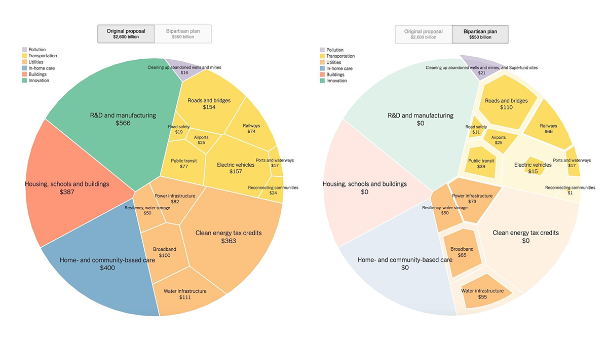
Worth about $550 billion in new federal spending, the new bipartisan infrastructure deal that passed in the U.S. Senate earlier in August is incredibly large. However, it is still much less than the initial proposal of President Biden priced at $2.6 trillion overall.
Quoctrung Bui and Aatish Bhatia used Voronoi treemaps to compare the two plans in a convenient visual manner. We can clearly see that there were six major areas in the original proposal: transportation, utilities, buildings, in-home care, innovation, and pollution. In the final bipartisan plan, the first two shrank and the next three got completely left out. Pollution cleanup survived and even got more funding.
Take a closer look using the visualizations on The New York Times’s The Upshot.
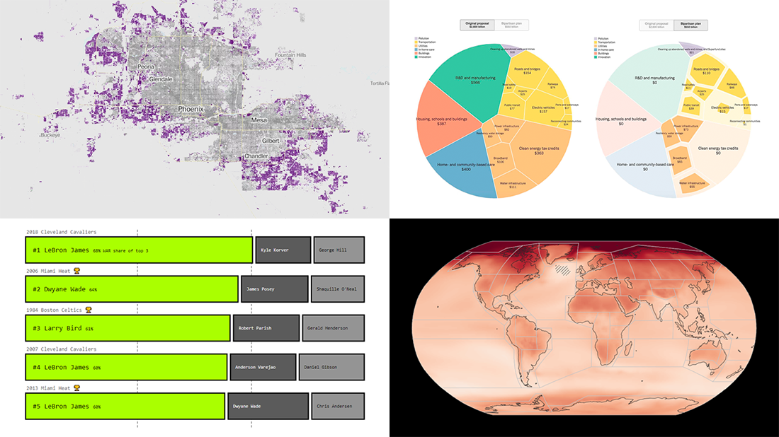
Urban Development and Sprawl in America in 2001-2019
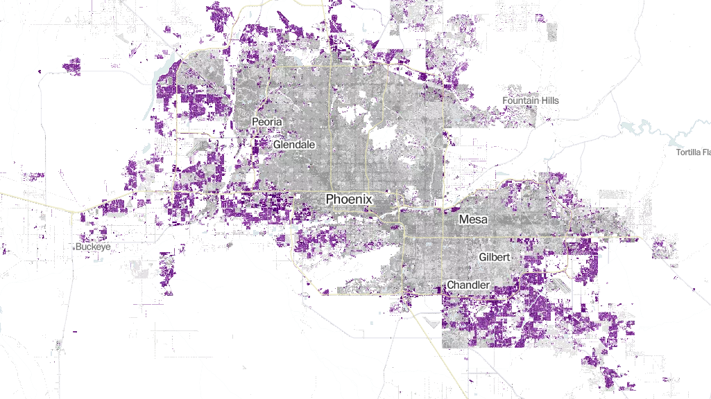
During the first twenty years of the twenty-first century, the built-up landscape of the United States of America grew by an area of more than five Delawares. Jess Eng and Zach Levitt mapped out the data recently made public by the U.S. Geological Survey to find out exactly what territories saw the most of new development.
A quick summary is, an especially significant urban sprawl has taken place in Arizona, Nevada, North Dakota, West Texas, and Florida. The article with the details will tell you more. But what’s especially interesting is an interactive map that lets you do your own exploration of newly developed areas (highlighted in purple) across the entire territory of the conterminous United States.
Have fun viewing the map on The Washington Post. Enter your ZIP code to quickly see new development areas where you live.
***
We appreciate your attention! Stay tuned for Data Visualization Weekly!
- Categories: Data Visualization Weekly
- No Comments »