 Each Friday, we pick the most compelling new data visualizations and show them in a quick overview. Take a look at our latest DataViz Weekly collection and feel the power of charts and maps!
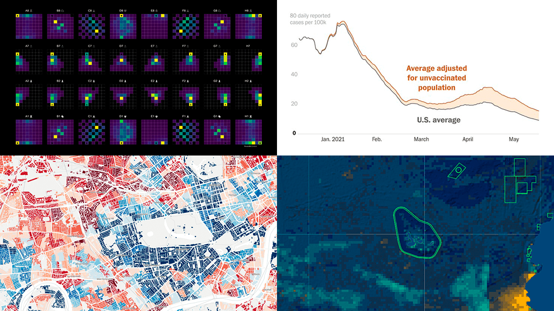
- COVID-19 rates for unvaccinated people in the U.S. — The Washington Post
- Income deprivation within English local authorities — ONS
- Where chess pieces are usually captured — Anders Sundell
- Global Fishing Watch Marine Manager — Global Fishing Watch
Data Visualization Weekly: May 28, 2021 — June 4, 2021
COVID-19 Rates for Unvaccinated Americans
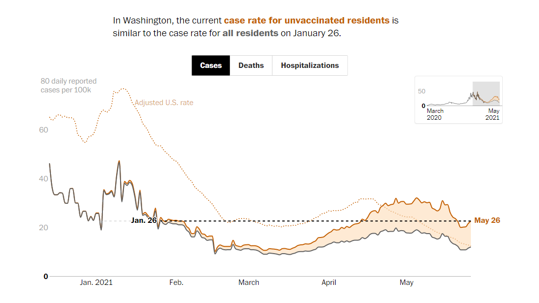
COVID-19 cases, hospitalizations, and deaths are on the decline in the United States. However, that can be a wrong signal for unvaccinated people. The rates among them are actually far less optimistic.
Leslie Shapiro and Dan Keating from The Washington Post worked with CDC’s data to adjust the hopeful general figures for vaccinations and shared their findings in an interactive story making use of charts. According to the analysis, the national infection rate among the unvaccinated is 73% higher than across the entire population. At the same time, with that adjustment for vaccinations, the hospitalization and death rates are about the same as three and two months ago, respectively. In some states, the coronavirus continues to rage and the figures have not gone far from the peak levels.
See the story in The Washington Post to learn more. There, you can also pick a state to compare the COVID-19 rates for all and unvaccinated residents over time.
Income Deprivation Within English Local Authorities
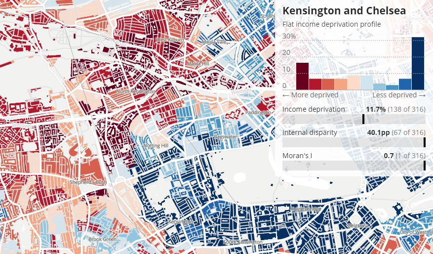
Following its recent analysis of regional economic inequalities across the United Kingdom, featured in DataViz Weekly two Fridays ago, now the Office for National Statistics (ONS) also offers a look at disparities at the neighborhood level.
In late May, ONS made public a project exploring income deprivation within England’s local authorities. Based on data from the English Indices of Multiple Deprivation (IMD), it provides a detailed picture of internal disparities. The levels of deprivation reflect the proportion of residents with low income and without a job at all.
The article makes use of robot journalism. After you choose a local authority, the story gets personalized according to where you want to look.
There is actually a lot to check out about the current levels of deprivation within areas and across the country, which is now made simple to understand in this cool scrollytelling piece on the ONS website.
Where Chess Pieces Are Usually Captured
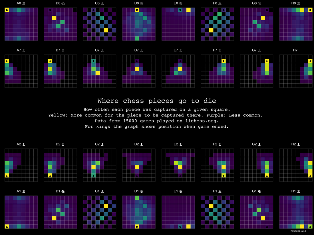
In chess, the queen is the most powerful piece on the board. It enjoys the most freedom of movement. In spite of that, the queen dies in the starting position more often than anywhere else across the chess board.
It is one of the interesting things you can notice in a new cool visualization by Anders Sundell, a political scientist at the University of Gothenburg. Using data from Lichess, a free online chess platform, he created a set of heat maps that display how frequently each piece is captured on every square of the board and therefore where it tends to be captured.
The visualization was shared on the r/dataisbeautiful subreddit on June 1 and has received over 30,000 upvotes there so far. The author is taking an active part in the discussion in the comments and you might like to check it out as well.
Global Fishing Watch Marine Manager
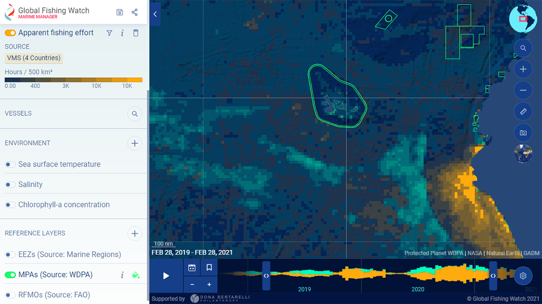
Marine protected areas (MPAs) and other effective area-based conservation measures (OECMs) are considered to be essential tools for restoring ocean health. To help improve their creation and management, Global Fishing Watch launched a brand new interactive portal.
Founded by Dona Bertarelli, a philanthropist and ocean conservation advocate, Global Fishing Watch Marine Manager uses data from the Automatic Identification System (AIS) and monitoring systems of partner countries to let regulatory authorities and researchers keep track of vessels involved in commercial fishing and other human activities in the near real-time. Environmental data such as sea surface temperature and salinity can be overlaid to provide an understanding of climate change impacts over time.
Take a look at this project on the Global Fishing Watch website. Impressive work.
***
When you have come across a cool chart or map. Or when you have made it by yourself. Let us know and we will be glad to consider it for the next Data Visualization Weekly article.
Have a great time! And stay tuned!
- Categories: Data Visualization Weekly
- No Comments »