 Every week, we choose the four most interesting visualizations from all we came across these days and present them to you in a quick review. Below is a list of the ones that made it to this new DataViz Weekly — take a glance and keep reading for a closer look at each!
- Vaccination rates in comparison with case metrics across the U.S. — McKinsey & Company
- Political bubbles across the U.S. — The New York Times Opinion
- Stephen Curry’s record-setting April scoring spree — The Washington Post
- World justified, left-aligned, centered, right-aligned — Nicolas Lambert
Data Visualization Weekly: April 30, 2021 — May 7, 2021
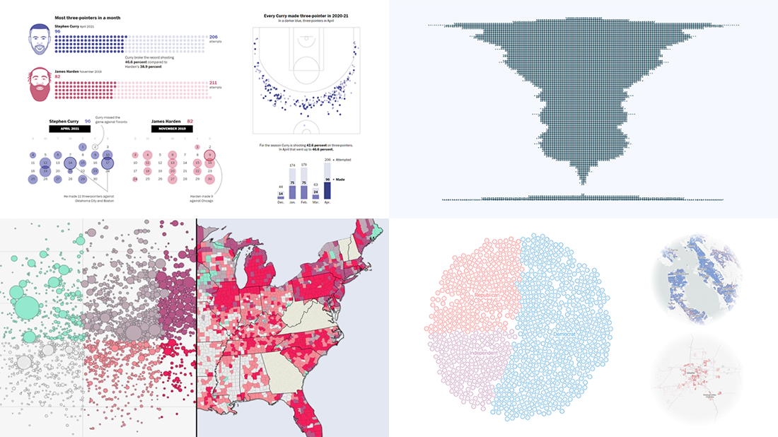
Vaccination Rates in Comparison with Case Metrics Across U.S.
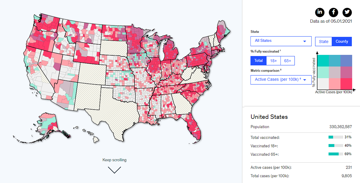
The COVID-19 vaccination campaign in the United States is in full swing. There are quite a few trackers all over the web that show the pace of inoculation across the country. If you are interested to see how the campaign impacts case metrics, here’s a cool interactive project to check out.
McKinsey & Company launched a tool that makes it easy to explore the per capita vaccination rates in comparison with the number of active coronavirus cases at the county level. The visualization is based on a bivariate scale that greatly displays relationships between the two variables. Turquoise stands for the percentage of the fully vaccinated population. Red represents active cases per 100K. The highest rates are shown in the most saturated colors.
The data is visualized in a choropleth map and in a bubble scatter plot, both interactive. You can also explore the impact of vaccinations from a different angle — by switching from active cases per 100K to total cases per 100k or total deaths per 100K. All the data by state and country is also represented in a table.
Political Bubbles Across U.S.
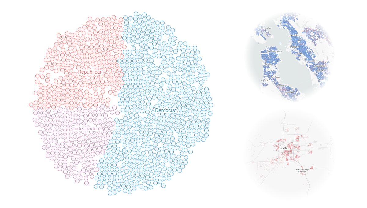
A recent poll conducted by Ipsos for Reuters revealed that 55% of Republicans actually think that the 2020 U.S. presidential election was stolen from Trump. One of the possible reasons is that they live in an area where most people did not vote for Biden.
Jacob R. Brown and Ryan D. Enos from Harvard University’s Institute for Quantitative Social Science estimated the political party preferences of all registered U.S. voters and, working together with Gus Wezerek from The New York Times Opinion, mapped that data for a compelling visual story. There, you can enter your address and find out whether or not you live in a political bubble based on the assessment of how your 1,000 nearest neighbors voted.
As a matter of fact, for about 40% of Democrats and 20% of Republicans, at least 75% of all people living nearby support the same party. See if your neighbors are mostly Republicans or Democrats and what’s the situation in some other places. Scroll down the story for a deeper look into what neighborhood-level data can tell us about political isolation across the United States.
Stephen Curry’s Record-Setting April Scoring Spree
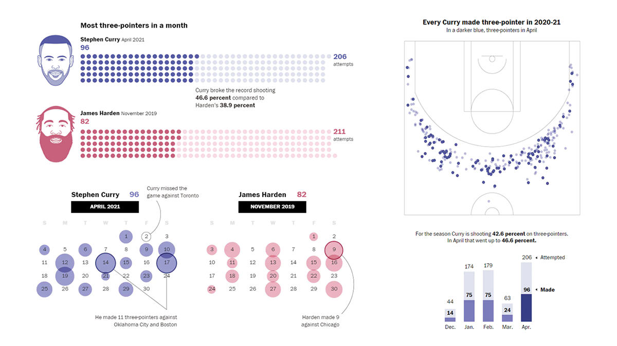
Stephen Curry’s play has been absolutely amazing as of late. The Golden State Warriors’ coach Steve Kerr even admits he’s already run out of unique phrases to describe it. But here comes a new one that can be applied: record-breaking.
In April, Curry made an incredible total of 96 three-pointers. That is more than anyone has ever made during one month in NBA history and 14 more than the previous record set by the Houston Rockets’ James Harden in November 2019. There are also other great achievements inside Curry’s phenomenal statistics, and The Washington Post now offers a look at his most recent scoring activity.
Join Ben Golliver and Artur Galocha as they analyze Curry’s numbers, providing multiple comparisons with other bests. Interesting visualizations.
World Justified, Left-Aligned, Centered, Right-Aligned
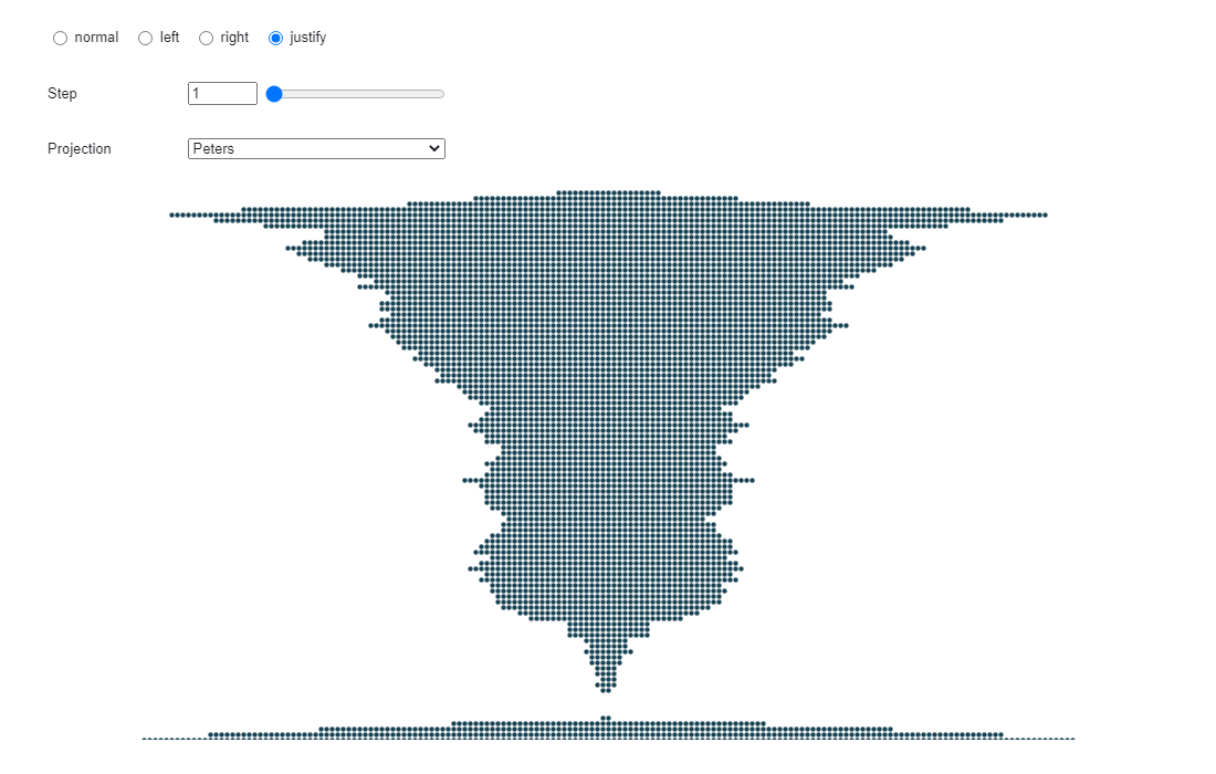
One last thing. In 2004, Brazilian artists Angela Detanico and Rafael Lain made “The world justified, left-aligned, centered, right-aligned”. Initially created for the 26th Bienal de São Paulo, it is a geophilosophical artwork showing our world as just one of four possibilities. A few days ago, Nicolas Lambert, a research engineer in geographic information science at CNRS, made a sort of interactive version.
By default, the world is represented geographically correctly, making use of dots to depict land. You can switch between the left-aligned, right-aligned, and centered views, as well as use the step slider to alter with the look further. Two map projections are available to choose from, Patterson and Peters.
It’s on Observable. So, it’s easy to fork the project and play with the visualization, add your own features, and so on.
***
Stay tuned and we’ll keep you updated on the most interesting new visualizations from all over the web.
- Categories: Data Visualization Weekly
- No Comments »