 Hello and greetings to all who are fond of data visualization! We’ve curated a new collection of impressive maps and charts that came into existence just a little while ago. See what projects are praised this time on DataViz Weekly and read next to learn more about each:
- Reshuffling of the U.S. House seats after the 2020 Census — The Washington Post
- Runnability of streets — Simon Fraser University
- Probability of finding undiscovered species across the world — Map of Life
- Coronavirus in American prisons — The New York Times
Data Visualization Weekly: April 9, 2021 — April 16, 2021
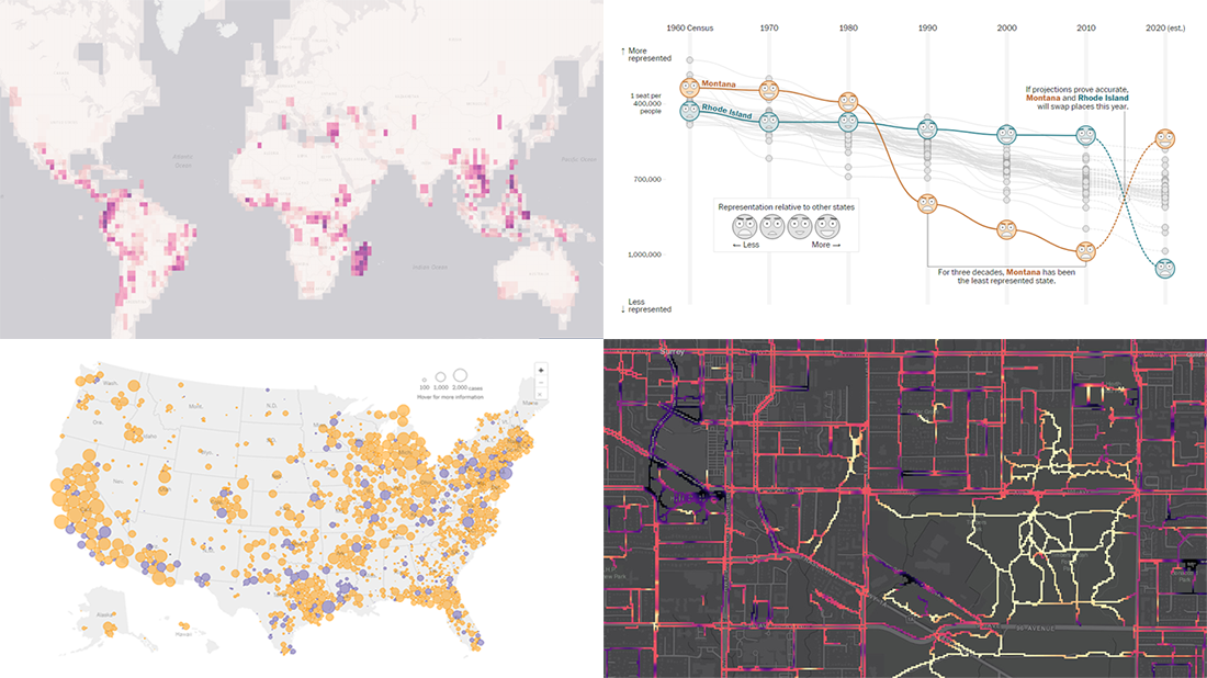
Reshuffling of U.S. House Seats After 2020 Census
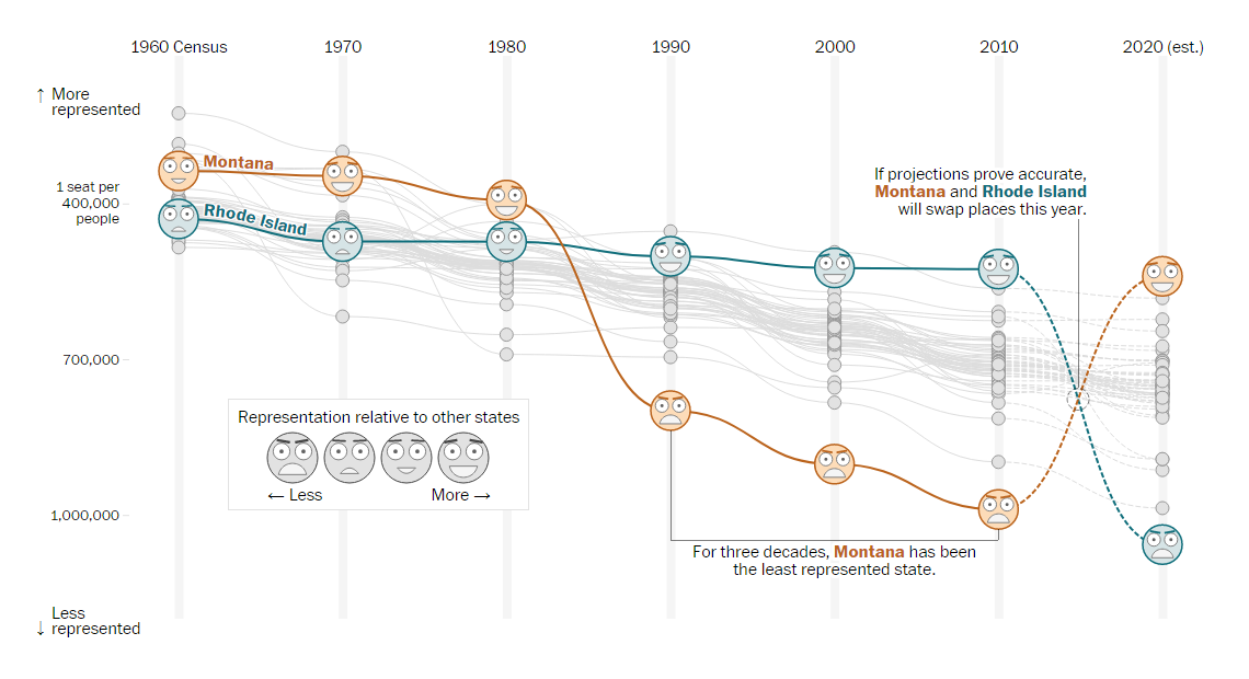
The United States Census takes place every ten years. While there are many applications its resulting figures are used for, the primary purpose is the reapportionment of the House of Representatives according to population changes.
Due to the pandemic, the 2020 Census was delayed. Now, officials hope to be able to unveil the newest state population totals by April 30. In the meantime, we can take a closer look at the Census Bureau’s annual estimates and see approximately what to expect. For example, that is possible with the help of a new interactive piece on The Washington Post.
Harry Stevens, Tara Bahrampour, and Ted Mellnik did a great job of analyzing what the estimates suggest. Scroll down the story with a bunch of really handsome graphics to understand how population counts affect representation in the U.S. House and find out what states are about to lose and gain seats. Don’t miss to explore the interactive chart shown above — it displays how the number of constituents per representative has changed since 1960, by state.
Runnability of Streets in Surrey, Canada
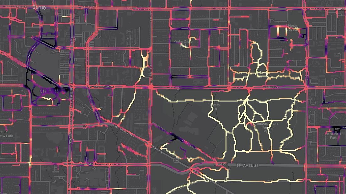
Regular physical activity is critical for good health. In particular, walking and running are known to be important for people of all ages, encouraged as everyday fitness training which can be easily done outside. However, even if you have enough time and will to go in for that, it is not always easy to find an appropriate place for that because of the built environment.
Actually, the situation is quite easier when it comes to walking. For example, we have seen some interesting projects researching the walkability of streets in various cities and showing how suitable they are for walking. Runnability, if studied at all, has been usually considered the same way as walkability, with the latter looked at as a proxy for the former. However, areas considered walkable are not necessarily desirable running routes at the same time, because walkers and runners have different objectives and needs.
A group of scholars from the Simon Fraser University decided to right a wrong and pay attention to runnability. Exploring the association between built environments and running, Aateka Shashank, Nadine Schuurman, Russell Copley, and Scott Lear developed a total of three different rough runnability indices based on a number of factors, applied them to the sidewalks of Surrey, a city in Canada’s British Columbia, and mapped them out.
Look how suitable Surrey’s streets are for running. The higher the runnability score, the lighter the color.
Probability of Finding Yet Unknown Species Worldwide
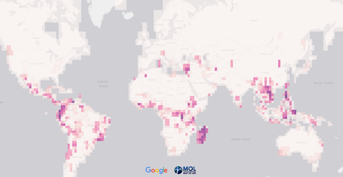
You may be surprised to know that, according to scientists’ estimates, hardly more than 20% of all species living on the planet are formally described. Moreover, given the global climate change, it is possible that we will never even learn what the others are, let alone considering their fate.
Map of Life, a global data project integrating knowledge about biodiversity distribution, made overwhelming research aiming to understand where to find the missing species. Its team, which mainly includes Yale researchers, analyzed a variety of characteristics of 32,172 known species and predicted where around the globe undiscovered species might be found.
The results of this impressive work are now represented in an interactive map where you can choose between four layers to explore the discovery potential of new reptiles, birds, amphibians, or mammals. The researchers are going to expand the map of yet unknown life in the coming years.
Coronavirus in American Prisons
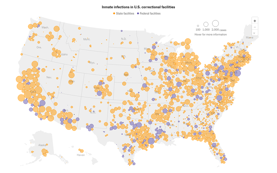
Now, let’s return to human life. Although the entire world remains largely affected by the pandemic, there are places where the situation is incredibly worse than anywhere. Prisons. Approximately 2% of people all over the world are known to have had COVID-19. In the U.S., that figure is 9%. In U.S. prisons, it’s 34%.
A large group of The New York Times journalists tracked all known COVID-19 cases in all federal and state prisons, regional and county jails, immigration detention centers, and juvenile detention facilities around the United States during the period from March 2020 to the end of March 2021. On average, more than 1,400 new inmate infections along with 7 deaths took place each day across all the 2,805 correctional settings.
Titled “Incarcerated and Infected: How the Virus Tore Through the U.S. Prison System,” the article provides an in-depth review of the data making use of maps and other graphics to represent the key statistics. Look at the story of the often forgotten part of the population.
***
Stay tuned for Data Visualization Weekly. We will keep delivering roundups of the most interesting charts and maps every Friday.
- Categories: Data Visualization Weekly
- No Comments »