 The extreme heat that has gripped the Western United States this summer basically aligns with scientists’ expectations for climate change. On top of that, as all the more scorchers are likely coming up, the year 2021 may well be remembered as a relatively cool one.
For this new edition of DataViz Weekly, we’ve curated a set of recent visualizations shedding light on the essence and context of the record-breaking heat and drought in the U.S. West. Take a look!
- Heat dome and temperature extremes in the West — The Washington Post
- Heat in the Pacific Northwest since 1979 — The Upshot
- Drought conditions in the West since 2000 — The New York Times
- Southwestern droughts since 800 CE (as shown by tree tings) — The Guardian
Data Visualization Weekly: June 25, 2021 — July 2, 2021
Heat Dome and Temperature Extremes in American West
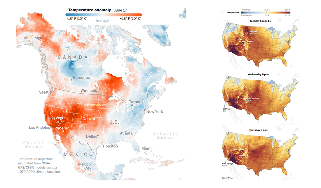
A heat dome is a zone of high pressure trapping a mass of hot air near the ground in a sprawling heat wave. The Washington Post explains how it works in more detail with the help of an informative drawing, in a dedicated story created by Jason Samenow, Dylan Moriarty, Laris Karklis, Diana Leonard, and Artur Galocha.
For the article, the journalists also visualized estimated temperature anomalies compared to the 1979-2000 climate baseline according to data from NOAA GFS/CFSR models, for entire North America. There are also smaller maps for the United States alone showing absolute temperature values recorded at 6 p.m. on June 15, 16, and 17 all over the country.
Learn about a heat dome and who it is strongly affecting in America.
Heat in Pacific Northwest Since 1979
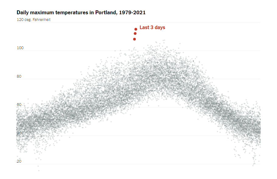
Looking into how weird the heat in the Pacific Northwest is compared to historical normals, NYT’s The Upshot charted daily maximum temperatures for Portland, Seattle, and Canada’s Vancouver over the period from 1979 to 2021. The three graphics are actually worth a thousand words, making it clear at a glance that the weather extremes experienced these days in this region have little to no precedent during at least the last four decades.
There are also a couple of no less telling visualizations appearing in the same article. For example, it starts with an impressive map built by Dutch climate researcher Geert Jan von Oldenborgh. He is known for creating the KNMI Climate Explorer, part of the World Meteorological Organization’s Regional Climate Centre at the Royal Dutch Meteorological Institute. The map displays where recent temperatures set new records or rank high compared to annual maximum temperatures recorded in 1979-2020.
The story is brought to you by Aatish Bhatia, Henry Fountain, and Kevin Quealy.
Drought Conditions in American West Since 2000
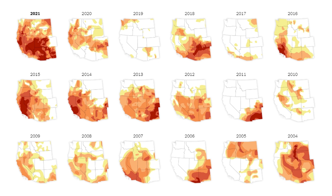
According to the U.S. Drought Monitor (USDM), a joint initiative of the National Drought Mitigation Center (NDMC), Department of Agriculture (USDA), and National Oceanic and Atmospheric Administration (NOAA), exceptional drought conditions have never been so widespread in the West over at least the last twenty years as in this summer (which is only beginning). Look at several data graphics on The New York Times website for proof.
Nadja Popovic, a data reporter on the NYT’s Climate Desk, made small multiple maps visualizing early June conditions in the American West for each year from 2000 to 2021. In addition, she used a stacked area chart to display the share of land in drought conditions across the region over the course of the same period. On both visualizations, color shows drought categories introduced in the USDM based on a yellow-to-red palette: abnormally dry, moderate, severe, extreme, and exceptional drought.
In the article, you will find several more maps worth taking a look at to learn more — for precipitation, temperature, as well as mountain snowpack and reservoir levels.
Southwestern Droughts Since 800 CE (as Shown by Tree Rings)
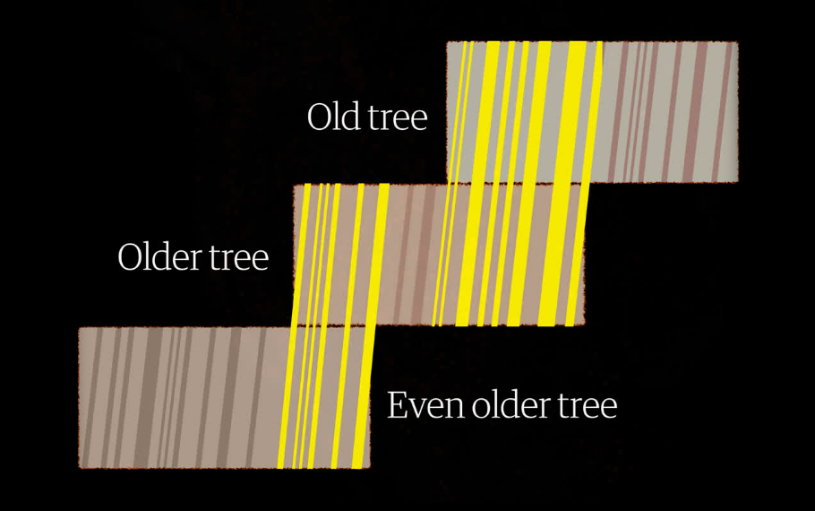
So, we already know that, according to weather records, the ongoing West American drought is the most severe over the past decades. But it is also possible to look even farther back into the past and compare it with droughts that took place thousands of years ago. With the help of tree rings.
A group of researchers lead by Park Williams, a bioclimatologist from UCLA, looked at multiple tree rings across the Southwestern United States and matched them into timelines to track the change of the soil moisture level since 800 CE based on the ring width (which is bigger when the soil is moister, and vice versa). And it appears, for example, that the current drought is just about as bad as the 1500s megadrought which was “so severe that tree ring experts talk about it as if it were some biblical event.”
What’s more, the researchers say, 46% of the intensity of the ongoing drought comes from human activity.
Check out Alvin Chang’s article on The Guardian to learn more and look at a line chart showing moisture levels over time during thousands of years.
***
If you like good charts, maps, and infographics, stay tuned for our weekly overview of the most interesting new visualizations from around the web.
- Categories: Data Visualization Weekly
- No Comments »