2021 Year in Review in Graphics — DataViz Weekly
December 31st, 2021 by AnyChart Team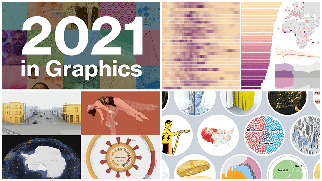 As we get ready to ring in the New Year 2022, it’s a great time to take a look back at 2021! Over the last 365 days, various experts in data graphics and visual storytelling have done their best to help us better understand what was going on around us with the help of static and interactive charts, maps, and infographics. Now we want to let you recall the most important matters that shaped the passing year from the lens of data visualization.
Here, in the final DataViz Weekly issue of 2021, we bring you a roundup of the year-in-review-in-graphics recaps on Bloomberg, The Wall Street Journal, The New York Times, and POLITICO.
Check it out, see the awesome visuals, and enjoy the start of a very happy, healthy, and prosperous new year that we wish you all to have in 2022! ??
- Categories: Data Visualization Weekly
- 1 Comment »
Excellent New Visualizations on Vaccination Rates, Air Temperatures, Unemployment Benefits, Political Leanings — DataViz Weekly
December 10th, 2021 by AnyChart Team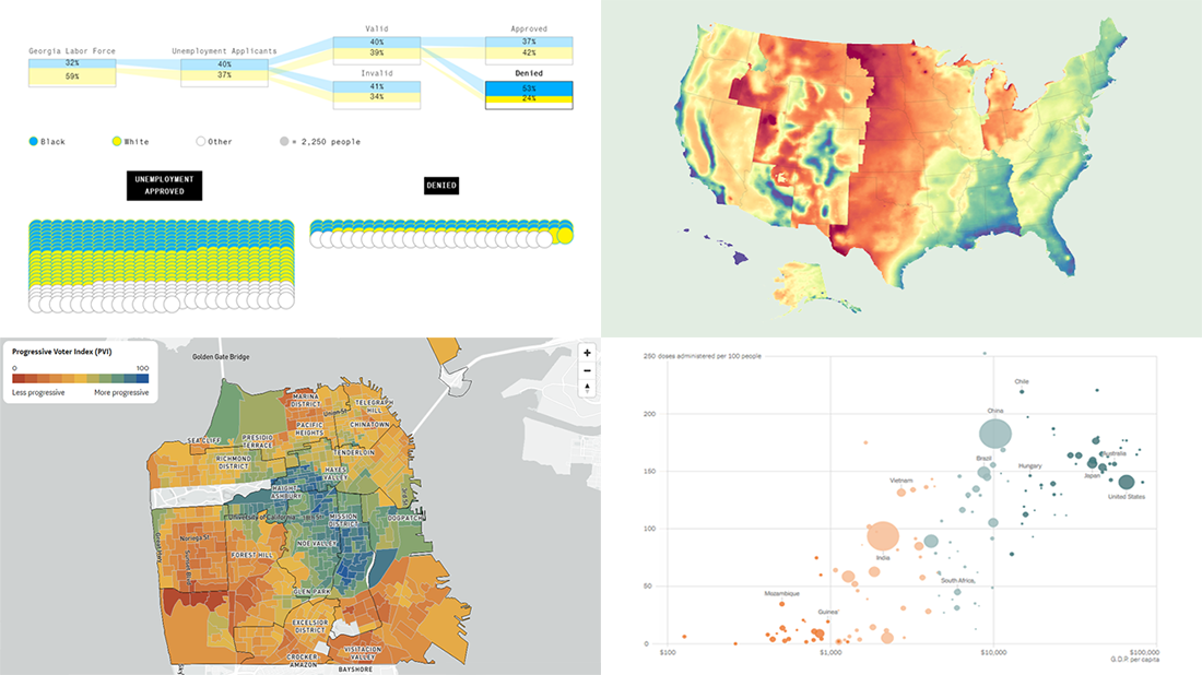 If you love good data visualizations as much as we do, come join us in reviewing some of the most interesting ones we’ve recently come across, in the new issue of DataViz Weekly!
- Global inequality in COVID-19 vaccine supply and demand — The New York Times
- U.S. heat data maps — Erin Davis
- Racial disparity in pandemic unemployment benefits in Georgia — Bloomberg
- Political progressiveness across San Francisco’s neighborhoods — The San Francisco Chronicle
- Categories: Data Visualization Weekly
- No Comments »
Powerful Visual Storytelling Examples — DataViz Weekly
December 3rd, 2021 by AnyChart Team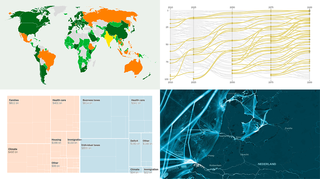 For this DataViz Weekly, we have curated a collection of wonderful new visual storytelling examples from around the web. Take a look through and check them out!
- Rapid urban growth in Africa — The Washington Post
- Maritime activities in the North Sea — TU Delft
- All provisions of the Build Back Better Act — The Upshot
- Climate pledges after COP26 — The Guardian
- Categories: Data Visualization Weekly
- 1 Comment »
Amazing New Charts and Maps That Tell Stories — DataViz Weekly
November 5th, 2021 by AnyChart Team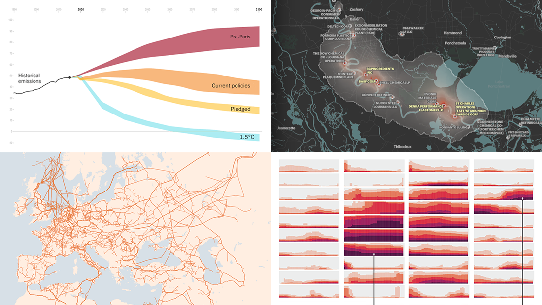 Ready for a new portion of amazing charts and maps for inspiration? We’ve got it for you right here! Join us today on DataViz Weekly as we look at four new visualizations that definitely deserve your attention.
- Greenhouse gas emission pathways and climate goals — The New York Times
- U.S. drought extent patterns by region since 2000 — Scientific American
- Cancer-causing industrial air pollution across the United States — ProPublica
- European natural gas pipeline infrastructure — The Financial Times
- Categories: Data Visualization Weekly
- No Comments »
Great Recent Data Graphics Worth Looking At — DataViz Weekly
October 22nd, 2021 by AnyChart Team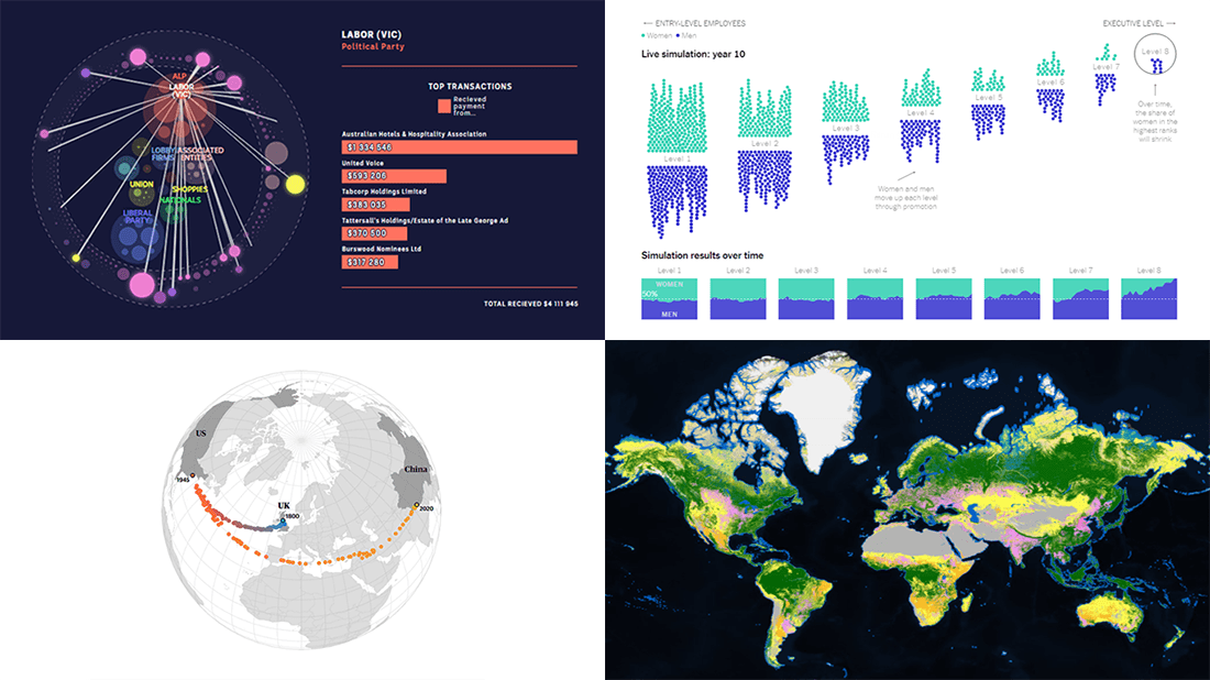 It’s time for DataViz Weekly! Check out the most interesting data visualizations that have recently come to our attention!
- Political donations from the gambling industry in Australia — ABC News
- Land cover worldwide — ESA
- Gender bias in the workplace — NYT Opinion
- World’s carbon “center of gravity” from 1800 through 2020 — The Guardian
- Categories: Data Visualization Weekly
- No Comments »
Most Compelling New Examples of Data Visualization in Action — DataViz Weekly
September 24th, 2021 by AnyChart Team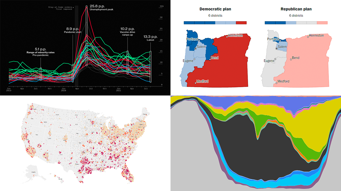 Hey everyone! It is Friday, and we are here to put a spotlight on the most compelling examples of sensible data visualization we have recently seen around the internet. As always, let’s start with a quick list and then look at each project. All aboard for DataViz Weekly!
- Intensive care unit occupancy rates in the United States — The New York Times
- Minority unemployment rates in 15 large U.S. cities. — Bloomberg
- Early proposals for congressional redistricting in Oregon, Indiana, and Colorado — The Washington Post
- Time use of American men and women by employment status — Nathan Yau
- Categories: Data Visualization Weekly
- No Comments »
Canadian Elections, Germany Under Merkel, Caracas Sounds, Night Temperatures in U.S. Cities — DataViz Weekly
September 17th, 2021 by AnyChart Team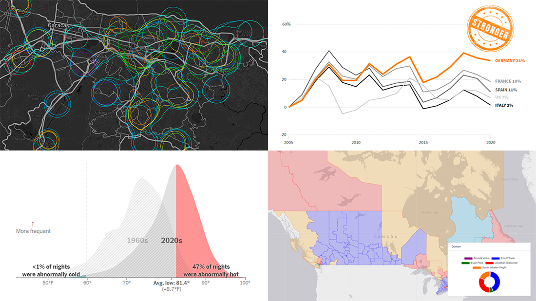 We continue to choose the most interesting out of all the newest data visualizations published here and there and show you them in weekly roundups. It’s time to look at our fresh selection! This time, the following projects are featured in DataViz Weekly:
- Canadian federal elections since 2000 — Stephen Taylor
- Germany under the 16-year leadership of Angela Merkel — Reuters
- Sounds of Caracas — Valeria Escobar
- Abnormally hot summer nights in American cities — The Upshot
- Categories: Data Visualization Weekly
- No Comments »
Excellent Examples of Data Graphics from Around Internet — DataViz Weekly
August 27th, 2021 by AnyChart Team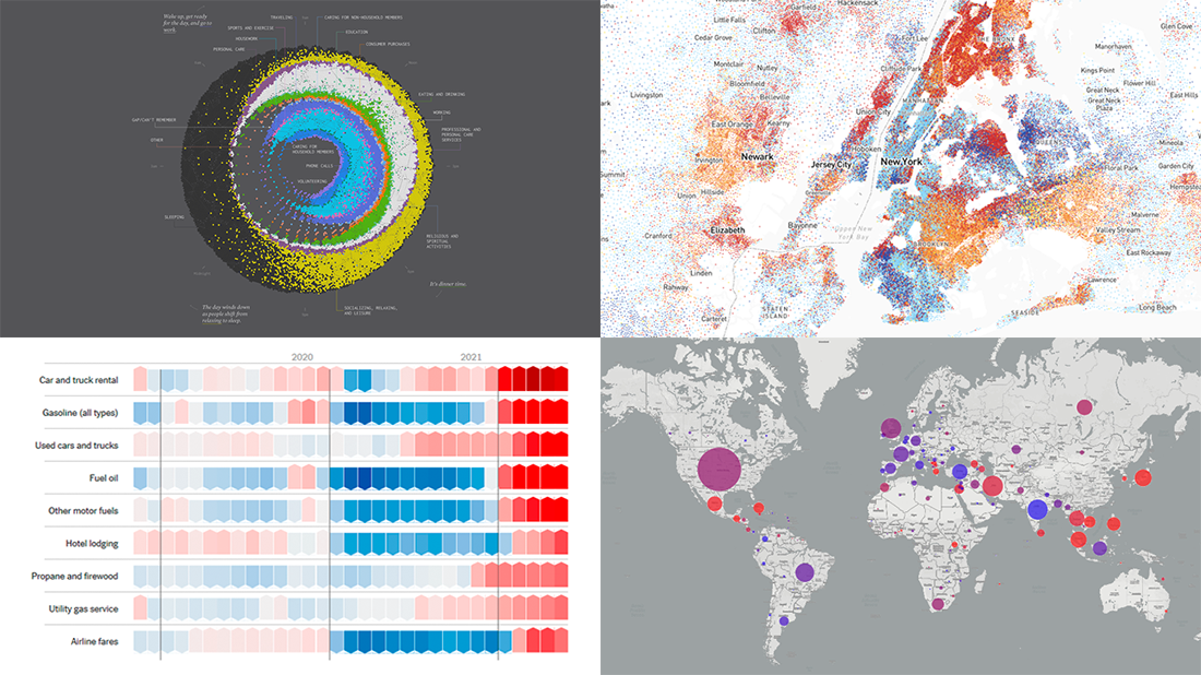 Are you ready for another set of excellent data graphics examples? It’s time! The following projects made it to the newest DataViz Weekly digest — see the list below and keep reading for a closer look!
- Average weekday in the life of Americans — Nathan Yau
- Race and ethnicity across the United States — CNN
- Inflation in the United States — NYT Opinion
- COVID-19 spread across the world over time — Olivia Jack
- Categories: Data Visualization Weekly
- No Comments »
New Impressive Visualizations Making Data Talk — DataViz Weekly
August 20th, 2021 by AnyChart Team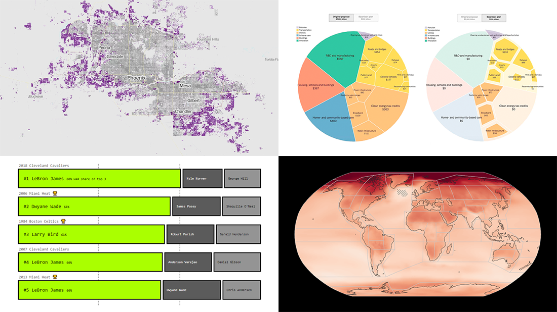 DataViz Weekly is here with an overview of new impressive visualizations that make data talk. These four projects grabbed our attention recently and we could not help telling you about them!
- The biggest carry jobs in NBA history — The Pudding
- Global and regional climate change effects — IPCC
- Presidential and bipartisan infrastructure plans in comparison — The Upshot
- Urban development and sprawl in America between 2001 and 2019 — The Washington Post
- Categories: Data Visualization Weekly
- No Comments »
Tokyo Olympics Medal Trackers — DataViz Weekly
August 6th, 2021 by AnyChart Team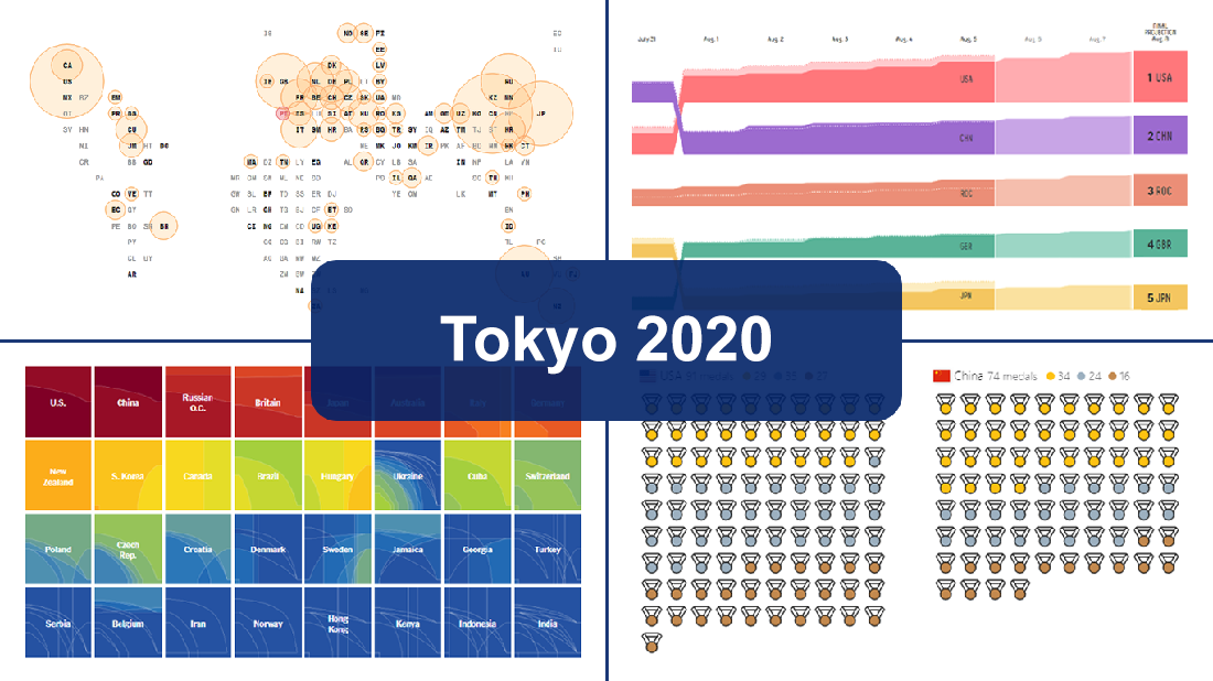 Delayed one year due to the COVID-19 pandemic, the 2020 Summer Olympics officially known as the Games of the XXXII Olympiad and commonly referred to simply as Tokyo 2020 have been underway for two weeks and are already coming to a close, with under 50 medal sets yet to be distributed over the remaining two days.
In this special edition of DataViz Weekly, we are happy to showcase four wonderful Olympic medal trackers providing an insightful view of medal counts and country standings with the help of telling visualizations — from Bloomberg News, The New York Times’s The Upshot, FiveThirtyEight, and Axios.
- Categories: Data Visualization Weekly
- 1 Comment »