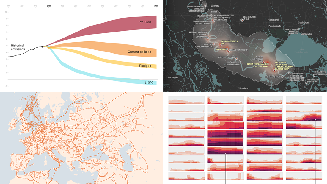
 Ready for a new portion of amazing charts and maps for inspiration? We’ve got it for you right here! Join us today on DataViz Weekly as we look at four new visualizations that definitely deserve your attention.
- Greenhouse gas emission pathways and climate goals — The New York Times
- U.S. drought extent patterns by region since 2000 — Scientific American
- Cancer-causing industrial air pollution across the United States — ProPublica
- European natural gas pipeline infrastructure — The Financial Times
Data Visualization Weekly: October 29, 2021 — November 5, 2021
Greenhouse Gas Emission Pathways and Climate Goals
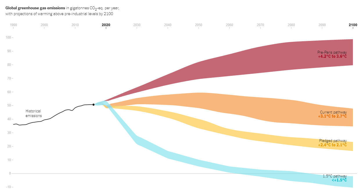
After the Paris agreement on climate change, the world has actually managed to make progress on global warming thanks to substantial clean energy efforts. However, it appears to be not nearly enough and there is still really much to do. Moreover, experts say it is critical to bend the emissions curve in a far more drastic manner and take accelerated action immediately.
For all who want to understand where we are and should be, there is a great recent piece on The New York Times providing a view of the possible pathways. The story begins with a scrollytelling part where the Climate Action Tracker’s estimates of global greenhouse gas emissions are represented in a time-series visualization. More precisely, the chart shows historical figures, since 1990, and then four possible trajectories through the end of the century: pre-Paris (on track for about 4 degrees Celsius of warming by 2100), current (nearly 3°C), pledged (2.1 to 2.4°C), and nowadays seen by scientists as required (1.5°C).
Take a closer look at the pathways together with Brad Plumer and Nadia Popovich.
U.S. Drought Extent Patterns by Region Since 2000
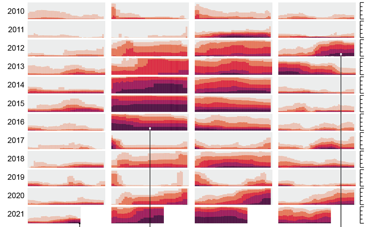
One of the known effects of ongoing global warming is more frequent and intense droughts. Some American regions, for example, have lived in a drought this year for longer than without it.
Georgios Karamanis and Cédric Scherer showed the extent of drought conditions by region over time visualizing data from the U.S. Drought Monitor in a set of percent stacked bar charts. The graphs are organized into a table-like structure, with each column representing a region and each row representing a year.
Above, you can see a small part of their charts just as a sample. Head over to Scientific American to look at all of them and enjoy a quick visual analysis of historical patterns of droughts in the U.S. over the last two decades.
Cancer-Causing Industrial Air Pollution Across U.S.
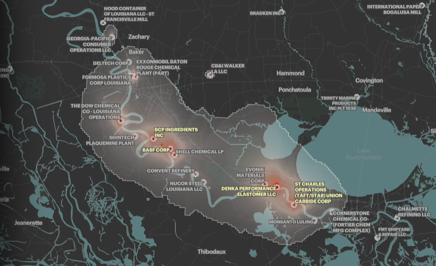
Industrial plants are commonly known to emit toxic pollutants into the atmosphere. And that air pollution not only is extremely poisonous but also hardly affects many people’s health.
On Tuesday, ProPublica made public the findings of its recent analysis, revealing that hazardous air blooms around industrial facilities leave an overwhelming number of Americans exposed to higher cancer risk levels considered unacceptable by the U.S. Environmental Protection Agency (EPA). In total, nearly a quarter million people appear to be living in such extremely toxic areas across the country.
Within the framework of the research, ProPublica mapped the spread of cancer-causing industrial emissions at the neighborhood level using official data from the EPA. Feel free to explore the hot spots all over the United States (one of them, Cancer Alley, is shown in the picture above) and check if you or your friends or relatives live in or near a dangerous site. You are also welcome to read this article for more information.
European Natural Gas Pipeline Infrastructure
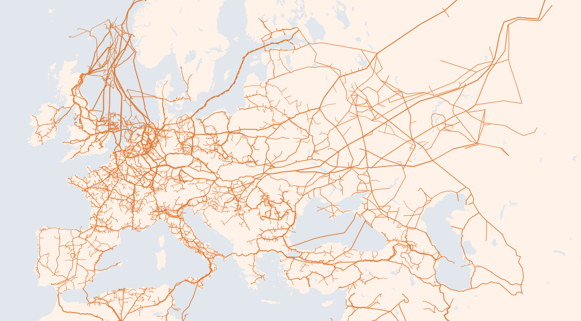
Europe is in the throes of a gas crisis. Current prices are nearly 400% higher than one year ago, and storage levels remain too low to feel comfortable on the threshold of winter.
The Financial Times decided to dig into the roots of the problem and look at how Europe actually gets its gas. In a cool visual story published just yesterday, it maps out Europe’s sprawling network of gas pipelines for a clear explanation.
Many analysts are reported to blame low supplies from Russia, considering this a major reason for the crisis. There are also likely to be other factors, however. Check out the map-based story and keep reading for some other interesting visualizations, including an interactive Sankey diagram showing the largest importers and exporters of liquefied natural gas (LNG).
***
We hope you liked these cool visualizations. Stay tuned for more — Data Visualization Weekly is out every Friday!
Have a wonderful time!
- Categories: Data Visualization Weekly
- No Comments »