 If you love good data visualizations as much as we do, come join us in reviewing some of the most interesting ones we’ve recently come across, in the new issue of DataViz Weekly!
- Global inequality in COVID-19 vaccine supply and demand — The New York Times
- U.S. heat data maps — Erin Davis
- Racial disparity in pandemic unemployment benefits in Georgia — Bloomberg
- Political progressiveness across San Francisco’s neighborhoods — The San Francisco Chronicle
Data Visualization Weekly: December 3, 2021 — December 10, 2021
Global Inequality in COVID-19 Vaccine Supply and Demand
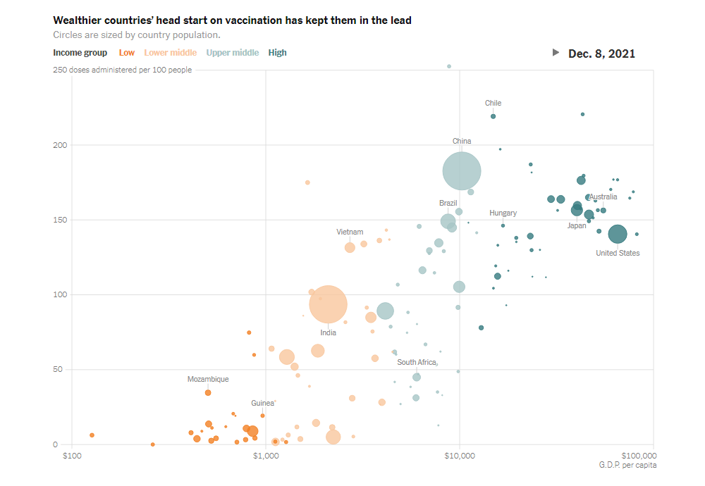
When the COVID-19 pandemic only began, high-income countries managed to reserve enough vaccine doses for their populations. By now, they have already inoculated most of their residents and even have entered the booster-dose stage. But even one year after the start of the global vaccine distribution, many other countries still cannot attain significant vaccination rates. And shortages appear to be just part of the problem.
For The New York Times, Keith Collins and Josh Holder looked at what data can say about the supply and demand of vaccine doses across the world. Using data from Our World in Data (administered doses), Airfinity (delivered doses), and the World Bank (income classifications and GDP), they made awesome visualizations shedding light on the situation in various countries. The first chart helps identify which countries have failed to use a significant part of all the received doses. The second one reveals the share of available doses used in the least-vaccinated countries. The third visualization — you can see its snapshot above — is animated, providing an at-a-glance view of the gaps in vaccination rates over time.
Check out the analysis on The New York Times.
U.S. Heat Data Maps
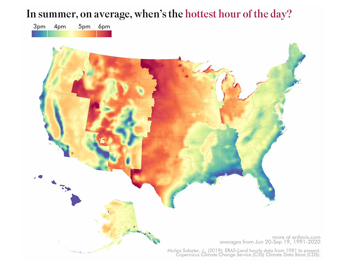
This year’s summer was especially hot in many places. Such as in Portland, Oregon, where professional data visualizer Erin Davis lives. At that time, she started wondering about many different things related to heat and then created a bunch of maps to find the correct answers.
Erin’s recent OC post in the /r/dataisbeautiful subreddit, where she shared one of those maps, has collected more than seven thousand upvotes (which is a heck of a lot, you know). The exhibited visualization shows the hottest hour of the average summer day across the United States — you can see it right above.
Take a look at this and other cool maps on Erin’s blog. There are, for example, visualizations displaying when is the first and last day the air temperature reaches a certain value and when is the warmest day of the year. All of them are based on data from the Copernicus Climate Data Store.
Racial Disparity in Pandemic Unemployment Benefits in Georgia
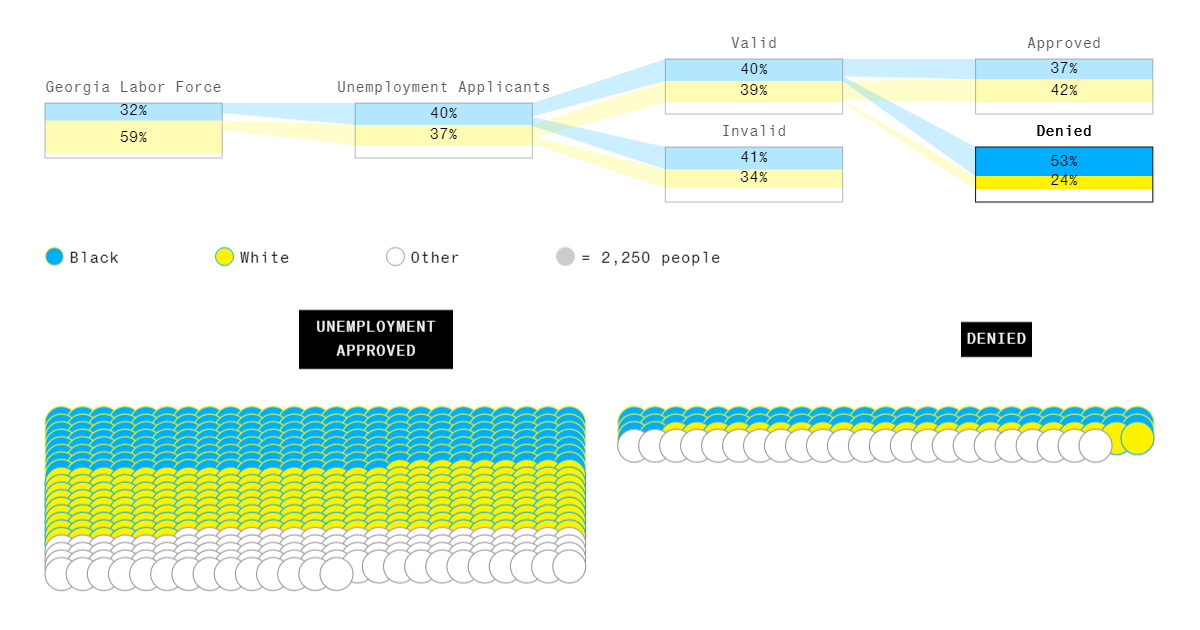
Among all residents of Georgia who lost their jobs during the COVID-19 pandemic, Black workers were more likely to get rejected for unemployment benefits than White ones. That was found in a recent Bloomberg News analysis of the situation with jobless claims in the state and, reportedly, can actually tell a bigger, nationwide story.
Carried out by Shawn Donnan, Reade Pickert, and Madeline Campbell, the analysis can be delved into with the help of beautiful data visualizations created by Rachael Dottle from the Bloomberg Graphics team. For instance, graphical representations of the racial breakdown at each stage, from the entire workforce to the “Denied” and “Approved” categories, nicely help to tell the story as you scroll. And they greatly illuminate the huge disproportion: If the system mirrored the labor force, the number of Black workers rejected for these benefits would be about half the number of White ones, but the reality was exactly the opposite.
Learn more from the article on Bloomberg and don’t miss out on the other telling visualizations with further details right there. Data for this research was taken from relevant official sources.
Political Progressiveness Across San Francisco’s Neighborhoods
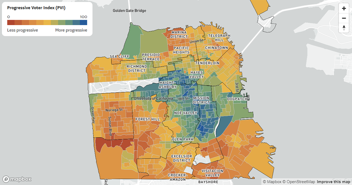
Based on election results, San Francisco is habitually seen as a deeply Democratic city. However, it is not exactly homogeneous in terms of political leanings and an in-depth look reveals many shades of blue within.
For The San Francisco Chronicle, Nami Sumida took data on how people across San Francisco had voted on 14 citywide referendums held from 2018 through 2020, calculated a “progressiveness” score for each electoral precinct using the Progressive Voter Index (PVI) methodology, and mapped them all out. Now, it is really easy to see which parts are the most and least progressive and how individual neighborhoods stack up. For instance, the deepest blue areas are quite clustered near the center of the city.
In the article on The Chronicle, also mapped are the results of all the San Francisco local ballot measures taken into account as well as the racial makeup of the city’s neighborhoods for comparisons. In addition, there is a chart showing the PVI scores by SF supervisorial district and current supervisor.
***
Stay tuned for DataViz Weekly. And if you deal with data visualization development, don’t miss the latest major update of our award-winning javascript charting library: AnyChart 8.11.0 is out with awesome new features!
- Categories: Data Visualization Weekly
- No Comments »