Discover Some of Most Interesting Recent Data Visualization Projects — DataViz Weekly
July 23rd, 2021 by AnyChart Team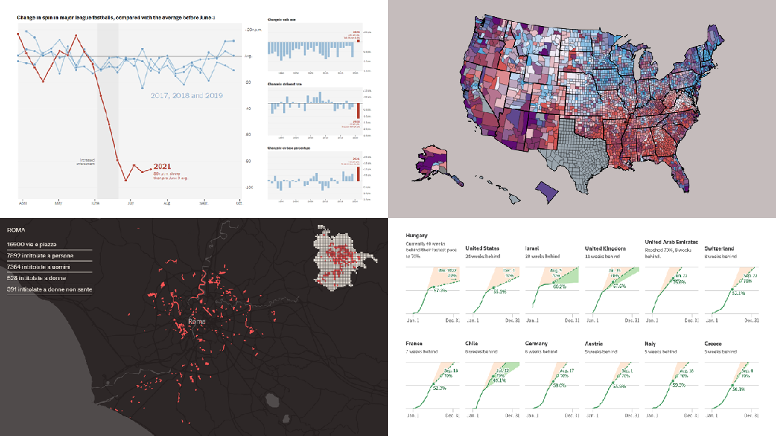 Look at some of the most interesting data visualizations we have come across out there over the last few days! The following projects are deservedly featured in DataViz Weekly this time:
- Falling spin rates in American baseball after a crackdown on sticky substances — The Upshot
- Gender diversity in Italian street names — EDJNet
- Shifts in the COVID-19 vaccination pace worldwide since January 2021 — Reuters
- Vaccination equity in America — CDC
- Categories: Data Visualization Weekly
- No Comments »
Heat and Drought in American West in Visualizations — DataViz Weekly
July 2nd, 2021 by AnyChart Team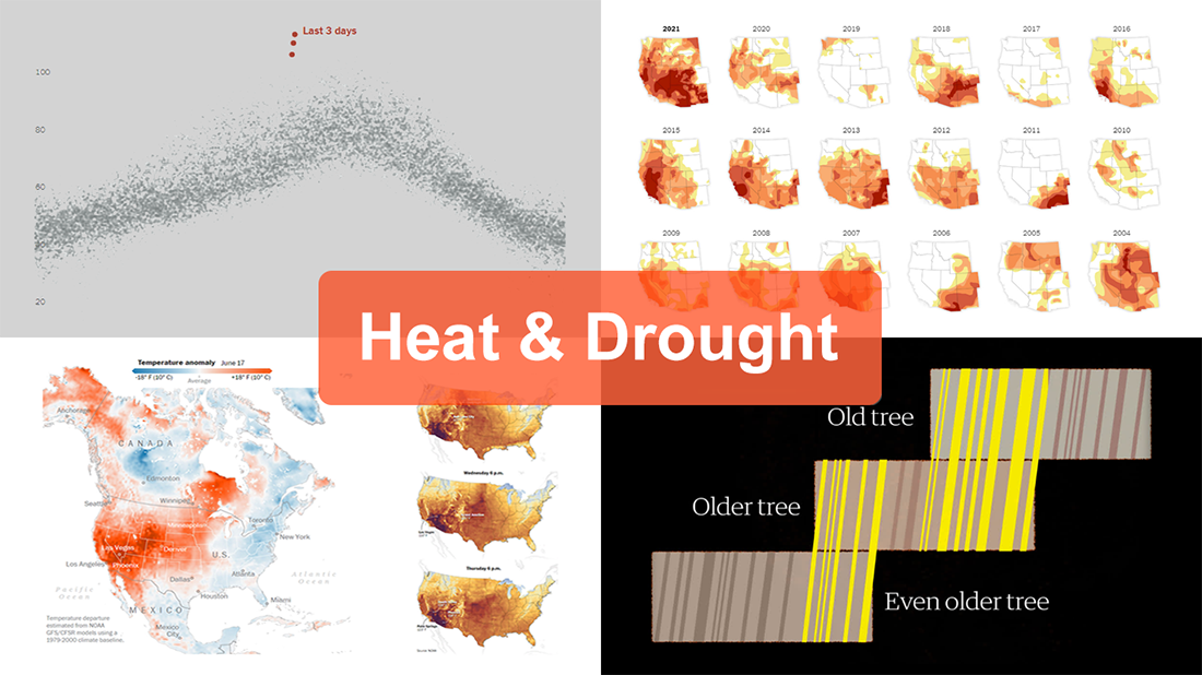 The extreme heat that has gripped the Western United States this summer basically aligns with scientists’ expectations for climate change. On top of that, as all the more scorchers are likely coming up, the year 2021 may well be remembered as a relatively cool one.
For this new edition of DataViz Weekly, we’ve curated a set of recent visualizations shedding light on the essence and context of the record-breaking heat and drought in the U.S. West. Take a look!
- Heat dome and temperature extremes in the West — The Washington Post
- Heat in the Pacific Northwest since 1979 — The Upshot
- Drought conditions in the West since 2000 — The New York Times
- Southwestern droughts since 800 CE (as shown by tree tings) — The Guardian
- Categories: Data Visualization Weekly
- No Comments »
Exploring Voting Bills, Birth Rates, Hospital Billing, Transit Equity — DataViz Weekly
June 25th, 2021 by AnyChart Team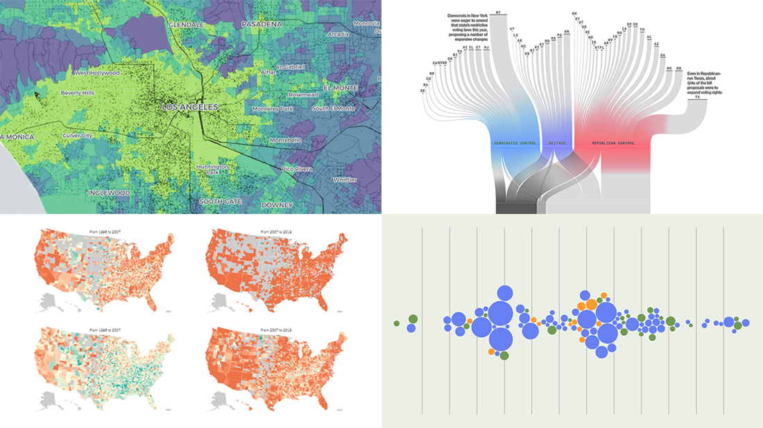 Join us to check out the most awesome data visualizations of all we have come across this week! To begin with, here is a full list of the projects featured today in DataViz Weekly:
- Proposed and passed voting bills across the U.S. in 2021 — Bloomberg
- Change in birth rates among American women — NYT
- Billing practices at the top 100 U.S. hospitals — Axios
- Transit equity in major U.S. cities — TransitCenter
- Categories: Data Visualization Weekly
- No Comments »
How to Create Interactive Timeline Chart with JavaScript
June 17th, 2021 by Shachee Swadia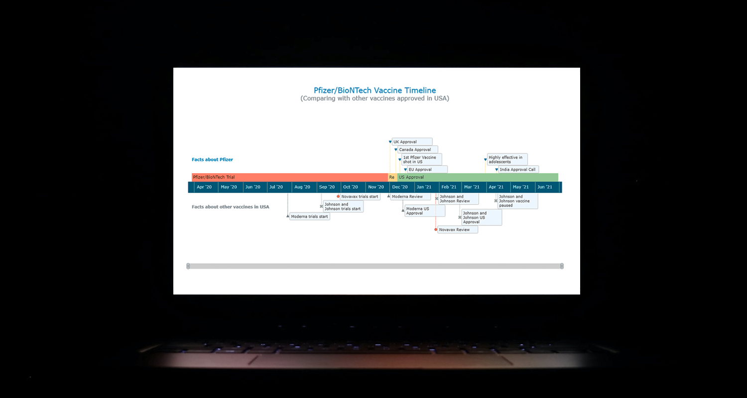 I think all of us have come across timelines somewhere or the other; as a means of conveying chronological information, the classic timeline is unmatched, both in the depth of information conveyed and the “cool” factor, when done with a deft creative touch. So, with that said, would you like to learn how to build a timeline chart using JavaScript that both looks great and is simple to create? (Of course, you do!) Follow along with me as I take you through the step-by-step breakdown for developing your own JS timeline with a practical example.
As the world continues to battle with COVID-19, the long-awaited good news is the development of vaccines across the globe. Here, I decided to build an interactive timeline that showcases the phases of Pfizer-BioNTech vaccine development in the United States. To add more contextual information, I also wanted to show approvals from other countries and some related facts, including the dates for the development of the 3 other vaccines approved for usage in the US.
Read the JS charting tutorial »
- Categories: AnyChart Charting Component, Big Data, Charts and Art, HTML5, JavaScript, JavaScript Chart Tutorials, Tips and Tricks
- No Comments »
Visualizing Vaccination Rates, Political Bubbles, Curry’s Stats, World Justified — DataViz Weekly
May 7th, 2021 by AnyChart Team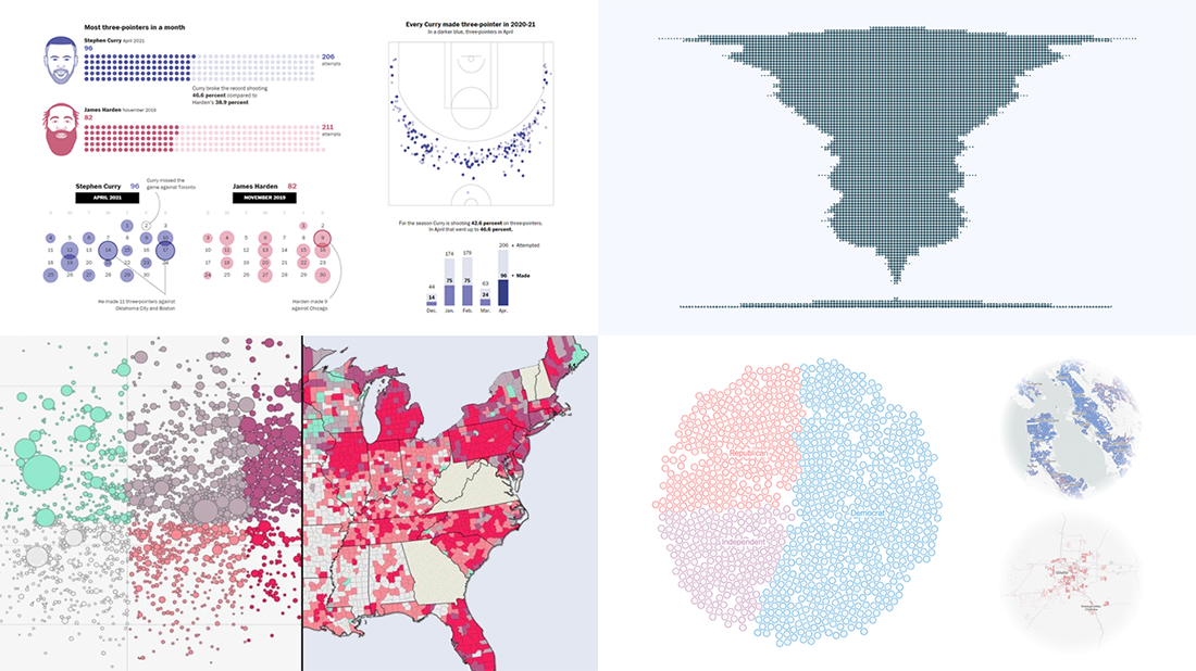 Every week, we choose the four most interesting visualizations from all we came across these days and present them to you in a quick review. Below is a list of the ones that made it to this new DataViz Weekly — take a glance and keep reading for a closer look at each!
- Vaccination rates in comparison with case metrics across the U.S. — McKinsey & Company
- Political bubbles across the U.S. — The New York Times Opinion
- Stephen Curry’s record-setting April scoring spree — The Washington Post
- World justified, left-aligned, centered, right-aligned — Nicolas Lambert
- Categories: Data Visualization Weekly
- No Comments »
New Impressive Data Visualization Projects — DataViz Weekly
April 16th, 2021 by AnyChart Team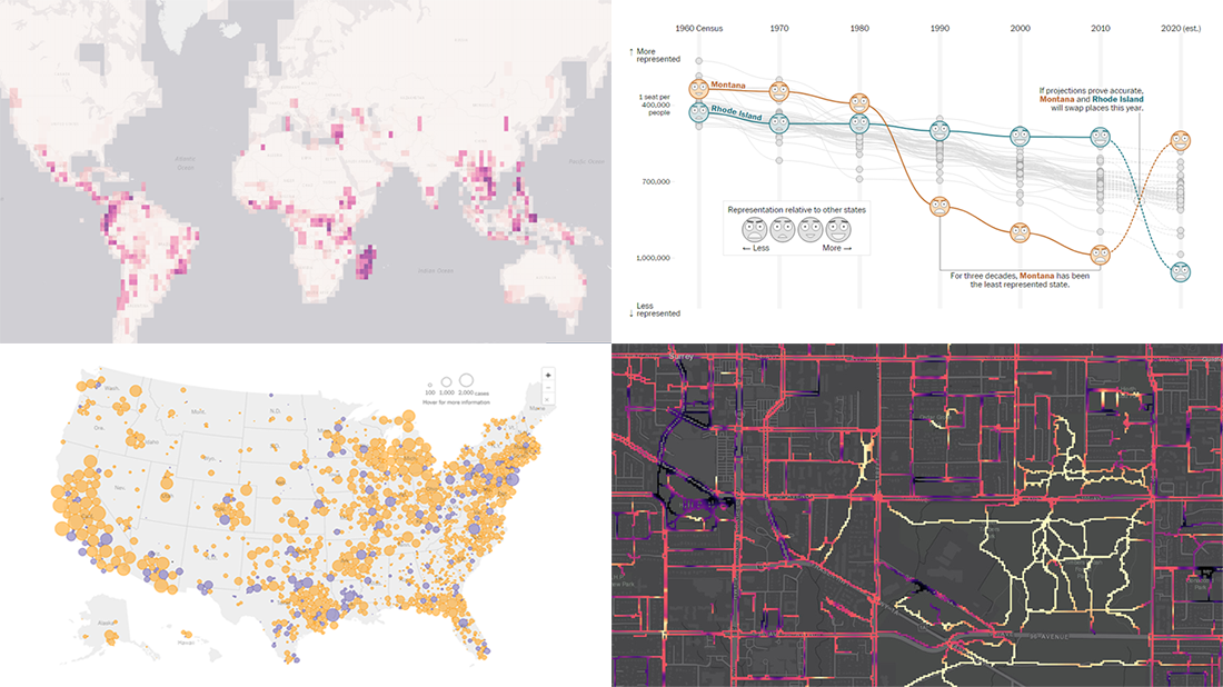 Hello and greetings to all who are fond of data visualization! We’ve curated a new collection of impressive maps and charts that came into existence just a little while ago. See what projects are praised this time on DataViz Weekly and read next to learn more about each:
- Reshuffling of the U.S. House seats after the 2020 Census — The Washington Post
- Runnability of streets — Simon Fraser University
- Probability of finding undiscovered species across the world — Map of Life
- Coronavirus in American prisons — The New York Times
- Categories: Data Visualization Weekly
- No Comments »
Some of Best Visualizations of Recent Days — DataViz Weekly
April 2nd, 2021 by AnyChart Team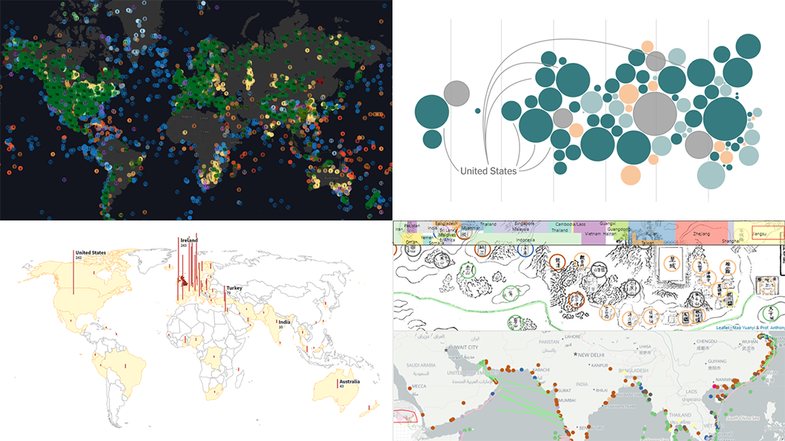 As we continue to bring you regular roundups of the best visualizations we have stumbled upon out there, it’s Friday and DataViz Weekly here! Read next and you’ll meet the following new stunning projects:
- Country wealth and vaccination roll-out — The New York Times
- Spread of the Kent variant across Britain and worldwide — Reuters
- Earth’s сlimate history in proxy data — Carbon Brief
- Interactive Mao Kun map explorer — Ryan Carpenter
- Categories: Data Visualization Weekly
- No Comments »
Four New Robust Visualizations to Check Out on Weekend — DataViz Weekly
March 5th, 2021 by AnyChart Team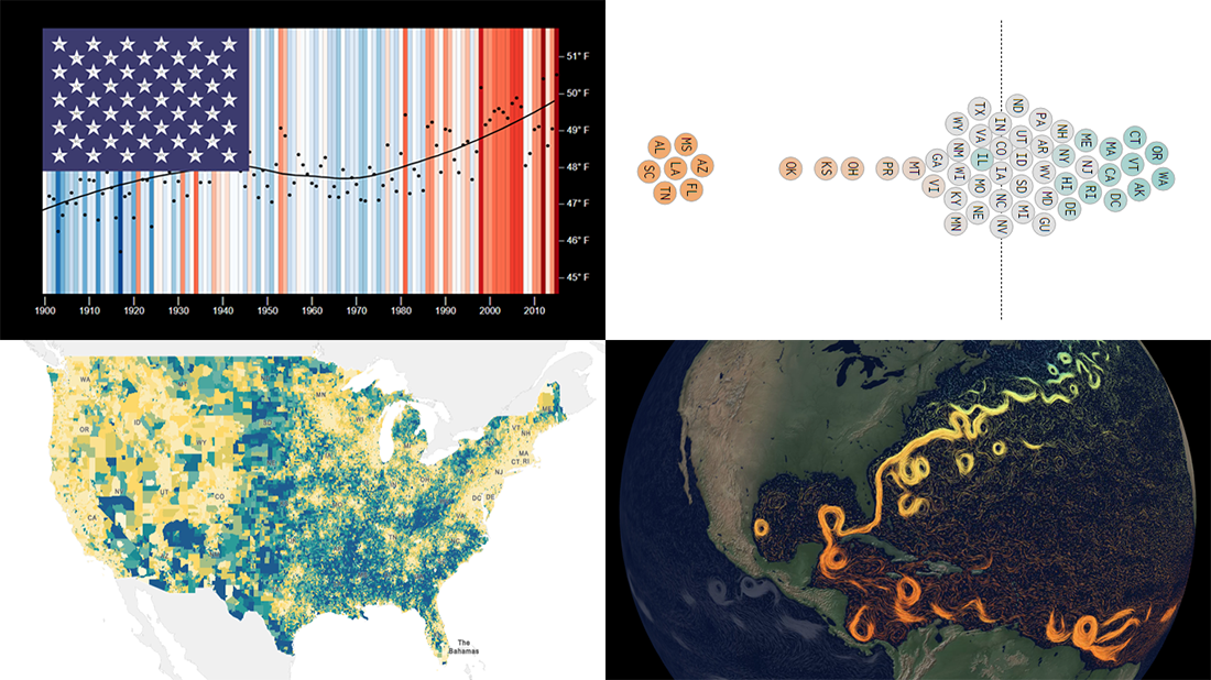 This week, we’ve found a number of new cool projects that could serve as good examples of robust data visualization. Here are the four ones we like the most. Watch how compelling charts and maps let data speak — join us as we overview these projects today on DataViz Weekly:
- Climate stripes for each U.S. state — Luke Browne, YSE
- Causes and dangers of the Gulf Stream weakening — The New York Times
- Minimum wage change in the U.S. by state since 1968 — Nathan Yau
- Homes worth <$100,000 and >$1,000,000 in the U.S. — Social Explorer
- Categories: Data Visualization Weekly
- No Comments »
Visualizing Information on Coronavirus, MiLB Teams, and Providence Buildings — DataViz Weekly
February 19th, 2021 by AnyChart Team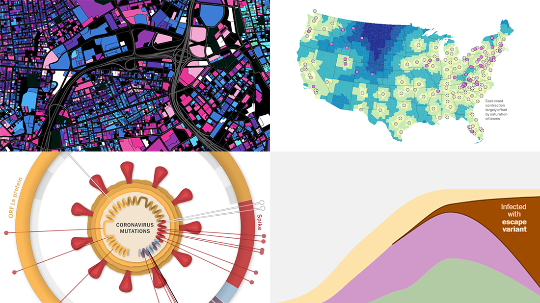 For us humans, data is usually easier to explore and analyze when it’s properly visualized. If you are looking for some good examples, you’ve come to the right place at the right time! DataViz Weekly is here to let you know about new great information visualizations.
Today on DataViz Weekly:
- Coronavirus vaccination pace, goals, and challenge — The Washington Post
- Coronavirus mutations and variants — The New York Times
- Distance to the nearest MiLB team in 2021 — Axios
- Age of buildings in Providence, RI — Chris Sarli
- Categories: Data Visualization Weekly
- 1 Comment »
New Stunning Charts and Maps from Around the Web — DataViz Weekly
January 29th, 2021 by AnyChart Team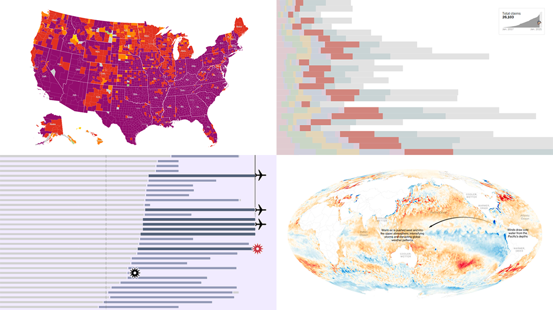 We continue our weekly blog feature where we show you the best data visualizations we’ve met out there over the past seven days. Here’s our new selection of stunning charts and maps from different creators — check it out! Today on DataViz Weekly:
- La Niña and its impacts — Bloomberg
- Donald Trump’s false and misleading claims while in office — The Washington Post
- COVID-19 risk levels by county — The New York Times
- Sriwijaya Air fleet — Reuters
- Categories: Data Visualization Weekly
- No Comments »