 For us humans, data is usually easier to explore and analyze when it’s properly visualized. If you are looking for some good examples, you’ve come to the right place at the right time! DataViz Weekly is here to let you know about new great information visualizations.
Today on DataViz Weekly:
- Coronavirus vaccination pace, goals, and challenge — The Washington Post
- Coronavirus mutations and variants — The New York Times
- Distance to the nearest MiLB team in 2021 — Axios
- Age of buildings in Providence, RI — Chris Sarli
Data Visualization Weekly: February 12, 2021 — February 19, 2021
Coronavirus Vaccination Pace, Goals, and Challenge
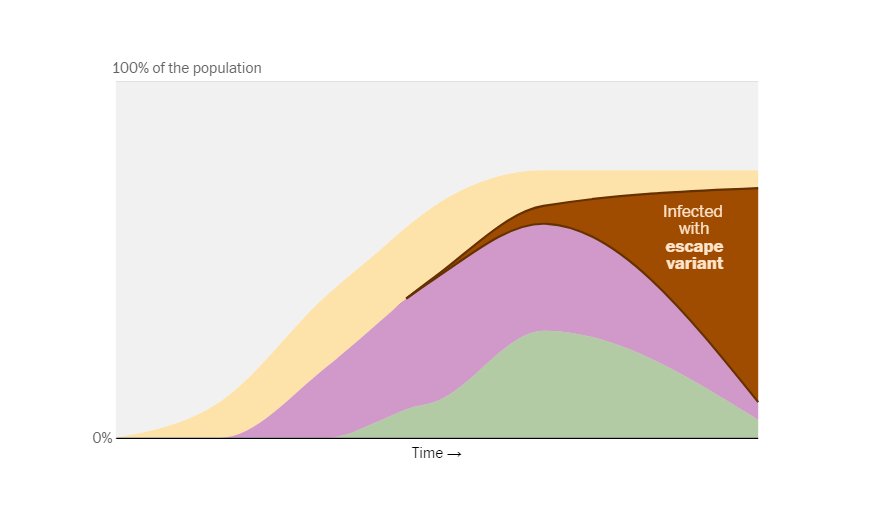
Do you remember all those “flatten the curve” visualizations and simulations that were especially popular at the beginning of the pandemic? They were simple but great at demonstrating the importance of social distancing and lockdown measures at a glance. Now, there is a new alarming challenge within the same COVID-19 crisis, and such plain graphics are here again to help communicate another major message.
While there are already several vaccines ready, distributed, and applied around the world, the vaccination campaign goes quite slowly, which may well give rise to a new big problem. The present pace, experts say, can not only postpone a return of life to normal. The biggest issue is the ongoing mutation of the novel coronavirus and the emergence of variants that will be (potentially) resistant to the existing vaccines. As a result, the previously immune could more likely get into trouble if (or when) infected by such new variants.
Don’t miss this new piece on The Washington Post. Created by Harry Stevens, Aaron Steckelberg, and Naema Ahmed, it provides a number of charts that greatly explain how vaccinations go, where we are on the way to reaching the herd immunity threshold, and why it is really critical to vaccinate asap.
Coronavirus Mutations and Variants

Now, would you like to learn more about how SARS-CoV-2 has changed so far? Carl Zimmer and Jonathan Corum from The New York Times made a fascinating guide project that tracks and explains all major recent mutations, including exactly where in the coronavirus genome they take place, how they work, as well as how they spread. A lot of compelling visualizations are in the centerpiece, of course.
The article begins with the basics. In particular, there’s a colorful diagram of the genome of the SARS-CoV-2 coronavirus and a quick glossary from which you understand the differences between such terms as mutations, lineages, variants, and strains. After that, you are welcome to find out more about the variants of concern (those with higher infection rates) and mutations of concern (that appear to be able to make the virus more infectious or even resistant to antibodies).
In addition to the genome and spike protein visualizations, the guide features maps showing where some mutated coronaviruses have been noticed, in the United States and across the world (in the awesome Cahill–Keyes projection, by the way).
Nearest Minor League Baseball Team in 2021
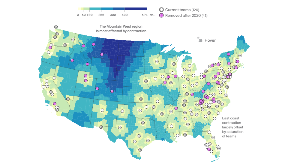
There will be 40 fewer teams this season in Minor League Baseball (MiLB) as 3 teams gained and 43 teams lost their MLB affiliation. As a result, people in many places around the United States will not have easy access to MiLB matches in 2021.
A new Axios map, however, might appear to be helpful to them in finding the closest team to support, watch, or at least come to see this level of baseball live. For every county in the U.S., Andrew Witherspoon and Kendall Baker visualized the distance to the nearest MiLB team. In addition, the map shows the location of the teams removed from MiLB after the 2020 season.
The visualization makes it clear that the Mountain West region is most affected by this kind of contraction as it will be much harder for their baseball fans to watch MiLB matches this year. Explore the map and see the authors’ analysis for more insights.
Age of Buildings in Providence, RI
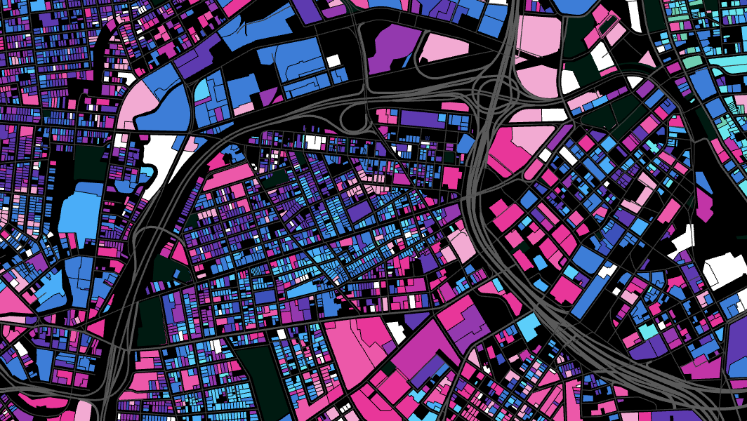
We have seen quite a few maps visualizing the age of buildings in various cities all over the world. Such visualizations are usually very beautiful. This new one we’ve just come across is not an exception.
Chris Sarli, studying Computer Science and Urban Studies at Brown University, published a building age map for Providence, the capital of his home Rhode Island state. Based on data from the GIS portal of the city, he colored land parcels according to how long ago the corresponding buildings had been erected.
The “How old is Providence?” map is interactive. Hover over a parcel to see the year of construction and click to open the entry in the City of Providence Online Assessment Database by Vision Government Solutions.
***
Can’t wait to see even more great examples of data viz in action? Look at the previous Data Visualization Weekly roundups. Follow us on Twitter, Facebook, and LinkedIn. And stay tuned!
- Categories: Data Visualization Weekly
- 1 Comment »