 I think all of us have come across timelines somewhere or the other; as a means of conveying chronological information, the classic timeline is unmatched, both in the depth of information conveyed and the “cool” factor, when done with a deft creative touch. So, with that said, would you like to learn how to build a timeline chart using JavaScript that both looks great and is simple to create? (Of course, you do!) Follow along with me as I take you through the step-by-step breakdown for developing your own JS timeline with a practical example.
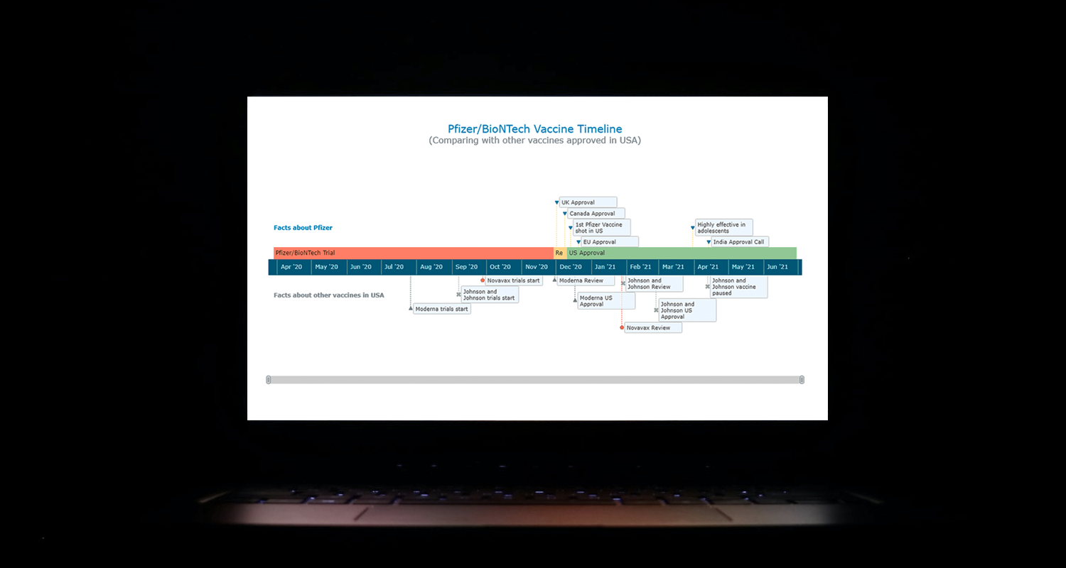
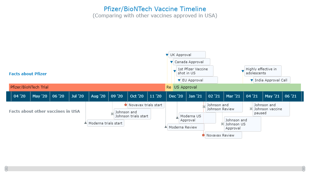
As the world continues to battle with COVID-19, the long-awaited good news is the development of vaccines across the globe. Here, I decided to build an interactive timeline that showcases the phases of Pfizer-BioNTech vaccine development in the United States. To add more contextual information, I also wanted to show approvals from other countries and some related facts, including the dates for the development of the 3 other vaccines approved for usage in the US.
Ultimately, this is what the finished product turns out as:
Building a Basic JavaScript Timeline Chart in 4 Steps
It’s actually quite easy to create charts and visualize data even without much technical knowledge. Of course, if you have skills with technologies like HTML and JavaScript, it is easier to grasp what is happening and you can arrange a wider range of customizations quicker. Nonetheless, data visualization with one of the available JS charting libraries is fairly straightforward. So, without worrying about any bugs (well, unfortunately, we do have to worry about the viruses), let’s take our first attempt at creating a timeline with JavaScript.
The first thing to understand is that not all JavaScript charting libraries support timeline charts. So logically, the first thing to do is to find one that does. In this tutorial, I decided to use AnyChart as it supports timelines out of the box and is also lightweight, flexible, and easy-to-use, providing extensive documentation and a dedicated playground that’s helpful for practising with code. All of this should help you understand the basics of the process, which tend to be quite similar regardless of which specific library you choose.
There are 4 fundamental steps to creating any JS chart, including a JS timeline chart. They are:
- Make a basic HTML page.
- Reference all necessary scripts.
- Add the data.
- Write some JS code to configure the timeline chart.
1. Make a basic HTML page
First of all, we have to set up a basic HTML page. This includes developing a framework for the visualization as well as adding the necessary CSS rules.
A basic HTML template is enclosed in html tag and contains 2 portions — a head and a body. The title of the page along with CSS links and JS scripts go in the head part. The body part defines the various components of the html page. One of the fundamental ways to define a section of the page is using the div tag in HTML.
Here, I create a div to contain the timeline chart and give it an id that will identify this specific container. I have set “100%” in both width and height parameters to make the timeline visualization occupy the entire page.
<!DOCTYPE html>
<html>
  <head>
    <title>JavaScript Timeline Chart</title>
    <style type="text/css">
      html,
      body,
      #container {
        width: 100%;
        height: 100%;
        margin: 0;
        padding: 0;
      }
    </style>
  </head>
  <body>
    <div id="container"></div>
  </body>
</html>
2. Reference all necessary scripts
Second, all necessary JS scripts need to be referenced in the <head> section. For this tutorial, since I am using the AnyChart library, I will include the corresponding files from its CDN (Content Delivery Network).
To create a timeline chart, I will need to add references to the core library module from AnyChart that is necessary for all types of charts as well as the special timeline module.
<!DOCTYPE html>
<html>
  <head>
    <title>JavaScript Timeline Chart</title>
    <script src="https://cdn.anychart.com/releases/8.9.0/js/anychart-core.min.js"></script>
    <script src="https://cdn.anychart.com/releases/8.9.0/js/anychart-timeline.min.js"></script>
    <style type="text/css">
      html,
      body,
      #container {
        width: 100%;
        height: 100%;
        margin: 0;
        padding: 0;
      }
    </style>
  </head>
  <body>
    <div id="container"></div>
    <script>
      // All the JS code for the timeline chart will come here.
    </script>
  </body>
</html>
3. Add the data
Third, let’s add the data. I created a dataset for this timeline chart tutorial manually by compiling what I wanted from various news sources, two of the main ones being NYT and Bloomberg. My JSON data file is here in case you are interested.
Loading the JSON file in AnyChart can be done with the help of the Data Adapter module, which I add along with all the JS scripts in the <head>. Next, I use the loadJsonFile method inside the <script> tag in the body of the HTML page to load the data file.
<!DOCTYPE html>
<html>
  <head>
    <title>JavaScript Timeline Chart</title>
    <script src="https://cdn.anychart.com/releases/8.9.0/js/anychart-core.min.js"></script>
    <script src="https://cdn.anychart.com/releases/8.9.0/js/anychart-timeline.min.js"></script>
    <script src="https://cdn.anychart.com/releases/8.9.0/js/anychart-data-adapter.min.js"></script>
    <style type="text/css">
      html,
      body,
      #container {
        width: 100%;
        height: 100%;
        margin: 0;
        padding: 0;
      }
    </style>
  </head>
  <body>
    <div id="container"></div>
    <script>
      anychart.data.loadJsonFile('{JSON data file location}',
        function (data) {
          // Timeline chart's JS code will come here.
      });
    </script>
  </body>
</html>
Now that all the prep is done, get ready to add the code which will create the interactive JS timeline chart in no time!
4. Write some JS code to configure the timeline chart
The first basic step to create any chart this way is to add a function enclosing all the code, which makes sure that the entire code inside of it will only execute once the page is ready.
The timeline chart that I create here consists of 3 parts:
- the central timeline that shows the Pfizer-BioNTech vaccine development phases for the US as time intervals,
- the temporal ranges above the timeline that indicates events related to the Pfizer-BioNTech vaccine in general as milestones, and
- the markers below the timeline that represent the dates of development phases for other vaccines approved in the US as milestones.
Creating the central timeline is very straightforward, but it could get slightly overwhelming when dealing with the points above and below the timeline. Do not worry though, as all the code is commented, and I will walk you through each of the code snippets.
For the central part, all I need to do is initialize the timeline chart object with the inbuilt functionality and set the points to the range series.
// create a timeline chart
var chart = anychart.timeline();

// create main timeline data points
for (var i = 0; i < data.pfizerTimeline.length; i++) {

  // create a range series
  var series = chart.range([
    [
      data.pfizerTimeline[i].title,
      data.pfizerTimeline[i].start,
      data.pfizerTimeline[i].end
    ]
  ]);

}
To plot the above and below the timeline points, I initialize datasets, define the mapping for the points, and set both series with the moment series functionality.
// create a data set for the top data points
var pfizerDataSet = anychart.data.set(data.pfizerFacts);

// map the top data points
var pfizerMapping = pfizerDataSet.mapAs({
  x: 'date',
  value: 'title'
});

// create the top series with moments
var pfizerMappingSeries = chart.moment(pfizerMapping);

// create a data set for the bottom data points
var otherVaccinesDataset = anychart.data.set(data.otherVaccines);

// map the bottom data set
var otherVaccinesDatasetMapping = otherVaccinesDataset.mapAs({
  x: 'date',
  value: 'title'
});

// create the bottom series with moments
var otherVaccinesSeries = chart.moment(otherVaccinesDatasetMapping);
Now I just need to set the scale of the timeline to 1 month and add a scroll bar that will allow seeing specific sections of the timeline.
// set the chart scale levels
chart.scale().zoomLevels([
  [
    { unit: 'month', count: 1 }
  ]
]);

// enable the chart scroller
chart.scroller().enabled(true);
To wrap it up, I add a title to the chart, set the container defined for the chart, and draw the actual timeline.
// set the chart's title
chart.title('Pfizer/BioNTech Vaccine Timeline');

// set the container id for the chart
chart.container('container');

// initiate the chart drawing
chart.draw();
That’s it! A fully functional, interactive timeline chart is all set up!
You’re welcome to see and play with this initial version of the interactive timeline chart with the full JS/CSS/HTML code on CodePen [or on AnyChart Playground].
<!DOCTYPE html>
<html>
  <head>
    <title>JavaScript Timeline Chart</title>
    <script src="https://cdn.anychart.com/releases/8.9.0/js/anychart-core.min.js"></script>
    <script src="https://cdn.anychart.com/releases/8.9.0/js/anychart-timeline.min.js"></script>
    <script src="https://cdn.anychart.com/releases/8.9.0/js/anychart-data-adapter.min.js"></script>
    <style type="text/css">
      html,
      body,
      #container {
        width: 100%;
        height: 100%;
        margin: 0;
        padding: 0;
      }
    </style>
  </head>
  <body>
    <div id="container"></div>
    <script>
      anychart.onDocumentReady(function () {
        anychart.data.loadJsonFile(
        'https://gist.githubusercontent.com/shacheeswadia/c65106bb00db4236140b4f6052fde55a/raw/9ec2af927a8bb81433f2236b41c161260aa4950d/pfizer-comparison-timeline',
          function (data) {

            // create a timeline chart
            var chart = anychart.timeline();

            // create main timeline data points
            for (var i = 0; i < data.pfizerTimeline.length; i++) {
              // create a range series
              var series = chart.range([
                [
                  data.pfizerTimeline[i].title,
                  data.pfizerTimeline[i].start,
                  data.pfizerTimeline[i].end
                ]
              ]);
            }

            // create a data set for the top data points
            var pfizerDataSet = anychart.data.set(data.pfizerFacts);

            // map the top data points
            var pfizerMapping = pfizerDataSet.mapAs({
              x: 'date',
              value: 'title'
            });

            // create the top series with moments
            var pfizerMappingSeries = chart.moment(pfizerMapping);

            // create a data set for the bottom data points
            var otherVaccinesDataset = anychart.data.set(data.otherVaccines);

            // map the bottom data set
            var otherVaccinesDatasetMapping = otherVaccinesDataset.mapAs({
              x: 'date',
              value: 'title'
            });

            // create the bottom series with moments
            var otherVaccinesSeries = chart.moment(otherVaccinesDatasetMapping);

            // set the chart scale levels
            chart.scale().zoomLevels([
              [
                { unit: 'month', count: 1 }
              ]
            ]);

            // enable the chart scroller
            chart.scroller().enabled(true);

            // set the chart's title
            chart.title('PFizer/BioNTech Vaccine Timeline');

            // set the container id for the chart
            chart.container('container');

            // initiate the chart drawing
            chart.draw();

          }
        );
      });
    </script>
  </body>
</html>
Customizing the JS Timeline Chart
JavaScript libraries like AnyChart not only simplify the process of creating the base visualization but also provide the option for easy customizations. With a few code tweaks (or slightly more), if you want, you can make some quick and effective changes to the chart.
Colors and markers for the timeline
Simple customization that makes the chart look personalized is changing colors. Since the development phases include trials, review and approval, I used a color spectrum of red to green — traffic signal colors. I also change the marker color for the top series and use Pfizer’s signature blue for it.
// create main timeline data points
for (var i = 0; i < data.pfizerTimeline.length; i++) {

  // create a range series
  var series = chart.range([
    [
      data.pfizerTimeline[i].title,
      data.pfizerTimeline[i].start,
      data.pfizerTimeline[i].end
    ]
  ])
  // using function and if conditions to color the timeline parts according to the phase
  .fill(function(d){
    // red color for the trial phase
    if(d.name == "Pfizer/BioNTech Trial"){
      return "#FD8060"
    }else if(d.name == "Review"){ // yellow color for the review phase
      return "#FEE191"
    }
    return "#B0D8A4" // green color for the approval phase
  })
  .stroke("none");
}

...

// customize the markers
pfizerMappingSeries.normal().markers().fill("#007cc2");
As the bottom series contains information for three separate vaccines, I create a different series for all three of them, which in turn automatically assigns a different marker for each of the series.
Check out how the variation now looks. You can find the interactive version of this JS timeline chart iteration with the complete code here [or on AnyChart Playground].
Tooltip customization
Additionally, I want to show some more information for each of the data points in the timeline, so I add that to the chart tooltip as an interactive feature, including some customization to the appearance.
// set the tooltip settings for the main timeline series
series
  .tooltip()
  .useHtml(true)
  .titleFormat('{%x}') // the event title
  .format(
    // the description field in the data contains additonal information
    data.pfizerTimeline[i].description
    // using breakline (<br>) tag to add space, bold (<b>) tag to emphasize
    // indicating the start and end of each timeline phase with start and end data fields
    + '<br/><br/>Start: <b>{%start}{type:date}</b><br/>End: <b>{%end}{type:date}</b>'
  );
Text markers and title
The timeline looks just about ready, so it’s time for the finishing touches. I’ll format the title and add a subtitle to make it look better. I will then add text markers for the different series above and below the central timeline so that the events are more explanatory.
// set the chart's title
chart
  .title()
  .enabled(true)
  .useHtml(true)
  .text(
    '<span style = "color: #007cc2; font-size:20px;">PFizer/BioNTech Vaccine Timeline</span>' +
    '<br/><span style="font-size: 16px;">(Comparing with other vaccines approved in USA)</span>'
  );

...

// create two text markers
var textMarker1 = chart.textMarker(0);
var textMarker2 = chart.textMarker(1);

// set the values of the markers
textMarker1.value(data.pfizerTimeline[0].start);
textMarker2.value(data.pfizerTimeline[0].start);

// set the text of the markers
textMarker1.useHtml(true);
textMarker1.text(
  "Facts about Pfizer");
textMarker2.text(
  "Facts about other vaccines in USA");

// configure the position of the markers
textMarker1.anchor("leftcenter");
textMarker2.anchor("leftcenter");
textMarker1.rotation(0);
textMarker1.offsetY(160);
textMarker2.rotation(0);
textMarker2.offsetY(300);

// configure the font of the markers
textMarker1.fontColor("#007cc2");
textMarker1.fontWeight(600);
textMarker2.fontWeight(600);
That’s it! You can find the interactive version of this JavaScript timeline chart on CodePen or GitHub [or on AnyChart Playground].
In this step-by-step tutorial, I have shown just how easy it is to get a JS timeline chart not just up and running, but also how to bring it to life. There are a lot of customization options for timelines, and you can continue your exploration with the documentation here. Creating versatile and interactive JavaScript charts is easy with the aid of a good JS library. You can check out various other chart options or try your hand at other JavaScript charting libraries for your data visualization needs.
Please feel free to ask me any questions or let me know how your own JS timeline turned out. Stay safe and get your shots in time to fight this pandemic!
Published with permission of Shachee Swadia. Originally appeared on Nightingale, the journal of the Data Visualization Society, under the title “Creating Interactive Timelines with JavaScript: A step-by-step guide to visualizing the development of COVID-19 vaccines” on May 18, 2021.
Learn more about timeline charts on Chartopedia. Check out other JavaScript charting tutorials.
If you want to create a cool guest post for our blog, feel free to contact us.
- Categories: AnyChart Charting Component, Big Data, Charts and Art, HTML5, JavaScript, JavaScript Chart Tutorials, Tips and Tricks
- No Comments »