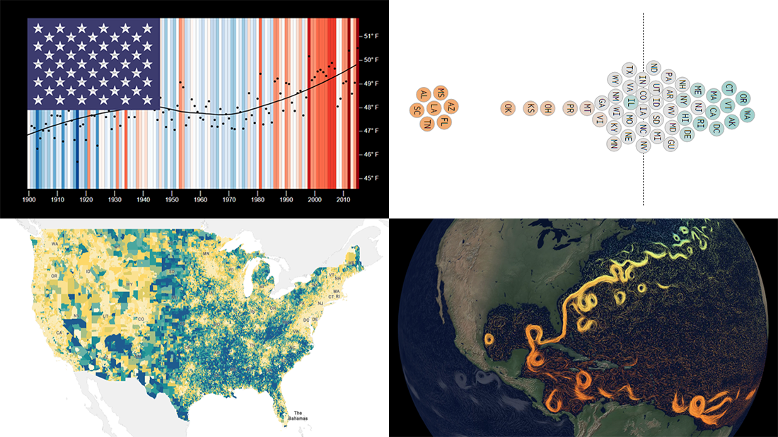
 This week, we’ve found a number of new cool projects that could serve as good examples of robust data visualization. Here are the four ones we like the most. Watch how compelling charts and maps let data speak — join us as we overview these projects today on DataViz Weekly:
- Climate stripes for each U.S. state — Luke Browne, YSE
- Causes and dangers of the Gulf Stream weakening — The New York Times
- Minimum wage change in the U.S. by state since 1968 — Nathan Yau
- Homes worth <$100,000 and >$1,000,000 in the U.S. — Social Explorer
Data Visualization Weekly: February 26, 2021 — March 5, 2021
Climate Stripes for Each U.S. State
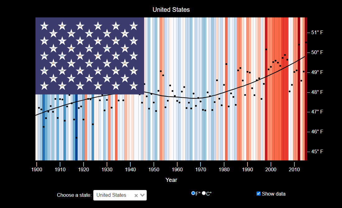
You know the warming stripes. Introduced in 2018 by Ed Hawkins, a climate science professor at the University of Reading, this way of visualizing temperature trends through a set of year-specific colored stripes became widely known after the public launch of his website #ShowYourStripes with a lot of such graphics for the entire world in June 2019 — of course, it was featured on DataViz Weekly right away.
Inspired by the original warming stripe graphics, Luke Browne, a postdoc associate at the Yale School of the Environment (YSE), created his own project called Stars and Climate Stripes. As the name suggests — the Stars and Stripes is a nickname of the American flag — it represents air temperature data for the United States. The visualization here actually resembles the flag.
Choose a state from the dropdown menu or click on the corresponding star on the “flag” and explore the change of the average yearly temperature there over the past century. Check the box “Show data” to plot the data as a graph on top of the climate stripes.
Causes and Dangers of Gulf Stream Weakening
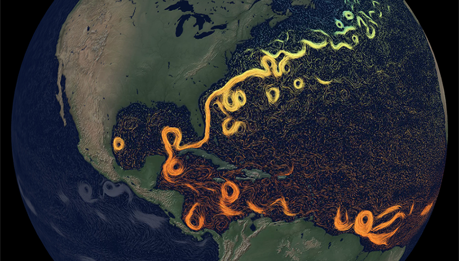
Climate data visualization projects are frequent guests on DataViz Weekly. Today, we even showcase two. So, after checking out the Stars and Climate Stripes project, go see a new impressive visual story from The New York Times that is also about climate change.
Created by Jeremy White and Moises Velasquez-Manoff, the piece provides a stunning explanation of how the Gulf Stream works, shaping climate on a total of four continents, and why the weakening of its northern arm due to the melting Greenland ice makes scientists fear about the planet’s future.
Start scrolling to overview and look into the network of the Atlantic ocean currents, from both above and underwater. You’ll be able to learn where the “cold blob” is, what has caused it, and why it actually is a big deal.
Minimum Wage Change by State Since 1968
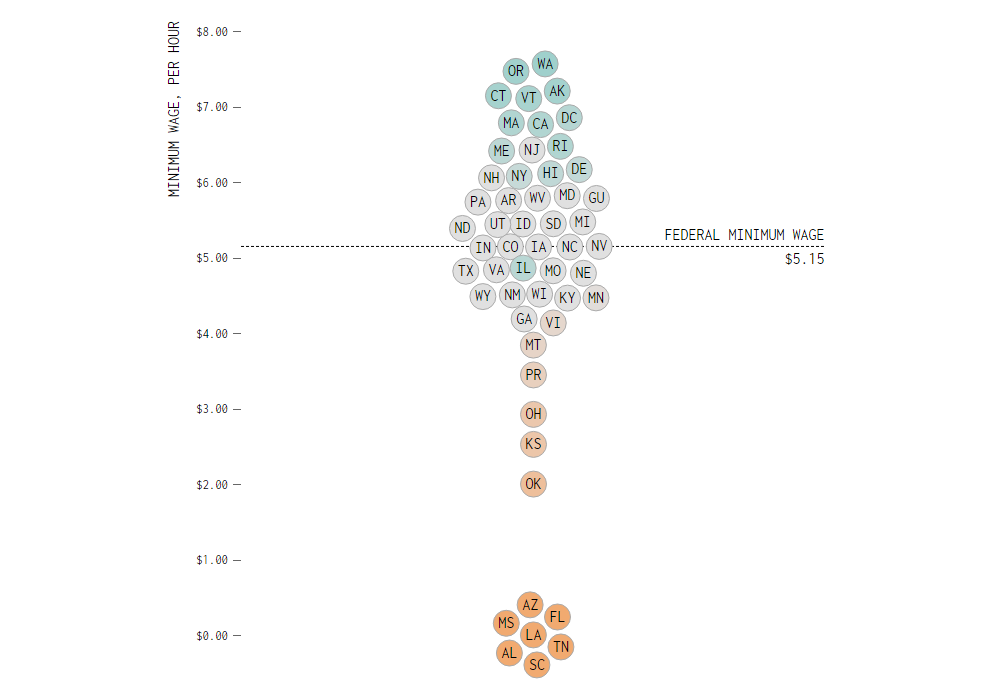
While debates about the $15-an-hour minimum wage initiative continue, you could be interested to check out the historical minimum wage data to see how it has changed over time. But the thing is, although the minimum wage has grown, not all states have followed the shifts of the federal minimum.
To explore the changes by state, Nathan Yau, an expert in statistics and data visualization, created a cool animated beeswarm graphic. It represents the minimum per hour rates in each state since 1968 based on data from the U.S. Department of Labor.
Play the animation and see how the state bubbles fly up and down the axis, visualizing the minimum wage shifts by state. For a closer look at a certain year, just press the pause button.
Houses Worth <$100,000 and >$1,000,000 in U.S.
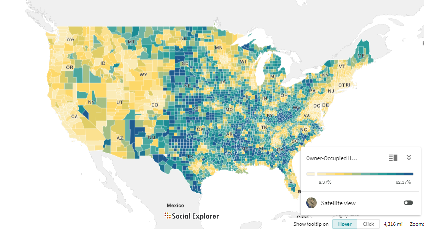
According to the National Association of Realtors (NAR), in the fourth quarter of 2020, the median price of a single-family house in the United States was $315,000. Basically, the days when you could buy a starter home in America for a 5-figure sum have not gone yet. But such offers are really becoming more and more difficult to find.
No fretting, however, as almost 20% of U.S. homes still cost less than $100,000, according to Social Explorer’s analysis of the American Community Survey 5-Year data (2009-2019). There are even places around the country where 5-figure houses are most popular. Social Explorer visualized the ACS data about owner-occupied housing units of less than $100,000 in an interactive map. So, now it is possible to explore these statistics in a convenient visual form where you can choose between multiple series to display, click on the legend items to filter the view by percentage range, and see details in the tooltip.
There is also another cool recent choropleth map on the Social Explorer website, which you might be interested to look at right after this one: 7-figure homes! Find out where million-dollar housing units are most (and less) common.
***
Thank you for the attention to our blog and Data Visualization Weekly in particular. Stay tuned for great charts, maps, and infographics.
- Categories: Data Visualization Weekly
- No Comments »