 Look at some of the most interesting data visualizations we have come across out there over the last few days! The following projects are deservedly featured in DataViz Weekly this time:
- Falling spin rates in American baseball after a crackdown on sticky substances — The Upshot
- Gender diversity in Italian street names — EDJNet
- Shifts in the COVID-19 vaccination pace worldwide since January 2021 — Reuters
- Vaccination equity in America — CDC
Data Visualization Weekly: July 16, 2021 — July 23, 2021
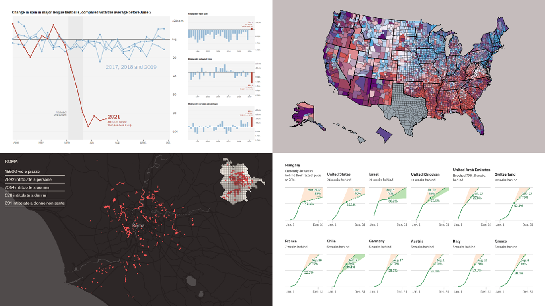
Falling Spin Rates in American Baseball After Sticky Substance Crackdown
A fight against sticky substances in American professional baseball is likely to bear fruit.
In case you missed it, the rule prohibiting the use of any foreign materials that let pitchers grip the ball better and therefore spin it faster has been in effect since the 1920s. But teams and officials have routinely ignored it, which resulted in all the more strikeouts and no-hitters making games less spectacular.
Finally, last month, the Major League of Baseball (MLB) began to apply what was called “enhanced enforcement procedures” aiming to put an end to that practice. The effects of the ban’s stricter enforcement can be clearly learned about from The Upshot’s charts published on Monday this week. They display over-time changes in the average fastball spin rates, as well as in the number of no-hitters, walks, strikeouts, and on-base percentages.
What can be especially interesting for many is the opportunity to see individual charts visualizing every pitcher’s spin rate statistics, starting from those with the biggest decreases.
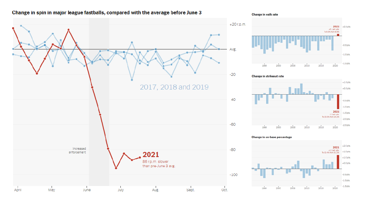
Gender Diversity in Italian Street Names
In 21 capitals of the regions and autonomous provinces of Italy, there is a total of 24,572 streets named after a person. 22,946 of them, or nearly 93.4%, are named after males and only 1,626, or nearly 6.6%, after females (mostly saints). This kind of gender inequality can be noticed in each of these major Italian cities, and you can see it at a glance in Mapping Diversity.
Mapping Diversity is an impressive project created by OBC Transeurope and Sheldon.studio for the European Data Journalism Network (EDJNet). It allows everyone to take a close look at the toponymy of the streets of Ancona, Aosta, Bari, Bologna, Bolzano, Cagliari, Campobasso, Catanzaro, Florence, Genoa, L’Aquila, Milan, Naples, Palermo, Perugia, Potenza, Rome, Turin, Trento, Trieste, and Venice from the point of view of gender equity. There, you will be able to see how many streets are named after males and females in each of these cities, as well as find out who were those women that deserved a street name.
The project features beautiful maps making it easy to explore the data collected within the framework of this research. You can learn more about the methodology and how the visualizations were built here.
Shifts in Vaccination Pace Worldwide Since January 2021
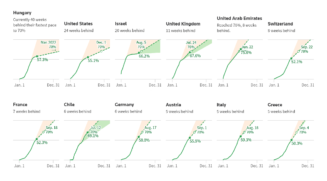
In early 2021, the COVID-19 vaccination campaign in Israel went on a pace that would allow the country to have 70% of its population inoculated by the middle of March. However, in a couple of months after its beginning, the campaign slowed down to a plateau. Then the more infectious Delta variant caused a new push and the daily vaccination rate began to grow again, with Israel now being on track to reach 70% vaccinated by early August.
Similar shifts have taken place in other places around the world. Reuters visualized the rate of vaccinations in 23 countries (including Israel), those where at least half of the five million minimum population have received at least one dose. The larger the pink fill area, the slower the pace compared to the initial one. The larger the green fill area, the sharper the pickup.
In addition, the article has charts that represent the share of sequenced samples identified as the Alpha, Beta, Gamma, Delta, and other variants over time since January 1, 2021, by continent, which show how Delta is turning dominant almost everywhere. There is also a graphic displaying the decline of vaccine skepticism all over the globe.
COVID-19 Vaccination Equity in America
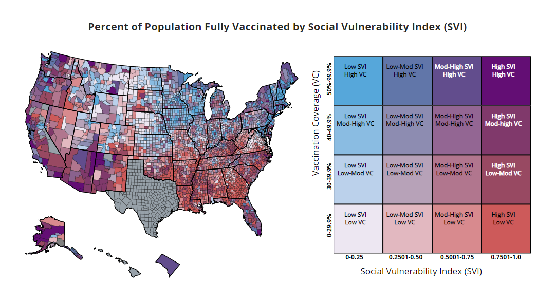
Here is another interesting project on the topic of vaccination rollout. The COVID Data Tracker on the website of the Centers for Disease Control and Prevention (CDC) now has a new feature which measures vaccination equity across the United States.
Essentially it is a bivariate choropleth map that visualizes the COVID-19 vaccination coverage along with social vulnerability at the county level. The social vulnerability here is represented by the CDC Social Vulnerability Index (SVI), a measure of a community’s ability to respond to disasters and disease outbreaks based on U.S. Census data on poverty, housing, as well as vehicle access in the corresponding territories.
The methodology and data sources are described in the footnotes. CDC says more information and features are coming up.
***
Thank you for your interest. Stay tuned for Data Visualization Weekly.
- Categories: Data Visualization Weekly
- No Comments »