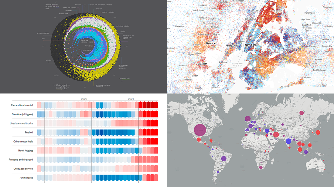
 Are you ready for another set of excellent data graphics examples? It’s time! The following projects made it to the newest DataViz Weekly digest — see the list below and keep reading for a closer look!
- Average weekday in the life of Americans — Nathan Yau
- Race and ethnicity across the United States — CNN
- Inflation in the United States — NYT Opinion
- COVID-19 spread across the world over time — Olivia Jack
Data Visualization Weekly: August 20, 2021 — August 27, 2021
Average Weekday in American Life
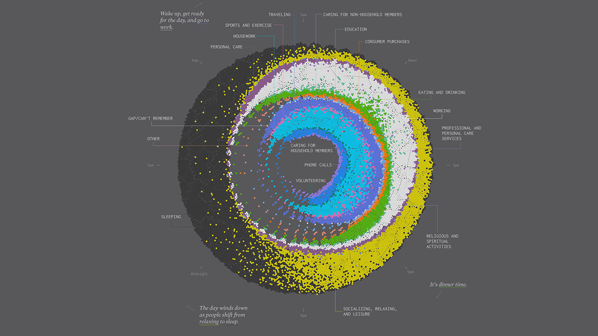
Nathan Yau, an expert in data visualization whose works are deservedly often featured in DataViz Weekly, has an obvious interest in time use research. Following the recent release of data from the 2020 American Time Use Survey (ATUS), an annual study of how the United States people spend their time carried out by the U.S. Census Bureau for the U.S. Bureau of Labor Statistics (BLS), he already made several interesting charts. Here is a brand new one that we could not help admiring.
It is Cycle of Many, a twenty-four-hour snapshot for a weekday in the life of people in America. The visualization consists of several colored rings representing different activities. The more people are doing a certain activity at a certain time, the more dots of that color are displayed for that time. If you feel a bit lost once you have opened it, just begin by looking at the very top of the circle. That is 9:00 a.m. and many people are already busy working. Go clockwise to see how the flows change over the course of the average day.
Lunch, dinner, afterwork relaxing, and sleeping can be recognized especially quickly. Jump in to see what else you can notice.
Race and Ethnicity Across United States
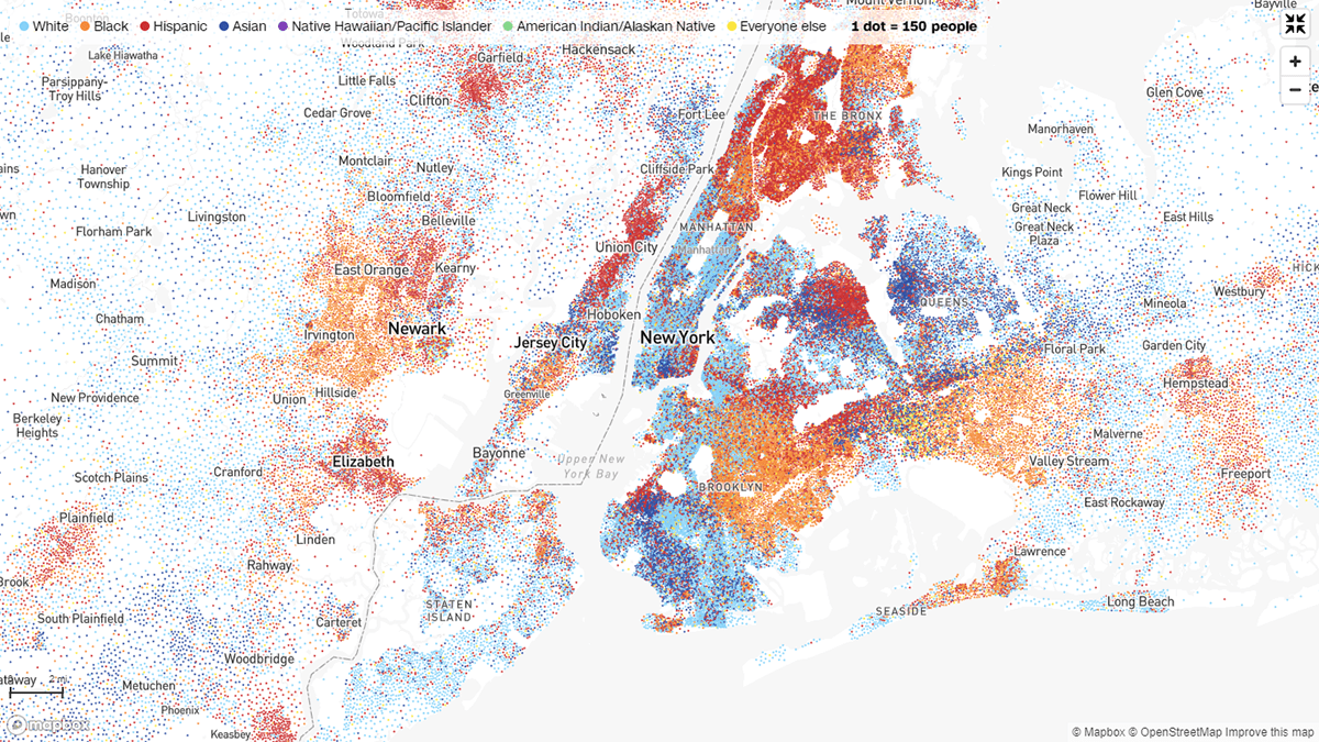
According to the results of the 2020 Census, another large-scale research delayed due to the pandemic and finalized by the U.S. Census Bureau only about now, the United States of America is currently more diverse than it has ever been before. To get a bird’s-eye view of race and ethnicity across the country, CNN’s John Keefe, Daniel Wolfe, and Sergio Hernandez plotted the newest data on group and density in a cool dot map.
The color of the dots visualizes race or ethnicity. Depending on your current zoom level, each dot represents 900, 300, or 150 people that belong to the respective group within a particular census tract. In each tract, dots are mapped randomly and do not show any precise location.
Explore the current racial makeup along with population density across the U.S. Use the search bar to look at a certain area.
Inflation in United States
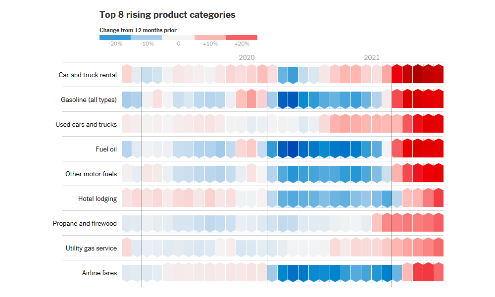
There has been a lot of talk about inflation fears these days in America. But maybe the situation is not worth worrying about too much in reality. Josh Bivens, the director of research at the Economic Policy Institute, and Stuart A. Thompson, a graphics editor at the New York Times Opinion Section, published a story explaining why there is probably no need to panic about inflation in the U.S. right now.
The piece includes interesting visualizations that look like custom-made heat map charts. They clearly represent how the price of a particular good or service changed each month compared to one year prior, representing data from the U.S. Bureau of Labor Statistics (BLS). Products are sorted in descending order of their price increase rates. First, the 152 categories with rising prices are shown. Then go the 27 products whose prices are flat or decreasing.
The gradient red-to-blue color scale makes it easy to understand price changes. Check out the charts and learn more from the text if you want.
COVID-19 Spread Across World Over Time
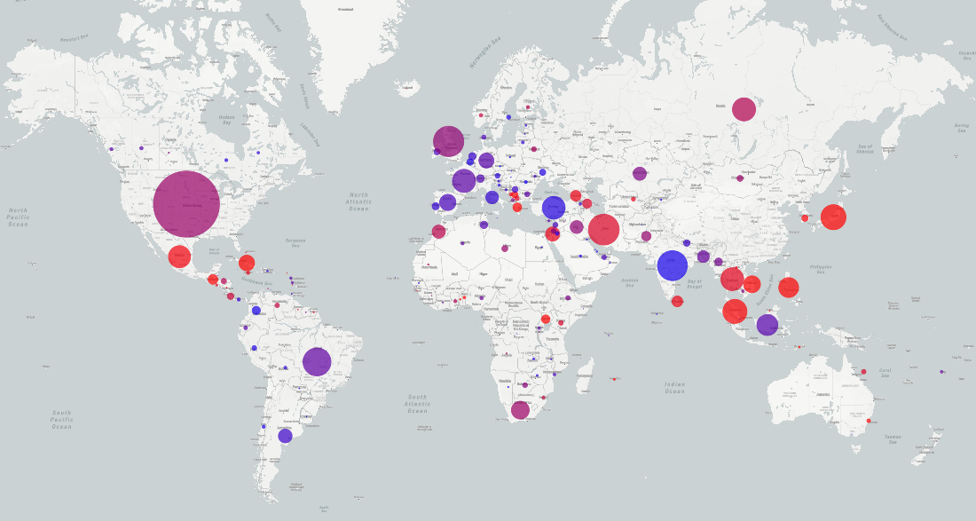
Inspired by the animations created last year by Hiroki Sayama, the director of the Center for Collective Dynamics of Complex Systems at Binghamton University, Olivia Jack from the Department of Biology at the Humboldt University of Berlin made an awesome interactive visualization mapping the spread of the COVID-19 pandemic worldwide over time since January 2020.
The graphic is based on data from Johns Hopkins University. Each bubble represents one country. The size of the bubbles is determined by the number of daily new coronavirus cases. The color shows whether the epidemic in a particular country is on the rise. The visualization is updated on a continuous basis as new data arrives.
This project is part of a collection of COVID-19 data visualizations built by the Research on Complex Systems (ROCS) team, which is now available online.
***
Thank you for your interest! Stay tuned for great data visualization examples from around the web, in DataViz Weekly!
- Categories: Data Visualization Weekly
- No Comments »