Visualizing Data on AI Content, Press Freedom, Pet Boom, and Divorce — DataViz Weekly
May 8th, 2026 by AnyChart Team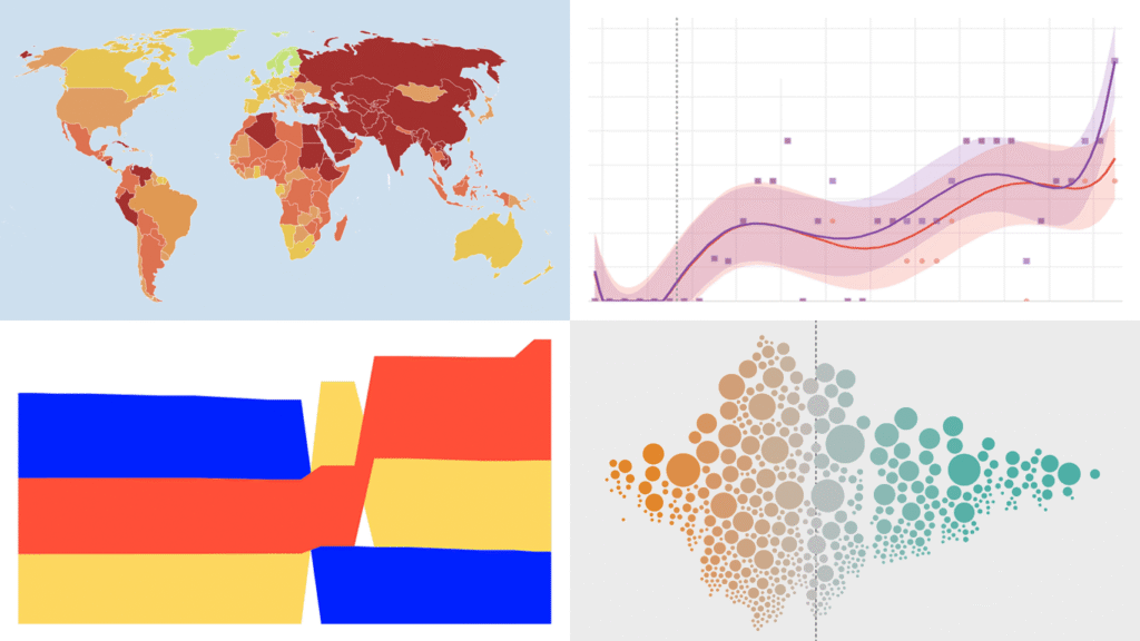
Data visualization does not take weeks off. We track charts and maps as they appear across the web and bring the most compelling finds together in DataViz Weekly. Our picks for this edition:
- AI-generated content on the web — Jonas Dolezal, Sawood Alam, Mark Graham, and Maty Bohacek
- Divorce rates by job — Nathan Yau
- Global press freedom at a 25-year low — Reporters Without Borders
- Italy’s pet boom — Il Sole 24 Ore
- Categories: Data Visualization Weekly
- No Comments »
More Great Charts and Maps to See — DataViz Weekly
April 24th, 2026 by AnyChart Team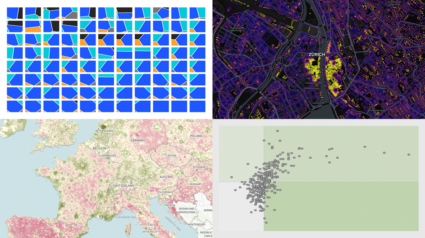
There is always more to see when it comes to great charts and maps. Welcome to DataViz Weekly, where we put a spotlight on notable data visualizations as they come out around the web. Here are the projects that made the cut this time:
- Tehran strike damage by land use — Bloomberg
- Six decades of population change in Europe — Correctiv
- Job stability across occupations in the United States — Nathan Yau
- Buildings by proximity to roads — Benjamin Lozes
- Categories: Data Visualization Weekly
- No Comments »
Best Data Visualizations of 2025 — DataViz Weekly
January 9th, 2026 by AnyChart Team In 2025, data visualization kept proving its value as a practical way to work through complexity without losing the thread. From conflict and humanitarian crises to climate risks, technology, culture, and long-running social trends, charts and maps helped people see structure, scale, and change more clearly.
This special edition of DataViz Weekly brings together the best data visualizations of 2025 as selected in major year-end picks. It features selections from FlowingData, GIJN, The Pudding, and Datawrapper, followed by a set of newsroom year-in-graphics roundups for more storytelling standouts from across the year.
- Categories: Data Visualization Weekly
- No Comments »
Data Visualization Work That Just Hit Our Radar — DataViz Weekly
December 5th, 2025 by AnyChart Team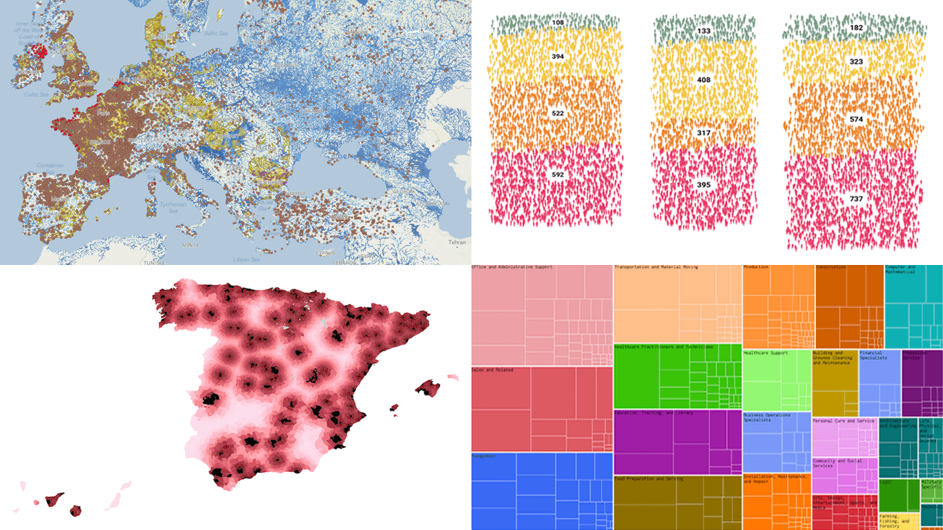 We continue our regular DataViz Weekly feature, where we curate the most interesting data visualization work we have come across over the past few days. Here is what made it into this edition:
- Michelin star restaurants in Spain — Colpisa
- Occupations with higher pay (than yours) — FlowingData
- Landfills across Europe — Investigate Europe & Watershed Investigations
- Catastrophic residential fire in Hong Kong — SCMP
- Categories: Data Visualization Weekly
- No Comments »
Recent Data Visualization Highlights — DataViz Weekly
October 17th, 2025 by AnyChart Team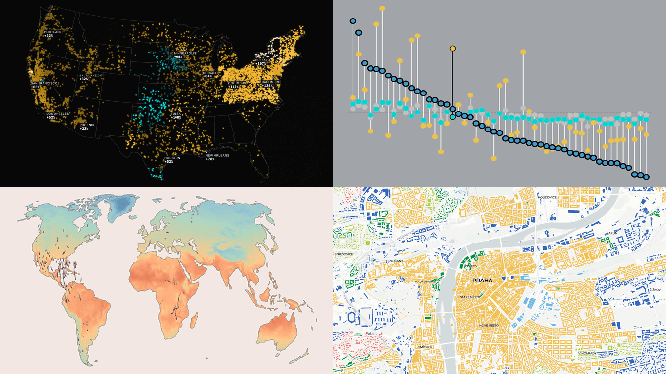 Welcome back to DataViz Weekly, where we regularly observe how visualization helps bring data to life. This time, we invite you to take a look at the following projects that we have recently found particularly interesting:
- Bird journeys amid global warming — The Guardian
- Living costs across the United States — FlowingData
- Electricity prices across the U.S. in the AI era — The Big Take
- Urban patterns in Europe — Urban Taxonomy
- Categories: Data Visualization Weekly
- No Comments »
When Data Becomes Visual Insight — DataViz Weekly
September 12th, 2025 by AnyChart Team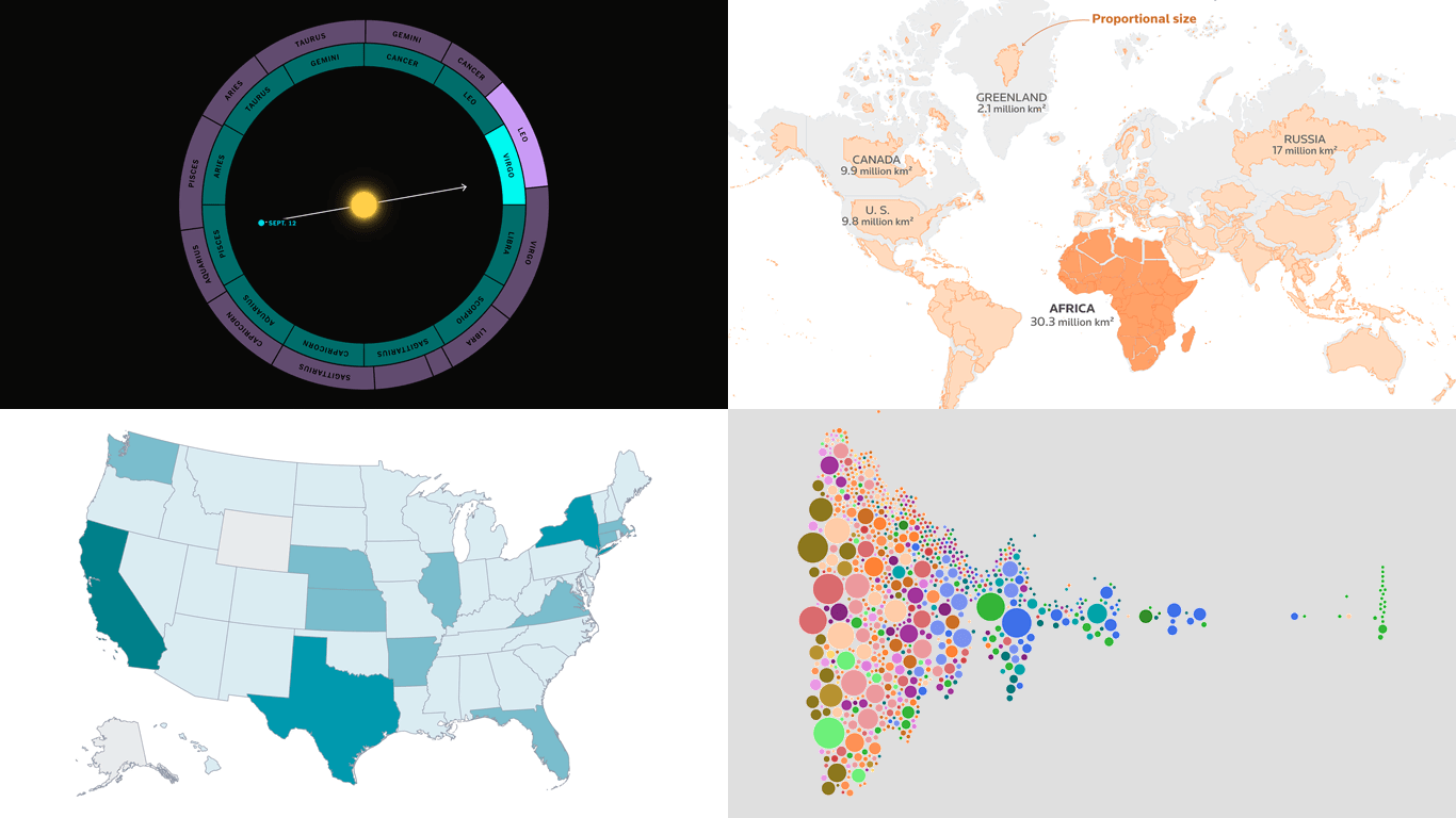 Numbers often stay abstract until they are put into form. Visuals can help reveal what is hidden in plain figures, generating insight and bringing meaning to the surface. In this edition of DataViz Weekly, we offer a quick look at four recent projects that turn data into something we, humans, can truly see and grasp more clearly.
- Pay across occupations — FlowingData
- Billionaires in America — WSJ
- Africa’s real size — Reuters
- Zodiac signs out of sync — The Upshot
- Categories: Data Visualization Weekly
- No Comments »
Best Data Visualizations of 2024 — DataViz Weekly
January 17th, 2025 by AnyChart Team In 2024, data visualization remained a vital tool for exploring complex topics and presenting insights in engaging ways. From global conflicts and environmental challenges to cultural phenomena and historical trends, charts and maps provided valuable perspectives and captivated audiences.
This special edition of DataViz Weekly highlights the best data visualizations of 2024. Featuring projects selected by FlowingData, The Pudding, and the Global Investigative Journalism Network (GIJN), as well as year-in-review collections from leading media sources, it offers a curated look at some of the most compelling visual storytelling created during the year. All aboard!
- Categories: Data Visualization Weekly
- No Comments »
Top Data Visualizations We’ve Recently Seen — DataViz Weekly
October 18th, 2024 by AnyChart Team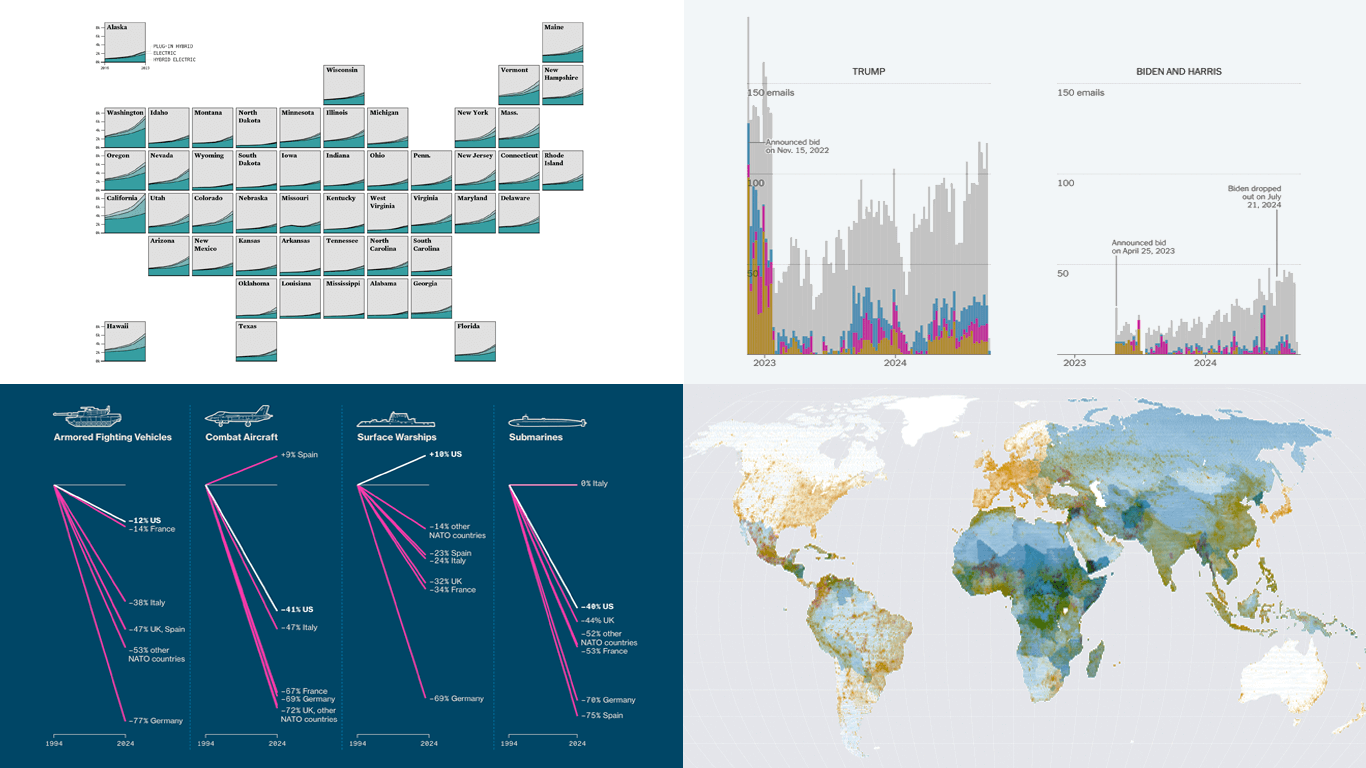 It’s Friday, which means it’s the perfect moment to look back at the data visualizations that have sparked our curiosity over the past few days. So, without further ado, welcome to DataViz Weekly!
- Electric vehicle adoption across the United States — FlowingData
- Europe’s military reductions and defense challenges — Bloomberg
- Climate—Conflict—Vulnerability Index for global risk assessment — UniBw München, PIK, AA, Truth & Beauty
- Campaign emails with donation incentives in the 2024 U.S. presidential race — The New York Times
- Categories: Data Visualization Weekly
- No Comments »
Fresh Charts and Maps You Need to See — DataViz Weekly
August 2nd, 2024 by AnyChart Team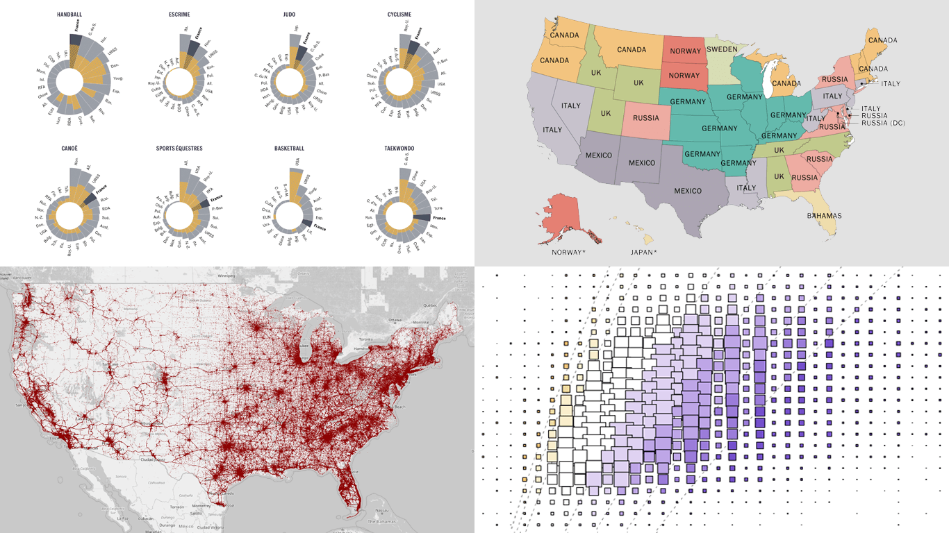 Greetings from DataViz Weekly, a feature on our blog dedicated to exploring the power of charts and maps in uncovering and communicating data. As visual creatures, humans understand and engage with information more effectively when it’s presented in graphical form. Our series focuses on highlighting outstanding and fresh data visualizations that have captured our attention. Today, we’ll showcase these great projects:
- Olympic performances since 1948 with focus on France — Le Monde
- U.S. immigrant origins and settlements in 1850–2022 — Pew Research Center
- Body mass index in the United States — FlowingData
- Traffic fatalities in the U.S. in 2001–2022 — Roadway Report
- Categories: Data Visualization Weekly
- No Comments »
Visualizing Forecast Accuracy, College Admissions, Global Demographics, and Election Results — DataViz Weekly
July 12th, 2024 by AnyChart Team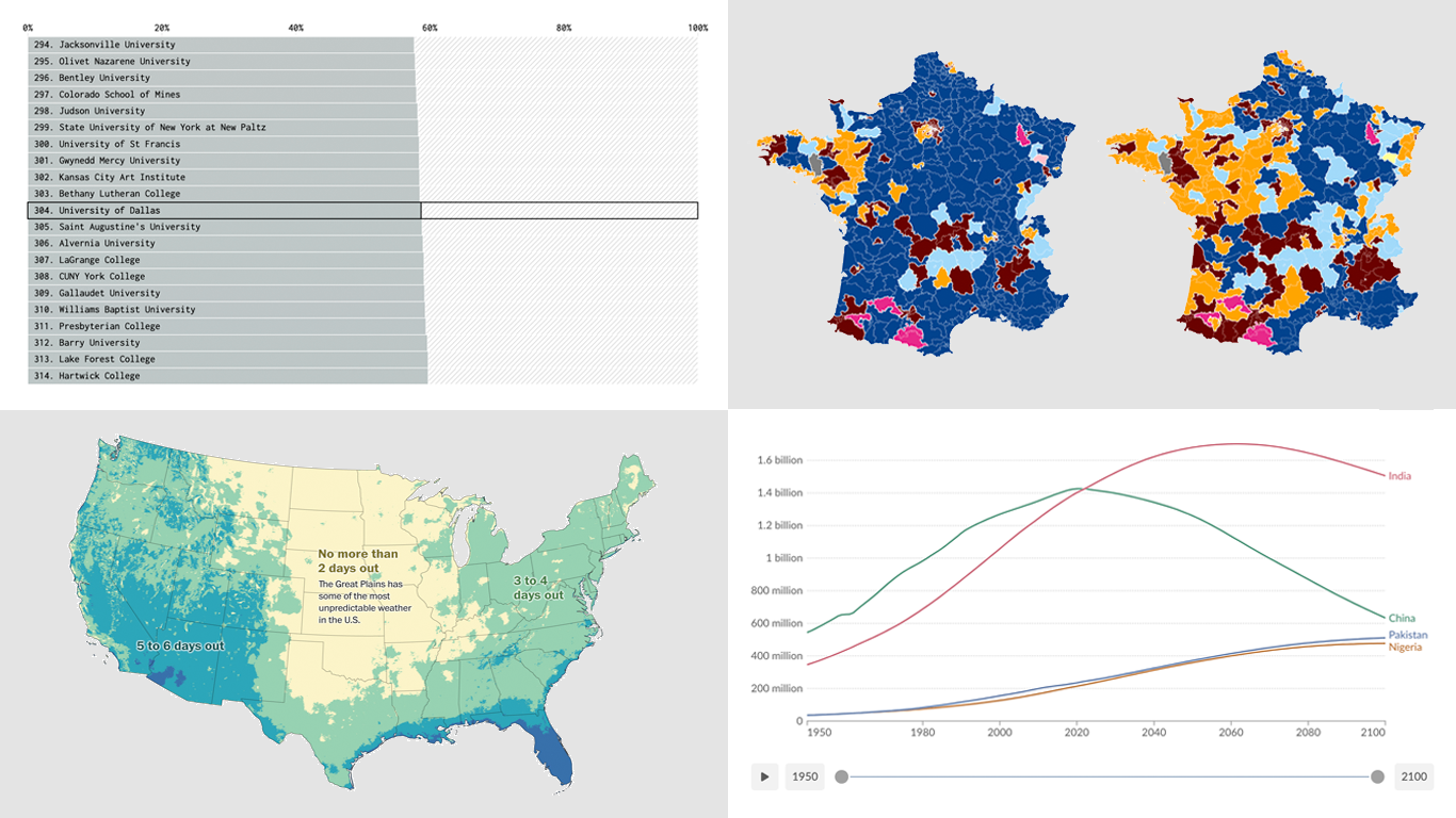 Ready for a fresh dose of impressive data visualizations crafted by seasoned professionals? Here’s what DataViz Weekly has in store for you this time:
- Weather forecast accuracy across the United States — The Washington Post
- U.S. college admission rates — FlowingData
- Global demographic shifts — Our World in Data
- France’s parliamentary election results — Various publications
- Categories: Data Visualization Weekly
- No Comments »