 It’s time for DataViz Weekly! Check out the most interesting data visualizations that have recently come to our attention!
- Political donations from the gambling industry in Australia — ABC News
- Land cover worldwide — ESA
- Gender bias in the workplace — NYT Opinion
- World’s carbon “center of gravity” from 1800 through 2020 — The Guardian
Data Visualization Weekly: October 15, 2021 — October 22, 2021
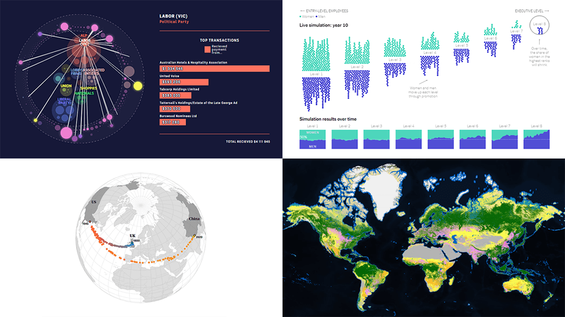
Political Donations from Gambling Industry in Australia
During the last twenty-two years, thousands of donations have been poured into the political system of Australia by organizations and people related to the gambling industry. Together they are worth a total of over $81 million, at least twice as much as was previously known.
That is what Inga Ting, Nathanael Scott, Alex Palmer, and Michael Workman from ABC’s Digital Story Innovations team found out in a months-long journalistic investigation into gambling-related political payments. The results of their rigorous analysis are now presented in a scrollytelling format using treemaps where each box stands for one such donation.
At the end of the article, you will find an interactive circle packing chart that provides a straightforward way to explore the collected database, showing who among Australian politicians is connected to who in gambling.
Land Cover Worldwide
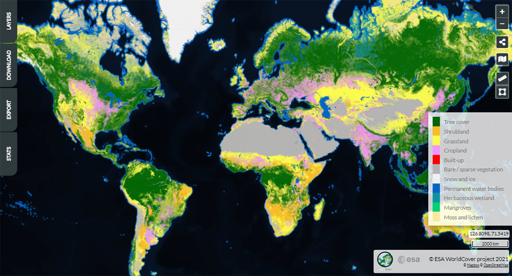
Land use maps are always stunning. Here is a new fascinating project launched just about now. A few days ago, the European Space Agency (ESA) released a freely accessible land cover map for 2020 at 10-meter resolution, for the entire globe.
Based on Copernicus Sentinel 1 and Sentinel 2 satellite imagery, the visualization uses colors to make each of the eleven represented types of land cover easily recognizable. So it is possible to differentiate at a glance between built-up areas, crops, grass, ice and snow, lichen and moss, mangroves, shrubs, trees, (bare) vegetation, water, and wetland. Additionally, don’t miss out on checking out the Statistics tab where you can pick a country — and even a region within — to see a bar chart showing how widespread each land cover class is over there.
The data are open and available for download.
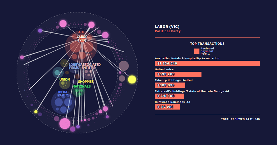
Gender Bias in Workplace
Bias can hardly be a one-time thing. Generally, it is kind of systematic, routine prejudice with a continuous impact. When it comes to gender bias at work, this is nicely shown in a recent study made public this month.
Jessica Nordell, a writer and a journalist, together with Yuhao Du and Kenneth Joseph from the University at Buffalo built computer simulations of promotion cycles in the workplace, demonstrating how even a tiny gender bias at the entry level leads to large disparities in the C-suite. Yarina Serkez, a graphics editor at The New York Times Opinion Section, made it all even more telling with the help of an animated visualization. It greatly displays how much longer and more difficult a women’s path to success is when female performance is undervalued by only 3%.
There are also other interesting charts in the article, and you are more than welcome to check out the study itself.
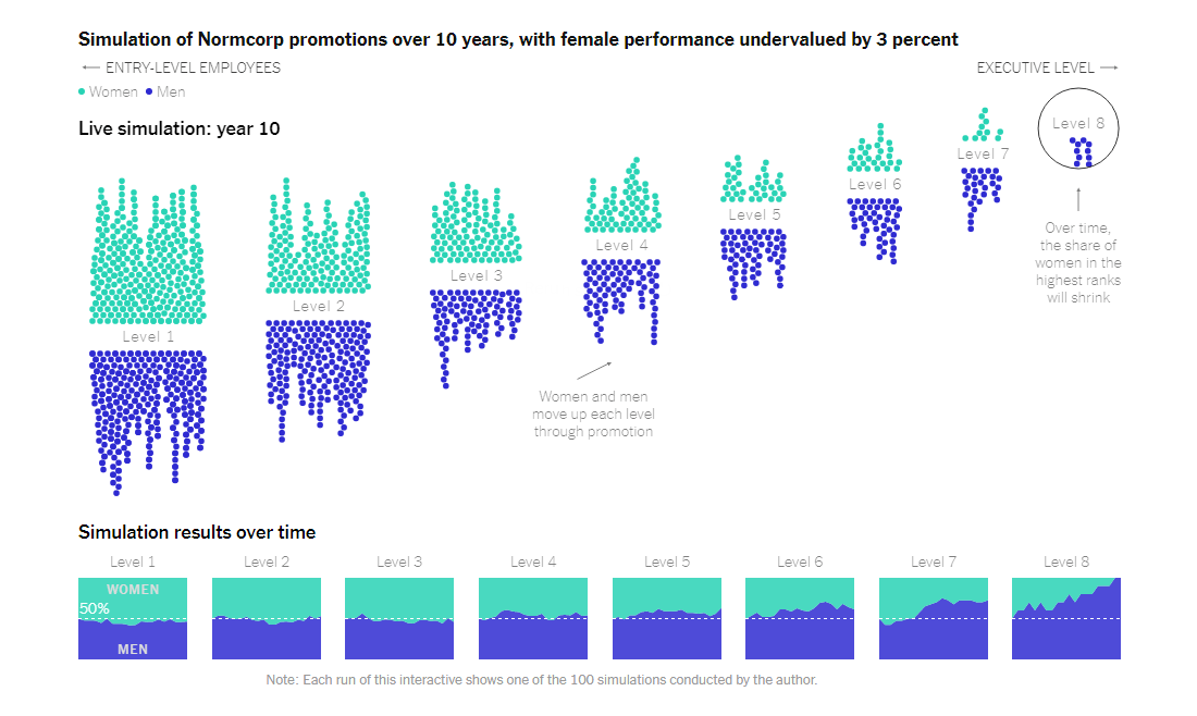
World’s Carbon Center of Gravity in 1800-2020
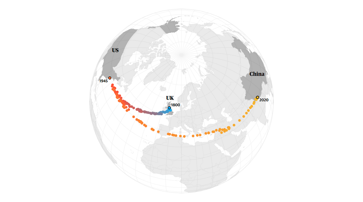
200 years ago, the United Kingdom was the biggest producer of carbon emissions in the world. Then it yielded to the United States. Nowadays, China is the definite leader in this field.
The Guardian’s Niko Kommenda, Niels de Hoog, and Ashley Kirk calculated the CO2 “center of gravity” for each year since 1800 — by taking an average of all countries’ geographic coordinates weighted by the amount of their annual emissions — and visualized its moves over time in an animated map. Currently, this point is situated on the territory of China’s Tibetan plateau.
Look how the geographic center of the global carbon emissions shifted over the two centuries between 1800 and 2020.
***
Great to have you with us! Stay tuned for awesome data visualizations!
- Categories: Data Visualization Weekly
- No Comments »