Demonstrating Power of Clever Data Visualization in 4 Examples — DataViz Weekly
October 15th, 2021 by AnyChart Team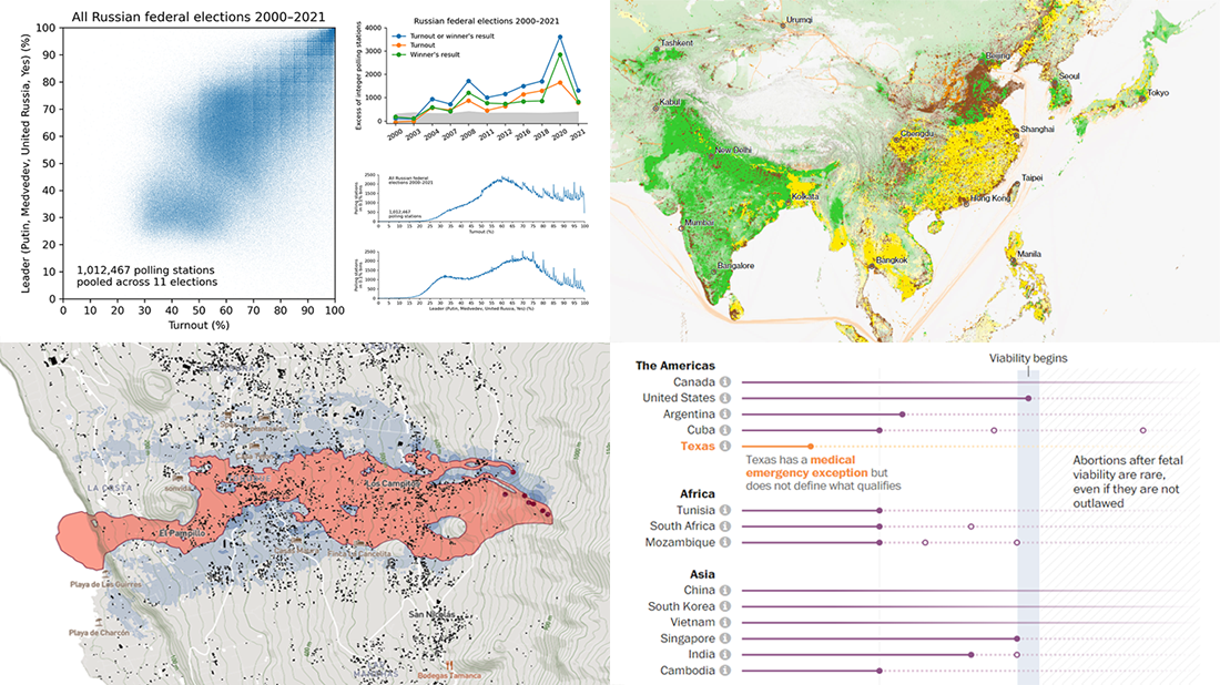 When properly visualized, data can truly speak and tell stories allowing us to quickly decode what raw numbers hide. Would you like to see some clever examples? Look at the awesome new charts and maps that made it to this Friday’s DataViz Weekly!
- All Russian federal elections since 2000 — Dmitry Kobak and Sergey Shpilkin
- Advance of the lava in La Palma — El País
- Abortion laws worldwide — The Washington Post
- Global methane emissions — Bloomberg Green
- Categories: Data Visualization Weekly
- No Comments »
Visualizing Mortality Statistics and Satellite Imagery Data — DataViz Weekly
September 10th, 2021 by AnyChart Team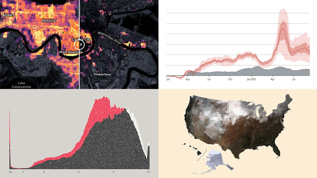 This week, we have come across a number of wonderful new data visualization projects out there. Here are the four that we’ve found most interesting and decided to showcase today in DataViz Weekly. Join us for a quick overview of these works and check them out!
- Black mortality gap in America — The Marshall Project
- Excess deaths worldwide during the COVID-19 pandemic — The Economist
- Ida-caused power outage in New Orleans as seen from space — NASA Earth Observatory
- Average seasonal colors of the United States — Erin Davis
- Categories: Data Visualization Weekly
- No Comments »
New Stunning Charts and Maps in Weekly Roundup — DataViz Weekly
April 30th, 2021 by AnyChart Team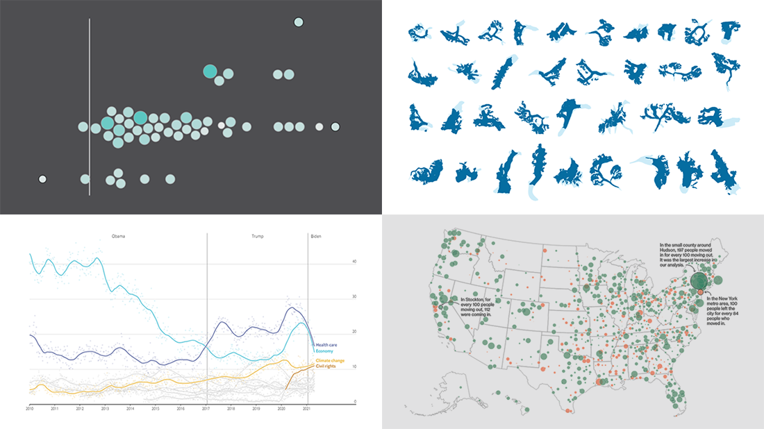 Continuing the series of weekly data visualization roundups, we’re glad to introduce you to our selection of new awesome charts and maps from around the web. Check out our latest picks!
- 2020 U.S. Census results — Nathan Yau
- American public opinion — The Economist
- Migration within the U.S. during the pandemic — Bloomberg CityLab
- Melting glaciers — The Guardian
- Categories: Data Visualization Weekly
- No Comments »
2020 Year in Review in Charts — DataViz Weekly
January 1st, 2021 by AnyChart Team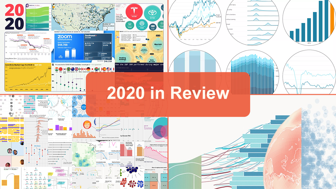 2020 was strange. It was difficult. But it was. Happy New Year everyone! ?
Even though 2020 was not that bad in everything, we all hope, of course, that 2021 will be (much) better. Let it be so! But before we dive into the new one, let’s take a glance back and remember 2020 as is, with the help of great data visualizations.
The January 1st issue of DataViz Weekly invites you to look through the lists of the charts included in the year-in-review features on Visual Capitalist, Recode by Vox, FiveThirtyEight, and The Economist. Sneak a peek, and then check out the graphics.
- Categories: Data Visualization Weekly
- 1 Comment »
20+ Electoral Maps Visualizing 2020 U.S. Presidential Election Results — DataViz Weekly Special Edition
November 6th, 2020 by AnyChart Team All eyes on election maps! Yes, they could be misleading. And even widely misleading. But it can be at least so fascinating to look at them, especially at times like this! So, we have curated a list of over twenty reputable resources — as of now, to be precise, 24 and counting! — where you can watch the live results of the 2020 United States Presidential election in compelling data visualizations. At the same time, it is a great chance for you to investigate and understand how election maps (and some other graphics) can look and work in practice.
? See also: 2024 U.S. Election Maps (November 2024).
Vote counts may be different on different platforms and update as more data becomes available out there — it’s absolutely okay. The election results are still partial. Over the coming days, all numbers will be adjusted to match the real, final vote count. Just in case: We’ve added only reliable sources — notable, reputable media outlets.
Without further ado, check out maybe the most important data visualizations these days! (Electoral vote count numbers in the text last updated on November 9th, 2020, for each source.)
- Categories: Data Visualization Weekly, News, Third-Party Developers
- 3 Comments »
Pre-Election Data in Charts and Analysis — DataViz Weekly
October 30th, 2020 by AnyChart Team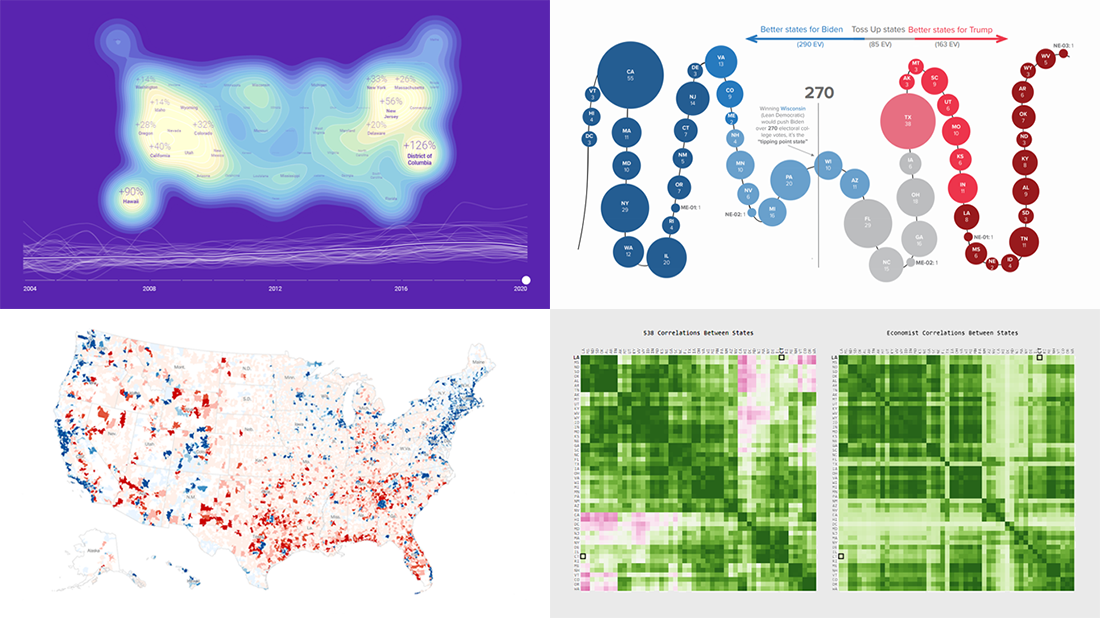 With November 3rd just around the corner, we could not resist the temptation to devote an entire Friday article to the 2020 U.S. election. Indeed, there are many great new data visualization projects on this topic that are worth featuring. Check out some of the most interesting ones in the special pre-election edition of DataViz Weekly:
- Visualizing data about donations to Biden’s and Trump’s campaigns — The New York Times
- Charting the latest Electoral College ratings — The Cook Political Report
- Exploring election forecast correlations — Adam Pearce
- Analyzing search interest in the U.S. election years since 2004 — Truth & Beauty
- Categories: Data Visualization Weekly
- No Comments »
Fresh Examples of Data Visualization Best Practices in Action — DataViz Weekly
October 9th, 2020 by AnyChart Team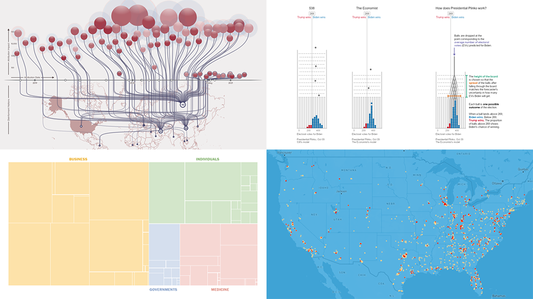 DataViz Weekly is here featuring a selection of new compelling projects with awesome charts and maps. Check out some of the coolest fresh examples of data visualization best practices in action!
- $4 trillion coronavirus bailout under the microscope — The Washington Post
- Presidential Plinko — Matthew Kay, Northwestern University
- Allegations of foreign interference in the 2020 U.S. election — DFRLab
- American streets named after athletes — ESPN
- Categories: Data Visualization Weekly
- No Comments »
Curating New Interesting Data Visualizations Worth Checking Out — DataViz Weekly
July 17th, 2020 by AnyChart Team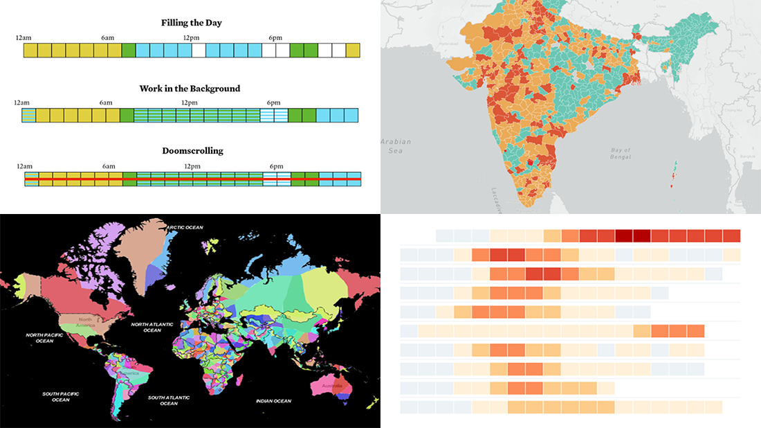 We continue to curate new interesting data visualizations from around the web for our DataViz Weekly blog. Join us as we look at some of the best charts and maps we have seen these days!
- Parenting and Working During Lockdown — Nathan Yau
- Nearest Neighboring Countries — Topi Tjukanov
- Excess Deaths Worldwide — The Economist
- Reopening India from Lockdown — Development Seed and Mapbox
- Categories: Data Visualization Weekly
- No Comments »
Visual Presentations of Data About Jobs, Simpsons, NYC and Journals — DataViz Weekly
June 5th, 2020 by AnyChart Team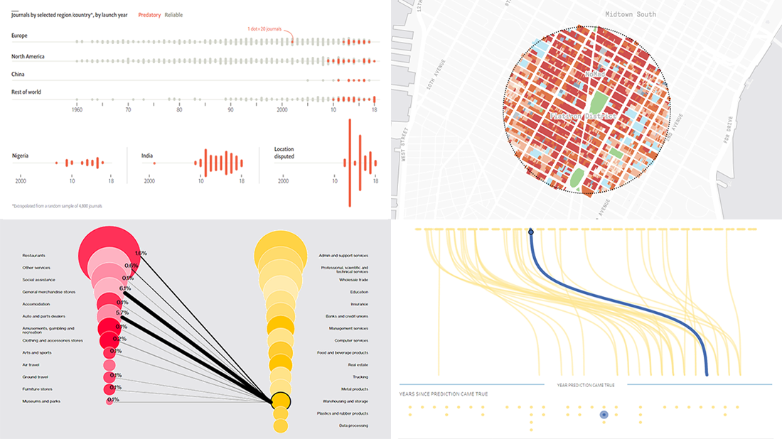 Every week, we meet a number of new visual presentations of data around the web. Then, on Friday, we pick the four most interesting of them to tell you about. The following projects made it to DataViz Weekly this time:
- Job losses in the United States, the second wave — Bloomberg
- Predictions from The Simpsons that came true — Seffana Mohamed-Ajaz
- Morphocode’s city explorer — Morphocode
- Dodgy academic journals — The Economist
- Categories: Data Visualization Weekly
- No Comments »
Creative Visualizations on Climate, Protests, Jobs, and Wildlife — DataViz Weekly
March 27th, 2020 by AnyChart Team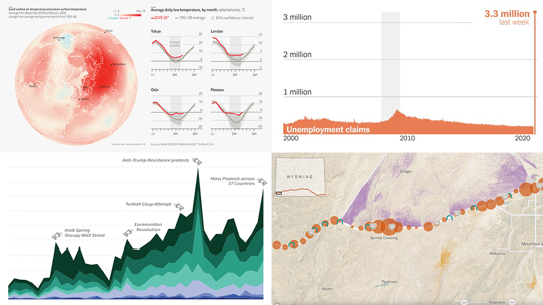 The new issue of DataViz Weekly puts a spotlight on some of the most interesting new creative visualizations from around the Web. Last week, we made a focus on COVID-19 charts. This time, we get along without the coronavirus subject. Well, mostly.
Here is what’s on DataViz Weekly this Friday:
- Winter temperatures in the northern hemisphere — The Economist
- Mass political protests worldwide — Center for Strategic and International Studies
- Spike in joblessness in the United States of America — The New York Times
- Wyoming wildlife corridors — The Washington Post
- Categories: Data Visualization Weekly
- No Comments »