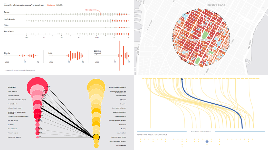
 Every week, we meet a number of new visual presentations of data around the web. Then, on Friday, we pick the four most interesting of them to tell you about. The following projects made it to DataViz Weekly this time:
- Job losses in the United States, the second wave — Bloomberg
- Predictions from The Simpsons that came true — Seffana Mohamed-Ajaz
- Morphocode’s city explorer — Morphocode
- Dodgy academic journals — The Economist
Data Visualization Weekly: May 29, 2020 — June 5, 2020
Second Wave of U.S. Job Cuts
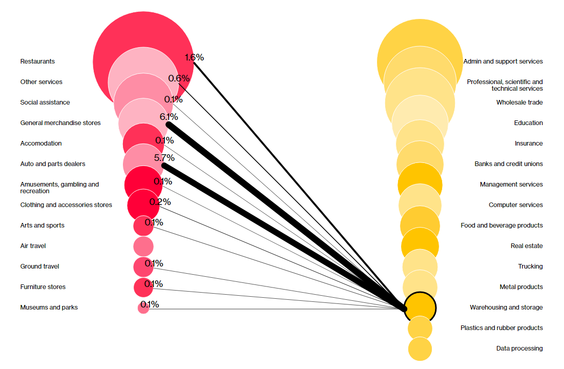
A Bloomberg Economics analysis shows the threat of a second wave of job losses is nothing but real. Industries immediately hit by the lockdowns imposed in response to the COVID-19 pandemic, such as hospitality, restaurants and travel to name a few, will now be followed by connected sectors such as finance, real estate and professional services. Most of the next jobs at risk are higher-skilled, white-collar positions.
For this analysis, Bloomberg’s experts took a look at job cuts by sector and ties between industries. The interactive visualization they made shows the connections at a glance. See exactly what industries are now considered most exposed to the next wave of layoffs in the United States. In total, about six million jobs seem to be on the line.
Simpsons Predictions That Came True
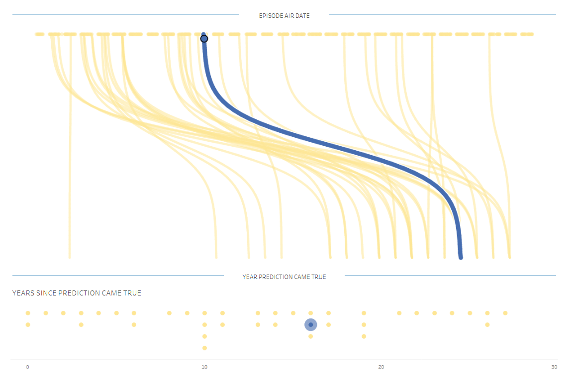
Analytical consultant Seffana Mohamed-Ajaz has recently published an attractive visualization presenting a few dozens of predictions made in The Simpsons that later came true. Using data from her own research reading articles and watching videos, she has charted when the predictions were made and how long it took for them to become the reality.
The prophecies being displayed touch upon various matters. For example, Donald Trump’s presidency, predicted in the “Bart to the Future” episode of the 11th season aired in 2000, came true in 2016. The quickest path between prophecy and fulfillment was as short as several days and belonged to Lisa’s correct pick of the Super Bowl winner in 1992. Next year, the “Marge in Chains” episode featured a sick Asian worker who sneezed on a shipment of juicers and caused an outbreak of the “Osaka Flu”, which can be currently seen as hinting at the novel coronavirus pandemic. Have fun exploring the other predictions: the Ebola outbreak, FIFA corruption, and much more.
Morphocode City Explorer
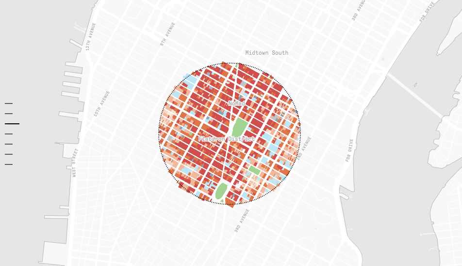
Morphocode, an urban data science firm, launched Morphocode Explorer. It is an awesome visual tool designed to facilitate exploring cities (only NYC is available for now, though). Visualizing a lot of different data, including but not limited to population demographics, land use and transport routes, Morphocode Explorer allows for an insightful analysis and comparison of neighborhoods by key urban indicators.
Start with choosing an area you want to look at through a circle “lens” with the radius of 0.25 to 0.5 miles. Then scroll down the indicators and watch them visualized on the map. Great experience. Can’t wait to see it scaled to the nationwide outlook.
Dodgy Academic Journals
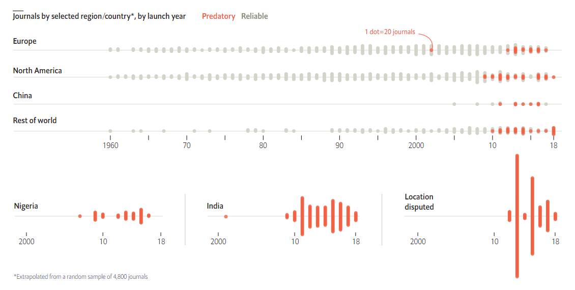
Not all journals are reliable. According to Cabells, an American scholarly services firm famous for its blacklist of deceptive journals called “predatory” (along with its whitelist of reputable ones), there were about a thousand of such sketchy journals ten years ago. Today, they number at least 13 thousands. The Economist published several interesting visualizations of data from Cabells to shed light on the current situation.
Missing archives, no editorial board listed, lack of transparent policies, and promises of rapid publication are only a few of red flags. And most journals in English originating from India and Nigeria have gotten blacklisted. Look at the charts and learn more on The Economist.
***
Enjoy these cool visual presentations. They are great examples of data visualization in action. Stay tuned for more.
- Categories: Data Visualization Weekly
- No Comments »