Interesting New Visualizations on COVID-19, Income, Hockey, and Internet — DataViz Weekly
March 13th, 2020 by AnyChart Team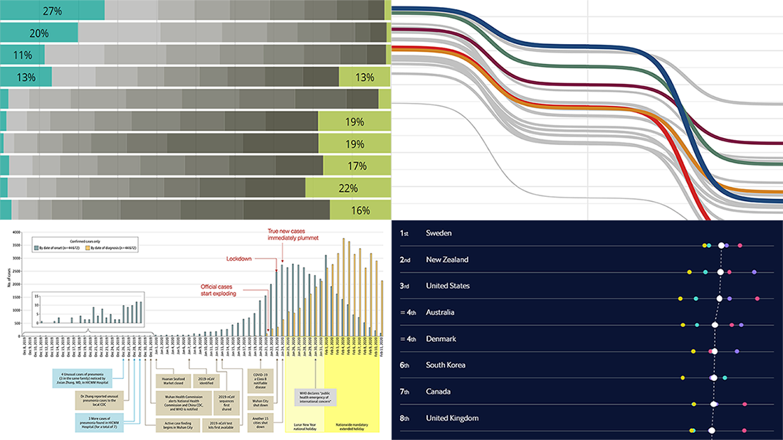 We continue to introduce you to interesting new visualizations from around the Web. These are great illustrations of how data becomes easier to make sense of when it’s represented in the right charts and maps. Check out the new DataViz Weekly article highlighting another four projects:
- Call to action on the novel coronavirus (COVID-19) — Tomas Pueyo
- Income estimates for small areas in England and Wales — ONS
- Hockey goals — Georgios Karamanis
- Inclusive Internet Index 2020 — EIU
- Categories: Data Visualization Weekly
- No Comments »
2019 Year in Charts from World Bank, The Economist, FT, and Business Insider — DataViz Weekly
January 3rd, 2020 by AnyChart Team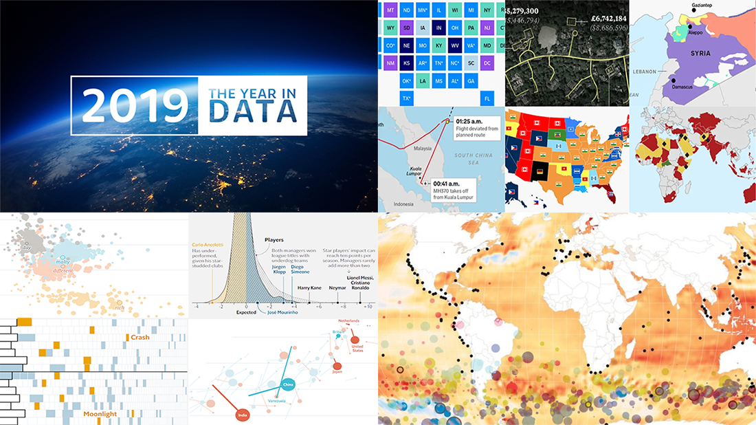 Happy New Year everyone! Now that 2020 is finally here, let’s hold on just one moment to take a look back at 2019. In the first DataViz Weekly post of this new year, we highlight four cool “Year in Charts” stories from the World Bank, The Economist, Financial Times, and Business Insider. Check them out to remember what 2019 was like.
- Categories: Data Visualization Weekly
- 1 Comment »
Readership, NBA, Color, and Christmas Data Visualizations — DataViz Weekly
December 27th, 2019 by AnyChart Team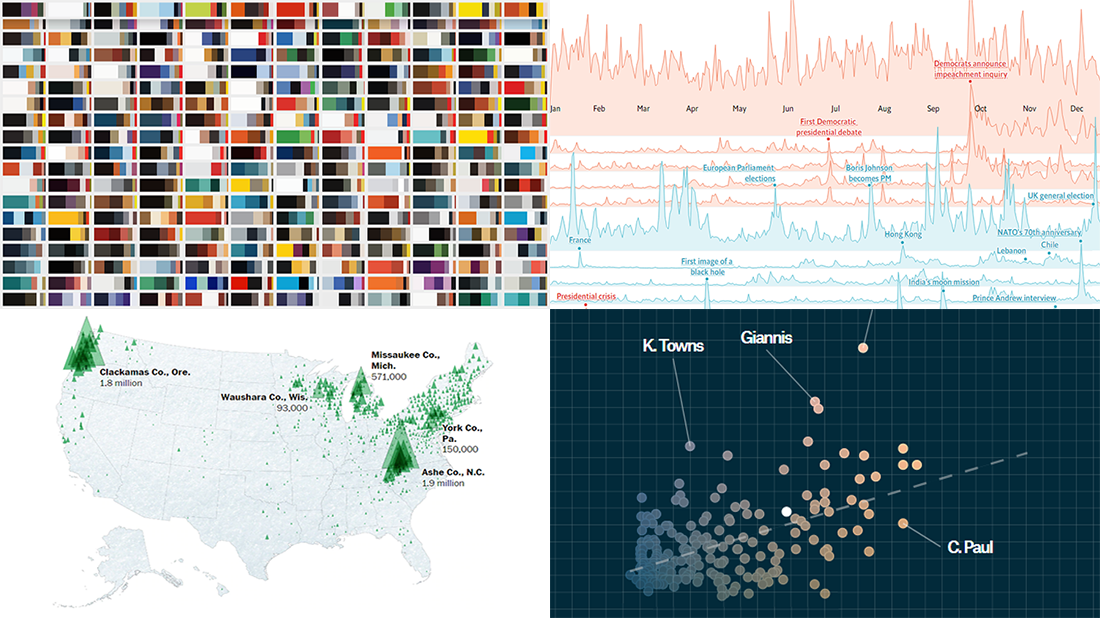 Merry Christmas to all who celebrate it! On the last Friday of 2019, we invite you to check out the year’s last DataViz Weekly article on AnyChart Blog, highlighting some of the most interesting charts published at the end of the year. Of course, we could not help featuring some Christmas data graphics in this festive week. But here you will also learn about projects with cool charts on other subjects. Here’s a list of what the data visualizations shown in today’s DataViz Weekly are about:
- Where American Christmas trees come from — The Washington Post
- Top news stories of 2019 by readership — The Economist
- NBA players’ performance against pay — The Pudding
- Colors on Scientific American’s covers over 175 years of the magazine’s life — Scientific American
- Categories: Data Visualization Weekly
- No Comments »
Trump Tweets, Big Mac Index, California Wildfires, Mid-Range Shots in NBA — DataViz Weekly
January 18th, 2019 by AnyChart Team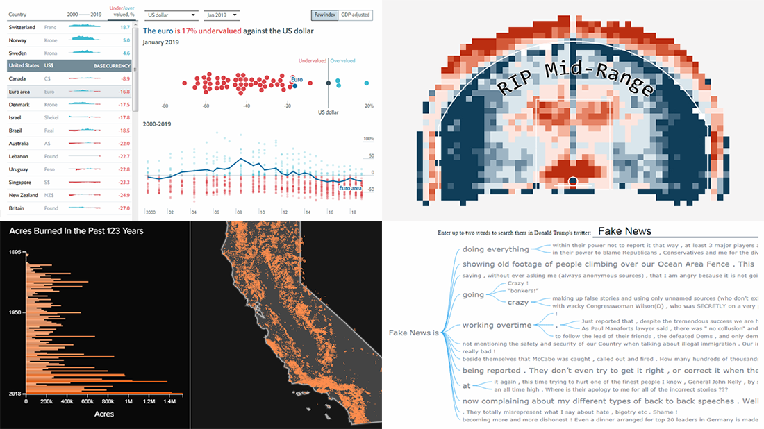 Take a look at some of the cool data visualization examples that appeared on the web just recently! The new article in the DataViz Weekly series features interesting, inspiring projects about words in Trump tweets, destiny of mid-range shots in NBA games, relative value of the world currencies according to the latest Big Mac Index data, and 100+ years of wildfires in California. Also, don’t miss out on an exciting news in the concluding part.
- Categories: Data Visualization Weekly
- No Comments »
Best Data Visualizations of 2018 — DataViz Weekly
December 28th, 2018 by AnyChart Team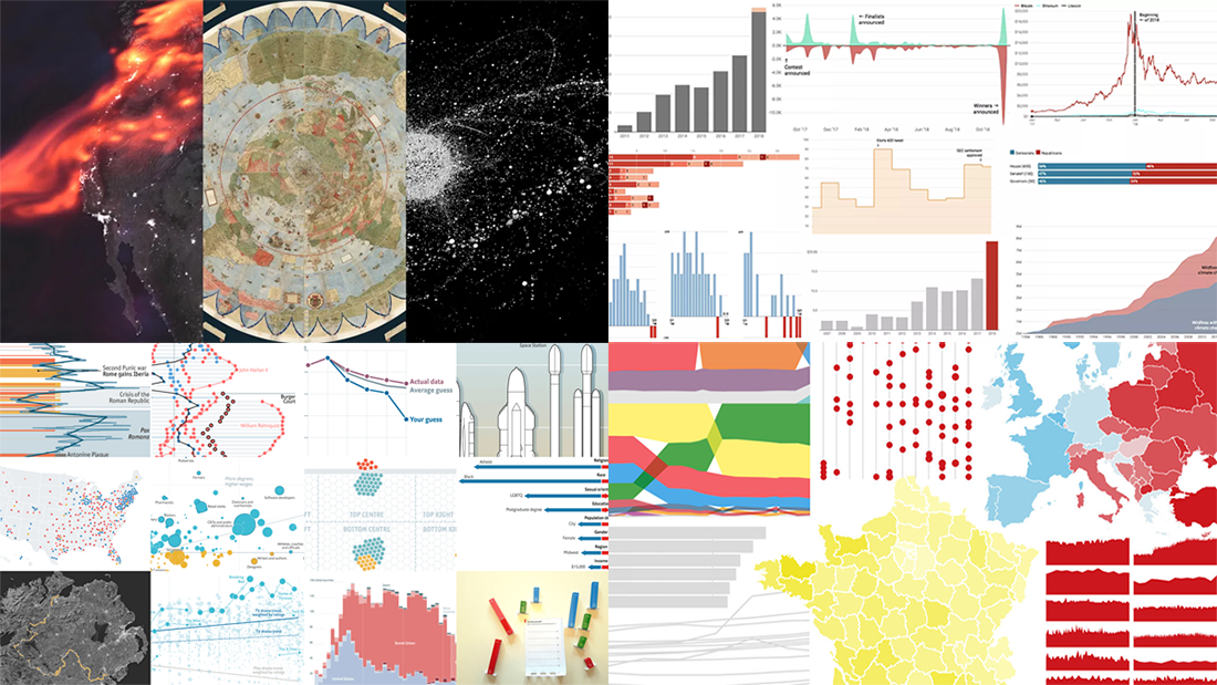 The last days of 2018 are a great time to look back at these 12 months. The year’s final issue of DataViz Weekly is here to familiarize you with four cool selections of the best data visualizations that show the picture of 2018, curated by four major media outlets: POLITICO, Recode, The Economist, and Fast Company. Take a quick look at the lists and check out the charts.
- Categories: Data Visualization Weekly
- 3 Comments »
Visualizing Data About Occupations, Airfares, Patents, and Porn — DataViz Weekly
December 14th, 2018 by AnyChart Team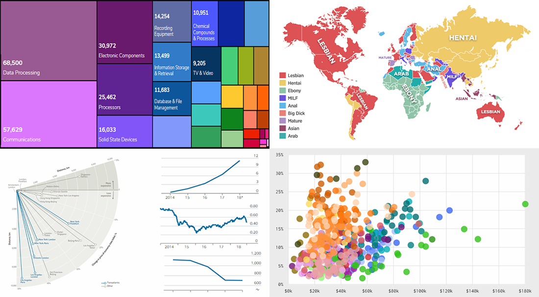 DataViz Weekly is here to tell you about new web projects and articles that feature interesting data graphics. This time, we showcase charts and infographics visualizing data about occupations of single earners in couple households in America, companies winning patent wars, change in air ticket prices globally, and Pornhub trends in 2018.
- Categories: Data Visualization Weekly
- No Comments »
New DataViz About Dating, TV Shows, Populists, and School Safety — DataViz Weekly
November 30th, 2018 by AnyChart Team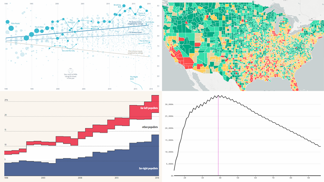 Data visualization is a wonderful way to represent data for intuitive, insightful exploration. The following new dataviz works we’ve found are actually good examples to prove this point.
Today on Data Visualization Weekly:
- dating pool by age;
- TV shows in IMDb user ratings;
- rise of populist parties in Europe;
- safety on the roads around American schools.
- Categories: Data Visualization Weekly
- No Comments »
Interactive Graphics Visualizing Skills, Crop Fields, Midterms, and Space Launches — DataViz Weekly
October 26th, 2018 by AnyChart Team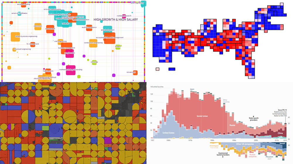 Presenting data in the form of interactive graphics helps to make its exploration more convenient and insightful. In our new DataViz Weekly post, we’ll tell you about another four interesting visualization examples illustrating this.
Today on DataViz Weekly:
- visual taxonomy of skills;
- map of AI-detected fields and crops in the U.S. and Europe;
- ORACLE of Blair — a midterms prediction model from high school students;
- chart of all space launches since 1957.
- Categories: Data Visualization Weekly
- No Comments »
Interesting Data Visuals About Land, Companies, Education, and Programming — DataViz Weekly
August 3rd, 2018 by AnyChart Team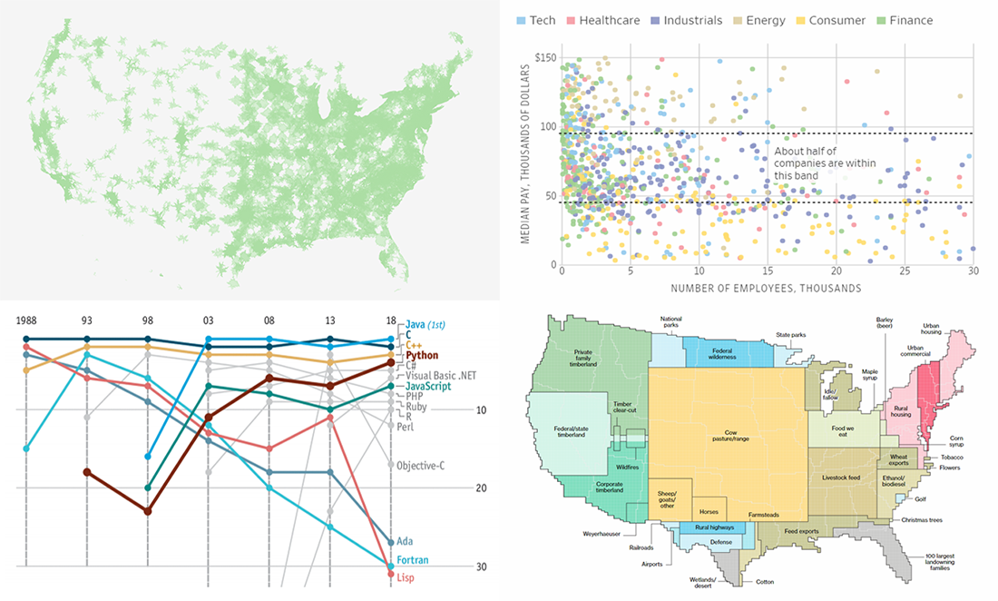 DataViz Weekly is here to meet you with several new interesting data visuals and stories based on them that have come to light just recently. Look what we are happy to feature this time:
- how the United States uses its land;
- company size vs. pay;
- education deserts in America;
- popularity of programming languages.
- Categories: Data Visualization Weekly
- 1 Comment »