 DataViz Weekly is here to tell you about new web projects and articles that feature interesting data graphics. This time, we showcase charts and infographics visualizing data about occupations of single earners in couple households in America, companies winning patent wars, change in air ticket prices globally, and Pornhub trends in 2018.
Data Visualization Weekly: December 7, 2018 — December 14, 2018
Occupations of Single Earners in Couple Households
According to the 2012-2016 American Community Survey, 82% of all American couple households are dual-income. Expert in statistics and data visualization, Nathan Yau looked into data about the rest of them, homes with just one partner earning money. Follow his cool visual story to find out what the earner usually does.
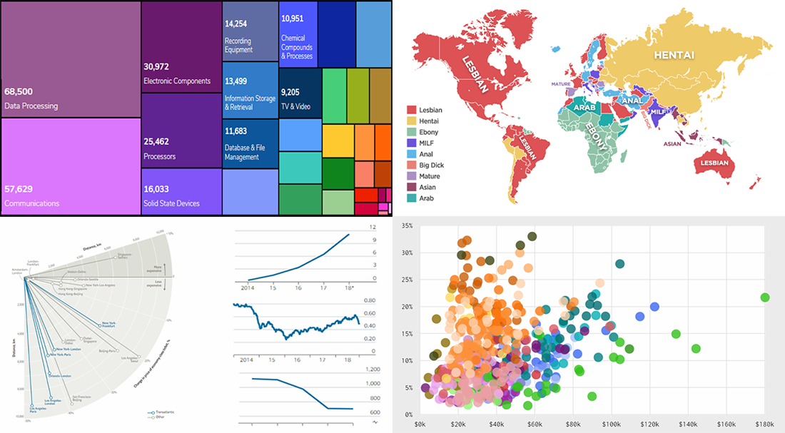
Patent Wars
The UK Domain, an educational resource for small businesses, visualized data from the United States Patent and Trademark Office to find out what companies are leading in innovations, winning so-called patent wars. Here you will find a lot of charts making it easy to look at the data from different angles, getting insight into how tech giants and unicorns have performed.
Decrease in Air Ticket Prices
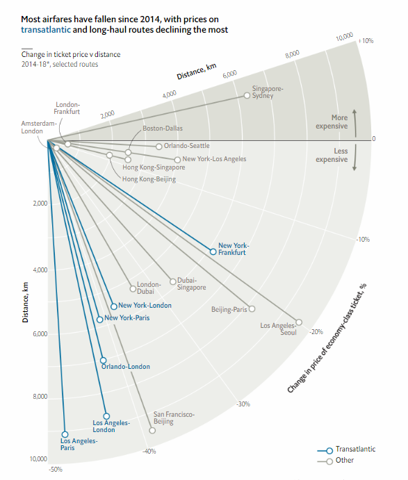
The Economist paid attention to a tangible decrease in ticket prices on transatlantic and long-haul air flight routes. In particular, the publication shared a chart that shows the change in airfares vs. distance for selected routes, visualizing data from Expedia. You’ll find three more charts shedding light on the situation, further down the article.
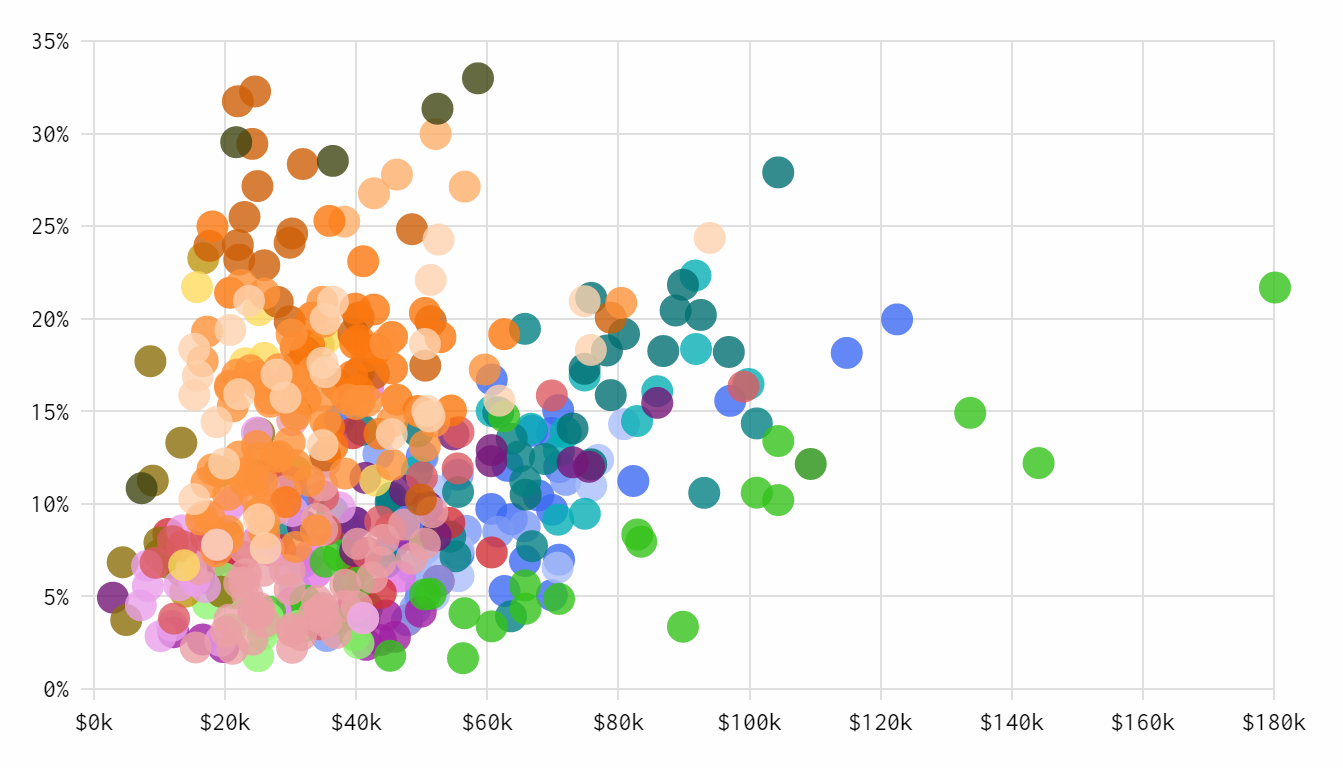
Pornhub’s 2018 Year in Review
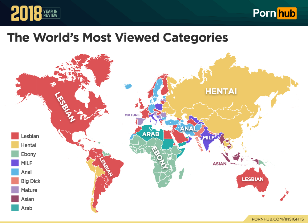
Pornhub, reported to be the world’s largest porn website, published an annual Year in Review report. It shows trends in what (and how) Pornhub users browsed content in 2018. The report includes a lot of charts and infographics visualizing diverse data sets: top searches and porn stars, traffic and time spent on the website, demographics, devices, and so on.
***
Thank you for visiting our blog and for your interest to the Data Visualization Weekly feature. We hope you liked our new collection of projects visualizing data about occupations, patents, air ticket prices, and porn trends. Have a great time, and stay tuned.
- Categories: Data Visualization Weekly
- No Comments »