 We continue to introduce you to interesting new visualizations from around the Web. These are great illustrations of how data becomes easier to make sense of when it’s represented in the right charts and maps. Check out the new DataViz Weekly article highlighting another four projects:
- Call to action on the novel coronavirus (COVID-19) — Tomas Pueyo
- Income estimates for small areas in England and Wales — ONS
- Hockey goals — Georgios Karamanis
- Inclusive Internet Index 2020 — EIU
Data Visualization Weekly with Interesting New Visualizations: March 6, 2020 — March 13, 2020
Call to Action on Coronavirus
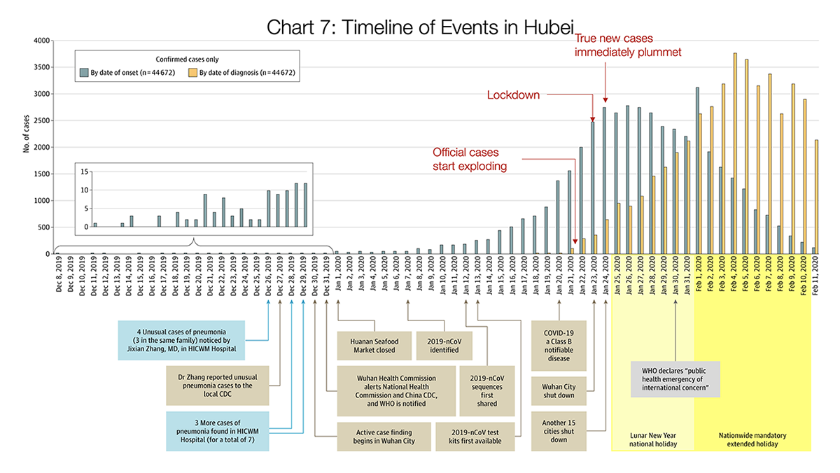
Tomas Pueyo, a Silicon Valley expert in product marketing and growth, has attained an overwhelming attention these days from media, people and organizations around the world for speaking on the novel coronavirus disease (COVID-19) which is currently the hottest topic on the global agenda. In particular, his Tuesday post on Medium has received more than 7 millions of views and over 125 thousand claps so far.
In that article, he managed to put together plenty of charts, data and models from diverse sources and called for officials — along with business and community leaders — to put the entire world in lockdown as allegedly the only helpful measure to stop the coronavirus pandemic and therefore save (our?) lives. Look at the charts and see what data has to say.
Small Area Income Estimates for England and Wales
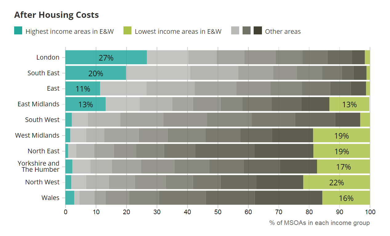
The United Kingdom’s Office for National Statistics (ONS) released new data on income estimates for small areas called middle layer super output areas (MSOAs) across England and Wales for the financial year ending 2018. The estimates are based on a combination of survey data and previously published data from the census as well as various administrative sources.
ONS provided the new report with an interactive map displaying the average household income across England and Wales before and after housing costs. There are also several charts that show where each local area falls in the income distribution and how the regions performed. Take a glance.
Inclusive Internet Index 2020
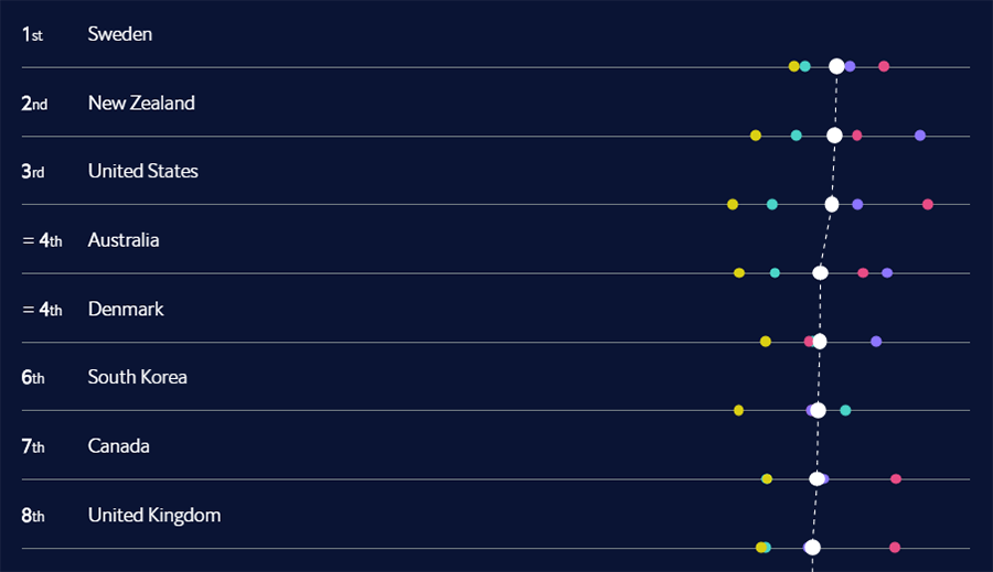
The Economist Intelligence Unit updated the Facebook-commissioned Inclusive Internet Index with revised rankings and scores, for 2020. Seeking to “measure the extent to which the Internet is not only accessible and affordable, but also relevant to all,” this year’s index include 100 countries that represent 91% of the world’s population and 96% of the total global GDP. Each country’s scores of the Availability, Affordability, Relevance and Readiness categories combined make up the Overall index score.
See the new rankings in a simple, yet cool interactive presentation. Such a visualization makes the exploration process easy and fun.
Hockey Goals
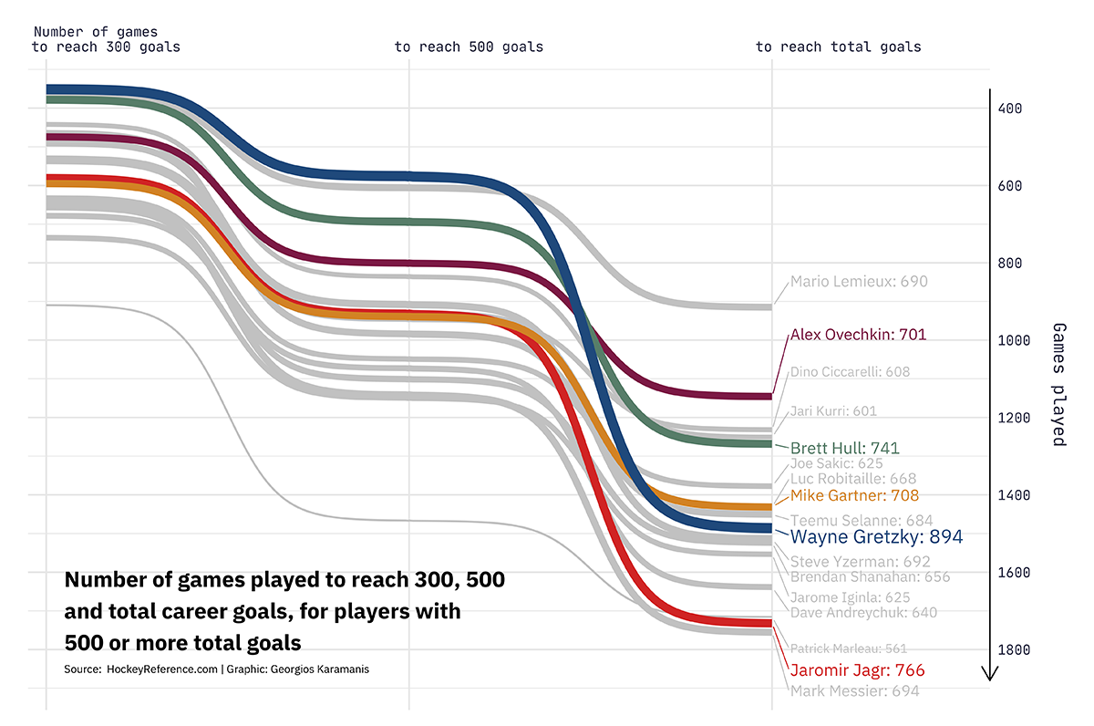
Within the framework of his Tidy Tuesday activities, data enthusiast Georgios Karamanis made an elegant visualization of hockey data from HockeyReference.com. For his project, he took data about all players who scored 500 or more goals over career and analyzed how many games it had taken for them to reach 300, 500 and total goals.
See how fast the top hockey scoring leaders achieved those milestones, in a cool slope graph. (It was built in R; the source code and data are provided on GitHub.)
***
Great to have you with us! Stay tuned for examples of interesting new visualizations — we publish fresh Data Visualization Weekly selections on our blog each Friday.
Have a wonderful weekend, everyone!
- Categories: Data Visualization Weekly
- No Comments »