 Data visualization is a wonderful way to represent data for intuitive, insightful exploration. The following new dataviz works we’ve found are actually good examples to prove this point.
Today on Data Visualization Weekly:
- dating pool by age;
- TV shows in IMDb user ratings;
- rise of populist parties in Europe;
- safety on the roads around American schools.
New DataViz in Data Visualization Weekly: November 23, 2018 — November 30, 2018
Dating Pool by Age
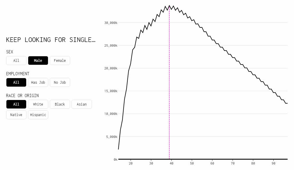
According to the Wikipedia article about age disparity in sexual relationships, “the “never date anyone under half your age plus seven” rule is a rule of thumb sometimes used to prejudge whether an age difference is socially acceptable.” Webcomic xkcd calls it the “standard creepiness rule.” Statistics and data visualization guru Nathan Yau charted how the dating pool of a person changes with age according to this rule and added demographics data from the U.S. Census Bureau for a more pragmatic look. Find out at what age your dating pool (in America) peaks depending on what kind of partner you are looking for in terms of sex, employment status, and race.
TV Show Dramas in IMDb Ratings
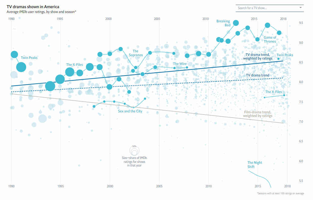
The Economist looked into whether American television actually is in a new golden age. An interactive visualization published this week displays the average IMDb user ratings for all TV dramas that have aired in the U.S. since 1990. Further down the article, you’ll find three static charts that show the distribution of the ratings for films/TV seasons in the 1990s, 2000s, and 2010s.
Rise of Populist Parties in Europe
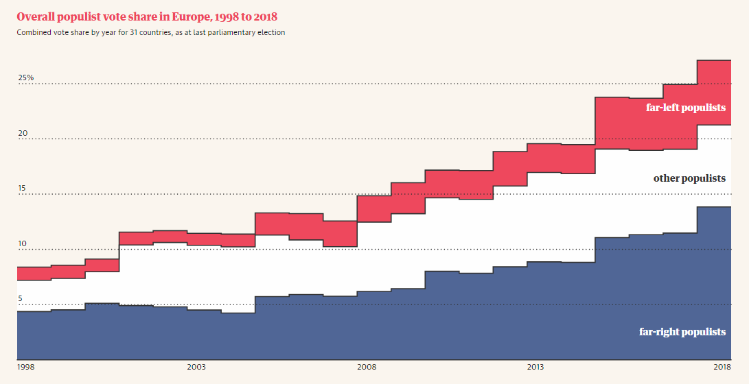
The Guardian’s research, conducted in collaboration with over 30 political scientists, revealed a consistent growth in the overall populist vote in Europe since 1998. As a result of this trend, 13 times more Europeans are currently living under governments with at least one populist in cabinet than 20 years ago. Take a look at several cool visualizations in the article to learn more.
Safety on Roads Around American Schools
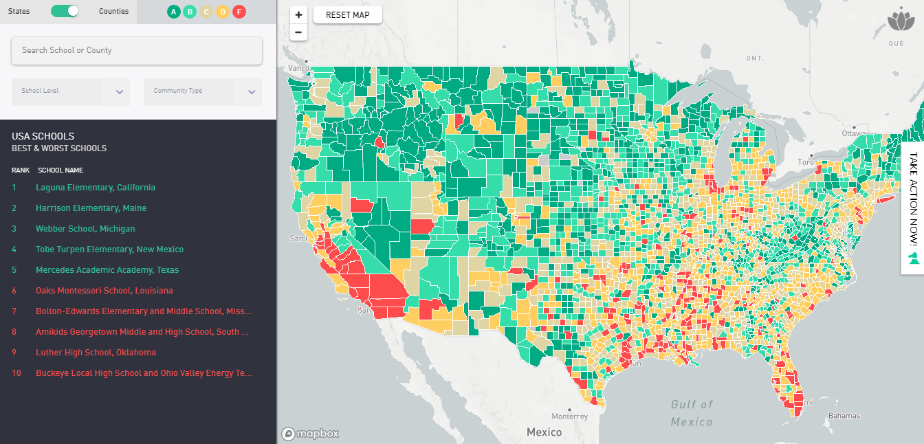
Zendrive, a company striving to make the roads safer using data and analytics, mapped safety scores for 125,703 schools all over the United States. In fact, car accidents are reported to lead the list of the most common causes of death for the school-age kids in America. Check out how dangerous the traffic is in the area around the school your kids attend. And explore the situation across the country, by state and county.
***
We appreciate your attention to data visualization in general and new dataviz examples we share on DataViz Weekly in particular.
Have a great time and stay tuned.
- Categories: Data Visualization Weekly
- No Comments »