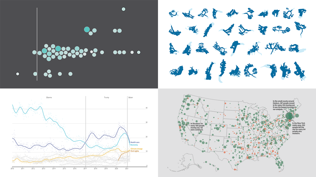
 Continuing the series of weekly data visualization roundups, we’re glad to introduce you to our selection of new awesome charts and maps from around the web. Check out our latest picks!
- 2020 U.S. Census results — Nathan Yau
- American public opinion — The Economist
- Migration within the U.S. during the pandemic — Bloomberg CityLab
- Melting glaciers — The Guardian
Data Visualization Weekly: April 23, 2021 — April 30, 2021
2020 U.S. Census Results
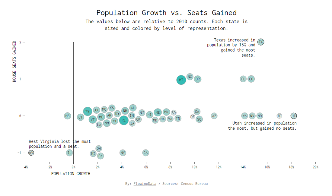
The main purpose of the decennial censuses in the United States is to figure out how many seats in the House of Representatives each state is entitled taking into account population changes. Earlier, operations and reporting for the 2020 Census were delayed because of the COVID-19 pandemic. Finally, the new counts are out.
On Monday, the U.S. Census Bureau made public the population results of the 2020 Census along with the up-to-date apportionment figures. You can view the new and historical data in an interactive dashboard on the agency’s official website. But we especially want to pay your attention to a cool chart produced by Nathan Yau for his blog FlowingData. The visualization — you can see a snapshot above — represents how each U.S. state fared when it comes to population growth and House seat numbers compared to the 2010 Census counts.
Find out what states gained and lost population and seats according to the new census statistics. Hover over the points to see the details for each state.
American Public Opinion
![]()
Public opinion is not a given. It is changing all the time, and various polls are frequently taken to find out how people feel about different political issues. There are many initiatives providing a way to analyze trends and shifts in public opinion. One more interesting project has been recently launched by The Economist.
Within the framework of the “Graphic detail” feature, The Economist made a special page where everyone can track what America actually thinks and has thought over the past years. For over a decade now, YouGov has been conducting weekly political polls for The Economist. The results of the surveys are now visualized in a set of interactive and static charts. New polling numbers will be added once a week.
Explore the presidential approval ratings for Joe Biden over time — by age, race, education, party, and overall. Find out what issues Americans are considering the most important and how that has changed. See even more, on the “What America thinks” page on The Economist.
Migration Within U.S. During Pandemic
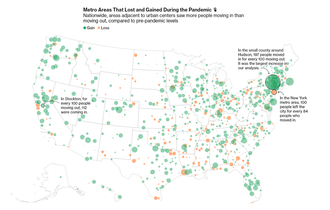
Maybe you also have heard that the pandemic made (or let) many people leave cities and generally move more than before. The truth is, data does not confirm such speculations. Well, with just a few exceptions.
Bloomberg CityLab looked into the U.S. Postal Service (USPS) data about approximately 30 million change-of-address and mail-forwarding requests in 2020. The analysis shows that even in the fifty largest U.S. cities, 84% of all moves were within the same metro area, which is not too much different from the pre-pandemic time, let alone any substantial evidence of an urban exodus. It looks like only New York City and San Francisco saw significantly more movement than in the previous years.
For a clearer picture and insights into in-country migration patterns during the COVID-19 pandemic, you should definitely see the charts and maps visualizing the latest data from USPS, on CityLab. Learn where Americans moved from and to, what metros gained and lost people, and much more.
Melting Glaciers

While you are reading this article, the world’s glaciers are losing ice due to global warming. The problem is actually alarming as the rate of melting is reported to double every decade. If you are still not sure about how bad things are, check out a new visualization.
The Guardian published an impressive animated graphic that shows the outlines of 90 of the largest glaciers from all over the globe, from the Andes to Alaska, as they look now and were several decades ago. It is a visualization of the Global Land Ice Measurements from Space (GLIMS) database, an international initiative involving more than 60 institutions worldwide.
Look how these glaciers have shrunk over the course of 40 years or more. Hover over them for details.
***
The next DataViz Weekly roundup will be published on May 7. Don’t hesitate to let us know if you’ve made or found a cool new chart or map as we will be happy to consider featuring it.
Stay tuned.
- Categories: Data Visualization Weekly
- No Comments »