Building Stock Chart with JavaScript
February 24th, 2022 by Shachee Swadia Data visualization is vastly applied in various fields. One such domain is financial trading, where stock charts are essential for smart market data analysis and decision making. Whether you invest in stocks or not, I am pretty sure that you have come across such graphics or even might need to build one right now. So, would you like to know how to make a stock chart? I’m ready to show you an easy path using the Tesla stock price data and JavaScript! Come along with me throughout this tutorial and you’ll learn how to quickly create elegant, interactive JS stock charts like the one you see in the picture.
Read the JS charting tutorial »
- Categories: AnyChart Charting Component, AnyStock, Big Data, Financial Charts, HTML5, JavaScript, JavaScript Chart Tutorials, Stock Charts, Tips and Tricks
- No Comments »
Creating Error Chart in JavaScript
February 3rd, 2022 by Shachee Swadia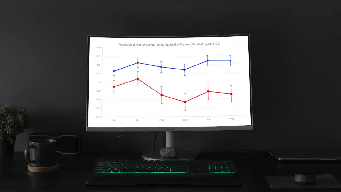 Need a cool interactive error chart visualization for your web page or app? Let me be your guide! Follow this tutorial and you’ll learn how to easily create elegant interactive error charts using JavaScript.
Here, I will be visualizing data on COVID-19 threat perceptions in the United States during the first six months of the pandemic, by political affiliation. So you will also be able to explore the divergence in those attitudes between Democrats and Republicans. The data originates from the article “COVID-19 and vaccine hesitancy: A longitudinal study” published in the Plos One journal.
Read the JS charting tutorial »
- Categories: AnyChart Charting Component, Big Data, HTML5, JavaScript, JavaScript Chart Tutorials, Tips and Tricks
- 1 Comment »
Visualizing Data on Income, Volcano Eruption, Shopping, Climate — DataViz Weekly
January 28th, 2022 by AnyChart Team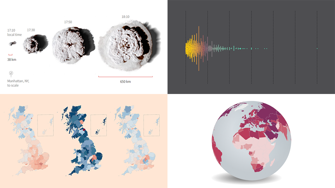 Continuing our regular roundups of the most interesting charts, maps, and infographics, we are glad to spotlight a bunch of new awesome projects for your inspiration. Today on DataViz Weekly:
- Americans’ annual personal income — Nathan Yau
- Tonga eruption’s true scale — Reuters
- High street crisis in Great Britain — The Financial Times
- Climate change drivers and sufferers — Der Tagesspiegel
- Categories: Data Visualization Weekly
- No Comments »
COVID-19 Risk Assessment App Pandemonium Uses AnyChart for Data Visualization
January 26th, 2022 by AnyChart Team We continue to support initiatives addressing the pandemic crisis by providing them with a full-featured free license for any of our data visualization tools. Today we are honored to be among the first to talk about a new project that joined this program, an innovative COVID-19 risk assessment app and framework called Pandemonium where all charts and maps are powered by AnyChart.
Built by Quantum Risk Analytics, Inc., a charitable nonprofit founded by MIT alumni, Pandemonium uses sophisticated machine learning algorithms to more accurately model the disease spread and provide a highly personalized evaluation of infection risks. It’s not yet publicly launched as the developers want to add a few more major features and data sources before the official release. But the app is already in the testing phase that the team encourages anyone to join.
We asked Richard Hamlin, CEO at Quantum Risk Analytics, Inc., to tell us more about Pandemonium, how it works, and how our data visualization solutions are used. Read on to know all the details.
- Categories: AnyChart Charting Component, AnyMap, Big Data, Dashboards, HTML5, JavaScript, Success Stories
- No Comments »
Amazing Data Visualization Works Worth Seeing — DataViz Weekly
January 21st, 2022 by AnyChart Team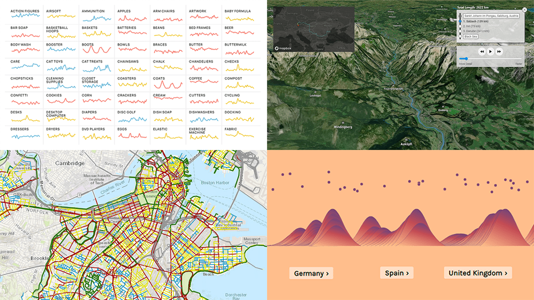 DataViz Weekly is here to let you know — and get excited — about the four most amazing data visualization works we have come across out there just about now. They are:
- Roadway traffic stress on bicyclists in Boston — Boston Transportation Department and Toole Design Group
- Shopping search behavior patterns for the pandemic era — Schema Design, Google Trends, Axios, and Alberto Cairo
- Thoughts and feelings about immigration in Europe — Federica Fragapane, Alex Piacentini, and ODI
- Raindrop flow path — Sam Learner
- Categories: Data Visualization Weekly
- No Comments »
Maigret.de Picks AnyChart JS Charts to Visualize Data on Georges Simenon’s Work
December 29th, 2021 by AnyChart Team When data is all around, it’s no wonder to see charts here or there as they greatly help make sense of it. With thousands of happy customers worldwide, both for our JS charting library and Qlik charting extensions, we have seen countless applications for data visualization across all fields and industries. Some use cases, however, might be less expected than others. What about a website dedicated to literature?
Maigret.de — a remarkable resource about Georges Simenon, a famous Belgian writer best known for creating police detective Jules Maigret — has recently started to publish interactive data graphics revealing interesting patterns and facts in his immense work. All the charts on the website are built with AnyChart.
We have chatted with Maigret.de’s creator Oliver Hahn about his project, data visualizations, and experience using our solutions. Read the quick interview and go check out the website. (Stack: HTML/MySQL.)
- Categories: AnyChart Charting Component, Books, HTML5, JavaScript, Success Stories
- No Comments »
New Interesting Visualizations on Jobs, Climate, TV Shows, Pandemic — DataViz Weekly
October 8th, 2021 by AnyChart Team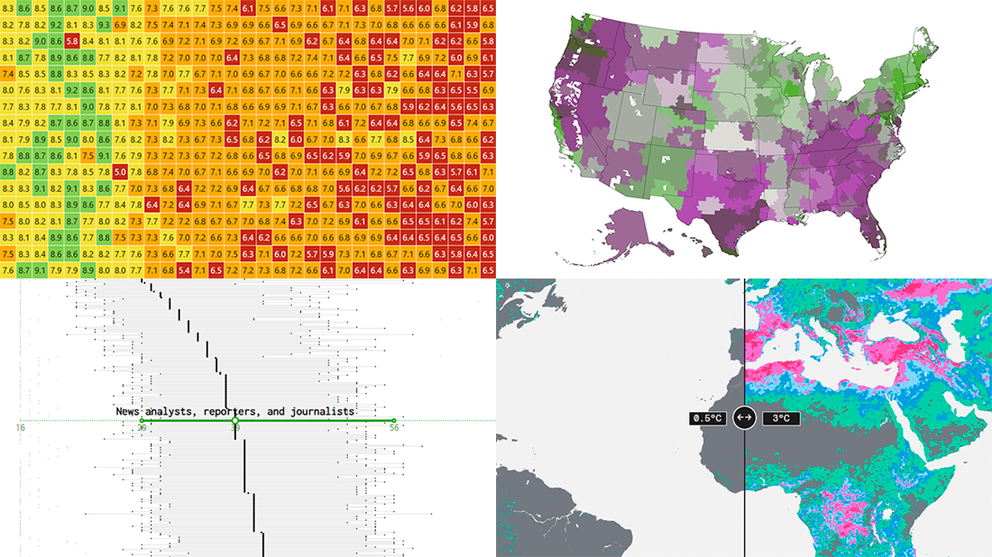 For all who already have an eye for data visualization or only want to get it, DataViz Weekly is here with an overview of four new interesting projects curated from around the web!
- U.S. jobs by age of workers — Nathan Yau
- Probable climate futures based on different scenarios — Probable Futures
- Average IMDb scores of all TV series by episode — Jim Vallandingham
- Vaccination vs hospitalization rates across the United States — The Washington Post
Read on to learn more about each and check them out!
- Categories: Data Visualization Weekly
- No Comments »
Building Word Tree Chart with JavaScript
October 4th, 2021 by Shachee Swadia Data visualization is not only useful for communicating insights but also helpful for data exploration. There are a whole lot of different chart types that are widely used for identifying patterns in data. One of the lesser-used chart types is Word Tree. It is a very interesting visualization form, quite effective in analyzing texts. And right now, I will teach you how to quickly create nice interactive word tree charts using JavaScript.
Word trees display how a set of selected words are connected to other words in text data with a branching layout. These charts are similar to word clouds where words that occur more frequently are shown bigger. But they are different in the sense that word trees also show the connection between the words, which adds context and helps find patterns.
In this tutorial, I will create a lovely word tree from the text of the very famous book The Little Prince by French aviator and writer Antoine de Saint-Exupéry. Check out a demonstration of the final chart below and keep reading to learn how this and any other interactive JS word tree can be built with ease.
Read the JS charting tutorial »
- Categories: AnyChart Charting Component, Big Data, Books, HTML5, JavaScript, JavaScript Chart Tutorials, Tips and Tricks
- No Comments »
AnyChart Used for Data Visualization in Open-Source Redis Inventory Tool
September 29th, 2021 by AnyChart Team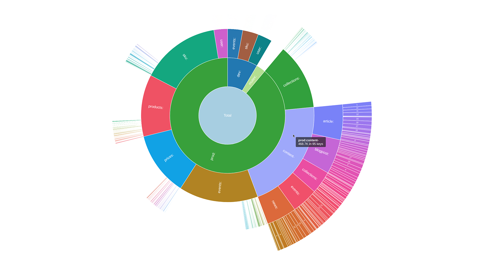 Sunburst charts are known to be greatly useful for visualizing hierarchical data structures. So it is no surprise that this chart type became a big hit among our users immediately after we added it to the AnyChart JavaScript library. Because the core of our global customer base is enterprise clients, most of the real-world use cases for our JS sunburst chart are hidden in internal corporate apps. But AnyChart is often picked for data visualization in open projects as well, and we invite you to see a super cool example we have recently found out about — Redis Inventory. It is an open-source tool that makes it easy to view Redis memory usage by key patterns in a hierarchical way, with an interactive sunburst chart in action.
Learn more about Redis Inventory and how AnyChart is used there from our quick interview with its creator Aleksandr Obukhov. (Stack: Go/Cobra/Redis.)
- Categories: AnyChart Charting Component, Big Data, HTML5, JavaScript, Success Stories
- No Comments »
Visualizing Mortality Statistics and Satellite Imagery Data — DataViz Weekly
September 10th, 2021 by AnyChart Team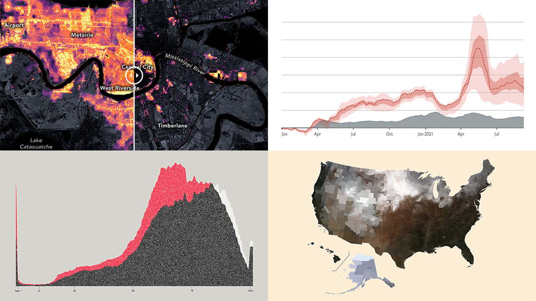 This week, we have come across a number of wonderful new data visualization projects out there. Here are the four that we’ve found most interesting and decided to showcase today in DataViz Weekly. Join us for a quick overview of these works and check them out!
- Black mortality gap in America — The Marshall Project
- Excess deaths worldwide during the COVID-19 pandemic — The Economist
- Ida-caused power outage in New Orleans as seen from space — NASA Earth Observatory
- Average seasonal colors of the United States — Erin Davis
- Categories: Data Visualization Weekly
- No Comments »