 DataViz Weekly is here to let you know — and get excited — about the four most amazing data visualization works we have come across out there just about now. They are:
- Roadway traffic stress on bicyclists in Boston — Boston Transportation Department and Toole Design Group
- Shopping search behavior patterns for the pandemic era — Schema Design, Google Trends, Axios, and Alberto Cairo
- Thoughts and feelings about immigration in Europe — Federica Fragapane, Alex Piacentini, and ODI
- Raindrop flow path — Sam Learner
Data Visualization Weekly: January 14, 2022 — January 21, 2022
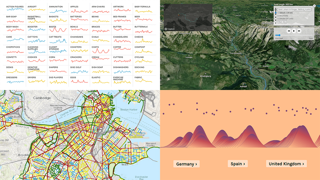
Roadway Traffic Stress on Bicyclists in Boston
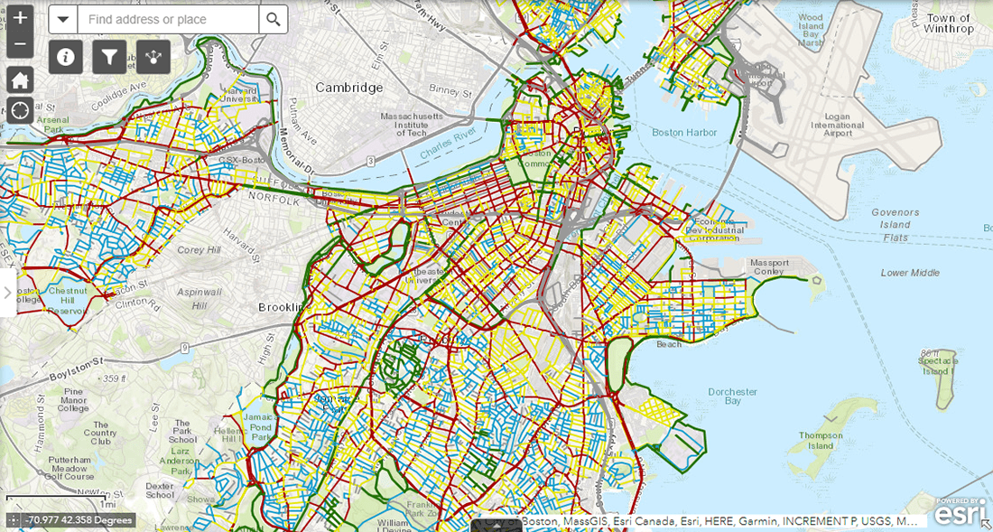
Improving road safety and accessibility for cycling commuters is one of the major goals of Boston’s long-term transportation plan called Go Boston 2030. To streamline the corresponding measures and make it easy to assess the results, the Boston Transportation Department, in cooperation with Toole Design Group, rated each street segment all over the city based on the newly developed Bicycle Level of Traffic Stress (BLTS) metric taking into account the volume and speed of traffic, presence of bike lanes, and other factors considered critical.
The BLTS scores are now represented in an interactive map. Coloring all street segments in the city based on their ratings, it provides a wonderful at-a-glance overview of the most and least stressful ways for bicycle riders. Click on a road to see its BLTS score breakdown by various parameters.
For bikers, the map facilitates finding the most comfortable routes around Boston. For city planners and developers, it clearly shows where additional protective and infrastructure measures are needed.
Shopping Search Behavior Patterns for Pandemic Era
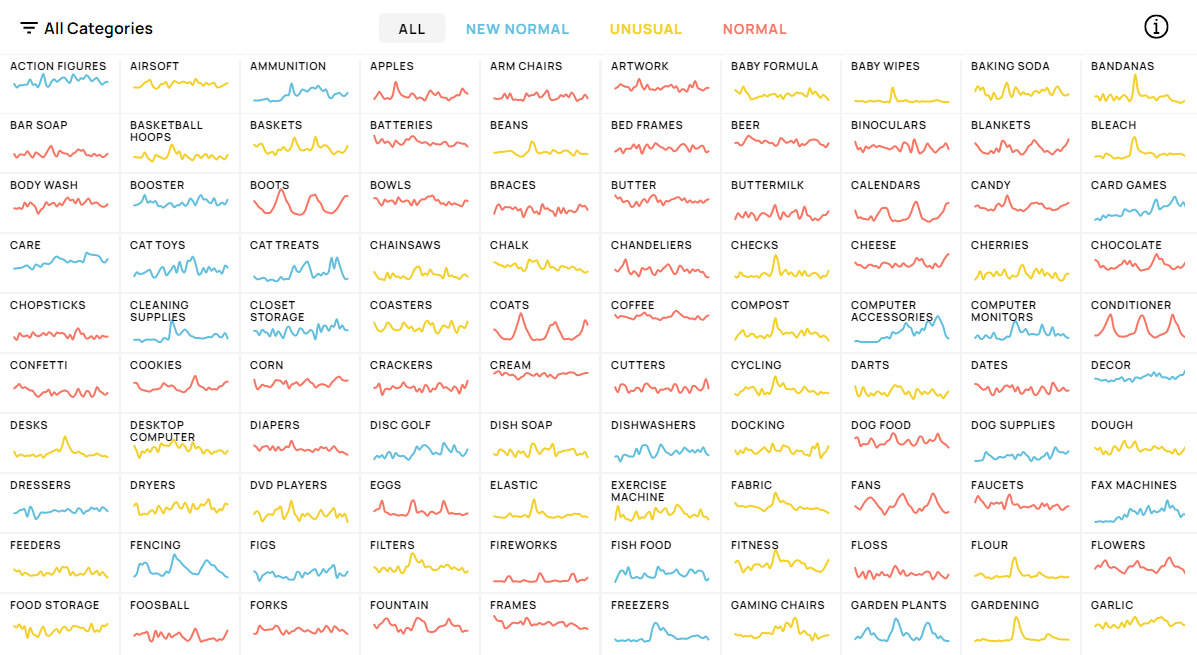
The COVID-19 pandemic has impacted the shopping behavior of people all over the world. Some of those shifts could be treated as temporary. For example, we all remember the panic-buying of toilet paper, which then normalized. But there are also many new purchasing habits being very likely here to stay.
Schema, Google Trends, and Axios worked together to explore the Americans’ shopping interest for various products before and during the pandemic based on search volume data for the corresponding keywords. The discovered patterns were then categorized as normal (search interest has not changed during the COVID-era), unusual (increased but then returned to usual), and new normal (increased and remains high).
Feel free to explore charts for individual products and find out how the pandemic is shaping shopping search behavior in the United States.
Thoughts and Feelings About Immigration in Europe
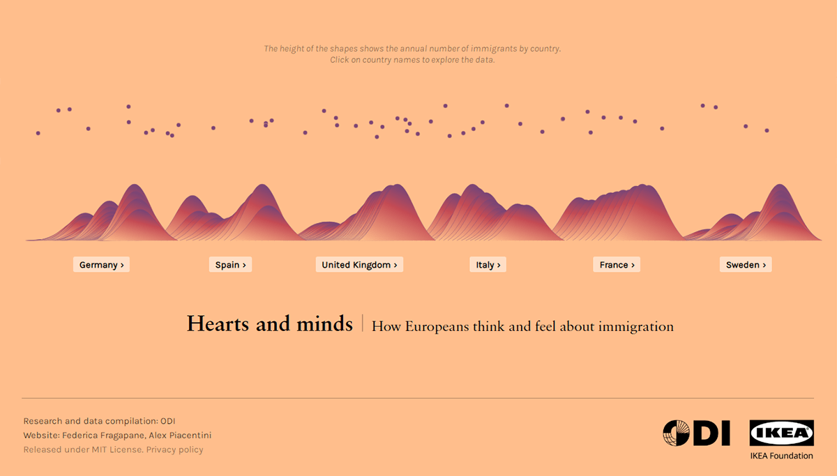
In Europe, perceptions of immigration and what people think about it are greatly influenced by media and political narratives. So, these change not only over time but also in response to individual events.
A fascinating new data project, Hearts and Minds allows you to delve into how Europeans feel about refugees and other migrants and how that has shifted. Created by Federica Fragapane and Alex Piacentini, in collaboration with ODI taking care of research and data compilation, it is a great example of an illuminating, beautiful presentation of data.
Begin with a glance at the annual number of immigrants in Germany, Spain, the United Kingdom, Italy, France, and Sweden. Then choose one of the countries for a deep dive — discover trends in migration figures, salience, perception, and attitude, all in the context of dominant public narratives and events.
Raindrop Flowpath
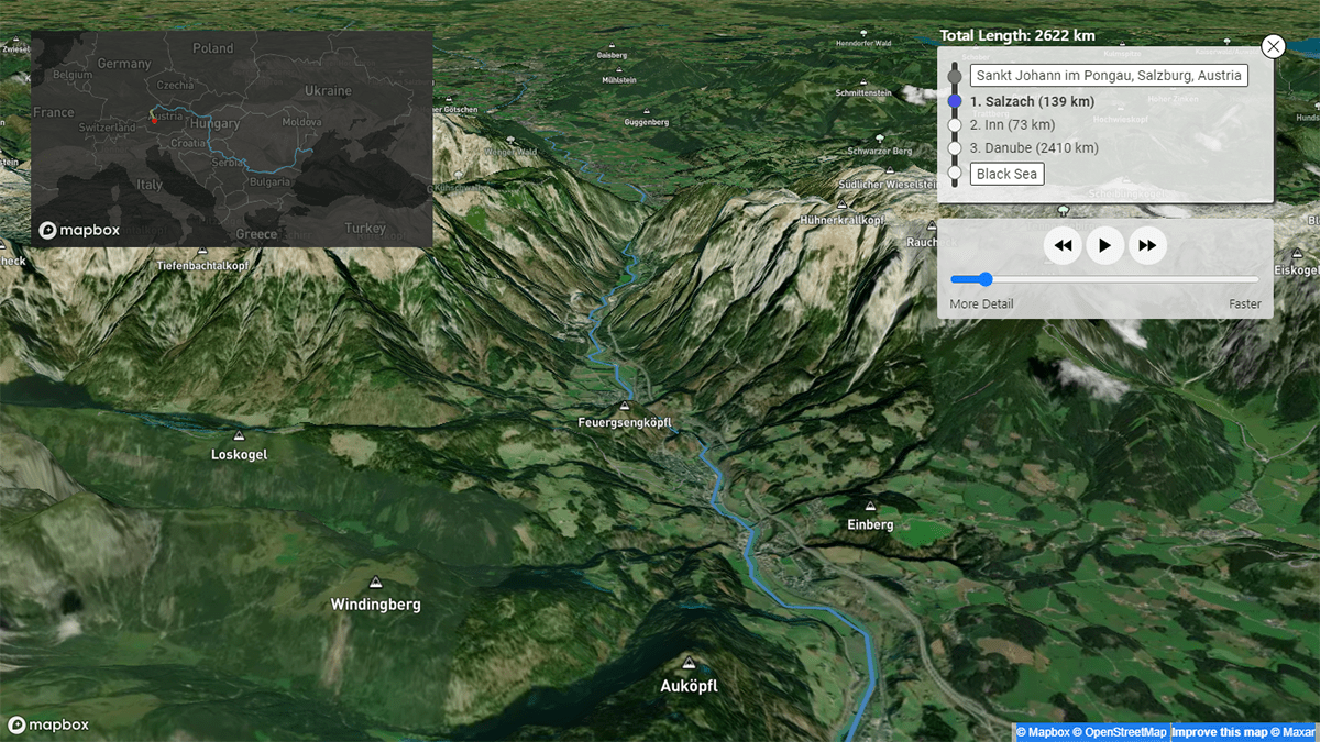
Have you ever wondered in what water body a raindrop would end up? Well, it is easy to find out, and moreover, you can even watch its entire path all the way downstream to a sea or a lake!
Sam Learner made a fantastic data visualization project, River Runner. Using an API created by Dave Blodgett, Kyle Onda, and Ben Webb, it lets you click anywhere in the world and see where a raindrop fallen in that location would flow to (assuming that it actually runs off into a stream). The journey is mapped out in an animated form that makes it exciting to follow and explore.
See where a raindrop could get to from your backyard. Or look at one of these selected flow paths to start with. You are more than welcome to read more about River Runner here.
***
Stay tuned for our Data Visualization Weekly series and feel free to share your own creations, charts and maps, with us for a chance to see them featured among the best.
Cheers.
- Categories: Data Visualization Weekly
- No Comments »