New Examples of Powerful Data Visualization in Action — DataViz Weekly
June 3rd, 2022 by AnyChart Team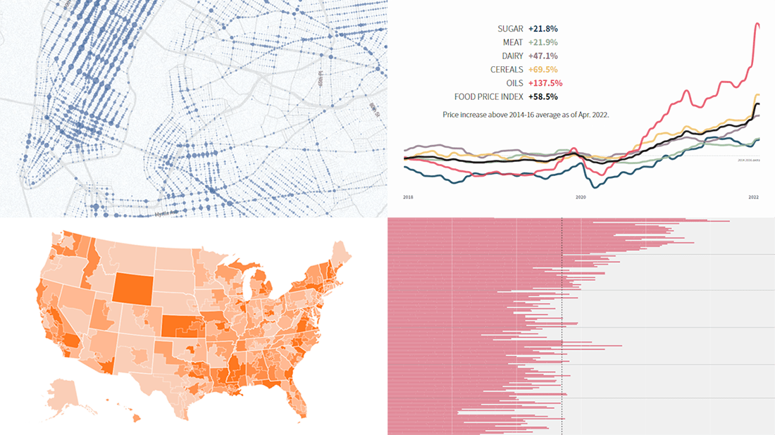 It’s Friday, and we are glad to show you four new examples demonstrating the power of data visualization in action! See what’s on DataViz Weekly today!
- Real costs of breastfeeding — The Washington Post
- Traffic violence across NYC in 2013–2021 — The New Yorker
- Global food crisis — Reuters
- Topical political issues across the U.S. in the run-up to the midterm elections — Axios
- Categories: Data Visualization Weekly
- No Comments »
Visualizing Abortion Data & Impact of Overturning Roe v. Wade — DataViz Weekly
May 13th, 2022 by AnyChart Team A leaked draft of a U.S. Supreme Court opinion suggests that the 1973 Roe v. Wade decision, establishing federal constitutional protection of abortion rights, could be overturned. If the justices strike down the ruling, each state will be able to determine the legality of abortions.
The document, which was later confirmed to be authentic, cast abortion rights back into the center of the political discourse in the United States. In the wake of that, we decided to make a special edition of DataViz Weekly to show you how some of the top publications — The Washington Post, Bloomberg, Reuters, and FiveThirtyEight — used data visualization to communicate the situation with abortions in the country and what is likely to change if the Supreme Court eventually overturns Roe.
- Categories: Data Visualization Weekly
- No Comments »
Visualizing Data on Income, Volcano Eruption, Shopping, Climate — DataViz Weekly
January 28th, 2022 by AnyChart Team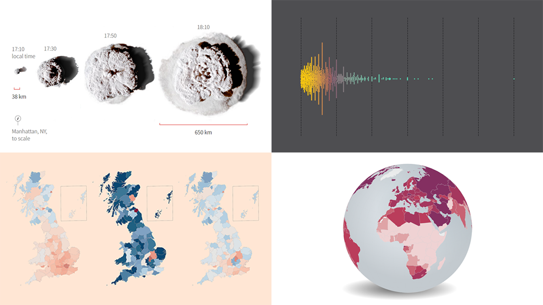 Continuing our regular roundups of the most interesting charts, maps, and infographics, we are glad to spotlight a bunch of new awesome projects for your inspiration. Today on DataViz Weekly:
- Americans’ annual personal income — Nathan Yau
- Tonga eruption’s true scale — Reuters
- High street crisis in Great Britain — The Financial Times
- Climate change drivers and sufferers — Der Tagesspiegel
- Categories: Data Visualization Weekly
- No Comments »
Visualizing Data on Prices, Emissions, Workforce, Palm Oil — DataViz Weekly
November 12th, 2021 by AnyChart Team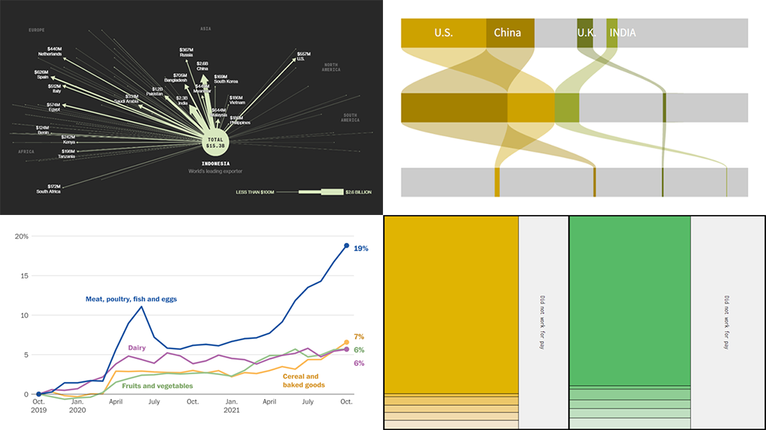 Hi everyone! DataViz Weekly is here to introduce you to some awesome new data visualizations that we have recently found out there and admired!
- Inflation in America — The Washington Post
- Carbon dioxide emissions by country — Reuters
- Shifts in how much U.S. men and women work — Nathan Yau
- Sustainable palm oil problem — Bloomberg Green
- Categories: Data Visualization Weekly
- No Comments »
Four Impressive Visual Data Stories To Check Out — DataViz Weekly
October 1st, 2021 by AnyChart Team Looking for awesome examples of visual data stories? You’re in the right place at the right time! In this edition of DataViz Weekly, we feature four impressive new ones we’ve come across these days:
- Sexual violence crisis in Singapore — Kontinentalist
- Climate change in the Arctic and beyond — Woodwell Climate Research Center
- Melting glaciers as vanishing climate archives — Reuters
- All 12+ million buildings in Spain by height — elDiario.es
- Categories: Data Visualization Weekly
- No Comments »
Canadian Elections, Germany Under Merkel, Caracas Sounds, Night Temperatures in U.S. Cities — DataViz Weekly
September 17th, 2021 by AnyChart Team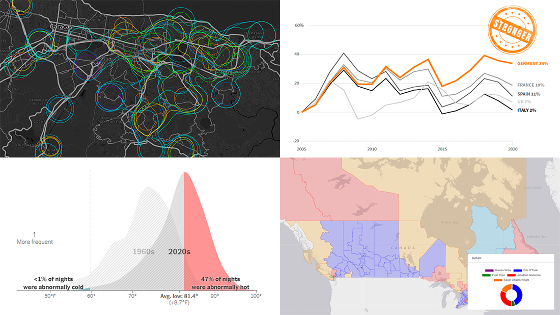 We continue to choose the most interesting out of all the newest data visualizations published here and there and show you them in weekly roundups. It’s time to look at our fresh selection! This time, the following projects are featured in DataViz Weekly:
- Canadian federal elections since 2000 — Stephen Taylor
- Germany under the 16-year leadership of Angela Merkel — Reuters
- Sounds of Caracas — Valeria Escobar
- Abnormally hot summer nights in American cities — The Upshot
- Categories: Data Visualization Weekly
- No Comments »
New Amazing Graphics for Fans of Data Visualization — DataViz Weekly
July 16th, 2021 by AnyChart Team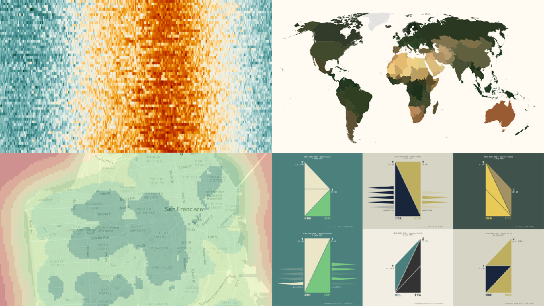 Are you ready for another set of amazing data graphics? It’s Friday, so DataViz Weekly is here to let you know about four great new visualization works worth checking out right now!
- 15-minute cities in Germany and worldwide — Chris and Nils from Gießen
- Daily temperatures in Tokyo since 1964 (and what to expect at the Olympics) — Reuters
- Average colors of countries, as well as U.S. states and counties — Erin Davis
- Euro 2020 and Copa América 2021 playoffs visualized in triangles — Krisztina Szűcs
- Categories: Data Visualization Weekly
- 1 Comment »
Engaging Data Graphics on Hobbies, Protests, Commute, and Reddit — DataViz Weekly
April 23rd, 2021 by AnyChart Team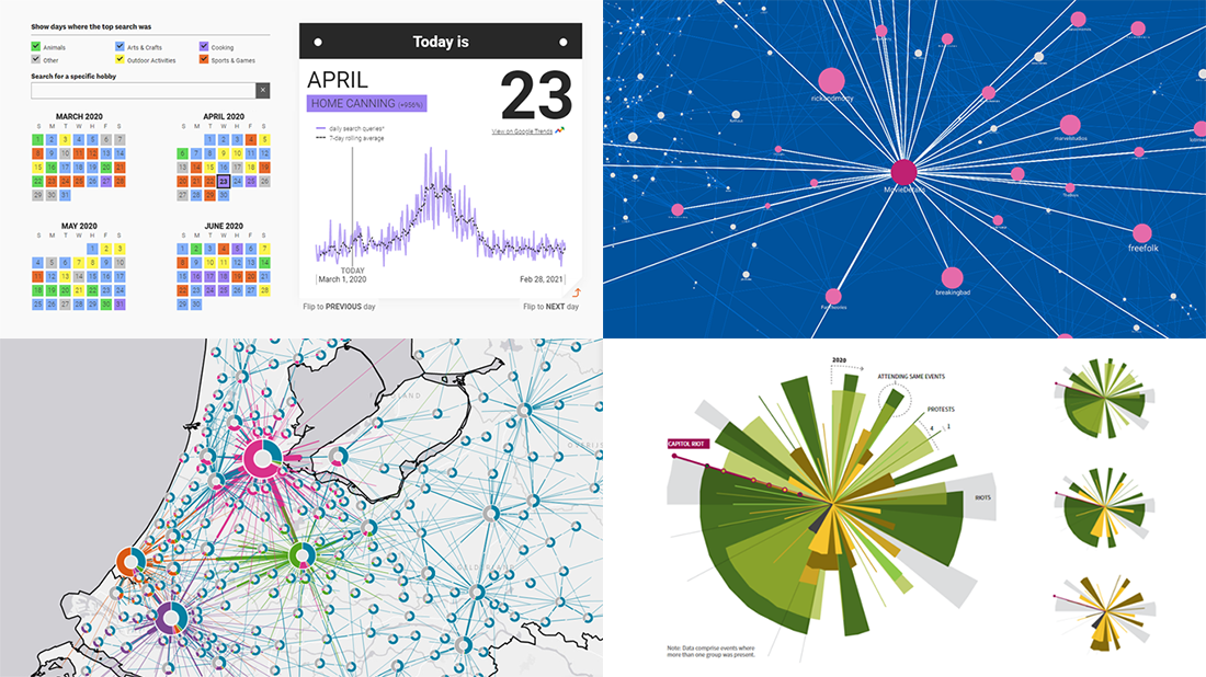 Can’t wait for a new portion of engaging data graphics? We’ve got it for you right here, right now! The following visualizations caught our eye this week, and DataViz Weekly is here to make sure you do not miss out on them:
- Top trending hobbies during the COVID-19 pandemic — Polygraph and Google Trends
- Right-wing protests in America in 2020-2021 — Reuters
- Commuting in the Netherlands — Statistics Netherlands
- Map of Reddit — Andrei Kashcha
- Categories: Data Visualization Weekly
- No Comments »
Recognizing Most Interesting New Data Visualizations — DataViz Weekly
March 12th, 2021 by AnyChart Team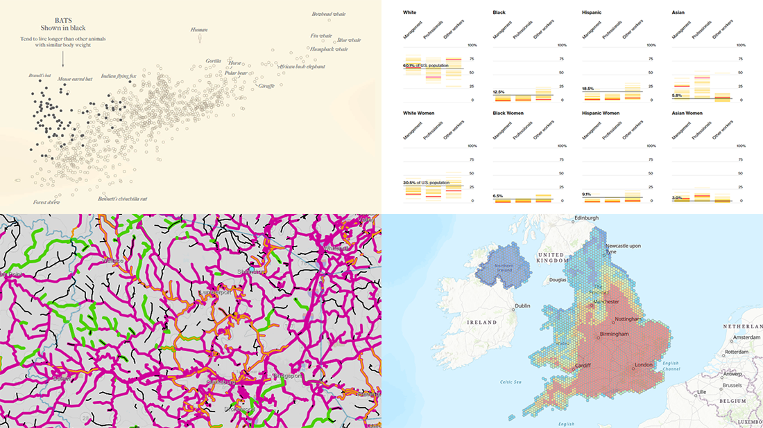 Welcome back to DataViz Weekly, our regular blog feature where we recognize some of the most interesting data visualizations we’ve recently seen out there. Here’s our new selection of stunning graphics from different people — take a look!
- Bats and the origin of virus disease outbreaks — Reuters
- Race and gender diversity within the biggest corporations in the U.S. — Bloomberg
- All roadwork projects in West Virginia for 2021 — WVDOT
- Climate threats to heritage sites in England, Wales, and Northern Ireland — National Trust
- Categories: Data Visualization Weekly
- No Comments »
Attacks on Press, COVID-19 Deaths, Infection Simulation, and U.S. Election — DataViz Weekly
February 26th, 2021 by AnyChart Team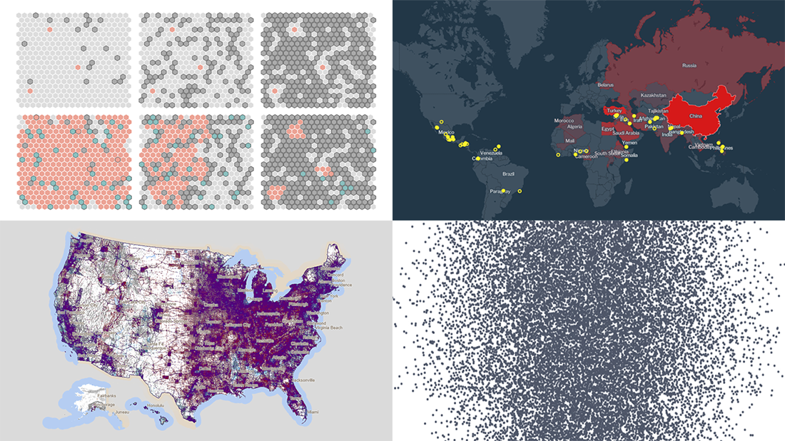 Hey everyone, Friday’s here and with it, a new DataViz Weekly article is out! Look at some of the best data visualization projects we have come across out there this week:
- Exploring all attacks on journalists worldwide in 2020 — Geoff McGhee for CPJ
- Visualizing the scale of 500,000 COVID-19 deaths in the United States — Sam Hart, Reuters
- Simulating the spread of infection for different immunity scenarios — Thomas Wilburn, NPR
- Mapping every vote in the 2020 U.S. election — Kenneth Field
- Categories: Data Visualization Weekly
- No Comments »