 Hi everyone! DataViz Weekly is here to introduce you to some awesome new data visualizations that we have recently found out there and admired!
- Inflation in America — The Washington Post
- Carbon dioxide emissions by country — Reuters
- Shifts in how much U.S. men and women work — Nathan Yau
- Sustainable palm oil problem — Bloomberg Green
Data Visualization Weekly: November 5, 2012 — November 12, 2021
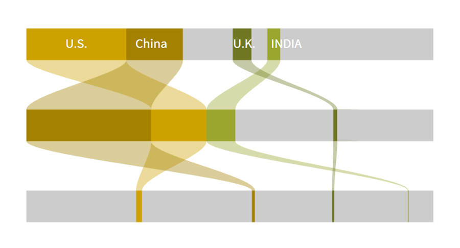
Inflation in America
Despite hopes that inflation in the United States would begin to cool down, in October it accelerated again. Experts say the Delta variant wave and continuously clogged supply chains are to blame for elevated and further rising prices.
For The Washington Post, Alyssa Fowers and Rachel Siegel made a very interesting analysis delving into the drivers of the ongoing streak of inflation. In the article, you will find four simple, yet definitely illuminating line, column, and area charts. Based on consumer price index data from the U.S. Bureau of Labor Statistics, they represent exactly how prices of basically everything have changed.
Check out the four charts explaining the American inflation, on The Washington Post.
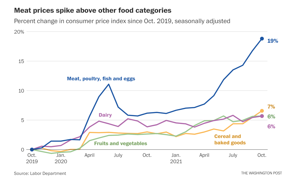
Carbon Dioxide Emissions by Country
A high level of carbon dioxide (CO2) is a topical issue that the global community is struggling to cope with. But wait a minute. Who exactly is to blame for this problem?
It actually is a hard question as the answer completely depends on the angle from which you want to view it. Michael Ovaska, Shadia Nasralla, and Kate Abnett from Reuters made an amazing work recently to demonstrate that using beautiful, telling Sankey-like parallel sets with a node for each of the following three perspectives:
- What country has emitted the most carbon dioxide since the industrial revolution?
- What country is emitting the most carbon dioxide currently?
- What country has the largest carbon dioxide emissions per capita?
Flow lines between the nodes represent the changing role of certain countries depending on exactly how the question is articulated.
Go ahead and explore the visualization in much more detail than pictured above, in the article on Reuters.
Shifts in How Much U.S. Men and Women Work
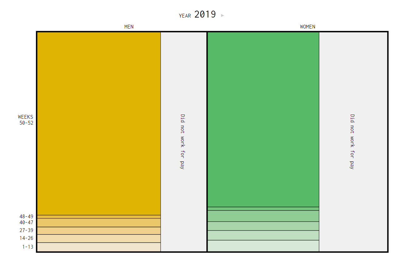
Data says Americans work more now than sixty years ago. Especially women.
On Tuesday, Nathan Yau published a cool animated mosaic plot that provides a great opportunity to observe the changes in how much men and women in the United States work, since 1960. Using data from the decennial census and the American Community Survey, the graphic represents both the labor force participation rate and the number of weeks worked for pay during a year, by gender.
Take a look at the animation on Nathan’s blog FlowingData.
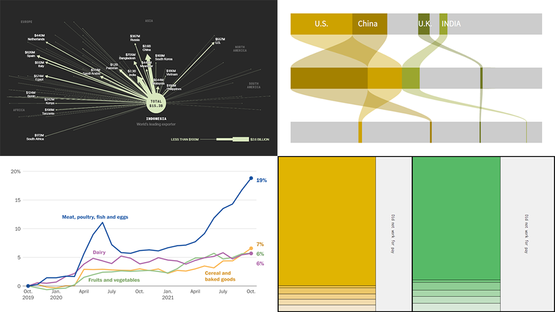
Sustainable Palm Oil Problem
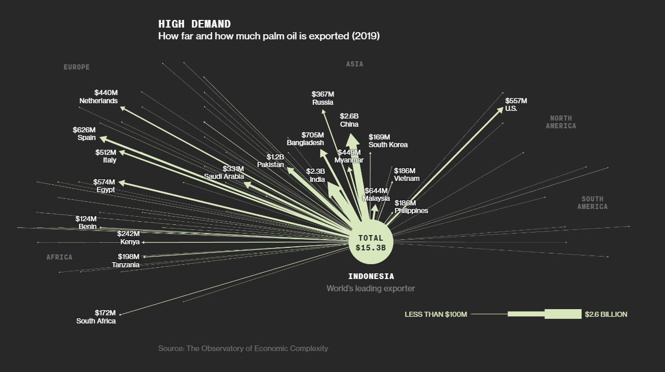
Last but not least, we recommend you to check out Bloomberg’s new big visual story that offers a deep dive into the problem of sustainable palm oil.
Since the beginning of the 21st century, global palm oil production has tripled. But the increased output has come at the expense of vast areas of rainforest being destroyed. Efforts to create a viable market for sustainable palm oil have largely failed. Pablo Robles, Anuradha Raghu, Adam Majendie, and Jin Wu explain why, with the help of a number of mesmerizing visualizations.
The diagram you see above is taken from there. It shows where and how much palm oil Indonesia sends, its biggest producer. There are more visualizations worth looking at in the piece itself — don’t miss out on seeing this great example of powerful storytelling in action on Bloomberg Green.
***
Many thanks for your attention! Stay tuned to not miss a big thing in data visualization!
- Categories: Data Visualization Weekly
- No Comments »