 Can’t wait for a new portion of engaging data graphics? We’ve got it for you right here, right now! The following visualizations caught our eye this week, and DataViz Weekly is here to make sure you do not miss out on them:
- Top trending hobbies during the COVID-19 pandemic — Polygraph and Google Trends
- Right-wing protests in America in 2020-2021 — Reuters
- Commuting in the Netherlands — Statistics Netherlands
- Map of Reddit — Andrei Kashcha
Data Visualization Weekly: April 16, 2021 — April 23, 2021
Top Trending Hobbies During COVID-19 Pandemic
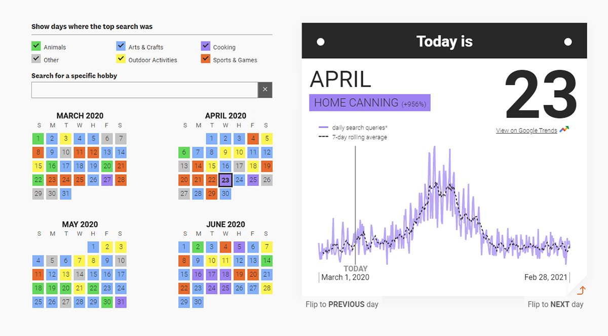
Search data can actually be a great source of insight into what is going on in our daily lives. Another striking example of this have been recently brought in by Google Trends and Polygraph, the visual storytelling studio behind The Pudding.
Their project A Year in Lockdown Trends provides a look at how our lives changed in the first year of the pandemic through the lens of hobbies. It is an interactive calendar that shows what hobby saw the biggest spike in the search volume on each day between March 1, 2020, and February 28, 2021, compared to the same day one year prior. For example, home canning is displayed on April 23, 2020, as the hobby with the greatest growth in the number of search queries, up 956% from April 23, 2019. The accompanying chart shows the change of the search interest for that hobby over time.
Have fun playing with this cool interactive dashboard.
Right-Wing Protests in America in 2020-2021
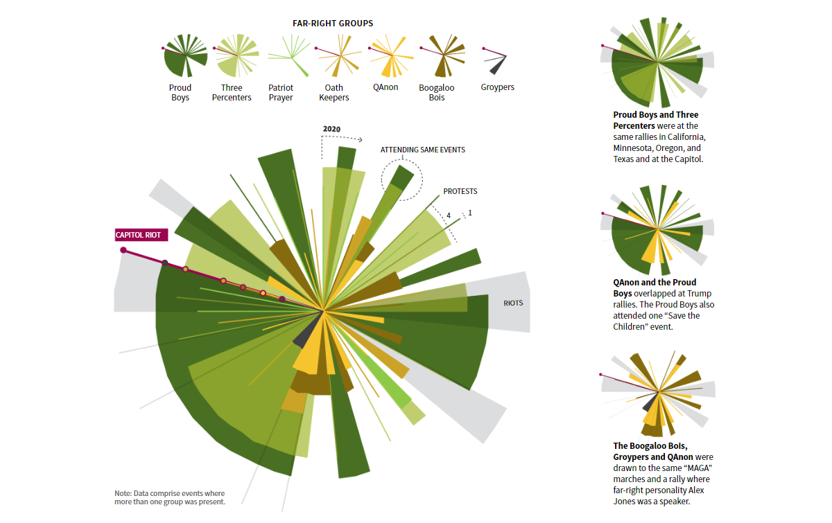
In 2020, the United States saw a lot of political protests. Many of them were right-wing rallies as a number of Americans objected against lockdown measures, gun regulations, the Black Lives Matter movement, election results, and so on. Such protests took place not only in the form of peaceful demonstrations but also violent riots.
Sarah Slobin and Sam Hart from Reuters decided to take a closer look at the spread of right-wing rallies in the U.S. observed throughout 2020 and continuing in 2021. For their research, they took data from the Armed Conflict Location and Event Data Project (ACLED) and made a bunch of compelling visualizations that shed more light on this kind of protest activity and reveal important trends and patterns worth the attention. For example, it looks like members of a dozen far-right groups allegedly involved in the Capitol Riot were present at about one-half of all right-wing events that turned violent last year.
Without more ado, see this new visual story on Reuters. There is really a lot to check out, explore, and think about.
Commuting in Netherlands
Commuting patterns are always interesting to explore. Here’s one more engaging project on that subject.
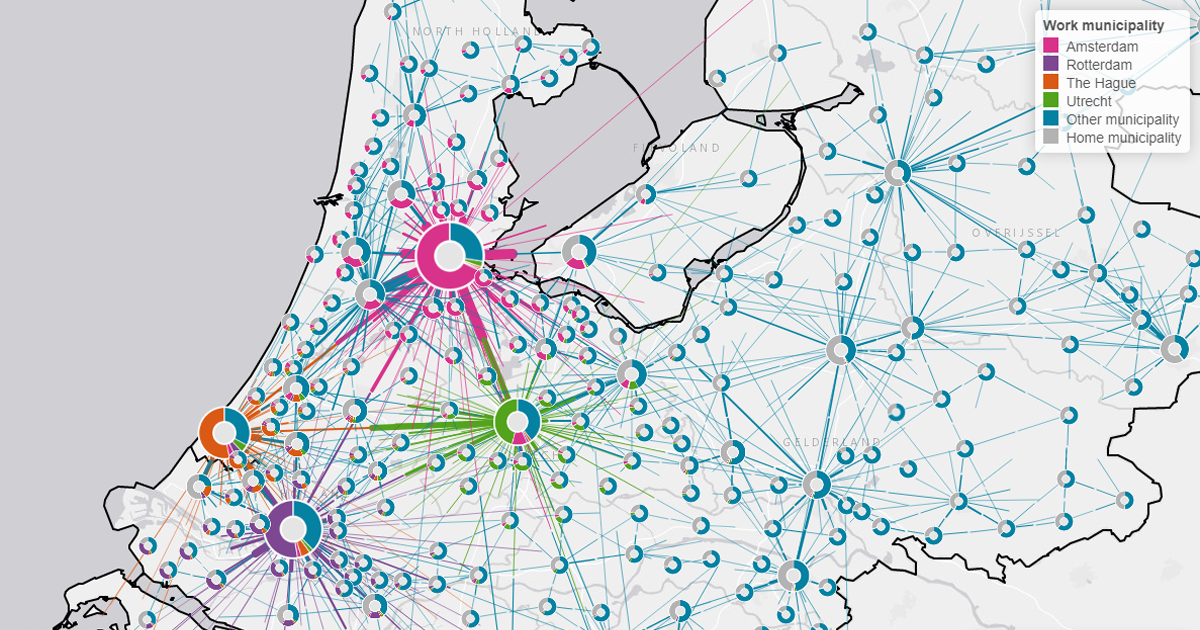
Statistics Netherlands (Centraal Bureau van Statistiek, or CBS for short) used pre-COVID job counts by work and home town as a proxy for commuting mobility and represented that data in an appealing interactive map. The visualization depicts thus determined flows from home to work in the form of lines colored by work municipality. Towns are displayed as donut charts sized proportionately with the number of its working dwellers, representing where (in what town) their job place is located. Click on the charts to view the absolute numbers for the corresponding municipalities.
Look how well connected and mobile the Netherlands is — or to be precise, was just before the pandemic — and enjoy an interesting type of map that we can call a donut-connector combo map or simply a donut map. Read more about the project in this article on the CBS website.
Map of Reddit
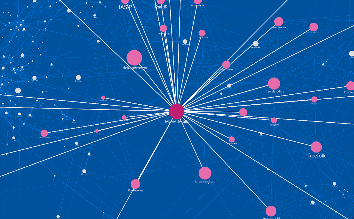
The last (but not least) visualization we would like to tell you about today is the Map of Reddit project by Andrei Kashcha, a software engineer from Seattle. Just like the previous map by Statistics Netherlands, this one makes good use of connectors but features bubbles instead of donuts, and technically, it is not a geographic map.
In this interactive visualization, subreddits are plotted based on how similar they are to each other in terms of active user audience. Each bubble is a certain subreddit. The more users leave comments on any two subreddits, the closer the corresponding bubbles appear; when you click on a subreddit, its links with others are highlighted with connection lines. The polygons represent thematic groups of subreddits.
Feel free to play with this awesome visualization and read more about it on Reddit’s /r/dataisbeautiful where the OC thread presenting this project has got over 59,200 upvotes so far.
***
We’ll keep you posted on new awesome data graphics appearing around the web. Stay tuned for DataViz Weekly!
- Categories: Data Visualization Weekly
- No Comments »