Exploring Voting Bills, Birth Rates, Hospital Billing, Transit Equity — DataViz Weekly
June 25th, 2021 by AnyChart Team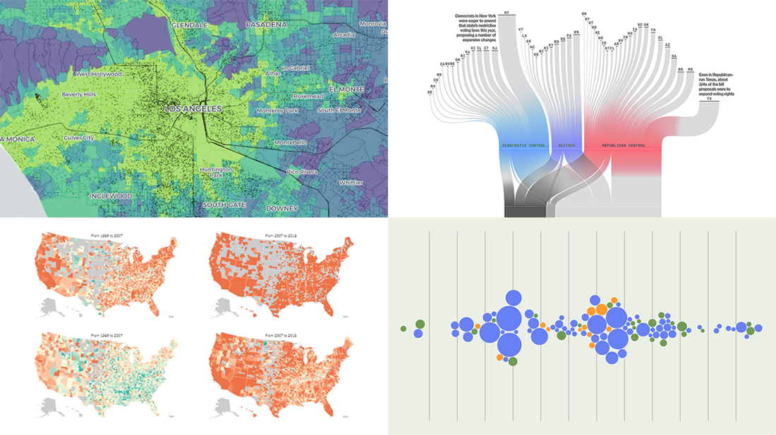 Join us to check out the most awesome data visualizations of all we have come across this week! To begin with, here is a full list of the projects featured today in DataViz Weekly:
- Proposed and passed voting bills across the U.S. in 2021 — Bloomberg
- Change in birth rates among American women — NYT
- Billing practices at the top 100 U.S. hospitals — Axios
- Transit equity in major U.S. cities — TransitCenter
- Categories: Data Visualization Weekly
- No Comments »
Engaging Data Graphics on Hobbies, Protests, Commute, and Reddit — DataViz Weekly
April 23rd, 2021 by AnyChart Team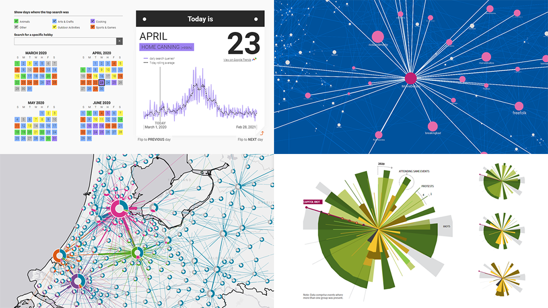 Can’t wait for a new portion of engaging data graphics? We’ve got it for you right here, right now! The following visualizations caught our eye this week, and DataViz Weekly is here to make sure you do not miss out on them:
- Top trending hobbies during the COVID-19 pandemic — Polygraph and Google Trends
- Right-wing protests in America in 2020-2021 — Reuters
- Commuting in the Netherlands — Statistics Netherlands
- Map of Reddit — Andrei Kashcha
- Categories: Data Visualization Weekly
- No Comments »
Visualizing Numbers on Migration, Powerlifting, Commute, and Nature — DataViz Weekly
October 18th, 2019 by AnyChart Team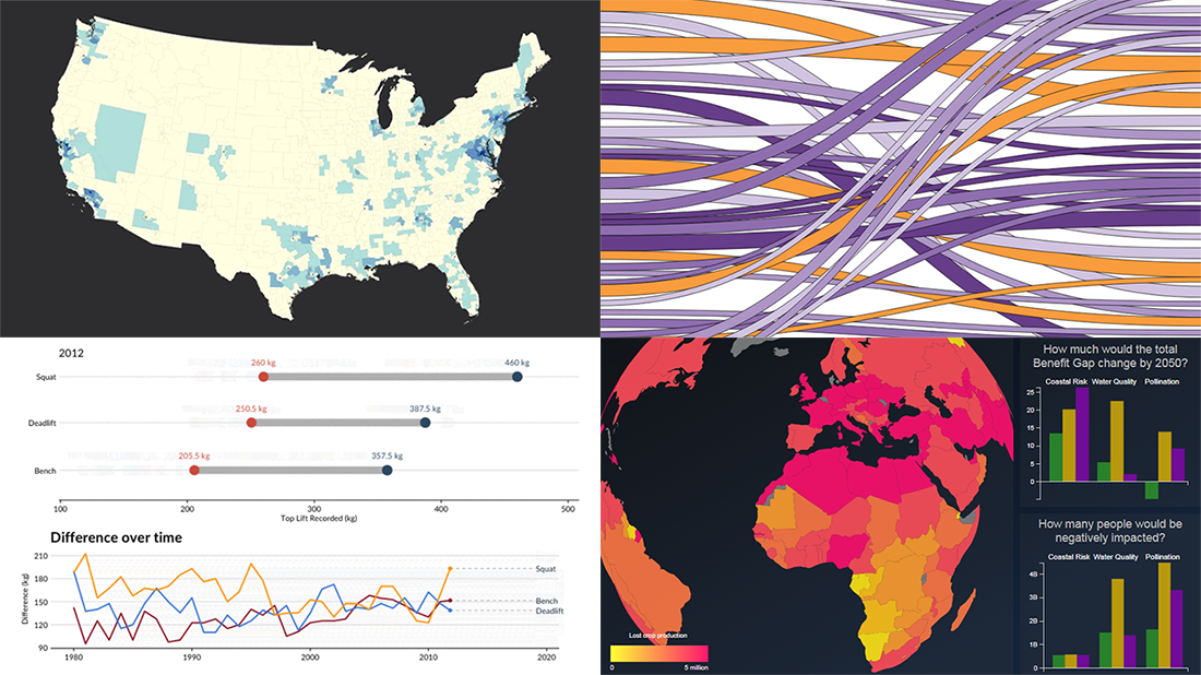 This week, we’ve found more new cool projects that wonderfully demonstrate the power of visualizing numbers. Here are the four most interesting ones where charts and maps actually let data speak — join us as we quickly present them in today’s DataViz Weekly:
- Charting migration pathways worldwide — Bloomberg
- Plotting differences between men’s and women’s top lifts at IPF events — Connor Rothschild, Rice University
- Mapping commute thresholds across the United States of America — Nathan Yau, FlowingData
- Visualizing nature’s contributions to people globally — Natural Capital Project
- Categories: Data Visualization Weekly
- No Comments »
Interactive Data Visualization Tool Examples Worth Checking Out — DataViz Weekly
September 27th, 2019 by AnyChart Team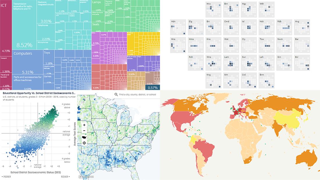 Analyzing data is always easier when it’s graphically represented and integrated in a convenient interactive data visualization tool. We’ll show you four great examples of such tools created by different groups of researchers from around the world just recently.
Today’s DataViz Weekly post highlights projects on the following topics:
- Economic complexity of 130 countries — Growth Lab at Harvard’s Center for International Development
- Educational opportunities in the United States of America — Stanford University’s Educational Opportunity Project
- Commuter flows in London — GLA City Intelligence Unit
- Global corporate profit shifts — Researchers from UC Berkeley and UCPH
- Categories: Data Visualization Weekly
- No Comments »
Excellent Visualizations on Subway, Moons, Energy, and Sea Ice — DataViz Weekly
July 12th, 2019 by AnyChart Team Many excellent visualizations have appeared this week around the web. Now it’s time to choose four and briefly introduce them to you — that’s what we’ve been doing for years within the framework of the special DataViz Weekly feature on our blog.
Alright. We invite you to take a look at the following new cool projects as another set of great data visualization examples, for your inspiration and fun:
- Variability in the New York subway commutes — The Upshot
- Moons in our solar system — National Geographic
- Energy consumption worldwide since 1980 — Bloomberg
- Sea ice extents since 1979 — ArcGIS Blog
- Categories: Data Visualization Weekly
- No Comments »
Interesting Data Graphics About Warming, Debt, Commuting, and China — DataViz Weekly
September 7th, 2018 by AnyChart Team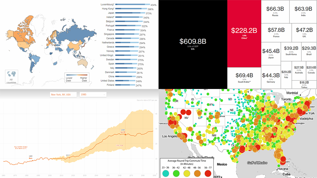 Check out the new issue of DataViz Weekly on the AnyChart blog, showing you four interesting data graphics-based stories and projects on the following topics:
- how much hotter your hometown is than when you were born;
- global debt;
- commute times in U.S. cities;
- China as an aspiring superpower.
- Categories: Data Visualization Weekly
- No Comments »