 This week, we’ve found more new cool projects that wonderfully demonstrate the power of visualizing numbers. Here are the four most interesting ones where charts and maps actually let data speak — join us as we quickly present them in today’s DataViz Weekly:
- Charting migration pathways worldwide — Bloomberg
- Plotting differences between men’s and women’s top lifts at IPF events — Connor Rothschild, Rice University
- Mapping commute thresholds across the United States of America — Nathan Yau, FlowingData
- Visualizing nature’s contributions to people globally — Natural Capital Project
Visualizing Numbers in Data Visualization Weekly: October 11, 2019 — October 18, 2019
Charting Migration Pathways
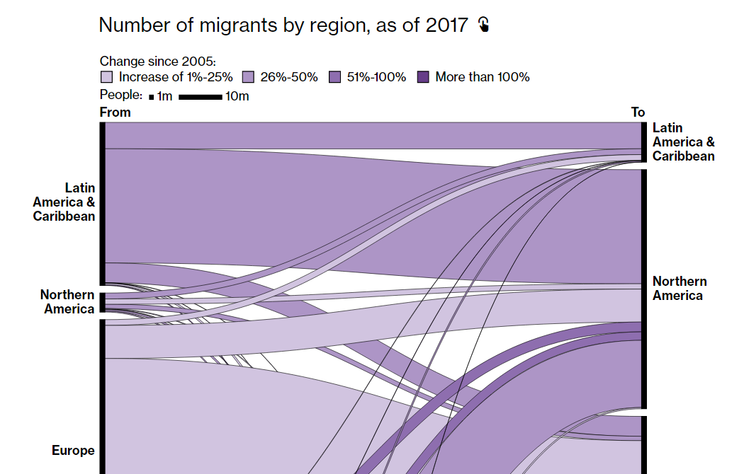
According to data from the United Nations Department of Economic and Social Affairs (UN DESA), in 2017, there were about 258 million people living not in their country of birth — those who we usually call migrants. In percentage terms, that is 3.4% of the world’s inhabitants, up from 2.8% of the overall population in 2000. What drives the growth of migration and makes it all the more contentious?
While discussing this in a recent article, Bloomberg published two cool Sankey diagrams to graphically represent global migration flows as of 2017. Both are interactive. The first one visualizes how many migrants moved from one region to another. The second chart offers a closer look by displaying country-level data about the pathways.
Plotting Differences Between Men’s and Women’s Top Lifts at IPF Events
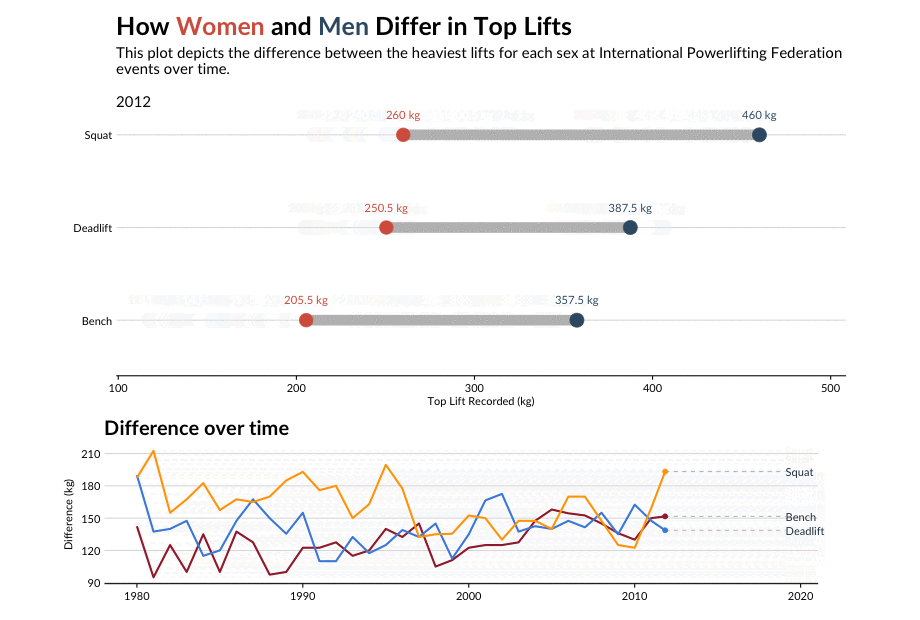
The strongest men have always been stronger than the strongest women. At least that’s the case for official powerlifting competitions during the last 40 years. However, the difference between the heaviest lifts for each gender has never been the same over time. Connor Rothschild, an undergraduate at Rice University, made a nice visualization to show that.
He used dumbbell plots to provide a look at the top lifts at the International Powerlifting Federation’s events in 1980-2019, by lift type — squat, deadlift, and bench. The differences are also represented on a multi-line chart in more detail. To make it easier for viewers to understand how the differences changed, the author made a right decision to add animation and synchronize it between the charts.
Mapping Commute Thresholds
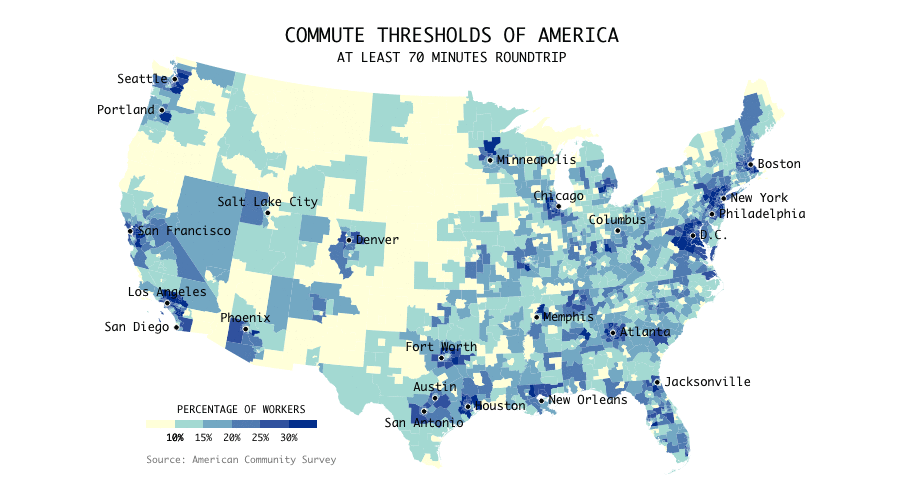
While working from home gets more and more common, most people in the United States have to spend time on traveling to work and then back home on a regular basis. Commutes can take as long as up to several hours or be as short as only a handful of minutes. And this is likely to depend a lot on exactly where you live. Looking into this matter, data visualization expert Nathan Yau mapped data from the American Community Survey.
His choropleth map displays commute thresholds for the entire contiguous U.S. in cumulative percentages. It is animated and begins with showing how many workers in each country take at least a zero-minute commute roundtrip, which is obviously everyone everywhere. The next frame represents the percentages with at least a ten-minute commute, then twenty-minute, and so on. The cutoff was discovered at 180 minutes, i.e. three hours.
Visualizing Nature’s Contributions to People
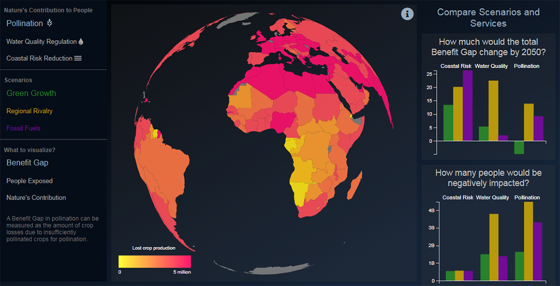
Nature is awesome. Not only is it so because we are basically part of it. Nature indeed helps us humans to live, purifying water, delivering pollinators, protecting us from floods, and so on. However, in areas where people need its assistance the most, nature’s ability to meet such needs appears to be declining. Stanford University’s Natural Capital Project launched an interactive data visualization to display the contribution of nature across the world for a more in-depth analysis.
Featuring multiple maps and charts, the project allows us to explore people’s needs for benefits from nature along with its contributions to meeting those needs now and in the future, across diverse regions and scenarios. The areas of nature’s contribution covered here are water quality, pollination of crops, and coastal risks.
***
Hoping you liked these awesome charts visualizing numbers on the topics of migration, powerlifting, commute, and nature, we invite you to stay tuned for Data Visualization Weekly as we’ll continue to highlight new cool projects.
Have a great time!
- Categories: Data Visualization Weekly
- No Comments »