 Check out the new issue of DataViz Weekly on the AnyChart blog, showing you four interesting data graphics-based stories and projects on the following topics:
- how much hotter your hometown is than when you were born;
- global debt;
- commute times in U.S. cities;
- China as an aspiring superpower.
Data Visualization Weekly: August 31, 2018 — September 7, 2018
How Much Hotter Your Hometown Is (and Will Be) Than When You Were Born
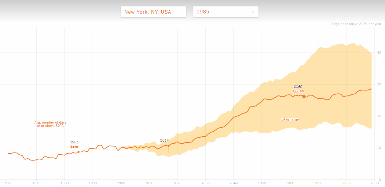
Climate change is a topical issue, so no wonder new data studies and visualizations on this subject frequently come to light. This time, The New York Times published another interesting data graphics-based project based on a special research conducted by the Climate Impact Lab. It allows you to check how much warmer your hometown currently is compared to your year of birth. There you’ll also find the future projection until 2089.
Global Debt
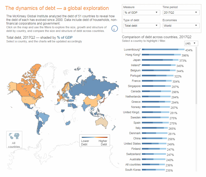
The McKinsey Global Institute made an interactive data visualization which displays at a glance how the debt of fifty-one countries has evolved since the year of 2000. Explore the government, household, non-financial corporate, and total debt globally.
Commute Times in U.S. Cities
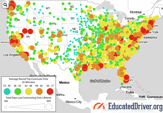
EducatedDriver.org looked into the average time people spend commuting to and back from work in one thousand U.S. cities, and made an interactive map for a more insightful overview. Check out the commute time in your area and how many days of your whole life you are likely to waste on these daily roundtrips, in total.
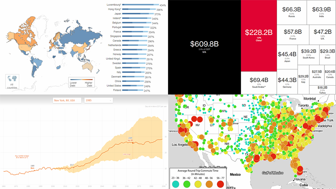
China as Aspiring Superpower
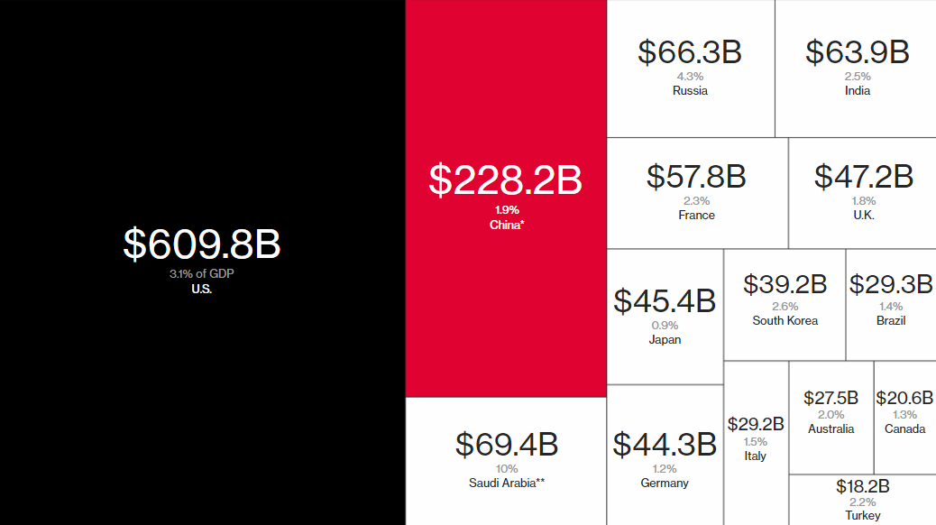
Bloomberg discussed ambitions of China as an aspiring global superpower and how they correlate to what it actually has and may achieve. Take a look at a lot of charts and maps in the story, communicating data about its GDP, population, defense budget, military strength, and so on in comparison with the U.S. and some other countries.
***
We appreciate your attention. Have a great time!
- Categories: Data Visualization Weekly
- No Comments »