 Analyzing data is always easier when it’s graphically represented and integrated in a convenient interactive data visualization tool. We’ll show you four great examples of such tools created by different groups of researchers from around the world just recently.
Today’s DataViz Weekly post highlights projects on the following topics:
- Economic complexity of 130 countries — Growth Lab at Harvard’s Center for International Development
- Educational opportunities in the United States of America — Stanford University’s Educational Opportunity Project
- Commuter flows in London — GLA City Intelligence Unit
- Global corporate profit shifts — Researchers from UC Berkeley and UCPH
New Cool Interactive Data Visualization Tool Examples: September 20, 2019 — September 27, 2019
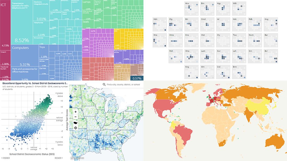
Economic Complexity of Countries
Harvard researchers launched Country Profiles, an interactive tool that should help government officials, entrepreneurs, and scholars better assess the economic development and growth opportunities in 130 countries. Created by the team of the Growth Lab at Harvard Kennedy School’s Center for International Development, it builds on the Atlas of Economic Complexity they have been working on for over ten years now.
The Atlas itself is a comprehensive project designed to represent a whole lot of data for exploring what The Harvard Gazette calls “an almost endless array of exports, industries, technologies, and capabilities in countries across the world.” In Country Profiles, the Growth Lab is reported to have “set out to harness and automate the data in simpler, more user-friendly forms that look not just at current national performance but at future strategic paths.”
Check out how the Country Profiles project is making good use of interactive data visualization to show the economic complexity of each of the 130 featured countries worldwide and how they evolve. Read more about it on The Harvard Gazette.
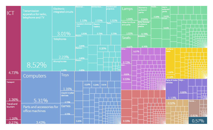
Educational Opportunities in America
The Educational Opportunity Project at Stanford University released Opportunity Explorer, an interactive tool designed to provide an unprecedented way to visually explore student test scores and achievement gaps by race, gender, and poverty level. It shows data from the Stanford Education Data Archive (SEDA) known as the first-ever comprehensive database of academic performance nationwide.
“Now, with an interactive tool on the Educational Opportunity Project’s website, any user can generate charts, maps and downloadable PDFs to illustrate and compare data from individual schools, districts or counties,” Stanford News suggests.
Look into the average test scores (indicating educational opportunities American children have from their birth to middle school), learning rates (indicating school effectiveness), and test score trends (indicating how educational opportunities change). Read this article on Stanford News to learn more about the significance of the Educational Opportunity Project and their new Opportunity Explorer tool.
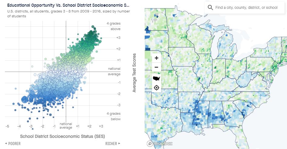
London Commuter Flows
The Greater London Authority’s City Intelligence Unit published a new interesting project, London Commuting Flows. It is a neat cartogram-based visualization that displays the number of commuters from home to destination boroughs within the capital of Great Britain.
The London Commuter Flows is an interactive tool. Each square represents a borough, and if you click one, you’ll see where and how many people living in that borough travel to work. Hover over smaller squares on big borough squares to explore the same data in a different view.
Try this cool interactive data visualization tool to analyze the commuting flows from individual boroughs and find out how many London citizens travel from one borough to each other on a regular basis.
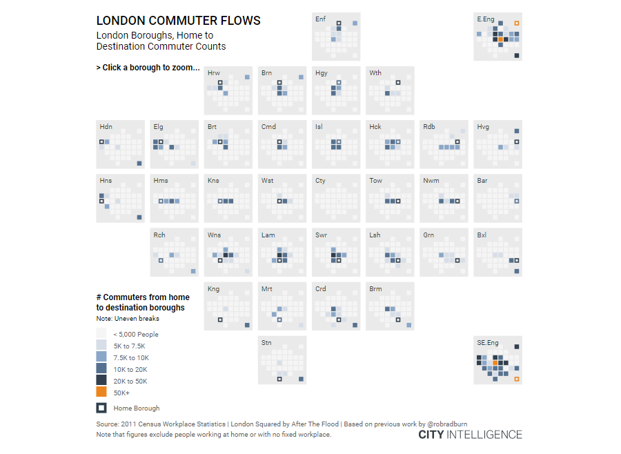
Global Corporate Profit Shifts
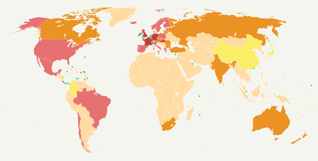
A group of researchers from the University of California, Berkeley and the University of Copenhagen created an interactive map that shows the amount of corporate profits and tax revenue that different countries lose and attract. It is a great visualization tool to look into how multinational companies shift their profits to tax havens in order to lower their tax bills globally.
The project builds on a database created by the authors, which reveals where corporations book profits. “[I]n recent years, the statistical institutes of most of the world’s developed countries (including the key tax havens) have started releasing new macroeconomic data known as foreign affiliates statistics. These data allow to obtain a comprehensive view of where multinational companies book their profits, and in particular to estimate the amount of profit booked in tax havens globally,” the description note explains.
Explore the map and you’ll quickly identify tax havens, find out how many profits each country shifted to exactly which of them, and learn even more about the real situation in this “game for profits.”
***
Check out these cool interactive data visualization tool examples and stay tuned for more, in Data Visualization Weekly on AnyChart Blog.
- Categories: Data Visualization Weekly
- No Comments »