 Welcome back to DataViz Weekly, our regular blog feature where we recognize some of the most interesting data visualizations we’ve recently seen out there. Here’s our new selection of stunning graphics from different people — take a look!
- Bats and the origin of virus disease outbreaks — Reuters
- Race and gender diversity within the biggest corporations in the U.S. — Bloomberg
- All roadwork projects in West Virginia for 2021 — WVDOT
- Climate threats to heritage sites in England, Wales, and Northern Ireland — National Trust
Data Visualization Weekly: March 5, 2021 — March 12, 2021
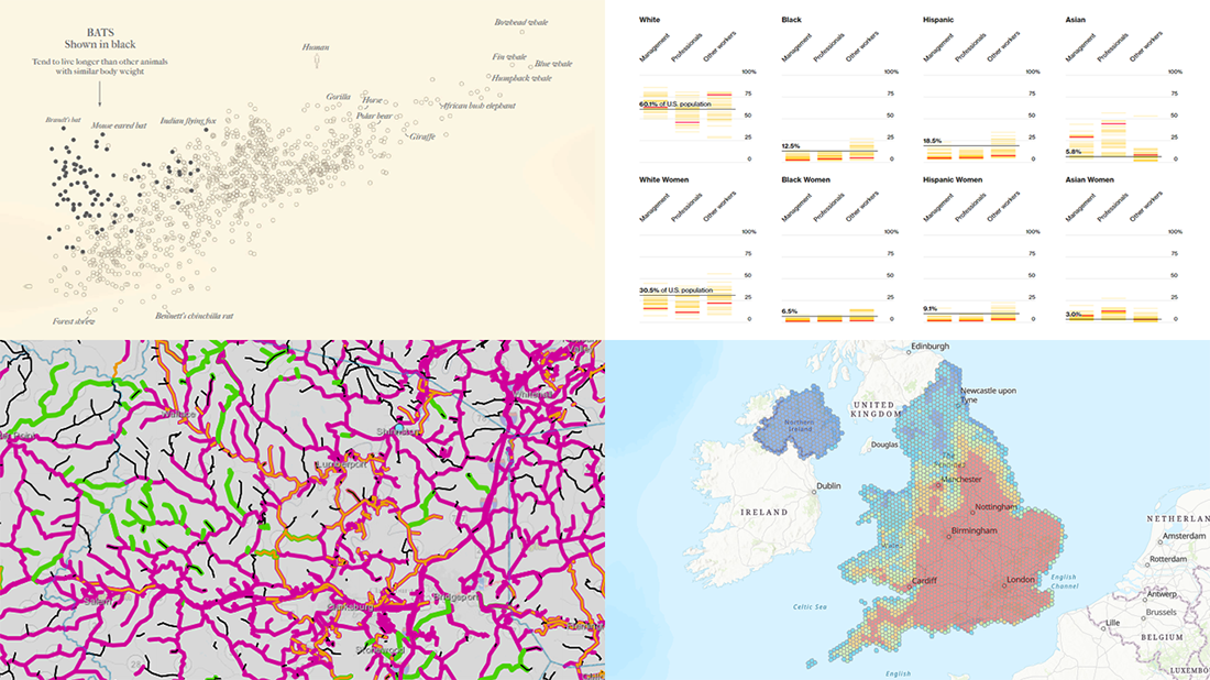
Bats and Origin of Virus Disease Outbreaks
Scientists say the pathogen that we now call the novel coronavirus, or SARS-CoV-2, most likely originated in a horseshoe bat. So, the COVID-19 pandemic may well have started with bats. But that’s not all. According to studies, bats appear to carry a lot of various other viruses. Some of these viruses have already caused outbreaks. For example, MERS, SARS, and Ebola are known to have come from bats. What makes these animals such great hosts for pathogens leading to diseases?
Reuters offers an explanation at a glance. Look at a set of compelling graphics made by Simon Scarr and Julia Janicki. In particular, it includes a representation of the universe of bats and their harbored zoonotic viruses. There are also two charts: one compares longevity against mass (you can see this graph on the picture above) and the other visualizes data about the conservation status of bat species.
Awesome illustrations by Catherine Tai make the story look especially impressive. Check it out.
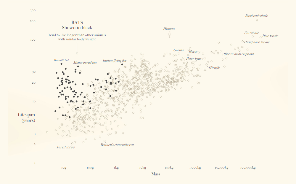
Race and Gender Diversity Within Biggest U.S. Corporations
#BlackLivesMatter has been loud. If you want to find out how top American companies respond to this movement when it comes to diversity in their employee base, see this noteworthy piece. Bloomberg succeeded to get employment data from 37 of the 100 largest U.S. corporations, which includes detailed breakdowns of employee counts by race as well as by gender.
The story, created by Jeff Green, Gerald Porter Jr., Cedric Sam, and Christopher Cannon, not only analyzes what the data does and doesn’t show but also allows you to explore it by yourself in a convenient visual way. Use their interactive charts to see the figures for the current racial and gender makeup of these companies, by type of role, and to compare them against the industry average according to the U.S. Equal Employment Opportunity Commission’s reports.
Look at what kind of corporate diversity landscape the data obtained by Bloomberg paints for America.
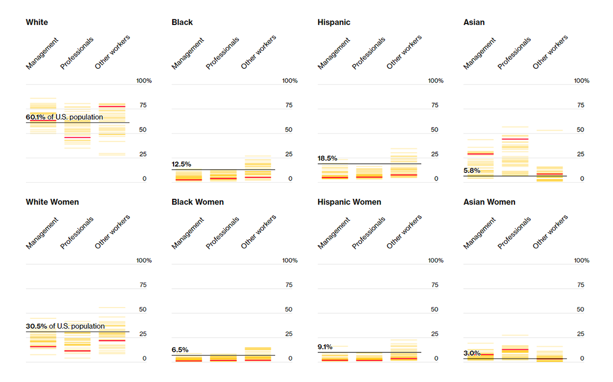
All Roadwork Projects in West Virginia for 2021
It’s always great when authorities at different levels leverage data visualization techniques to represent information in a convenient, human-friendly way. Here’s another cool example we’ve recently noticed. West Virginia’s Department of Transportation (WVDOT) visualized the entire statewide roadwork plan for this year in an interactive map.
There, you can search for a place to see all road projects that are currently underway, already completed, or coming up thanks to the corresponding color coding pattern. The map has several tabs that let you filter the view if you want to see only paving, bridge, slide repair, core maintenance, or Roads to Prosperity program works. To find details about a certain project, click on it and you’ll see its start and finish dates, scope, and some other information.
WVDOT promises to update the map once every two weeks to make sure it displays the latest data on the status of each roadwork project in the state.
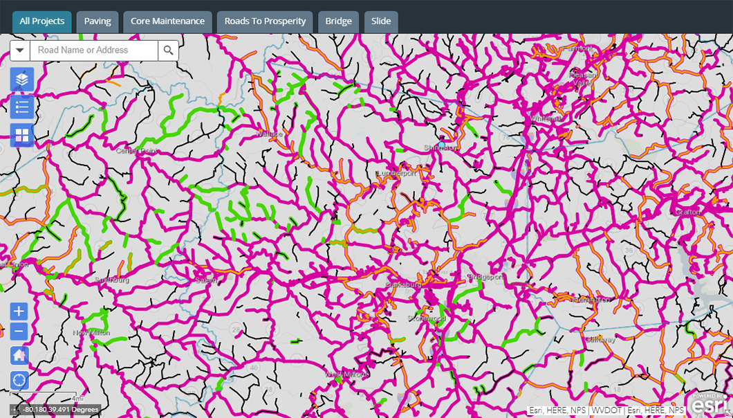
Climate Threats to Heritage Sites in England, Wales, and Northern Ireland
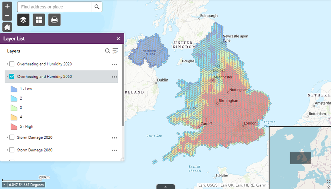
Last but not least, we invite you to check out another interesting geovisualization. The National Trust for Places of Historic Interest or Natural Beauty (or simply the National Trust), a charity in support of heritage conservation, mapped out climate change related hazards for England, Wales, and Northern Ireland.
Based on data from multiple sources, the map displays how threats such as overheating, flooding, and landslide could be expected to change over the following forty years from now. Just select a layer depending on the type of hazard you want to look into and the year, 2020 or 2060, and watch the threat levels visualized in hexagonal grids.
There is also an arrow at the bottom of the visualization. Click on it and you will be able to zoom into individual land and buildings run by the National Trust to understand what amount of risk from climate change they face.
***
Don’t miss a thing in data visualization! Stay tuned for Data Viz Weekly!
- Categories: Data Visualization Weekly
- No Comments »