 Looking for awesome examples of visual data stories? You’re in the right place at the right time! In this edition of DataViz Weekly, we feature four impressive new ones we’ve come across these days:
- Sexual violence crisis in Singapore — Kontinentalist
- Climate change in the Arctic and beyond — Woodwell Climate Research Center
- Melting glaciers as vanishing climate archives — Reuters
- All 12+ million buildings in Spain by height — elDiario.es
Data Visualization Weekly: September 24, 2021 — October 1, 2021
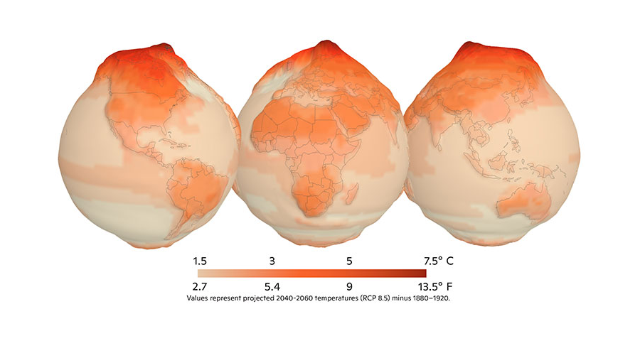
Sexual Violence Crisis in Singapore
Only a small share of all sexual assault cases happening in Singapore come to light and get known by the public. The main reason is the lack of comprehensive reporting. As a result, there is a myth that sexual violence is not a big problem in this country.
A recent analysis, however, reveals a crisis. Kontinentalist, a storytelling studio from Singapore, and Women Unbounded, a nonprofit for women’s empowerment, carried out tremendous work to collect data about sexual attacks from local news reports. Then they took a deep dive into the gathered information to see the true scale of the issue.
The results of their investigation are represented in an impressive visual data story, making use of a number of circle packing and other types of graphics to show the main statistics and findings at a glance as you scroll.
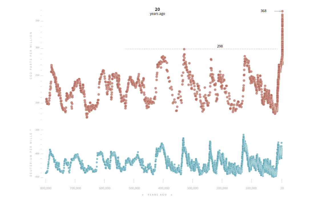
Climate Change in Arctic and Beyond
In the Arctic, warming is happening more than twice as fast as on average globally. At the same time, the effects of this change do not stay locked in that region. Because the planet’s climate system is globally connected, they spread far beyond, worldwide.
To show how climate change is impacting the Arctic landscapes and what consequences we are to expect not only in the north but all over the globe, climate think tank Woodwell Climate Research Center launched an interactive data visualization hub called UnstableGround.
The project features a lot of great maps and diagrams packed into fascinating visual stories. The home page, for example, greets you with a remarkable depiction of the projected warming as elevation, displaying the disproportionate impact of the ongoing climate change.
Melting Glaciers as Vanishing Climate Archives
Glaciers are not just masses of ice. They are natural archives of historical climate records. Small bubbles of air that can be found in the ice contain direct evidence of past climates and atmospheres.
Unfortunately, these climate archives are disappearing as glaciers are melting due to global warming. Some of them are vanishing at a faster pace than expected. So, scientists are now in a rush trying to accelerate ice core harvesting missions while it is not too late to collect the remaining frozen records.
Cassandra Garrison, Clare Baldwin, and Marco Hernandez from Reuters made a cool explanation of how ice cores are extracted and analyzed in a visual storytelling format. In particular, there is a great example of what kind of climate data can be collected from ice and what it can reveal, based on the findings of the European Project for Ice Coring in Antarctica (EPICA).
All 12+ Million Buildings in Spain by Height
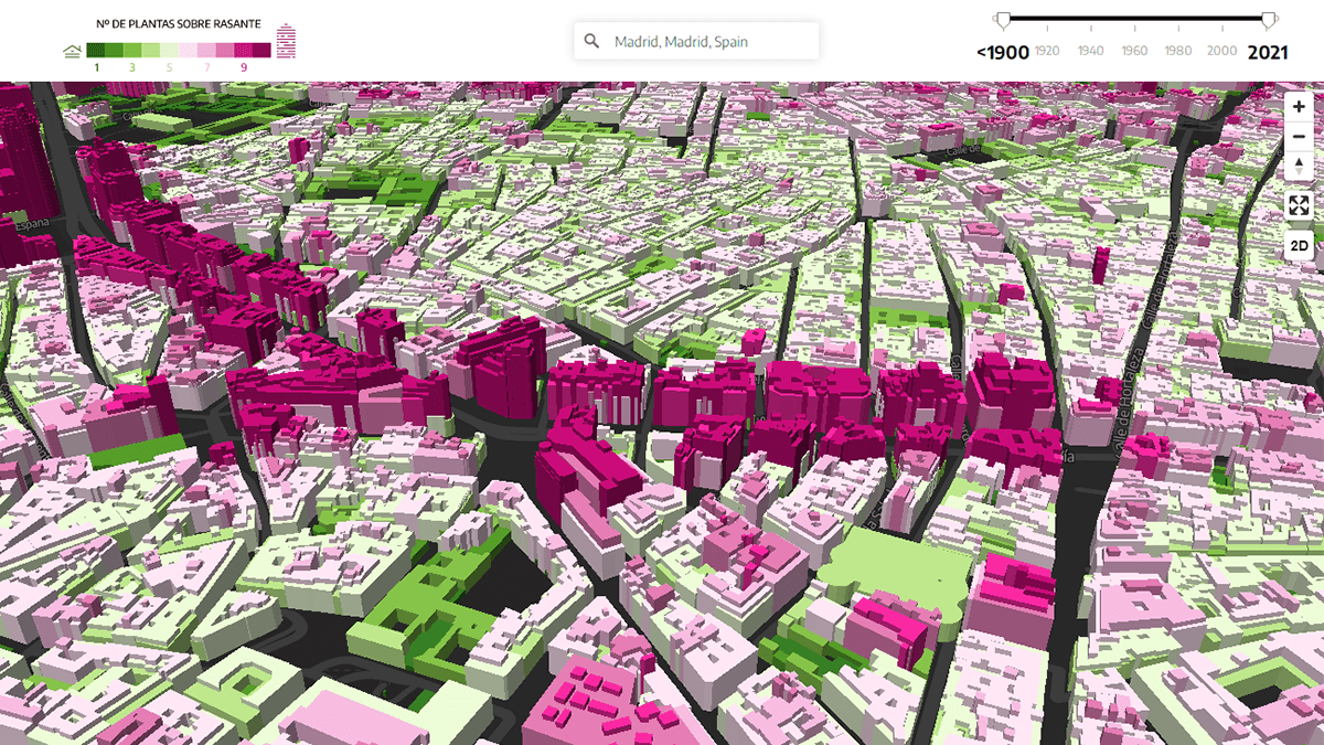
Last but not least for today, we invite you to look at a beautiful map and a story around it created by Raúl Sánchez and Analía Plaza for elDiario.es, a Spanish online newspaper.
Using official cadastral data, the map displays the height of all the more than 12 million buildings all over Spain by coloring them according to the number of floors above ground. It can be viewed not only in 2D but also in 3D, letting you explore the differences by visually comparing the buildings with each other by height. To quickly zoom in to a certain town or street, use the search bar. Additionally, a handy slider at the top right corner allows you to filter out the view by year of construction.
After the map, the article presents the diversity of the Spanish urban landscape through an interesting analysis of what it’s like in ten cities: Toledo, Barcelona, Murcia, Benidorm, Boadilla del Monte, Santander, Palm, Las Palmas de Gran Canaria, Empuriabrava, and Cadiz. (The original language is Spanish.)
***
Thanks for checking in! Stay tuned for great data visualizations, weekly!
- Categories: Data Visualization Weekly
- No Comments »