 A leaked draft of a U.S. Supreme Court opinion suggests that the 1973 Roe v. Wade decision, establishing federal constitutional protection of abortion rights, could be overturned. If the justices strike down the ruling, each state will be able to determine the legality of abortions.
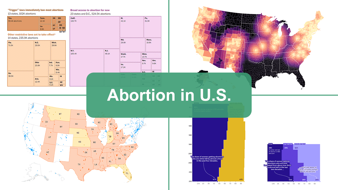
The document, which was later confirmed to be authentic, cast abortion rights back into the center of the political discourse in the United States. In the wake of that, we decided to make a special edition of DataViz Weekly to show you how some of the top publications — The Washington Post, Bloomberg, Reuters, and FiveThirtyEight — used data visualization to communicate the situation with abortions in the country and what is likely to change if the Supreme Court eventually overturns Roe.
Data Visualization Weekly: “Abortion in U.S.” Edition
FiveThirtyEight
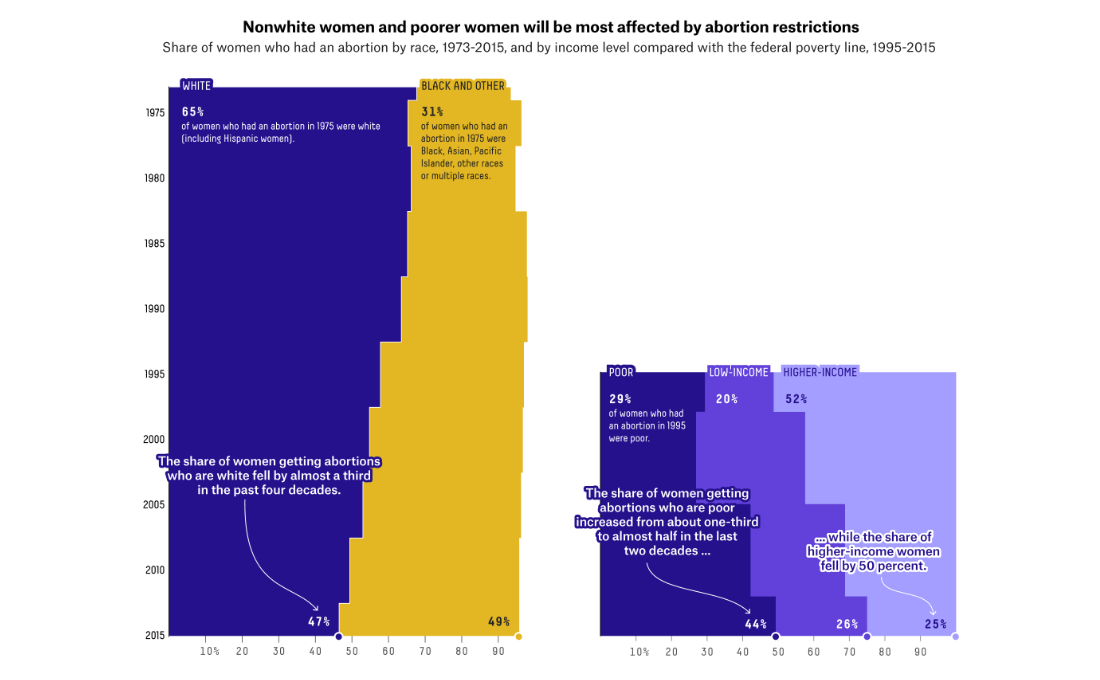
FiveThirtyEight made five visualizations that show where the United States stands on abortion.
The first one plots polling data from Gallup, KFF, Pew Research, and YouGov, representing the percentage of American adults who thinks abortion should be legal or illegal. The second visual is a set of pie charts displaying views on when during the pregnancy the abortion should be generally legal and on whether or not Roe should be overturned. Then comes a cartogram that visualizes how access to abortion could be expected to change without Roe. The next chart shows the share of women who had an abortion by race (from 1973 to 2015) and by income (from 1995 to 2015) — you can glance at this one in the picture above. Finally, you can see how the percentage of Joe Biden and Donald Trump voters calling abortion a “very important” issue was changing in 2021.
See the article “Where Americans stand on abortion, in 5 charts” by Jean Yi and Amelia Thomson-DeVeaux on FiveThirtyEight.
The Washington Post
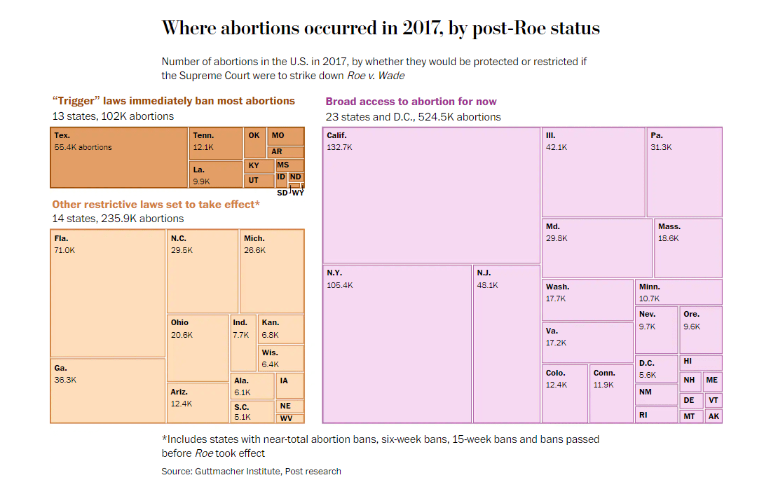
The Washington Post looked into the possible effect of overturning Roe v. Wade on access to abortion across the United States.
The story starts with a treemap representing the number of abortions that occurred in each state in 2017. The visualization is split into three groups by the expected status of those abortions without Roe. One group comprises states where so-called “trigger” laws would immediately ban most abortions. A second one shows states with other restrictive laws set to take effect. The largest group displays states where abortions would remain protected.
Scroll down the piece for more insight from more charts, on The Washington Post. Titled “Majority of women ages 15 to 44 would face new post-Roe abortion limits,” it was created by Harry Stevens, Aaron Steckelberg, Dan Keating, and Bonnie Berkowitz.
Bloomberg
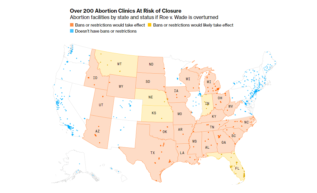
Bloomberg mapped all abortion clinics around the United States and colored the states based on the (estimated) post-Roe status. The resulting data visualization shows where and how many facilities are at risk of closure.
In the same article, there are also important charts revealing how many child-bearing Americans will likely lose access to legal abortion if Roe v. Wade is overruled by the Supreme Court. In fact, over half of all child-bearing people in the U.S. live in states considered to be hostile to abortion rights. Additionally, a cartogram similar to what we have seen on FiveThirtyEight shows the big picture of the impacts of a reversal of Roe across the country.
Check out the entire story “Supreme Court could jeopardize abortion access for 36 million people” produced by Kelsey Butler, Mathieu Benhamou, Rachael Dottle, Jeremy C.F. Lin, Dave Merrill, and Cedric Sam. On Bloomberg.
Reuters

Reuters published impressive maps representing the distance to the nearest abortion clinic and how it will change without Roe v. Wade, by county.
The initial map is for the current conditions with Roe in effect. The other two visualize possible distances to abortion facilities if Roe is overturned. The Guttmacher Institute rates states as “certain” or “likely” to impose an abortion ban based on their current laws and constitutions. So, the two post-Roe maps show distances to the nearest abortion clinics under those two scenarios. (The larger the distance, the darker the color.)
All the three maps are displayed one by one in the animated image above. Take a closer look at them and learn more in the article “The distance hurdle” by Sam Hart on Reuters.
***
Thank you for your attention to our special edition dedicated to data visualizations about abortions in the U.S. and the potential impacts of overturning the Roe v. Wade ruling. Stay tuned for DataViz Weekly where we curate the most interesting charts and maps for your inspiration!
- Categories: Data Visualization Weekly
- No Comments »