Created Visualizations on Cities, Politics, Education, and Romanovs — DataViz Weekly
May 24th, 2019 by AnyChart Team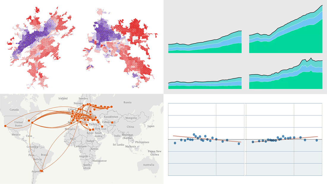 Each Friday, we meet you with four of the most interesting data-based projects we’ve just come across. Here’s what recently created visualizations we are glad to tell you about this time on DataViz Weekly:
- Why Workers Without College Degrees Are Fleeing Big Cities — The New York Times
- Where Democrats And Republicans Live In Your City — FiveThirtyEight
- Cost of College — FlowingData
- The Romanovs’ Twilight — TASS
- Categories: Data Visualization Weekly
- No Comments »
Data Charting on Health Care, Elections, Income, and Countries — DataViz Weekly
April 19th, 2019 by AnyChart Team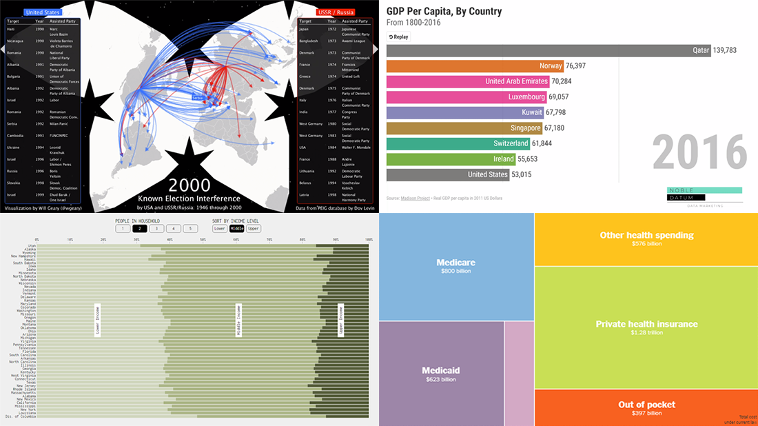 Various data charting examples get published on the web every day. They are part of visual stories, analytical reports, scientific studies, and so on. Every week, we choose four of the most interesting projects with charts and maps we’ve come across and feature them in a special post on the AnyChart blog within the framework of our regular DataViz Weekly series. So here’s a new one!
Today on Data Visualization Weekly:
- estimates of health care expenditures under the “Medicare for All” plan by U.S. Senator Bernie Sanders;
- electoral interference instances by the United States and USSR (Russia) in 1946-2000;
- U.S. households in each state by income level;
- top countries by GDP per capita in 1801-2016.
- Categories: Data Visualization Weekly
- No Comments »
Data Visualization Practices on Relationships, Brands, Hollywood, and Wildlife — DataViz Weekly
March 29th, 2019 by AnyChart Team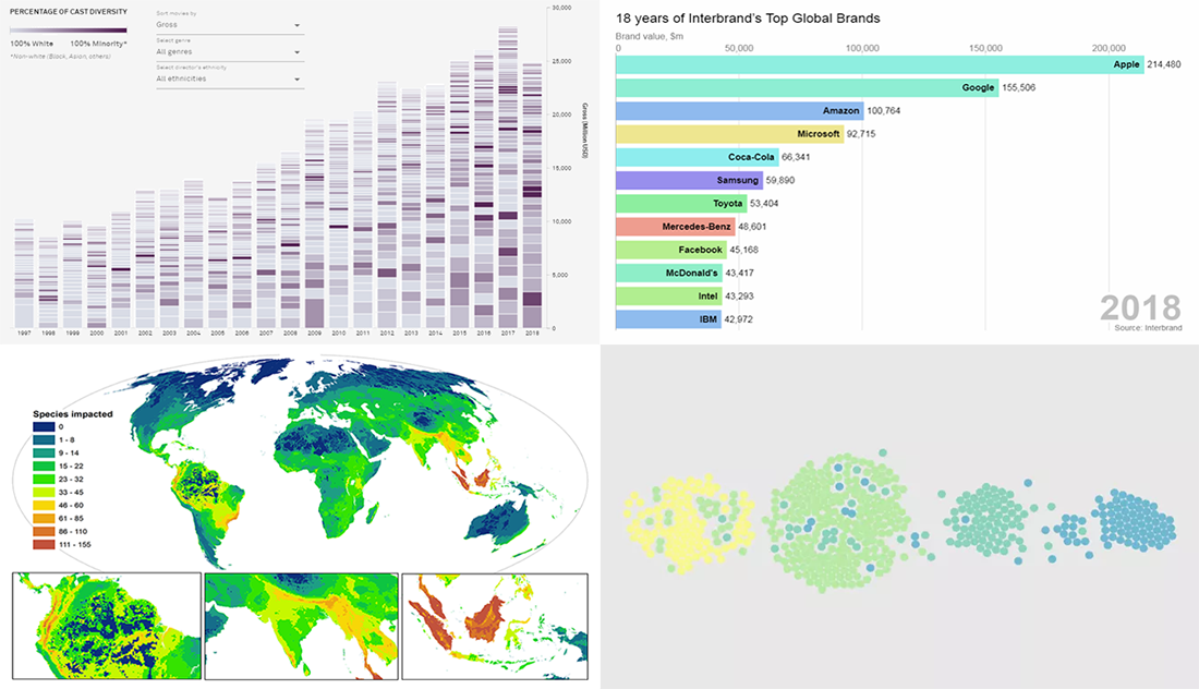 By looking at the best data visualization practices, not only do you have fun and learn something interesting about life and the world around us, but you can also pull together ideas that will help you take your charting skills to the next level. DataViz Weekly on the AnyChart blog is the right place to get such inspiration as that’s where we share with you some of the most interesting charts and graphics-based projects that have recently come to our attention.
Join us as we take a quick overview of new data visualizations on the following subjects:
- relationship timeline in 1970s vs 2010s
- top global brands in 2000-2018
- Asian on-screen representation in Hollywood movies
- global hotspots of human impact on threatened species
- Categories: Data Visualization Weekly
- No Comments »
Visualizing Statistics About Greenhouse Gases, Carbon Footprints, Movie Franchises, and Coal Production — DataViz Weekly
February 22nd, 2019 by AnyChart Team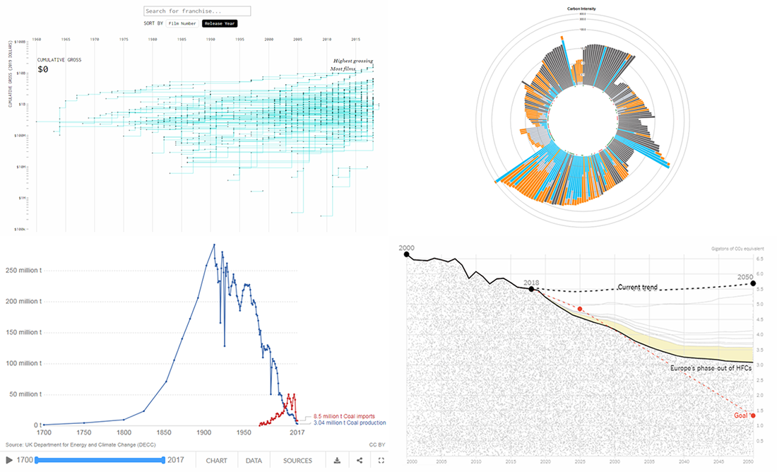 Don’t miss out on a new serving of interesting online projects visualizing statistics as we continue the DataViz Weekly series on the AnyChart blog! This time, we are glad to feature data graphics on the following subjects:
- scenarios of the greenhouse gas emissions reduction for the United States;
- carbon footprints of consumer products;
- box office revenue of movie franchises;
- rise and fall of coal production in the United Kingdom.
- Categories: Data Visualization Weekly
- No Comments »
Interesting Visualizations on Russia’s Borders, Paths to Congress, Child Time, News Lifespan — DataViz Weekly
February 1st, 2019 by AnyChart Team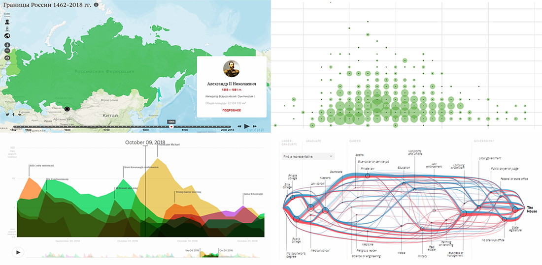 DataViz Weekly is here to meet you with some of the interesting visualizations we’ve come across these days. The new selection includes data-based projects worth seeing, with charts and infographics on the following topics:
- Russian borders from 1462 through 2018;
- career paths to the U.S. Congress;
- time to have the first child;
- lifespan of news stories.
- Categories: Data Visualization Weekly
- No Comments »
Trump Tweets, Big Mac Index, California Wildfires, Mid-Range Shots in NBA — DataViz Weekly
January 18th, 2019 by AnyChart Team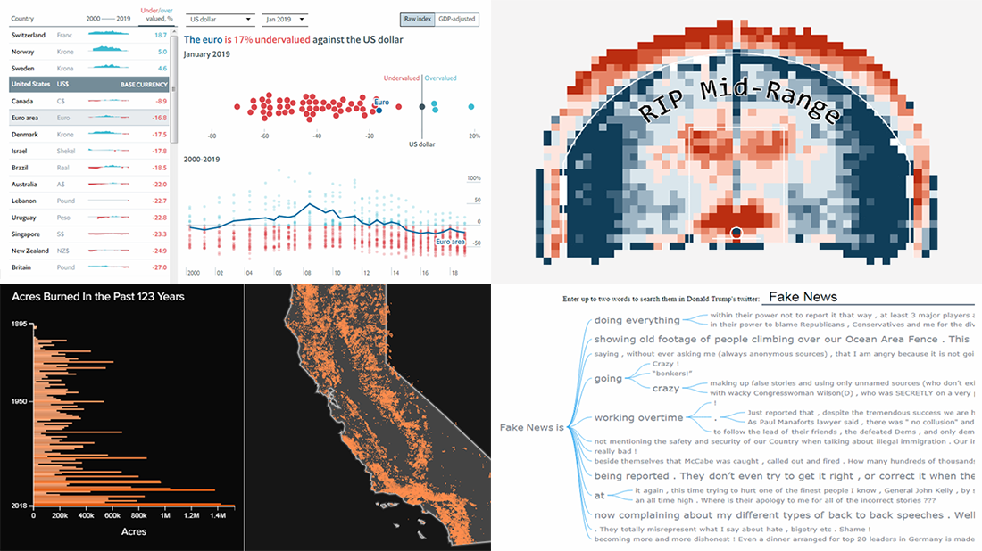 Take a look at some of the cool data visualization examples that appeared on the web just recently! The new article in the DataViz Weekly series features interesting, inspiring projects about words in Trump tweets, destiny of mid-range shots in NBA games, relative value of the world currencies according to the latest Big Mac Index data, and 100+ years of wildfires in California. Also, don’t miss out on an exciting news in the concluding part.
- Categories: Data Visualization Weekly
- No Comments »
Visualizing Data About Occupations, Airfares, Patents, and Porn — DataViz Weekly
December 14th, 2018 by AnyChart Team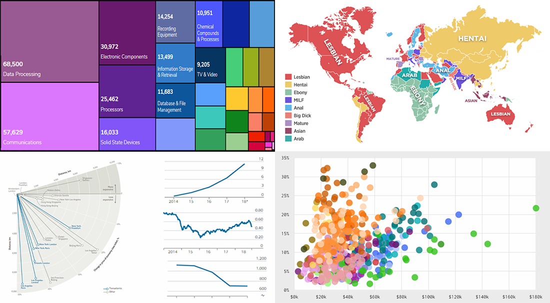 DataViz Weekly is here to tell you about new web projects and articles that feature interesting data graphics. This time, we showcase charts and infographics visualizing data about occupations of single earners in couple households in America, companies winning patent wars, change in air ticket prices globally, and Pornhub trends in 2018.
- Categories: Data Visualization Weekly
- No Comments »
New DataViz About Dating, TV Shows, Populists, and School Safety — DataViz Weekly
November 30th, 2018 by AnyChart Team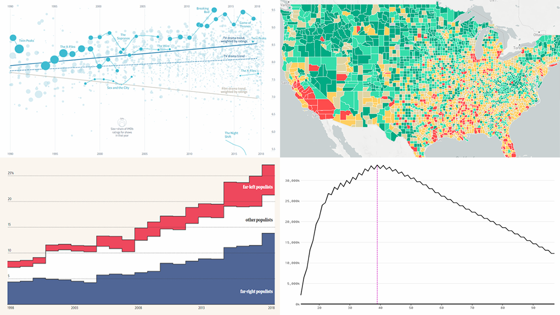 Data visualization is a wonderful way to represent data for intuitive, insightful exploration. The following new dataviz works we’ve found are actually good examples to prove this point.
Today on Data Visualization Weekly:
- dating pool by age;
- TV shows in IMDb user ratings;
- rise of populist parties in Europe;
- safety on the roads around American schools.
- Categories: Data Visualization Weekly
- No Comments »
New Visualizations of Data on Subreddits, Voters, Population, and Health — DataViz Weekly
November 2nd, 2018 by AnyChart Team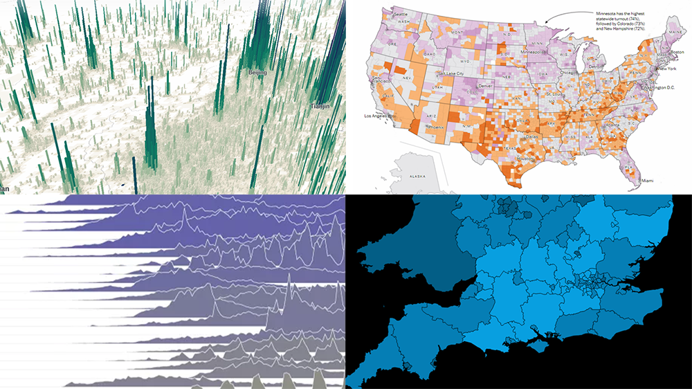 Hey everyone! We’ve gone through a number of new visualizations this week and selected four interesting projects to feature on DataViz Weekly today:
- the most commented subreddits over years;
- voter turnout in the United States;
- population density as terrain;
- years lost to leading death causes across the United Kingdom.
- Categories: Data Visualization Weekly
- No Comments »
Charting Projects About Population, Voting, Traffic, and Buildings — DataViz Weekly
October 19th, 2018 by AnyChart Team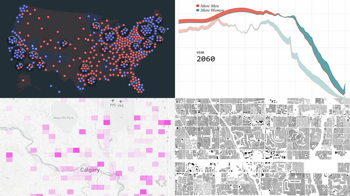 Another seven-day wait is over, and a new DataViz Weekly issue is here! This time, we offer you to look at the following interesting charting projects:
- U.S. population projections through 2060;
- House of Representatives elections from 1840;
- Calgary traffic incident prediction;
- every building in America.
- Categories: Data Visualization Weekly
- No Comments »