 Hey everyone! We’ve gone through a number of new visualizations this week and selected four interesting projects to feature on DataViz Weekly today:
- the most commented subreddits over years;
- voter turnout in the United States;
- population density as terrain;
- years lost to leading death causes across the United Kingdom.
New Visualizations in DataViz Weekly: October 26, 2018 — November 2, 2018
Most Commented Subreddits Over Years
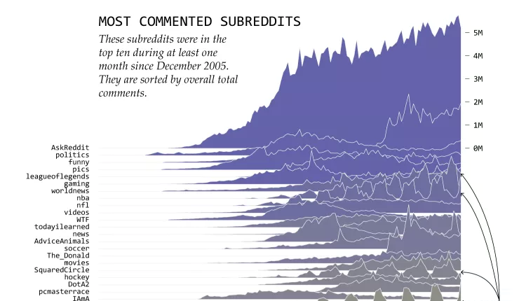
Nathan Yau looked into data about the number of comments across Reddit over the last 12+ years and charted how it changed for the most active subreddits (those that were in the 10 most commented in at least 1 month between late 2005 and nowadays). The project offers two visualizations providing different views. The first chart is an overview, and the second one provides a split view. Explore the most trending topics and how discussion activity changed over time.
Voter Turnout Geography
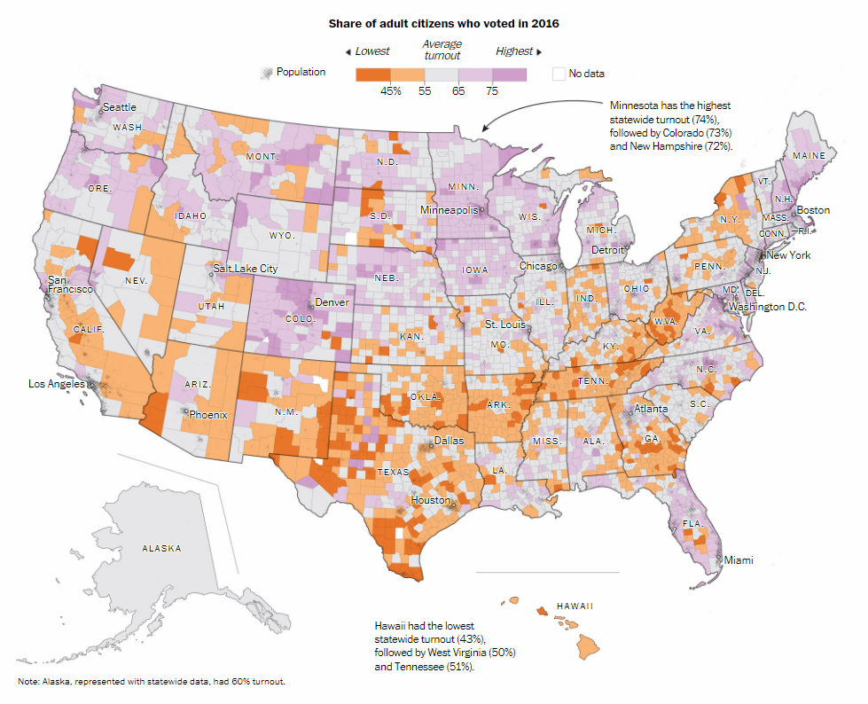
The 2018 midterm elections are coming very soon. So it is no surprise that many visualizations dedicated to voting have come to light lately. Another interesting data story was published by The Washington Post. Based on population and election data, it reveals voter turnout in the United States in 2016, in the latest national election, with the help of maps. In the article, you can also learn about expert views on what turnout to expect in November 2018.
Population Density as Terrain
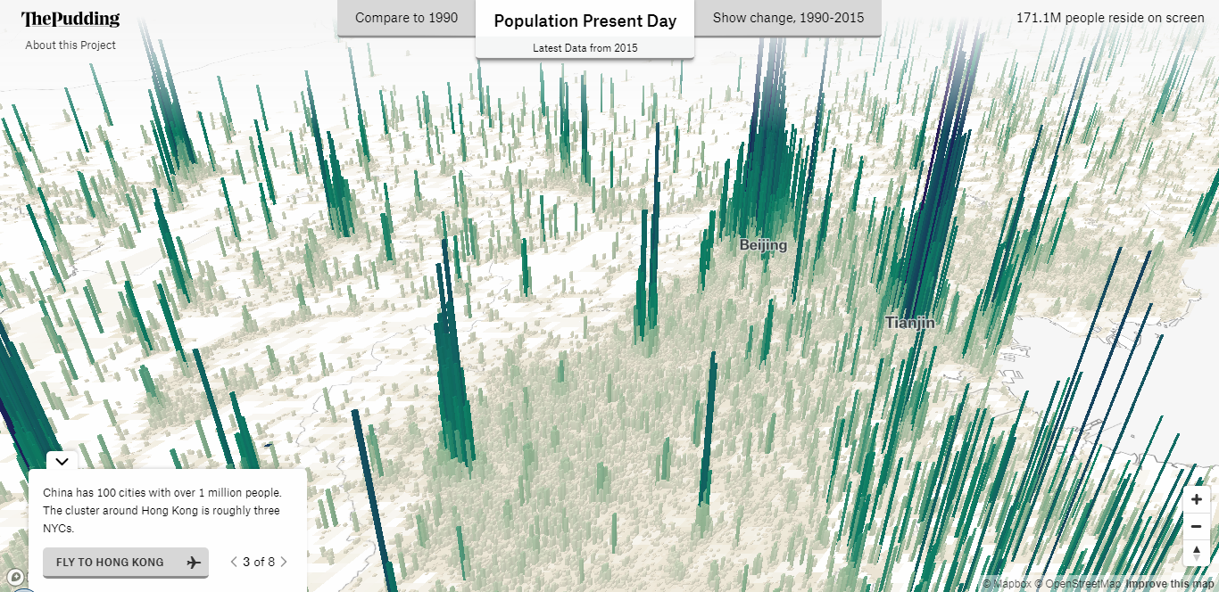
Matthew Daniels from The Pudding created a cool interactive 3D terrain visualization that nicely shows the population density all over the globe as of 2015. Two other views are available, displaying the difference between 1990 (or 1975) and 2015, as well as providing a single “Show change” look at 1990–2015. Blocks on the map represent areas of 250 to 5,000 square meters, i.e. approximately 2,700 to 53,800 square feet.
Years Lost to Leading Causes of Death Across United Kingdom
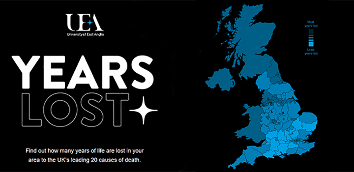
University of East Anglia (UEA) conducted a new research into health inequality in the United Kingdom based on data from the Global Burden of Disease Study (GBD). Look at their map to see the differences between local areas in terms of what causes of death are most common where as well as exactly how many years (of life) are lost in each area to the leading causes of death: heart disease, lung cancer, stroke, drug abuse, road injuries, and so on.
***
Explore and enjoy these new visualizations. And stay tuned for our regular DataViz Weekly feature.
- Categories: Data Visualization Weekly
- No Comments »