 Various data charting examples get published on the web every day. They are part of visual stories, analytical reports, scientific studies, and so on. Every week, we choose four of the most interesting projects with charts and maps we’ve come across and feature them in a special post on the AnyChart blog within the framework of our regular DataViz Weekly series. So here’s a new one!
Today on Data Visualization Weekly:
- estimates of health care expenditures under the “Medicare for All” plan by U.S. Senator Bernie Sanders;
- electoral interference instances by the United States and USSR (Russia) in 1946-2000;
- U.S. households in each state by income level;
- top countries by GDP per capita in 1801-2016.
New Data Charting Examples in Data Visualization Weekly: April 12, 2019 — April 19, 2019
Estimating Health Care Expenditures Under Medicare for All Plan
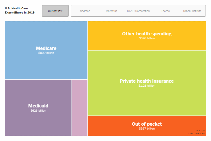
The “Medicare for All” plan reintroduced by U.S. Senator Bernie Sanders this week has been met with mixed reactions. As a matter of fact, it appears to be hard to conclude whether it would increase health spending in the United States or make costs lower. The New York Times tried to figure this out and asked several economists and think tanks to provide their estimates: Gerald Friedman from the University of Massachusetts, Charles Blahous from Mercatus Center at George Mason University, RAND Corporation’s analysts, Kenneth E. Thorpe from Emory University, and analysts from the Urban Institute. Take a look at the findings on whether “Medicare for All” will save billions or cost billions, in a special piece on The Upshot.
Electoral Interference by United States and Russia (USSR) in 1946-2000
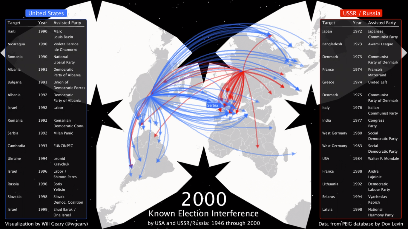
The (alleged) interference of Russia in the 2016 United States presidential election has been widely discussed in media. Whatever the case, such things are not really rare in world history, and data scientist Will Geary made a nice illustration of this fact. His impressive map animation displays all known instances of electoral interference lead by the USA on the one hand, and the USSR and Russia on the other, covering the period from 1946 through 2000. Take a look and do not forget to turn on the audio to listen to speeches by American presidents Harry Truman, Ronald Reagan, and George H. W. Bush.
U.S. Households by Income Level
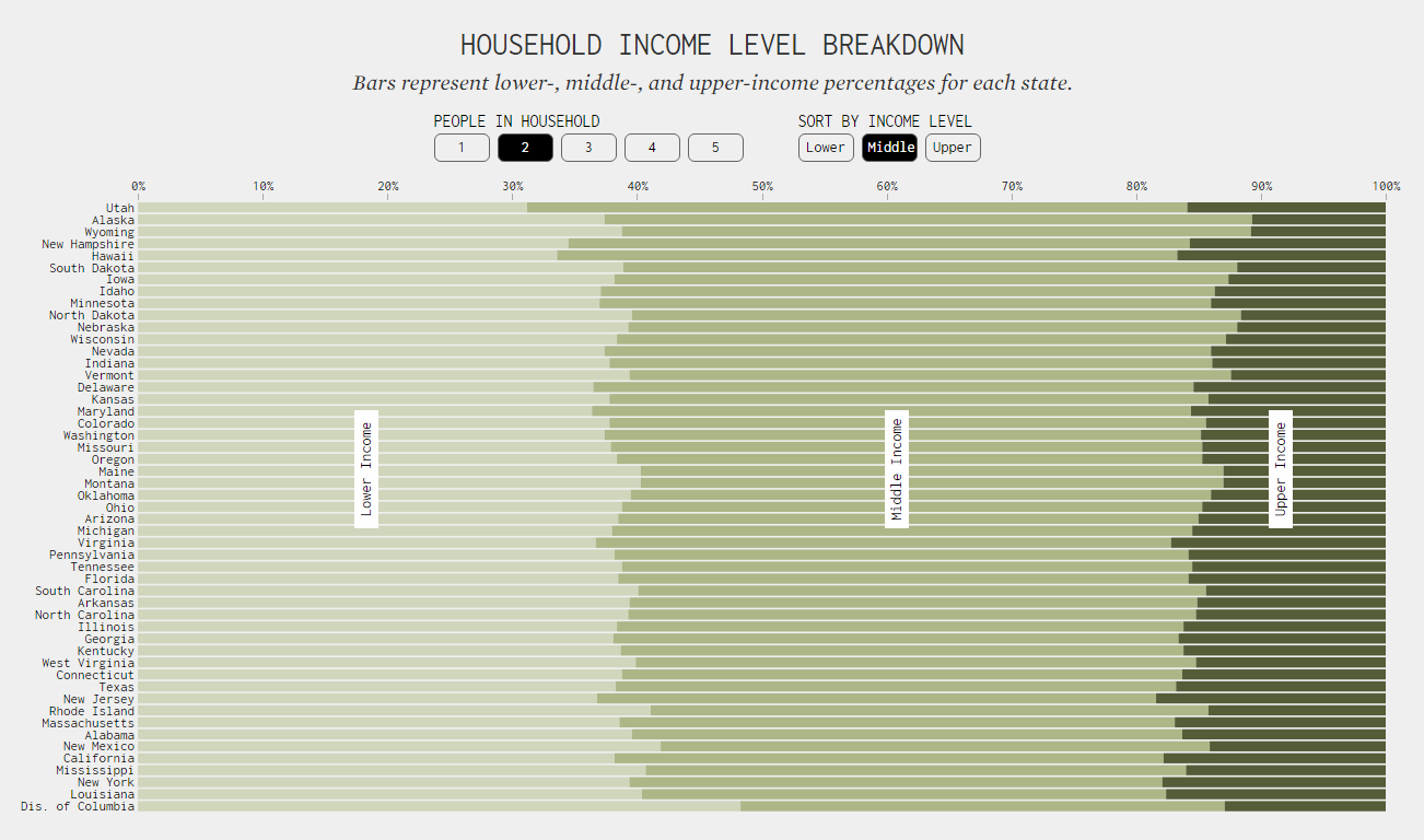
Famous statistician and data visualization expert Nathan Yau continues to look into the American Community Survey data. In his new project published as recently as this week on his blog FlowingData — it is #1 on the list of the 50 best data visualization blogs according to Feedspot, where our AnyChart blog with DataViz Weekly is now #2 best — he allows us to see what percentage of all households in each U.S. state belongs to the lower, middle, and upper-income level, adjusted for household size. Take a look. Also, don’t miss out on Nathan Yau’s other interesting work on the income subject, based on the same data and posted last week, which in a similar manner visualizes what qualifies as middle-income in each state of the United States of America.
Top Countries by GDP Per Capita in 1801-2016
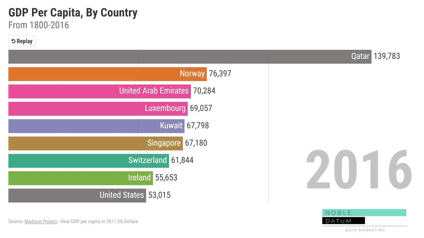
Noble Datum, a company developing interactive data visualization content, created a cool video showing the top countries by GDP per capita over 216 years from 1800 through 2016. The authors leverage the form of a bar chart race applied to data from the University of Groningen’s Maddison Project Databases. Take a look at the world’s economic history through the lens of the criterion of GDP per capita.
***
We’ll show you more data charting examples next week. Meanwhile, have a wonderful time everyone, and stay tuned!
- Categories: Data Visualization Weekly
- No Comments »