DataViz Projects About Cities, Opportunity, Mortality, and Migration — DataViz Weekly
October 5th, 2018 by AnyChart Team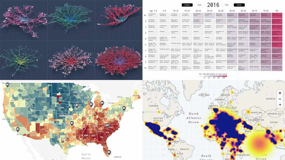 Read the first October issue of Data Visualization Weekly to learn about four interesting dataviz projects that have recently come to light:
- city road networks visualized as corals;
- U.S. Opportunity Atlas;
- top 10 causes of death over years;
- human migration routes that are most dangerous.
- Categories: Data Visualization Weekly
- No Comments »
Captivating Visualizations of Data About Recipe Ingredients, Social Connectedness, Decade Since Financial Crisis, and U.S. Government Spending — DataViz Weekly
September 21st, 2018 by AnyChart Team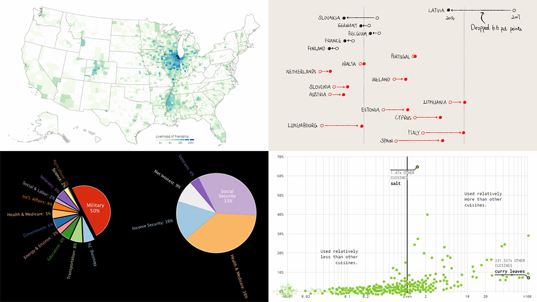 Take a look at another four new interesting projects with captivating visualizations that we’ve come across just about now. As always happens on DataViz Weekly, we start with a quick list of topics and then get straight down to the show:
- food ingredients by cuisine;
- social connectedness across the United States;
- ten years since the 2008 global financial crisis;
- U.S. federal government spending from 1962 to 2023.
- Categories: Data Visualization Weekly
- No Comments »