 Take a look at another four new interesting projects with captivating visualizations that we’ve come across just about now. As always happens on DataViz Weekly, we start with a quick list of topics and then get straight down to the show:
- food ingredients by cuisine;
- social connectedness across the United States;
- ten years since the 2008 global financial crisis;
- U.S. federal government spending from 1962 to 2023.
Data Visualization Weekly: September 14, 2018 — September 21, 2018
Food Ingredients by Cuisine
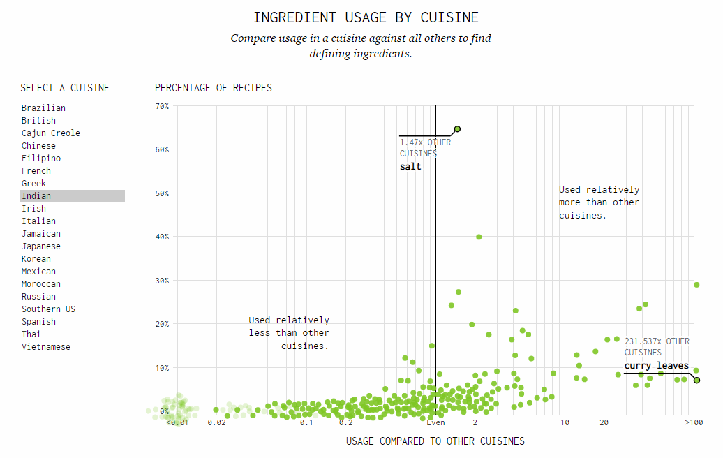
Statistician and data visualization expert Nathan Yau looked into a dataset of food ingredients from about 40 thousand recipes across 20 world cuisines — it came from recipe recommendation service Yummly — and created a visualization that enables an insightful comparison of ingredient usage by cuisine. Find out what ingredients define each cuisine — Brazilian, British, Cajun Creole, Chinese, Filipino, French, Greek, Indian, Irish, Italian, Jamaican, Japanese, Korean, Mexican, Moroccan, Russian, Southern U.S., Spanish, Thai, and Vietnamese — and even more on the FlowingData blog.
Social Connectedness Across U.S.
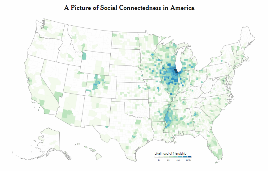
Quoctrung Bui and Emily Badger from The New York Times‘ The Upshot conducted an interesting research into how Americans are connected on Facebook in terms of location. Take a look at their cool interactive map of the social connectedness and see how probable it is that someone living in a certain U.S. county has Facebook friendship ties with someone from any other county around the country.
10 Years Since 2008 Global Financial Crisis
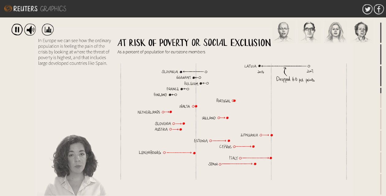
Reuters made an impressive interactive visual story, analyzing what has changed since the Lehman Brothers’ collapse in 2008, what has remained the same, and what may well trigger the next big financial crisis. Join five Reuters journalists — Dan Burns, Noah Barkin, Jennifer Hughes, Howard Schneider, and Karolina Tagaris — as they discuss all this from different angles (markets, politics, financial services, macroeconomy, and wealth distribution), and check out multiple charts that accompany the story to see what data tells us.
U.S. Federal Government’s Discretionary and Mandatory Spending in 1962—2023
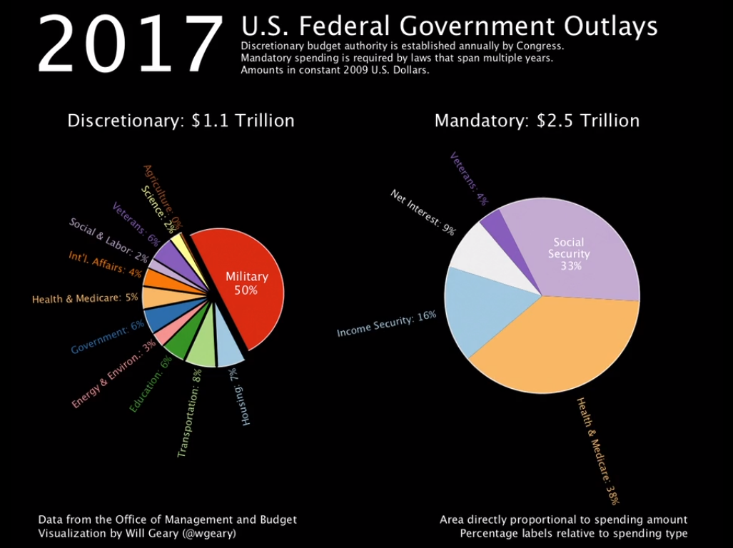
Data scientist Will Geary created an animated visualization of how the U.S. federal government outlays, both discretionary and mandatory, have changed since 1962 and what they are forecast to be through 2023, based on data from the White House Office of Management and Budget. Check out his video presentation on Vimeo.
***
We appreciate your attention to DataViz Weekly and will be glad to continue meeting you with captivating visualizations of data every week. Have a good time!
- Categories: Data Visualization Weekly
- No Comments »