 By looking at the best data visualization practices, not only do you have fun and learn something interesting about life and the world around us, but you can also pull together ideas that will help you take your charting skills to the next level. DataViz Weekly on the AnyChart blog is the right place to get such inspiration as that’s where we share with you some of the most interesting charts and graphics-based projects that have recently come to our attention.
Join us as we take a quick overview of new data visualizations on the following subjects:
- relationship timeline in 1970s vs 2010s
- top global brands in 2000-2018
- Asian on-screen representation in Hollywood movies
- global hotspots of human impact on threatened species
Data Visualization Practices in Data Visualization Weekly: March 22, 2019 — March 29, 2019
Relationship Timeline in 1970s and 2010s
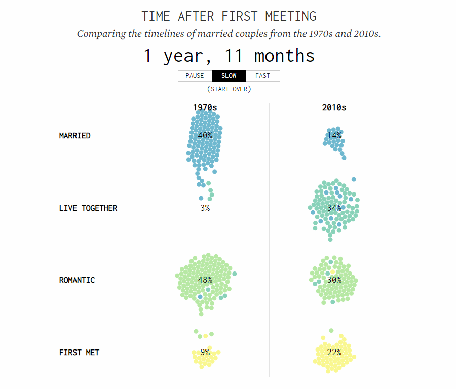
Over the past months, expert in statistics and data visualization Nathan Yau has created multiple charts on the subject of relationships, representing where couples usually meet, when people marry and get kids, and more. You can find those projects on his blog FlowingData, all of them are cool, and you could have already seen some of them featured on DataViz Weekly.
Earlier this week, Nathan published another interesting animated visualization within the framework of the same big subject. Based on data from the How Couples Meet and Stay Together survey from Stanford University’s SSDS Social Science Data Collection, the new project shows how quickly people pass the stages of relationships from the time they first met, to romantic, to living together, and finally, to getting married. What’s more, here you can compare the relationship timelines of Americans from the 1970s with 2010s.
Top Global Brands in 2000-2018
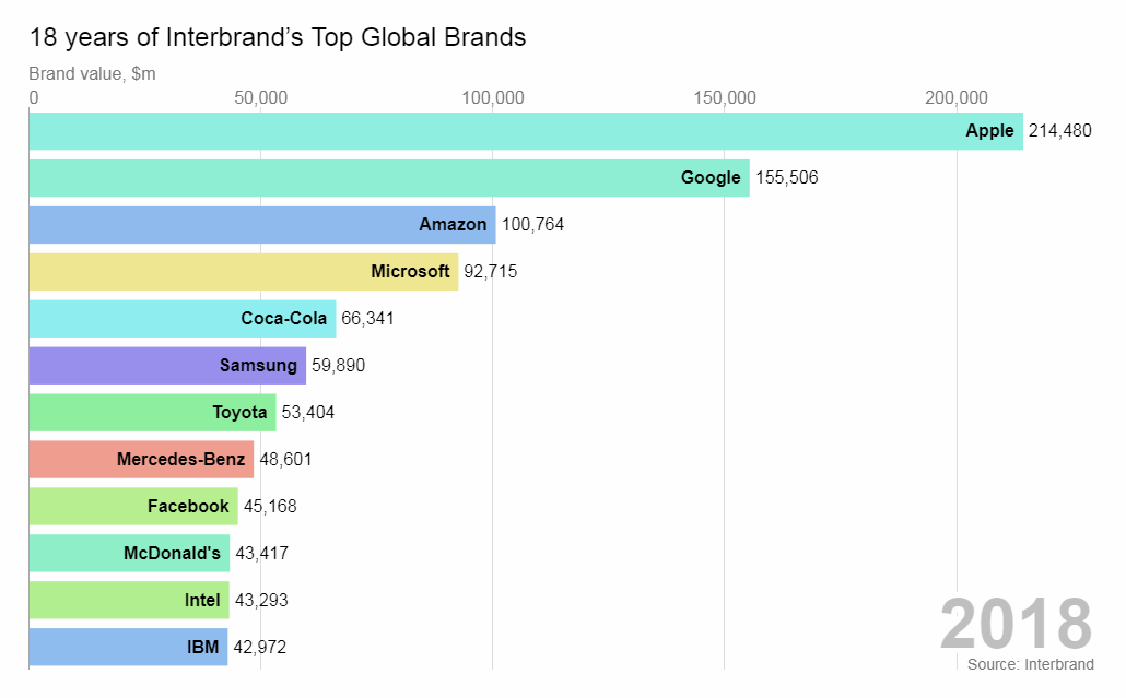
John Burn-Murdoch, a data journalist at Financial Times, occasionally publish interesting visualizations on his personal space on Observable. One of his most recent projects is an awesome animation that shows how the value of the world’s 12 biggest brands and the list itself were changing during 18 years, from 2000 through 2018.
Indeed, while bar charts greatly facilitate comparison, animation in the form of a race allows us to see the changes over time at a glance, making it all beautifully informative. Take a closer look and play with the code right there if you want.
Asian On-Screen Representation in Hollywood Movies
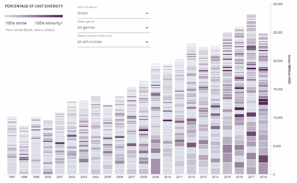
Inspired by the recent success of Crazy Rich Asians, the first major Hollywood movie with an all-Asian cast since The Joy Luck Club premiered in 1993, Isabella Chua from online platform Kontinentalist looked into the issue of the on-screen representation of Asians in blockbuster movies and how, if at all, this changed.
The research was based on the analysis of 21 years of IMDb blockbuster data and categorization of the starring cast into 4 categories: Asian, black, white, and others. The results are now published on Kontinentalist in the form of a great-looking visual story, offering a data-driven view of how diversity in Hollywood movies has changed so far and where the trend goes.
Global Hotspots of Human Impact on Threatened Species
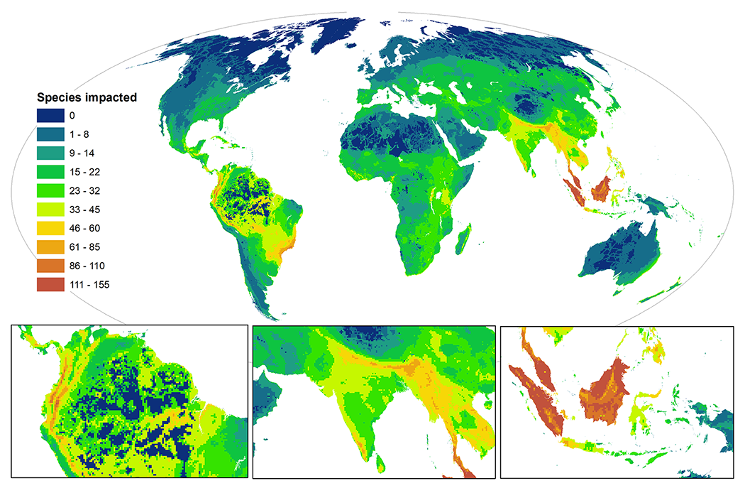
A new study from The University of Queensland’s researchers published this month on PLOS Biology, an open-access biology journal from the Public Library of Science (PLOS), shows that as many as 1,237 species will almost undoubtedly face extinction if no conservation effort is made to eliminate the threats.
The authors visualized and analyzed the International Union for Conservation of Nature’s and other publicly available data to discover what they called “global hotspots of human impact” where terrestrial birds, amphibians, and mammals are strongly endangered. “Coolspots” were also revealed, meaning the areas where species are naturally protected. Check out the maps and learn more in the paper on PLOS Biology.
***
We’ll keep you posted on the most interesting data visualization practices we notice around the web, within the framework of the regular Data Visualization Weekly feature on our blog. Stay tuned.
- Categories: Data Visualization Weekly
- No Comments »