Most Compelling New Examples of Data Visualization in Action — DataViz Weekly
September 24th, 2021 by AnyChart Team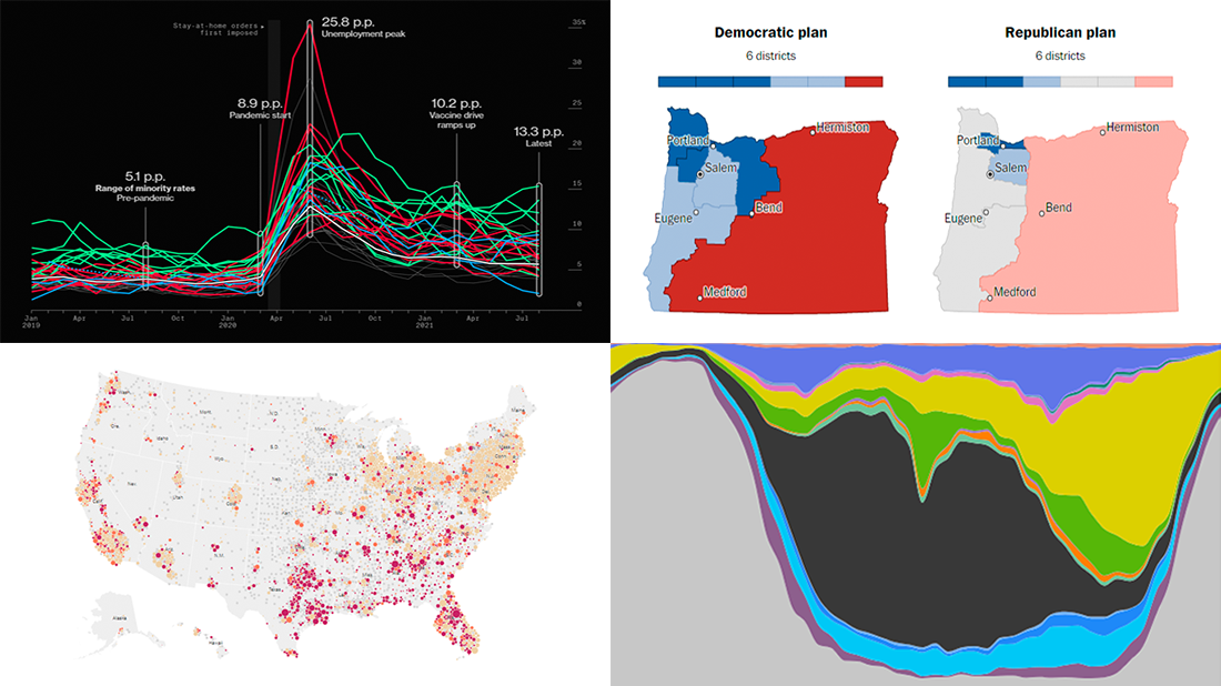 Hey everyone! It is Friday, and we are here to put a spotlight on the most compelling examples of sensible data visualization we have recently seen around the internet. As always, let’s start with a quick list and then look at each project. All aboard for DataViz Weekly!
- Intensive care unit occupancy rates in the United States — The New York Times
- Minority unemployment rates in 15 large U.S. cities. — Bloomberg
- Early proposals for congressional redistricting in Oregon, Indiana, and Colorado — The Washington Post
- Time use of American men and women by employment status — Nathan Yau
- Categories: Data Visualization Weekly
- No Comments »
Canadian Elections, Germany Under Merkel, Caracas Sounds, Night Temperatures in U.S. Cities — DataViz Weekly
September 17th, 2021 by AnyChart Team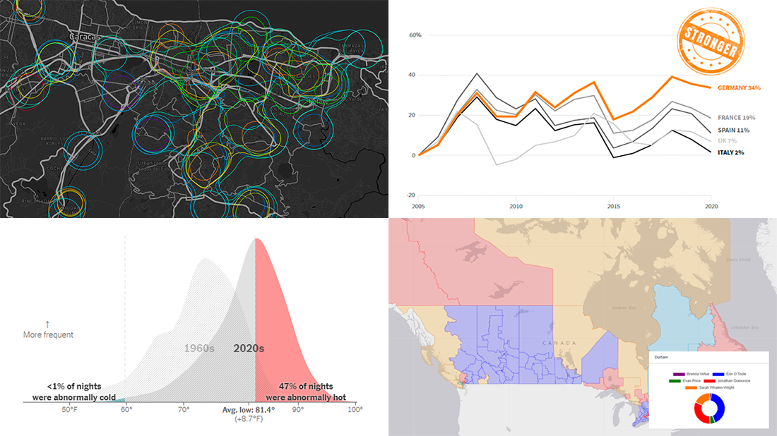 We continue to choose the most interesting out of all the newest data visualizations published here and there and show you them in weekly roundups. It’s time to look at our fresh selection! This time, the following projects are featured in DataViz Weekly:
- Canadian federal elections since 2000 — Stephen Taylor
- Germany under the 16-year leadership of Angela Merkel — Reuters
- Sounds of Caracas — Valeria Escobar
- Abnormally hot summer nights in American cities — The Upshot
- Categories: Data Visualization Weekly
- No Comments »
Visualizing Mortality Statistics and Satellite Imagery Data — DataViz Weekly
September 10th, 2021 by AnyChart Team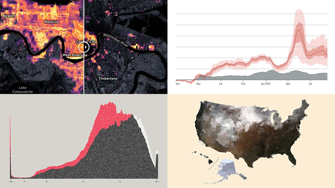 This week, we have come across a number of wonderful new data visualization projects out there. Here are the four that we’ve found most interesting and decided to showcase today in DataViz Weekly. Join us for a quick overview of these works and check them out!
- Black mortality gap in America — The Marshall Project
- Excess deaths worldwide during the COVID-19 pandemic — The Economist
- Ida-caused power outage in New Orleans as seen from space — NASA Earth Observatory
- Average seasonal colors of the United States — Erin Davis
- Categories: Data Visualization Weekly
- No Comments »
New Awesome Charts and Maps Curated for Data Visualization Fans — DataViz Weekly
September 3rd, 2021 by AnyChart Team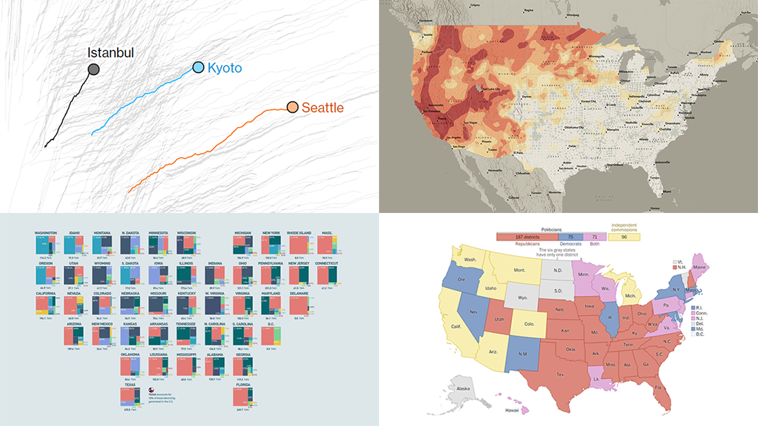 The seven-day wait is over for all data visualization fans wherever you are! DataViz Weekly is back with a selection of new awesome charts and maps curated from around the web. Look at our latest picks.
- Current and historic drought conditions across the United States — Esri
- Relationship between temperature, income, and mortality — Bloomberg Green
- U.S. electricity mix by state — Visual Capitalist
- Congressional redistricting rules and practices — The Washington Post
- Categories: Data Visualization Weekly
- 1 Comment »
Visualizing Codebase Structure, Climate Data, Time Use Patterns, and Census Stats — DataViz Weekly
August 13th, 2021 by AnyChart Team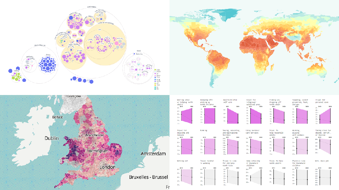 It is Friday the 13th. But don’t worry about the irrational! Check out the four really cool data visualization projects we have discovered around the web these days and you will be fine, entertained, and inspired.
Today on DataViz Weekly:
- Codebase visualization in packed bubble charts — GitHub OCTO
- Climate change impacts through 2099 — Climate Impact Lab
- Shifts in U.S. time use patterns during the pandemic — Nathan Yau
- 50 years of social change in England and Wales — ONS
- Categories: Data Visualization Weekly
- No Comments »
Tokyo Olympics Medal Trackers — DataViz Weekly
August 6th, 2021 by AnyChart Team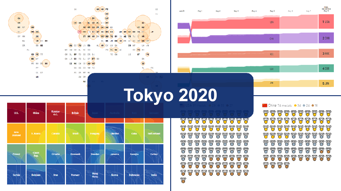 Delayed one year due to the COVID-19 pandemic, the 2020 Summer Olympics officially known as the Games of the XXXII Olympiad and commonly referred to simply as Tokyo 2020 have been underway for two weeks and are already coming to a close, with under 50 medal sets yet to be distributed over the remaining two days.
In this special edition of DataViz Weekly, we are happy to showcase four wonderful Olympic medal trackers providing an insightful view of medal counts and country standings with the help of telling visualizations — from Bloomberg News, The New York Times’s The Upshot, FiveThirtyEight, and Axios.
- Categories: Data Visualization Weekly
- 1 Comment »
New Amazing Graphics for Fans of Data Visualization — DataViz Weekly
July 16th, 2021 by AnyChart Team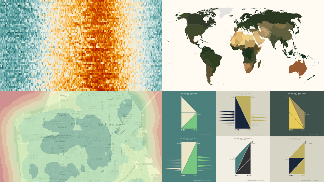 Are you ready for another set of amazing data graphics? It’s Friday, so DataViz Weekly is here to let you know about four great new visualization works worth checking out right now!
- 15-minute cities in Germany and worldwide — Chris and Nils from Gießen
- Daily temperatures in Tokyo since 1964 (and what to expect at the Olympics) — Reuters
- Average colors of countries, as well as U.S. states and counties — Erin Davis
- Euro 2020 and Copa América 2021 playoffs visualized in triangles — Krisztina Szűcs
- Categories: Data Visualization Weekly
- 1 Comment »
New Stunning Data Visualization Examples to See and Learn From — DataViz Weekly
July 9th, 2021 by AnyChart Team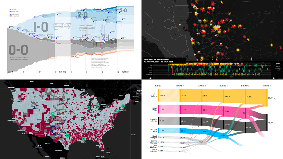 Graphical representation makes data easier to understand and interpret. The DataViz Weekly series on our blog aims to highlight the most vivid examples of clever data visualization in action so you can better realize how it can work or simply have fun exploring new stunning charts and maps.
Today on DataViz Weekly:
- European arms in the bombing of Yemen — Forensic Architecture, Yemeni Archive, ECCHR, and Bellingcat
- All scorelines and goals from the UEFA Euro 2020 group stage — Krist Wongsuphasawat
- Racial residential segregation in the United States — The Othering and Belonging Institute at UC Berkeley
- NYC Democratic mayoral primary vote results — Bloomberg
- Categories: Data Visualization Weekly
- No Comments »
Fresh Great Data Visualization Projects on Thanksgiving, COVID, and Tree Equity — DataViz Weekly
December 4th, 2020 by AnyChart Team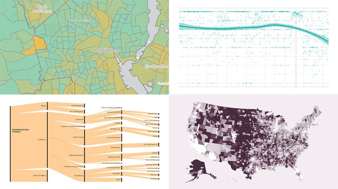 Hey everyone! Continuing to curate the best charts, maps, and infographics from around the Internet, we invite you to meet four fresh great data visualization projects worth checking out.
Today on DataViz Weekly:
- Visualizing the ways the Thanksgiving turkey leftovers were used — Nathan Yau
- Understanding the scale of 250,000 deaths from the coronavirus — The Washington Post
- Finding a correlation between scented candle reviews on Amazon and COVID-19 — Kate Petrova
- Evaluating tree equity in American city neighborhoods — American Forests
- Categories: Data Visualization Weekly
- No Comments »
20+ Electoral Maps Visualizing 2020 U.S. Presidential Election Results — DataViz Weekly Special Edition
November 6th, 2020 by AnyChart Team All eyes on election maps! Yes, they could be misleading. And even widely misleading. But it can be at least so fascinating to look at them, especially at times like this! So, we have curated a list of over twenty reputable resources — as of now, to be precise, 24 and counting! — where you can watch the live results of the 2020 United States Presidential election in compelling data visualizations. At the same time, it is a great chance for you to investigate and understand how election maps (and some other graphics) can look and work in practice.
? See also: 2024 U.S. Election Maps (November 2024).
Vote counts may be different on different platforms and update as more data becomes available out there — it’s absolutely okay. The election results are still partial. Over the coming days, all numbers will be adjusted to match the real, final vote count. Just in case: We’ve added only reliable sources — notable, reputable media outlets.
Without further ado, check out maybe the most important data visualizations these days! (Electoral vote count numbers in the text last updated on November 9th, 2020, for each source.)
- Categories: Data Visualization Weekly, News, Third-Party Developers
- 3 Comments »