 Graphical representation makes data easier to understand and interpret. The DataViz Weekly series on our blog aims to highlight the most vivid examples of clever data visualization in action so you can better realize how it can work or simply have fun exploring new stunning charts and maps.
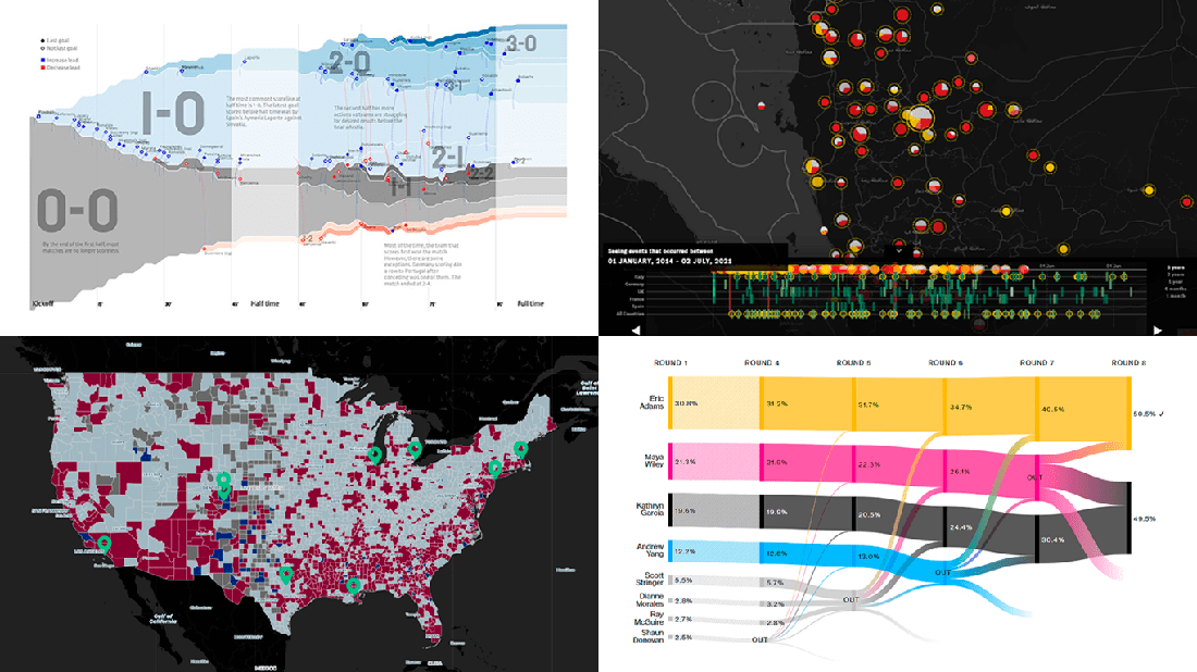
Today on DataViz Weekly:
- European arms in the bombing of Yemen — Forensic Architecture, Yemeni Archive, ECCHR, and Bellingcat
- All scorelines and goals from the UEFA Euro 2020 group stage — Krist Wongsuphasawat
- Racial residential segregation in the United States — The Othering and Belonging Institute at UC Berkeley
- NYC Democratic mayoral primary vote results — Bloomberg
Data Visualization Weekly: July 2, 2021 — July 9, 2021
European Arms in Bombing of Yemen
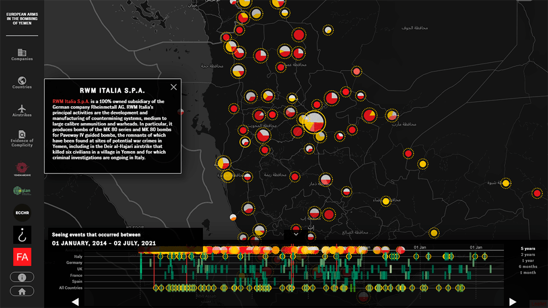
A total of at least 8,759 civilians have been killed in Yemen since 2015 as a result of numerous airstrikes executed by a military coalition led by the United Arab Emirates and Saudi Arabia. The bombings appear to have been in fact supported by some European governments and arms manufacturers. Moreover, reports say the coalition continues to successfully receive missiles, fighter jets, and other military goods along with maintenance and training services from Spain, Italy, Germany, France, and the United Kingdom even despite a number of reported violations of human rights and humanitarian law committed by the UAE and Saudi Arabia in Yemen.
The airstrikes and evidence of Europe’s involvement are now documented and represented in an interactive dashboard created by the European Center for Constitutional and Human Rights (ECCHR), Forensic Architecture, Yemeni Archive, and Bellingcat. The project plots all the registered incidents over time and over geography, providing exposure for how they relate to certain companies and countries.
Explore the complicity of European arms producers and governments in fueling the horrible war in Yemen as it is revealed and declared in this joint investigation. Plus you can read about the methodology here.
All Scorelines and Goals from Euro 2020 Group Stage
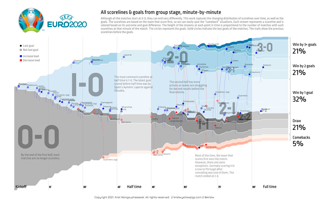
The UEFA Euro 2020 is coming to an end. The final, with Italy facing England, will take place already on Sunday. At the end of big tournaments, it is always interesting to take a look back. And here’s one cool approach that you should be aware of when it comes to such analysis.
Kris Wongsuphasawat, currently a data visualization engineer at Airbnb, created a visual summary of all the matches from the Euro 2020 group stage in the form of a streamgraph, representing the changing distribution of the scorelines and goals over time from the kickoff to the final whistle. Each stream shows a certain scoreline. The height of each stream at each point is proportional to how many matches had that scoreline at that minute. Circles indicate goals (solid ones represent the matches’ last goals). Trails help to see the previous scorelines (before the corresponding goals).
Check it out for interesting insight into how the group stage went and keep an eye on Kris’s feed and the dedicated thread on Twitter for more iterations.
Racial Residential Segregation in America

81% of large metropolitan areas in the United States had a higher level of racial segregation in 2019 than in 1990. It is one of the key findings of the national segregation report just published within the framework of The Roots of Structural Racism Project carried out at the Othering and Belonging Institute at the University of California, Berkeley.
To illustrate the extent of the problem, the researchers represented the collected data in an interactive map. This visualization allows you to explore racial residential segregation across the country down to the census tract level as well as observe changes over time. There, you can search for a specific address, select a year (1980, 1990, 2000, 2010, or 2019), and pick different measures (divergence, dissimilarity, entropy, etc.). In addition to a view by census tract, it is possible to see segregation at the level of cities or metropolitan areas and counties.
The map also includes multiple location-specific segregation stories worth reading. For an accompanying report, see here.
NYC Democratic Mayoral Primary Vote Results
![]()
Eric Adams, the Brooklyn Borough President, is about to become the Democratic party’s nominee for the mayor of New York City. After the latest reported ranked-choice count of primary voters made public by the NYC Board of Elections on Tuesday, The Associated Press called the Democratic mayoral primary race for him as he was announced to hold an 8,426-vote lead over Kathryn Garcia. That is as little as one percentage point, though.
To communicate the redistribution of votes round by round at a glance, Bloomberg’s Allison McCartney made a beautiful interactive Sankey diagram. Basically, this graphic looks like a perfect way to visualize the system of ranked-choice elimination in action.
Check out the newest tallies graphically represented.
***
We appreciate your attention and will continue to showcase the best data visualization examples within the framework of our weekly blog feature. Stay tuned.
- Categories: Data Visualization Weekly
- No Comments »