Best New Data Visualizations in Overview — DataViz Weekly
December 11th, 2020 by AnyChart Team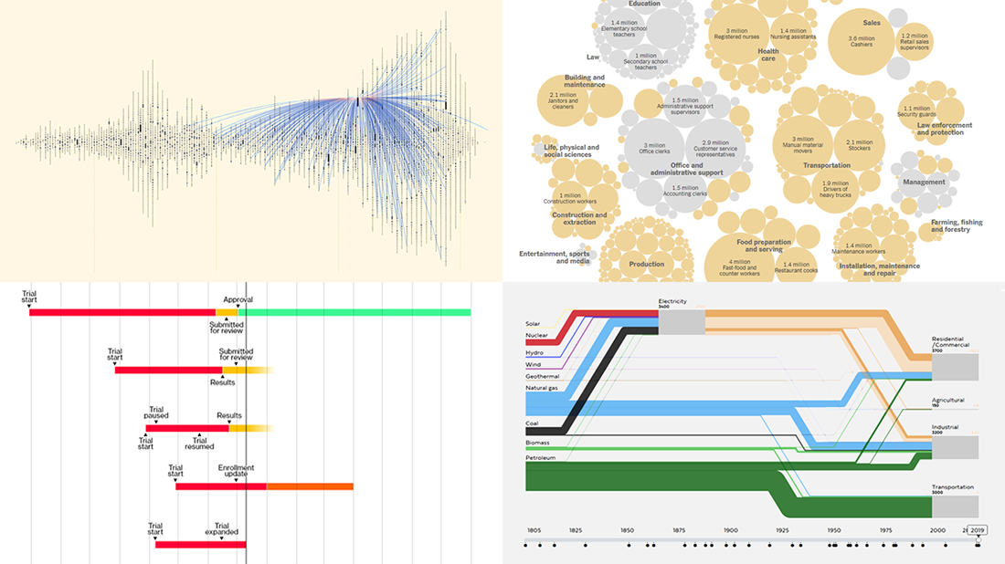 Welcome back to DataViz Weekly, where we overview the best new data visualizations created by professionals. As always, let’s begin with a list of the projects we’re excited to put a spotlight on, and then take a closer look at each:
- Exploring letter communication networks of the Tudor government in the 16th century — Kim Albrecht, Ruth Ahnert & Sebastian Ahnert
- Tracking the most promising coronavirus vaccines — Bloomberg
- Defining “essential” and “frontline” workers for vaccination — NYT
- Understanding the U.S. energy use evolution since 1800 — RDCEP, UChicago
- Categories: Data Visualization Weekly
- No Comments »
How I Created Sunburst Chart Using JavaScript to Visualize COVID-19 Data
December 8th, 2020 by Shachee Swadia Almost recovered from COVID-19 myself these days, I decided to explore how the world is currently doing, during the pandemic. So I created a sunburst chart to see at a glance what continents and countries are more (and less) affected by the coronavirus than others. The process was quick and I thought someone could be interested to learn about how such data visualizations can be built in a pretty straightforward way, even with very little technical skills. So I also made a tutorial. And here I am — (1) sharing my interactive sunburst chart of COVID cases and (2) describing how I created it using JavaScript in a matter of minutes, step by step!
My JS sunburst chart provides an overview of the situation as of November 24, 2020, and also shows the global count, continent-wide data, and country-wise proportions for the current active COVID-19 cases and deaths. Scroll down to explore it by yourself and check out the tutorial along the way. Here is a sneak peek of the final chart to get you excited:
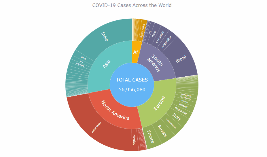
This sunburst charting tutorial is mainly for beginners to data science. So before we get to business, let’s make sure we’re on the same page. I’ll explain what a sunburst chart is and how it works, to start with. Then I’ll show you how to create a cool and colorful interactive visualization like that with JavaScript (and you can do it even if you don’t know it too well). That’s the plan!
Read the JS charting tutorial »
- Categories: AnyChart Charting Component, Big Data, Business Intelligence, HTML5, JavaScript, JavaScript Chart Tutorials, Tips and Tricks
- No Comments »
Fresh Great Data Visualization Projects on Thanksgiving, COVID, and Tree Equity — DataViz Weekly
December 4th, 2020 by AnyChart Team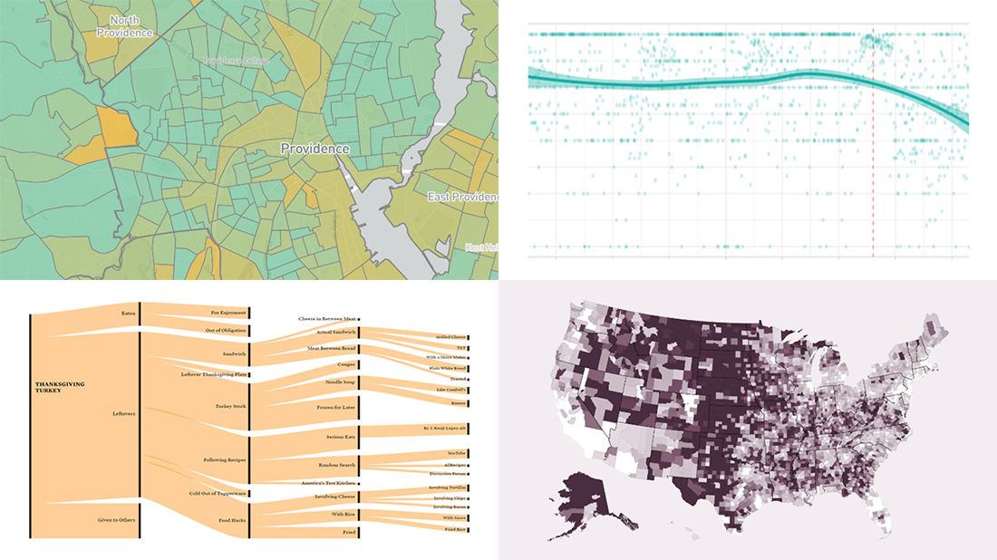 Hey everyone! Continuing to curate the best charts, maps, and infographics from around the Internet, we invite you to meet four fresh great data visualization projects worth checking out.
Today on DataViz Weekly:
- Visualizing the ways the Thanksgiving turkey leftovers were used — Nathan Yau
- Understanding the scale of 250,000 deaths from the coronavirus — The Washington Post
- Finding a correlation between scented candle reviews on Amazon and COVID-19 — Kate Petrova
- Evaluating tree equity in American city neighborhoods — American Forests
- Categories: Data Visualization Weekly
- No Comments »
Power of Data Visualization in Four New Compelling Examples — DataViz Weekly
November 27th, 2020 by AnyChart Team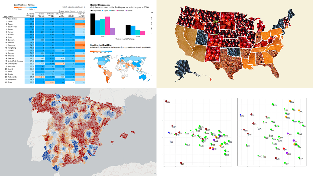 If you love good data visualizations, you’ve come to the right place at the right time! Every Friday, we choose the four most interesting projects making good use of charts and maps, from those we have come across out there just lately, and introduce you to them. Here are the visualizations we’re going to tell you about this time on DataViz Weekly:
- (False?) dichotomy between saving lives and saving the economy during the second wave — Michael Smithson on The Conversation
- COVID Resilience Ranking revealing the best and worst places to stay during the pandemic — Bloomberg
- Length of summers in Spain since 1950, by municipality — Predictia
- The most popular Thanksgiving pie in each state — Instagram
- Categories: Data Visualization Weekly
- No Comments »
New Awesome Visualizations on COVID-19, SDGs, Judges, and Colors — DataViz Weekly
November 20th, 2020 by AnyChart Team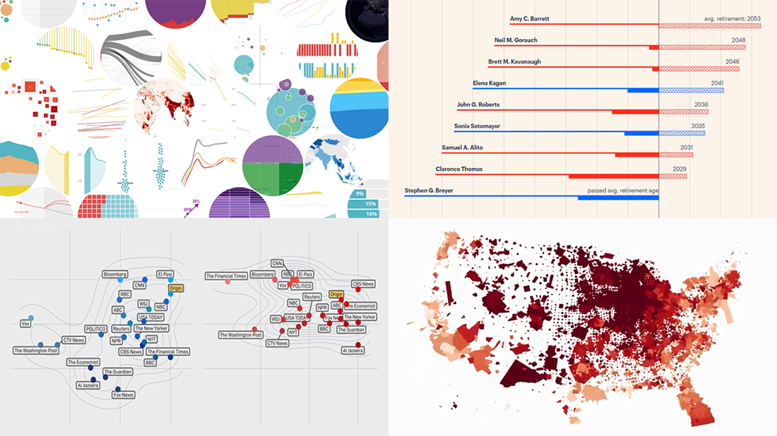 Another long seven-day wait is over, and DataViz Weekly‘s already here to introduce you to new awesome data visualizations we have met these days around the Web. Let’s see what we’ve got this time!
- COVID-19 growth rates in each U.S. county — Benjamin Schmidt
- World development indicators — The World Bank
- Timelines for new and all current federal judges — ProPublica
- Colors of the U.S. election maps on different media — SBS News
- Categories: Data Visualization Weekly
- No Comments »
How to Create Venn Diagram with JavaScript
November 11th, 2020 by Shachee Swadia A Venn diagram is a form of data visualization that uses shapes, generally circles, to show the relationships among groups of things. In this chart type, overlapping areas show commonalities while circles that do not overlap show the traits that are not shared.
Introduced by John Venn, an English mathematician, logician, and philosopher, Venn diagrams are also called set diagrams or logic diagrams since they show possible logical relations between elements of different sets. When drawing such charts, we will most probably be dealing with two or three overlapping circles, since having only one circle would be boring, and having four or more circles quickly becomes really complicated.
Not only are these diagrams good visualizations as a concept, but they also provide a great opportunity to represent qualitative data and a bit of graphic humor. Basically, they are easy and fun to build and use. I’ll show you right now!
Read this tutorial to learn how to easily create a visually appealing and informative Venn diagram for your website or app with the help of JavaScript. All the code used and demonstrated along the tutorial will be freely available for you to play with.
During the ongoing coronavirus pandemic, with working from home and avoiding food from outside, many of us have become amateur chefs. So, let us use a JS-based Venn diagram to find out what kind of recipe would be the best to try out on a working day — this is going to be a delightful use case to explore!
Read the JS charting tutorial »
- Categories: AnyChart Charting Component, HTML5, JavaScript, JavaScript Chart Tutorials, Tips and Tricks
- 2 Comments »
Exploring Data About COVID-19, Road Curvature & U.S. Elections — DataViz Weekly
October 23rd, 2020 by AnyChart Team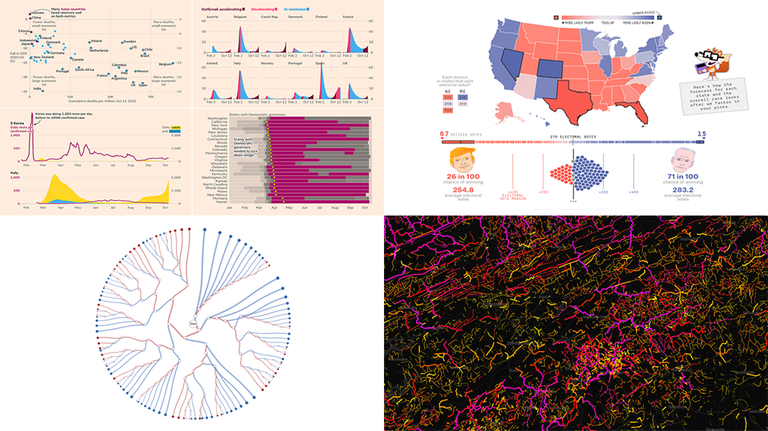 Meet a set of new amazing visualizations we’ve spotted and admired lately. Below is a list of the projects featured today on DataViz Weekly. Keep reading to learn about each and then check them out right away.
- Global COVID-19 crisis in data — FT
- Twisty roads worldwide — Adam Franco
- Ways Biden or Trump could win — FiveThirtyEight
- Electoral College Decision Tree — Kerry Rodden
- Categories: Data Visualization Weekly
- No Comments »
New Stunning Data Graphics Projects Not to Miss — DataViz Weekly
October 16th, 2020 by AnyChart Team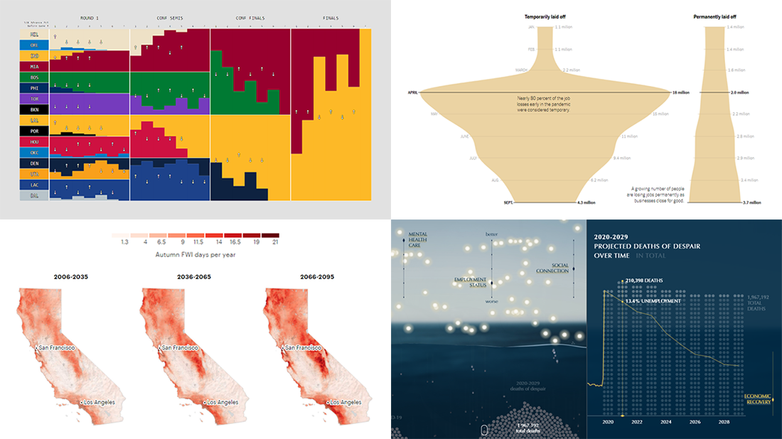 We know DataViz Weekly is read on a regular basis by data visualization practitioners from many countries, and we are happy you guys find it interesting and helpful. Are you ready for another bunch of new great data graphics projects worth looking at? There you go:
- NBA playoff win probabilities — Adam Pearce
- Fall fire weather days in California by the century’s end — ProPublica
- U.S. unemployment crisis shapes — NYT
- Deaths of despair in America — Periscopic
- Categories: Data Visualization Weekly
- No Comments »
Fresh Examples of Data Visualization Best Practices in Action — DataViz Weekly
October 9th, 2020 by AnyChart Team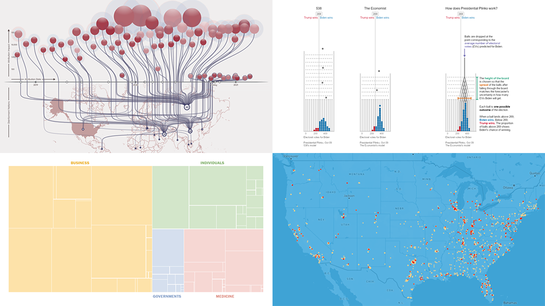 DataViz Weekly is here featuring a selection of new compelling projects with awesome charts and maps. Check out some of the coolest fresh examples of data visualization best practices in action!
- $4 trillion coronavirus bailout under the microscope — The Washington Post
- Presidential Plinko — Matthew Kay, Northwestern University
- Allegations of foreign interference in the 2020 U.S. election — DFRLab
- American streets named after athletes — ESPN
- Categories: Data Visualization Weekly
- No Comments »
Feel Power of Data Visualization in Four New Examples — DataViz Weekly
October 2nd, 2020 by AnyChart Team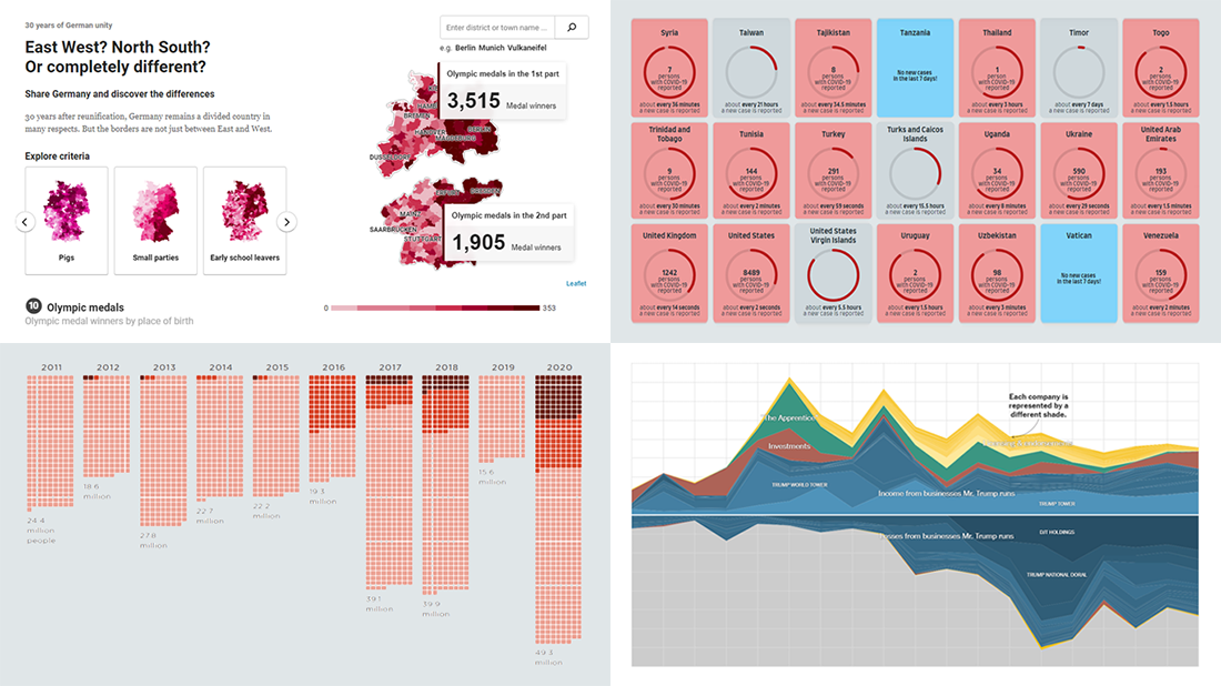 We’ve curated another four new wonderful examples from around the web that greatly illustrate the power of data visualization in action. Meet them straight away, on DataViz Weekly!
- COVID-19 spreading rates by country — Jan Willem Tulp
- Two decades of Trump’s finances — The New York Times
- Dangerous air pollution in the record wildfire season in the Western U.S. — NPR
- Germany divided — Berliner Morgenpost
- Categories: Data Visualization Weekly
- No Comments »