 If you love good data visualizations, you’ve come to the right place at the right time! Every Friday, we choose the four most interesting projects making good use of charts and maps, from those we have come across out there just lately, and introduce you to them. Here are the visualizations we’re going to tell you about this time on DataViz Weekly:
- (False?) dichotomy between saving lives and saving the economy during the second wave — Michael Smithson on The Conversation
- COVID Resilience Ranking revealing the best and worst places to stay during the pandemic — Bloomberg
- Length of summers in Spain since 1950, by municipality — Predictia
- The most popular Thanksgiving pie in each state — Instagram
Data Visualization Weekly: November 20, 2020 — November 27, 2020
(False?) Dichotomy Between Lives and Economy During Second Wave of Pandemic
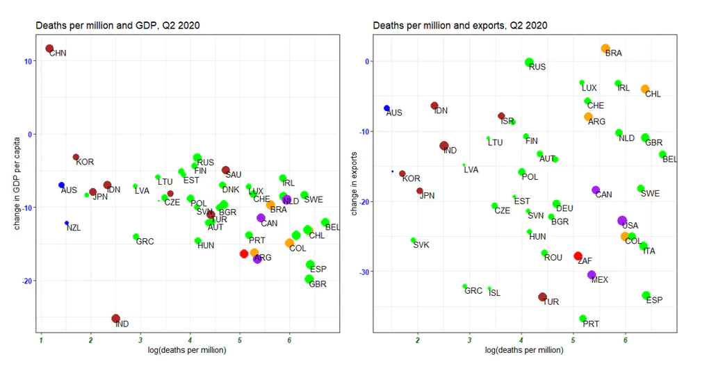
Generally, сharts are employed to discover trends, patterns, and relationships in data. But it is also possible that applied to certain data, they reveal nothing of the aforementioned, which can still be very helpful. Here’s a nice example.
It is usually voiced that containing COVID-19 by means of strict lockdown measures leads to severe damage to the economy. So saving the economy and saving lives are believed to be opposites and governments have to balance between the two while combatting the second wave. Michael Smithson, a professor at the Australian National University in Canberra, looked at the relevant open data and concluded the claimed dichotomy is actually false.
For his analysis, he took several basic economic indicators for 45 countries (37 OECD member states and 8 other major economies) from the OECD’s QNA dataset and COVID statistics from Our World in Data, and charted them on scatter plots. The visualizations made by the professor show no clear evidence of the relationships one would expect to observe if the claimed dichotomy existed in reality. So, according to his conclusion, the problem should not be considered as a clear trade-off between health, on the one hand, and economic costs, on the other. Check out the charts and read more, on The Conversation.
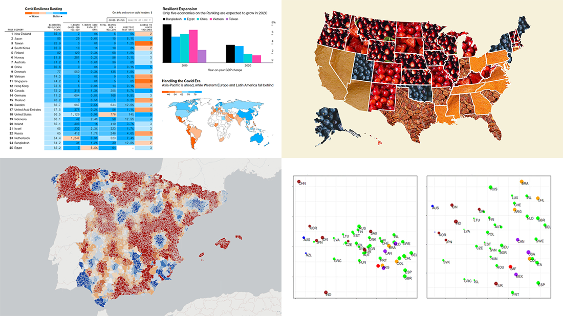
Best and Worst Countries to Live in During Pandemic
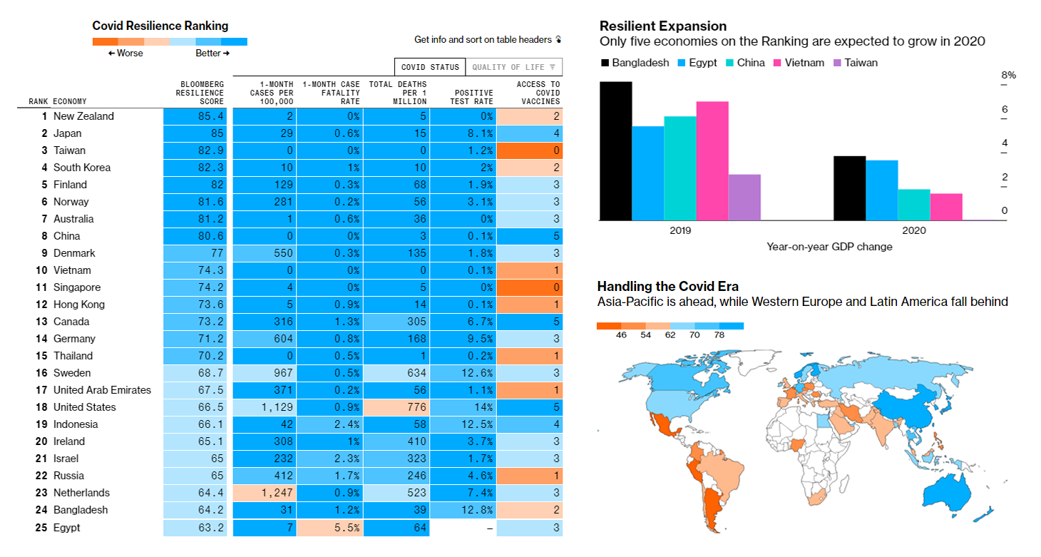
As the entire world remains challenged by the pandemic and its impact on the economy and people’s lives, some countries are significantly more successful in coping with the crisis than others.
No single parameter could determine that, however. So Bloomberg analysts developed what they call the Resilience Score, a complex measure based on ten indicators of the COVID status and quality of life extracted from various carefully selected sources. Then they ranked the 53 largest economies accordingly, revealing where the novel coronavirus has been contained most effectively and, at the same time, with the lowest degree of economic and social disruption.
The components of the COVID Resilience Score include one-month cases per 100,000 people, one-month case fatality rates, total deaths per one million, positive test rates, and the number of vaccine supply agreements — as well as lockdown severity, community mobility, GDP growth forecast, healthcare coverage, and Human Development Index.
Explore the COVID Resilience Ranking, in an interactive table or map, and find out what countries are the best (and worst) places on Earth to stay during the pandemic. Scroll down the article for more insights.
Length of Summers in Spain by Municipality Since 1950
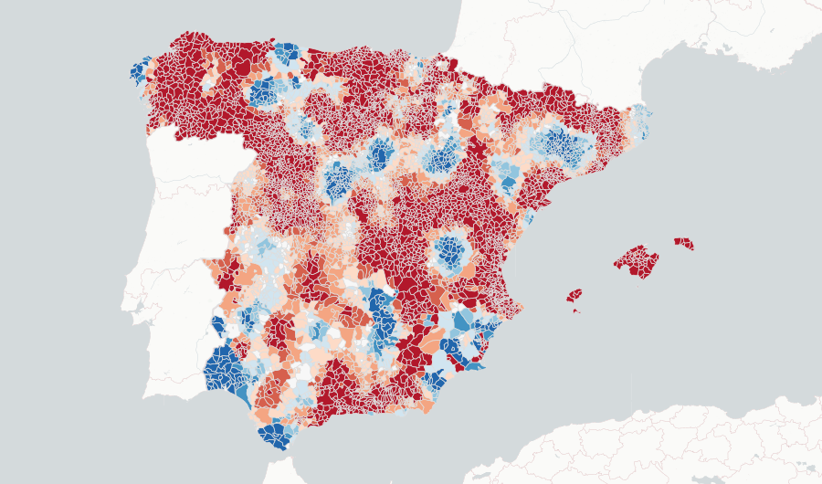
In 2019, Spain was the second most visited country in the world, after France. (Wondering where they are on Bloomberg’s resilience ranking? You will not find them even close to the top. They are ranked 41st and 45th out of 53, respectively.) Warm and sunny summers attract especially many tourists to Spain, and the good thing for the country’s tourism industry is that summers there are getting longer overall.
Predictia, a Spanish data intelligence company, represented climate data from AEMET (Spain’s State Meteorological Agency) and the University of Cantabria in an interactive visualization. When you open it, the first thing you see is a map accompanied by a sidebar with the settings. There, you can choose to view the average first day of the real summer weather, the average last summer day, or the average summer length for the periods of 1960-1982 or 1983-2015, or differences between the two periods, on a municipality level.
You can see that summers on most of the territory of Spain have had longer summers over time. For some places, however, that is not the case. Look into the data with the help of the map and click on municipalities to learn more about their summers 1950-2015 in bar and range area charts.
Most Popular Thanksgiving Pie in Each State
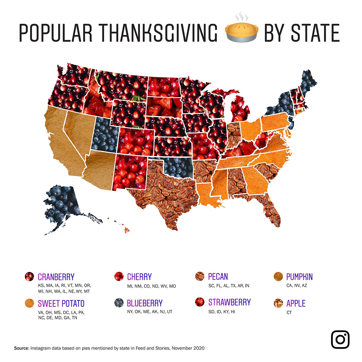
We hope those of you who celebrate it had a happy Thanksgiving Day and enjoyed your meal! So what kind of pie did you eat? Pumpkin? Sweet potato? Cherry? Now we can try to guess it based on where you live!
Instagram revealed the most popular Thanksgiving pie in each state based on the number of likes and mentions of the corresponding pie flavors in stories and feeds in November. According to the map shared on Instagram’s Facebook page, a cranberry pie leads in most states and is the favorite Thanksgiving pie in 14: Illinois, Iowa, Kansas, Massachusetts, Minnesota, Montana, Nebraska, New Hampshire, Oregon, Rhode Island, Vermont, Washington, Wisconsin, and Wyoming.
Sweet potato comes second, winning in the District of Columbia and 10 states: Delaware, Georgia, Louisiana, Maryland, Mississippi, North Carolina, Ohio, Pennsylvania, Tennessee, and Virginia. Cherry, blueberry, and pecan pies lead in 6 states each. Strawberry wins in 4. Pumpkin is the most popular in California, Nevada, and Arizona. Finally, an apple pie tops the list of the most popular Thanksgiving pies in only one state, Connecticut.
In the comments on Facebook, some people expressed doubts that these results could be extrapolated to the real world. Based on their own experience, of course. Check if the picture looks true for your state.
***
We hope you enjoyed checking out these visualizations. Stay tuned for Data Visualization Weekly and you will hardly miss any good project whatsoever.
Have a great time everyone!
- Categories: Data Visualization Weekly
- No Comments »